japan

Uniqlo Tokyo Fashion Map

By | WEBSITES | No Comments

uniqlo fashion map

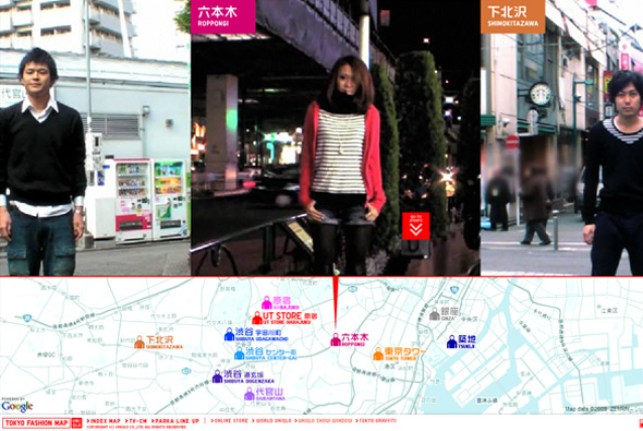
Part of the Uniqlo Parka Style 1000 series, another cool site promoting Uniqlo’s parkas. Similar to the ‘Pass the ball’ concept by Nike, in this case ‘pass the parka’, a series of videos & photos of real people from the streets of Tokyo all setup the same way, passing the parka to their left – this all makes a nice sequence of visuals which is interesting to watch it all passing by on screen. Nice addition of a map of Tokyo showing you where the person was ‘steet snapped’. Nicely executed as usual, with slick animations and cool transitions. Nice vibe from this project…

Created by Dentsu and Bascule inc.

Website here…

Uniqlo – Wire

By | WEBSITES | No Comments

uniqlo wired
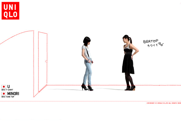
Site promoting Uniqlo’s range of bra tops. As usual Uniqlo provides another cool microsite promoting a new product, this time videos of 100 women talking about the bra tops. On top of this content is a layer of red dotted lines which draw things over the screen and ask simple questions about bra tops, at any time you can find out more about the products on display.  Presented in a slideshow type way, as with many of Uniqlo’s online work you can sit back and watch, it’s clean, cool, and so so simple.

Site here…

Hiroshi Seo

By | WEBSITES | No Comments

hiroshi seo

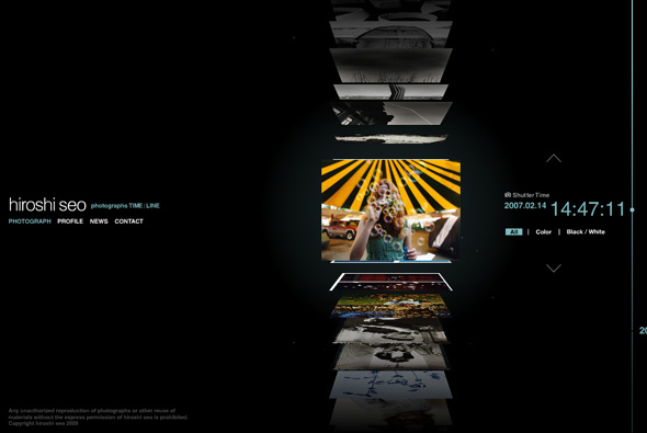
Portfolio site of photographer Hiroshi Seo. Slick timeline based interface which allows you to quickly scroll through thumbnails of his photos. Each of the thumbnails are 3d and flip upwards, much like a vertical coverflow interface, and organised upon time – on click the photo enlarges. Really like the scrolling interface, and the whole minimal slick look & feel. All in all a very nicely made photographers portfolio with some really nice touches with smooth fluid animation, nice interface that fits the content well.  

Created by Murakami Design.

Website here…

Uniqlo Zoom

By | WEBSITES | No Comments

uniqlo zoom

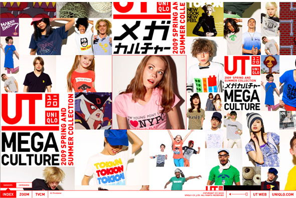
New Uniqlo website, best described by their incredible agency tha ltd, “A campaign website for Uniqlo’s 2009 UT Spring/Summer Collection has been launched. Just like the TVCM, the website features some of the main T-shirts of the collection in an endless zoom.” So we have a nice endless zoom feature, similar to the ‘zoom quilt’ of the past, except this time we zoom into Uniqlo’s range of t-shirts. Featuring photography and video, you use your mouse scroller to control your direction and speed (or let it scroll automatically). I like the fact when you view the videos your scroller controls the speed of the video – nice touch, also love the high resolution photos and the overall style. Also love the ‘homepage’, a constantly scrolling view of each of the photos, when clicked take you right to that item – also well integrated to the Japanese online shop. Again lots of nice animation and small touches – all set inside a simple interface which is clear and easy to use…  Cool!!

Created by tha ltd.

Website here…

The Toke

By | WEBSITES | No Comments

the toke

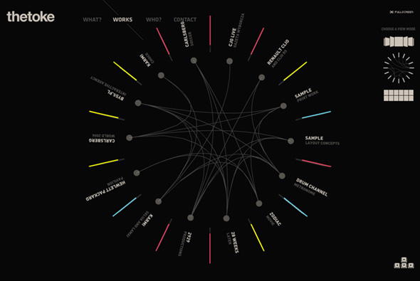
Portfolio of Darek Nyckowiak, Polish Flash guy. Some interesing use of 3d to show off his projects, giving the option of viewing his work in 3 ways, nice animation and interactivity, all presented in a clean, easy to use way.

Website here…

Kikonashi Hoop

By | WEBSITES | No Comments

hoop clothing

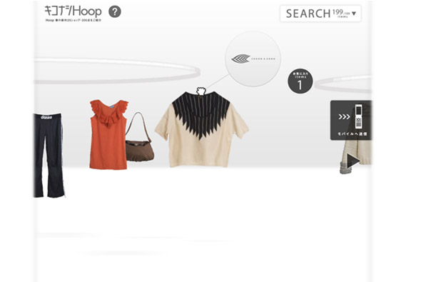
Site promoting Japanese online clothing store Hoop. What I like is the user interaction and unique way of browsing products, using a nice drag and drop metaphor for shopping in the real world, you can flow through the available products and pick and drag any item into your own shopping rack – for purchase later. But it’s the polish and interactivity that really makes it, feels very tactile and becomes quite fun to pick up items, which react to your mouse movement in a ‘realistic’ way.

Website here…

Kenjiro Harigai

By | WEBSITES | No Comments

kenjiro harigai

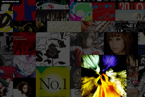
Portfolio of Japanese creative Kenjiro Harigai. Some really nice things in here, presented in an interesting way – all of his work is neatly packed in together with all of it scrolling slowly to the left, on rollover the images fade up, enlarge and overlay the montage. It’s a nice way to present a lot of work in an engaging manner…

Website here…

Internavi Realization – Honda

By | WEBSITES | No Comments

honda internavi

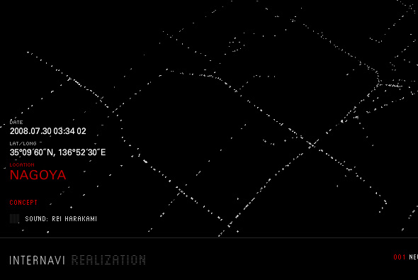
Site promoting Honda’s Internavi GPS system. One part of the site visualises the ‘neuron road’ concept, whereby the car fitted with the Internavi system constantly communicates GPS coordinates, showing a simple animated map of various Japanese city roads, which you can pan around and zoom in / out of. Another really nice feature is a time lapse drive of a coastal road to illustrate the fact the Internavi system has a ‘scenic route’ mode which searches for the most scenic roads for you. Again I dig the simplicity of the Japanese style, it seems for like an inspired ‘art’ project than a promotional site, but pretty cool visualisations. Lots of nice interactions and attention to detail, you can also download the screensaver for each…

Created by Dentsu, Semitransparent, Metaphor, and Shipoo.

Website here…

Beams

By | WEBSITES | No Comments

beams clothing

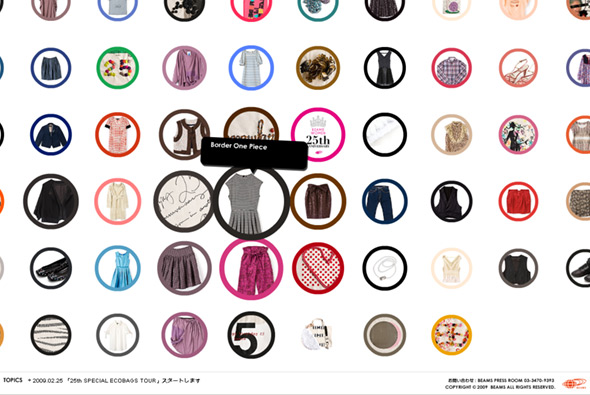
Site promoting Beams, specifically Women’s clothing 25th anniversary. A very simple interface showing thumbs of the items, when you click on an item they have used a really nice way of zooming in/out of the photo. You hold down your mouse button to zoom in / pan around (with the item slightly rotating on left/right movement) and let go to zoom out, complete with nice little sound fx. Again another typically Japanese site design, where the interface and interaction design is top notch, the site is fun and simple  to use.

Website here…

Churaumi Hakken – Okinawa Aquarium

By | WEBSITES | No Comments

Okinawa Aquarium

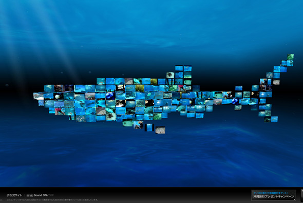
Nice site, promoting the Okinawa Churaumi Aquarium in Japan. Simply using videos from YouTube that feature videos made at the aquarium, made special by forming the shape of a ‘shark’, which swims gracefully through the ocean. Lovely music and sound, the interface is minimal and typically Japanese, all combined it gives a nice feeling! The combination of a fluid moving ocean creature composed of YouTube videos is quite mesmerising, and gives a positive feeling that is amplified when you see the videos of people amazed by the animals they are filming. As it uses tags from YouTube the content of the videos stays fresh. Really pretty damn cool…

Created by Asahi Advertising.

Site here…

Uniqlo – Parka Style 1000

By | WEBSITES | No Comments

uniqlo parkastyle

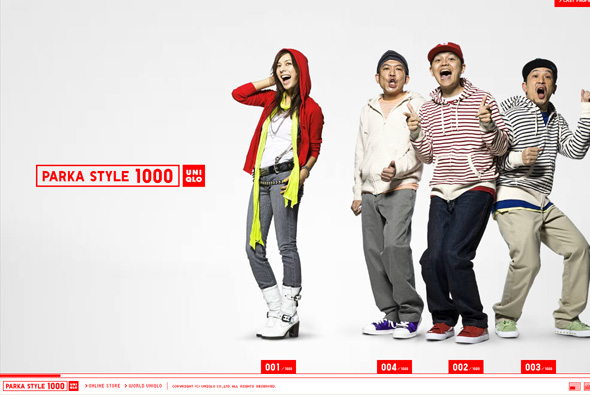
Very simple microsite promoting Uniqlo’s parka collection. Pretty cutesy and fun, but I really appreciate again Uniqlo’s simplicity – horizontal scrolling navigation highlighting the different styles of parka featuring a mix of Japanese celebrities and models. The whole thing just gives a positive impression of the brand, with clean and crisp interactivity, and a nice layout.  

Website here…

Noodle on Noodle – Aim for Space!

By | WEBSITES | No Comments

noodle on noodle

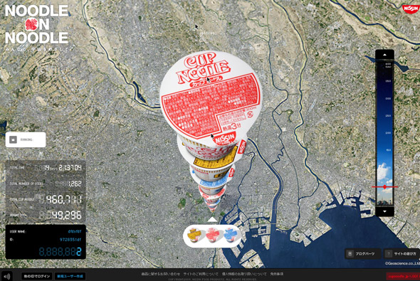
Really cool website, promoting Japanese Cup Noodles – in Japan. From a google earth-esque viewpoint users stack up pots of cup noodles with the aim of reaching space. Really simple idea, really nicely executed – you can watch other users stack up pots and see their mouse cursors and watch how they interact with the site. The screen refreshes with each newly stacked noodle pot, you can also drag a slider to the right to zoom right down to the bottom or where the stack is currently. Typically Japanese style minimal interface and clean slick interaction, looks great too – bit of a cultural nod to the google earth interface, nicely angled to bring out the full ‘stack’ of noodle pots. Really awesome…

Created by Dentsu and Dentsu Razorfish.

Website here…

Play Muji

By | WEBSITES | No Comments

play muji

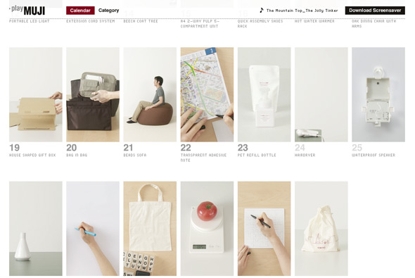
Nice idea for Muji, every day a product from their catalogue is highlighted in the style and layout of a calendar.  The highlighted products feature videos and information with future items greyed out to be revealed on a certain day. Really simple idea, much better than creating a standard list or ‘normal’ product listing, even creating anticipation to visit again to find out more about things that caught your eye! Each item even has a click through to the item in the online store, so the process is complete. Explained simply by tha: “A promotional website for Mujirushi Ryouhin (MUJI). The website features a calendar interface of videos showing one MUJI product a day. By showcasing the products in small instructional videos, the website cuts across languages and is aimed for a worldwide audience.”.

It also looks great and as you can expect from it’s Japanese creators – a great layout and a well executed Flash site, nice and minimal with lots of good polish and animation. Created by one of my favourites tha ltd.

Site here…

LOWORKS

By | WEBSITES | No Comments

loworks

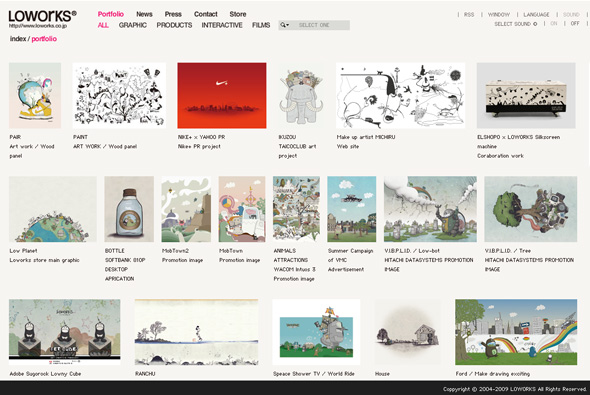
The home of LOWORKS, a Japanese agency. Really nice site, very clean & simple, easy to use and nice to look at. Smooth animations reveal the artwork where you can find more about the project. The navigation is super clean, really nice site… 

Website here…