environment

Brontide

By | @ouiwillagency | No Comments


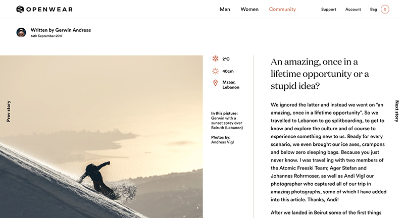
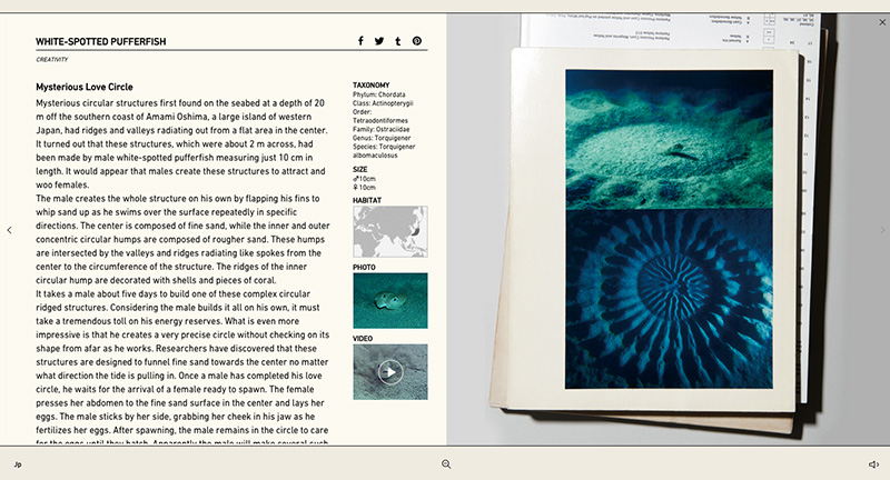
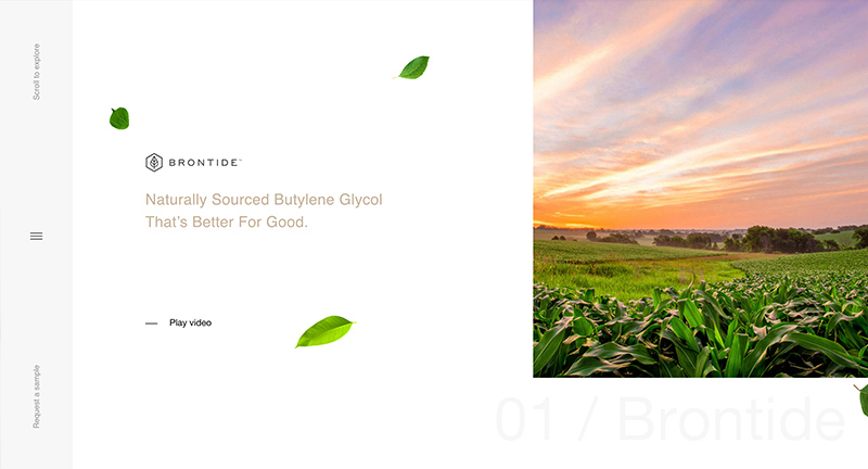
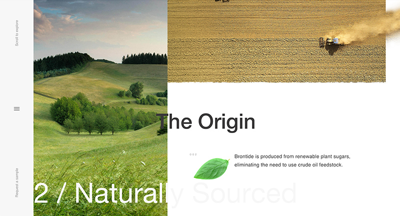
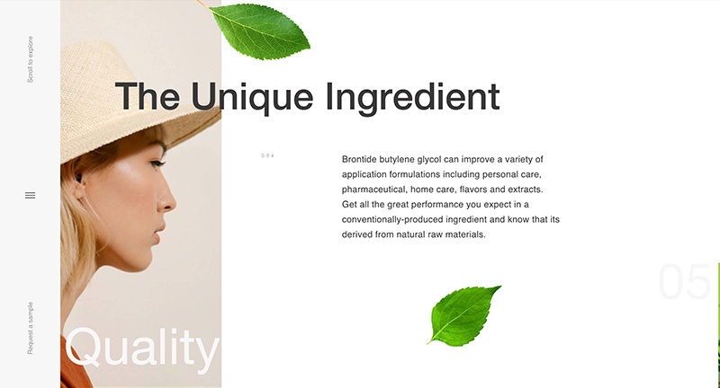
Site of Brontide a bioengineering company. Lovely horizontal scrolling home screen that animates on scroll – fluid and dynamically introducing what Brontide is all about. The corresponding pages are vertically parallax scrolling again with the same attention to detail for the home. Beautifully designed and executed site.

Created by Oui Will (@ouiwillagency).

Site here…

Open Wear

By | @buildinams | No Comments


Site of Open Wear, a ski / snowboard outerwear brand and community. Featuring an editorial design approach featuring articles, opinion pieces, gear reviews and so on. Beautiful design and great execution, love the transition states between the pages, and the thoughtful interactions. Nice design details, with slightly skewed buttons / UI, makes it feel a little more human. Particularly enjoy the homescreen, with the scrolling panel of content along the right edge.

Created by Build in Amsterdam (@buildinams).

Site here…

Sidewalk Labs

By | @sidewalklabs | No Comments


Site for Alphabet’s Sidewalk Labs, research group dedicated to changing the cities of the future. Really love the approach of explaining the mission through easy to digest videos, problem statements, and short article like pieces. It is also beautifully designed, with large type, editorial style layouts, all with thoughtful transitions and interactions. Great example of a modern site explaining complex ideas and concepts.

Created by Sidewalk Labs (@sidewalklabs).

Site here…

The Hidden Worlds of National Park

By | @google, @stinkdigital | No Comments

nps-1
nps-2
nps-3
nps-4

Lovely site promoting 100 years of the American National Parks System. Choosing five of the hardest to access National Parks, Google brings an immersive exploration of these parks guided by the rangers that work there every day. You can explore a crevasse, fly with thousands of bats, soar over an active volcano, dive through shipwrecks – many shot with 360 video/audio. Each location has a few interactive moments, like scrubbing through time to see glacier melt. High production values, and a beautiful and immersive experience taking you to these iconic National Parks.

Created Google Brand Studio (@google) & Stinkdigital (@stinkdigital).

Site here…

Navigating Responsibly

By | @SprngSmmr | No Comments

navi-1
navi-2
navi-3
navi-4

Great site for Danish Shipowners Association, highlighting how they are tackling key issues and showing stats and data on shipping. I love the way they bring their story to life through a long scrolling site that pulls out key stats and makes them tangible, like the banana. Love the way they have divided the chapters and if you click on the short nav it jumps straight to that section rather than scrolling you down. It looks great too, with well considered design, colour coded chapters, and nice type.

Created by Spring / Summer (@SprngSmmr).

Site here…

Bear’s Eye View of Yellowstone

By | @hellomondaycom | No Comments

bear-1
bear-2
bear-3
bear-4
bear-5

Lovely site for National Geographic, documenting four resident bears in Yellowstone through their daily activity and cameras mounted to their necks. Fascinating insight into where the bears go, what they do and how people interact with them. Beautifully designed too, love the scrolling mechanic that tracks the position across the map for each bear pulling out key moments. Lots of nice details such as the progress bar along the left edge of screen, and little prompts for action. Lovely example of a long form

Created by Hello Monday (@hellomondaycom).

Site here…

Sailing With Greenpeace

By | @TODAYTHE12 | No Comments

green-1
green-2
green-3
green-4

See the Greenpeace fleet and how they have tried to raise awareness for the ocean environment and the creatures affected by humans. Rich immersive audio and visual experience highlighting the vessels Greenpeace uses and has used over the past 40 years. Love the look and feel for the site, from the rotating reel acting as the menu to the technique used to show inside the ships – the site is full of delightful details. It works really nicely on mobile too, from the menu to the map view – all works and looks great.

Created by TWLVR (@TODAYTHE12) and Julien Renau (@julien_rno).

Site here…

Act of Love

By | @koichiroot | No Comments

actoflove-1
actoflove-2
actoflove-3

The digital accompaniment of a new book documenting various animals love rituals. Love the minimal pared down approach which highlights various movements and behaviors the animals have – shown simply through moving shapes. Click on the animation and a page split appears and more information is shown. Nice transitions and love the unifying way of displaying the simple animations to highlight the various weird and wonderful ‘acts of love’.

Created by Projector Japan (@koichiroot).

Site here…

Subaru and the Environment

By | @resn_has_no_i | No Comments

subaru-1
subaru-2
subaru-3

Highlighting Subaru’s CSR initiatives and relationship with the environment. Featuring a dynamic and fluid timeline that is first formed by tree rings – you can zoom in and out and the timeline unravels and populates with events. The execution sets this whole experience a level above, from the slick transitions, animations, and interactions. Fantastic attention to detail – great example of a timeline based experience.

Created by Resn (@resn_has_no_i).

Site here…

The Great Human Odyssey

By | @overhaulmedia | No Comments

human-1
human-2
human-3
human-4

Online interactive documentary highlighting nomads and their environment. Featuring first person walkthroughs of nomadic people, through their camps, where they hunt and live. Prompts to see videos and imagery pop up allowing you to see more when you want to dive into the detail – a sliding panel arrives with photos, film etc. There is a lot of detail, such as ambient sounds, conversations and insights into these people and their world. Lots of nice transitions, animations, icons and so on – it also looks great and provides an immersive experience.

Created by Overhaul Media (@overhaulmedia).

Site here…

Species in Pieces

By | @wengerstoybus | No Comments

species-1
species-2
species-3

Lovely bit of work, highlighting the plight of 30 of the world’s most threatened animals. Nice project educating the world about these amazing animals – love the look and feel, the polygonal creatures morphing from one to another. Attention to detail is great, the animals subtly animate, so does the typeface! Pleasure to use and love the way each scene changes to the next – and on top of all of this it also works on mobile/tablet really well. Great to see more of this kind of work out there.

Created by Bryan James (@WengersToyBus).

Site here…

No Fish No Nothing – Kenzo

By | @okfocus | No Comments

nofishnonothing-1
nofishnonothing-2
nofishnonothing-3

Site from Kenzo trying to raise awareness about the global decline in ocean life. A tie in with the Blue Marine Foundation Kenzo have also released a line of tee shirt and sweaters too. Interestingly done through a 3d scrolling site, as you scroll your view explores the screen in a uniquely Kenzo way – colourful and bold.

Created by OKFocus (@OKFOCUS).

Site here…

Il était une forêt – l’Expédition

By | @JulesBassoleil | No Comments

foret-expedition-1
foret-expedition-2
foret-expedition-3
foret-expedition-4

Site for Wild Touch – an expedition into tropical forests on a quest of discovery. Lots of short films, photographs and so on – all exploring their findings. All wrapped up in a nice minimal interface, lots of attention to detail – from preloaders, the film scrubber, and slick transitions. Nice full bleed video and rollovers on the hub pages – a nice immersive experience.

Created by Tim Roussilhe (@TimRoussilhe), Jules Bassoleil (@JulesBassoleil), and Wild Touch (@wild_touch).

Site here…

WWF – 40 Years

By | @WWFFrance | No Comments

wwf-1

wwf-2

wwf-3

Stunning site for WWF France – documenting the past 40 years. Featuring an interactive timeline that you scroll through showing video thumbnails – clicking them and they expand to more detail – bit of parallax effect and some light information. Nice timeline shown at the bottom of the page – rollover to expand – which categorises the various events and milestones. Loads of cool transitions and smooth animation throughout, very nice…

Created by WWF France (@WWFFrance).

Site here…