data

Concrete Rep

By | @intmagicgroup | No Comments


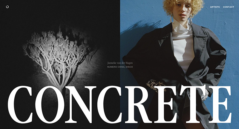
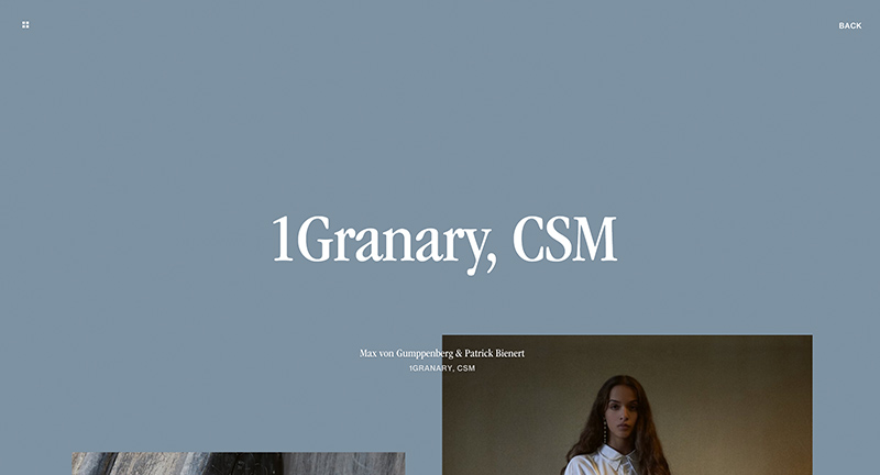
Site of Concrete Rep a UK based rep agency for artists working in the fashion, editorial, and advertising industries. Love the homescreen with the segmentation of the various artists scrolling down the page with locked elements such as title creates a wonderful sense of movement. Also love all the subtle patterns and interactions such as scrolling to the end of the project takes you back to the previous page. It looks beautiful too, elegant and clean, with dynamic colour palette and great use of typography.

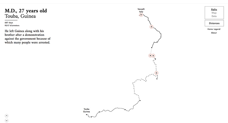
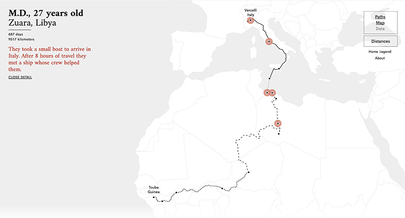
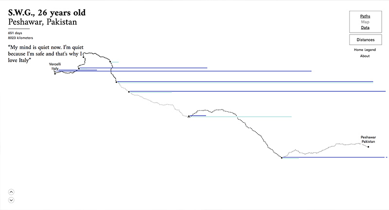
Created by International Magic (@intmagicgroup).

Site here…

The Stories Behind a Line

By | @fedfragapane | No Comments


Site documenting several migrants journeys “is a visual narrative of six asylum seekers’ routes. They travelled from their hometown to Italy. This project wants to tell their stories through the data that shaped their personal travelling line.” Love the way you can toggle the various ways of representing their routes, from a data perspective, from a map, and from the lines.

Created by Federica Fragapane (@fedfragapane) and Alex Piacentini.

Site here…

Sidewalk Labs

By | @sidewalklabs | No Comments


Site for Alphabet’s Sidewalk Labs, research group dedicated to changing the cities of the future. Really love the approach of explaining the mission through easy to digest videos, problem statements, and short article like pieces. It is also beautifully designed, with large type, editorial style layouts, all with thoughtful transitions and interactions. Great example of a modern site explaining complex ideas and concepts.

Created by Sidewalk Labs (@sidewalklabs).

Site here…

Wind and Words

By | @WeAreImpossible | No Comments

ww-1
ww-2
ww-3
ww-4
ww-5
ww-6

Beautiful site and data vis of the words and dialogue from Game of Thrones. Divided by each of the seasons, each with their own custom ambience, you can dive into the relationships between the characters and explore the data. Love the various ways they have visualized the data, one chart showing the amount of dialogue and who they spoke to, another showing the sentiment, one allows you to explore the words, and another shows types of words with a more graphic approach. The level of polish and detail is amazing, from particle effects, fantastic imagery, to nice type – you can tell they have poured heart and soul into this project – and it shows. All of the design is lifted by transitions and animations that add a dynamic element to the experience.

Created by Impossible Bureau (@WeAreImpossible).

Site here…

Eye of the Stormers

By | @active_theory | No Comments

bastille-1
bastille-2
bastille-3

Love this companion site for Bastille’s new album ‘Wild World’. In a collaboration with Spotify this site maps the cities streaming the album and creates 3D ‘storms’ that represent the activity in those cities. Beautifully executed and playful site, that simply shows a world of activity and movement. Nice idea and fun to play with.

Created by Active Theory (@active_theory).

Site here…

Dev Random Notes

By | @webdesign | No Comments

dev-notes-1
devnotes-2
devnotes-3

Site of Chinese based designer and coder Du Haihang. Nice exploratory of visual code experiments that play with 3D, textures, and physics. Simple scroll mechanic to go through the experiments, love the transitions and bold type – nicely wrapped up in a minimal interface, fun to play around with.

Created by Du Haihang.

Site here…

Navigating Responsibly

By | @SprngSmmr | No Comments

navi-1
navi-2
navi-3
navi-4

Great site for Danish Shipowners Association, highlighting how they are tackling key issues and showing stats and data on shipping. I love the way they bring their story to life through a long scrolling site that pulls out key stats and makes them tangible, like the banana. Love the way they have divided the chapters and if you click on the short nav it jumps straight to that section rather than scrolling you down. It looks great too, with well considered design, colour coded chapters, and nice type.

Created by Spring / Summer (@SprngSmmr).

Site here…

Porsche Blackbox

By | @onformative | No Comments

porsche-1
porsche-2
porsche-3

Taking racing data from a Porsche and mixing it with audio and visualising the results. Lovely rich, dynamic 3D experience, love the way the lines roll across the car and particles flow to highlight the profile of the Porsche. Nice colours and shapes that really offer a sensation of speed as the car ‘drives’ through the data. Nice idea and well crafted experience.

Created by Onformative (@onformative).

Site here…

Unique Flow

By | @field_io | No Comments

uniqueflow-1
uniqueflow-2
uniqueflow-3
uniqueflow-4

Site allow people to create personalised 3D artworks. Sign in with Twitter / Facebook and press keys on your keyboard to create flowing colours and shapes set to music. There is a loose tie into a new Toyota car – but any excuse to create interactive artwork is a good one! Love the ambient sound and music and fun process involved in creating these artworks. I like the way a short gif is created to allow you to share your work.

Created by Field (@field_io).

Site here…

Cryptaris

By | @ToolofNA | No Comments

cryptaris-1
cryptaris-2
cryptaris-3

Site promoting the US Army and recruitment for STEM capabilities (science, technology, engineering, math). With a futuristic 3D look and feel you can play a series of challenges that map back to STEM such as guiding a drone over a landscape, decrypting codes and so on. Execution is superb, with the whole world rendered in 3D – landscapes, details, and interactions – the ‘path clearing’ is a great example. Love the look and feel of the site – very impressive, and it also works nicely on mobile.

Created by Tool (@ToolofNA).

Site here…

Subaru and the Environment

By | @resn_has_no_i | No Comments

subaru-1
subaru-2
subaru-3

Highlighting Subaru’s CSR initiatives and relationship with the environment. Featuring a dynamic and fluid timeline that is first formed by tree rings – you can zoom in and out and the timeline unravels and populates with events. The execution sets this whole experience a level above, from the slick transitions, animations, and interactions. Fantastic attention to detail – great example of a timeline based experience.

Created by Resn (@resn_has_no_i).

Site here…

Code Doodles

By | @nexuslondon | No Comments

code-1
code-2
code-3

Lovely site containing many ‘code doodles’ short and sweet interactive experiments, that are also a Chrome plugin. Real simple layout making it easy to dip in and out of the doodles. Love the breadth of doodles available, all from a range of different coders and artists. Nice wrapper for the doodles with lots of slick transitions and animations, and nice UI details too.

Created by Nexus Interactive Arts (@nexuslondon).

Site here…