Damn cool website promoting the Nike Air Jordan 2009 shoe. 3D interface showing videos of Nike athletes and the shoe, you click and drag to pan the camera through the 3d scene, with nice lighting and visuals. I like the way by clicking a video moves the camera to the correct position, also love the camera panning on click and drag. Nicely polished, nice icons, VERY clean and simple, love the progression and lack of patronising the audience. So simple and clean, really appreciate the interface, very cool…
Monthly Archives: February 2009
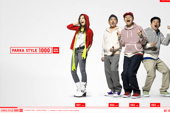
Very simple microsite promoting Uniqlo’s parka collection. Pretty cutesy and fun, but I really appreciate again Uniqlo’s simplicity – horizontal scrolling navigation highlighting the different styles of parka featuring a mix of Japanese celebrities and models. The whole thing just gives a positive impression of the brand, with clean and crisp interactivity, and a nice layout.
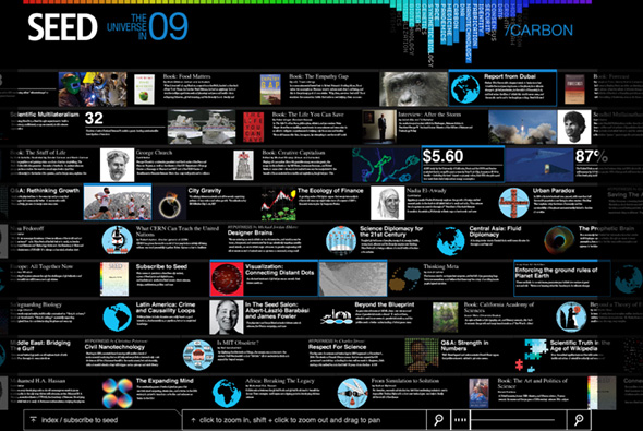
Site promoting SEED magazine and it’s articles. Providing an overview of articles on science, design, politics and so on that the world will face in 2009. Nice way of presenting a lot of data in an interesting way, nice colour based navigation system at the top which highlights the articles that address the topic you have selected. Zooming interface also allows you to isolate an article and read all about it. Quite interesting…
Created by Fangohr.
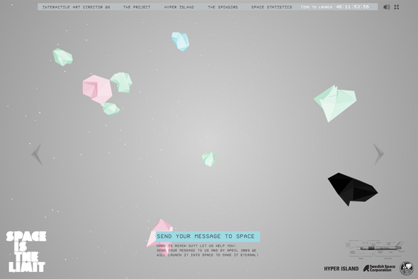
Cool site from Hyper Island with the idea to send messages you submit into space via the Swedish Space Corporation, essentially to promote Hyper Island and it’s Interactive Art Director students. Nice 3D interface with messages floating around from users, you pan around the environment, cool background music, nice layout and design. Like the way the camera moves around with the mouse. Simple, clean, looks cool…
Developed by Kristofer Forsell.
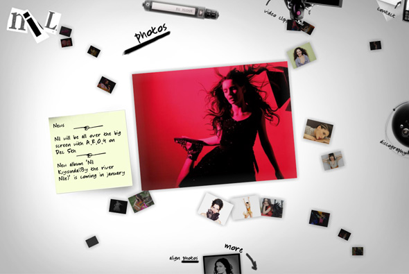
Site of singer known as Nil Karaibrahimgil. The style is a bit of a blast from the past, but it looks pretty nice, and some fun drag and drop features and other nice touches.
Created by iGOA.
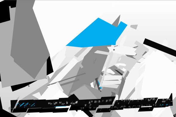
Interesting navigation for the site of JVST an agency based in California. I like the transitions between the sections, lots of floating 3d planes and objects – but it all seems a bit, well unfinished maybe? It was created by one of the old masters, Joshua Davis, who did the groundbreaking Praystation, and makes incredible digital paintings. Was he restricted? Were things changed? How much input did he have? You would think that such a name would bring greatness. It’s a shame as the navigation transitions are nice, but on the whole it doesn’t really work… a lesson to be learned here maybe…
Created by Joshua Davis.
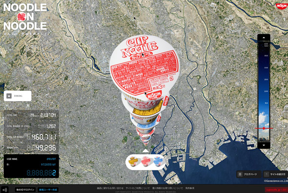
Really cool website, promoting Japanese Cup Noodles – in Japan. From a google earth-esque viewpoint users stack up pots of cup noodles with the aim of reaching space. Really simple idea, really nicely executed – you can watch other users stack up pots and see their mouse cursors and watch how they interact with the site. The screen refreshes with each newly stacked noodle pot, you can also drag a slider to the right to zoom right down to the bottom or where the stack is currently. Typically Japanese style minimal interface and clean slick interaction, looks great too – bit of a cultural nod to the google earth interface, nicely angled to bring out the full ‘stack’ of noodle pots. Really awesome…
Created by Dentsu and Dentsu Razorfish.
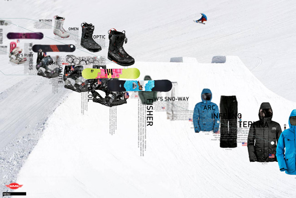
Site of Sims snowboards. Pretty interesting navigation and layout for a product website; parallax scrolling and rotation, zooming around items and info. All makes for a nice sense of depth with cool animation and interaction. Quite experimental menus that take a while to get the hang of, it’s always great to see new things and ways of navigation. Love it…
Created by FL2.
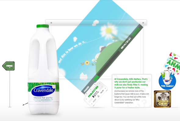
Really cool brand site for milk brand Cravendale. Like the previous incarnation this site is also highly interactive and fun, in this edition all navigational elements are interactive and can picked up and thrown around, all with realistic physics. Small hand drawn characters come on stage and add a humorous touch to things, these can also be picked up and chucked around! I particularly like the ‘why cravendale’ section where a projector playing a video can also be thrown around with projected video distorting and so on, the shadows on the picked objects are really great too. Lots of nice touches and attention to detail with really excellent Flash execution!
Created by Outside Line.
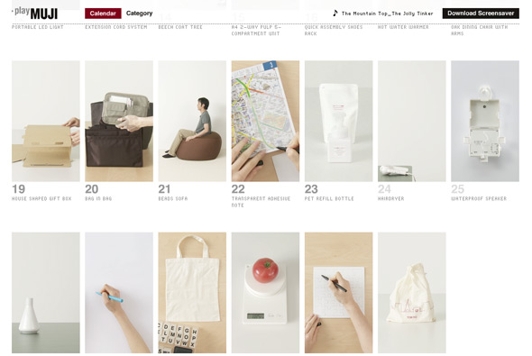
Nice idea for Muji, every day a product from their catalogue is highlighted in the style and layout of a calendar. The highlighted products feature videos and information with future items greyed out to be revealed on a certain day. Really simple idea, much better than creating a standard list or ‘normal’ product listing, even creating anticipation to visit again to find out more about things that caught your eye! Each item even has a click through to the item in the online store, so the process is complete. Explained simply by tha: “A promotional website for Mujirushi Ryouhin (MUJI). The website features a calendar interface of videos showing one MUJI product a day. By showcasing the products in small instructional videos, the website cuts across languages and is aimed for a worldwide audience.”.
It also looks great and as you can expect from it’s Japanese creators – a great layout and a well executed Flash site, nice and minimal with lots of good polish and animation. Created by one of my favourites tha ltd.
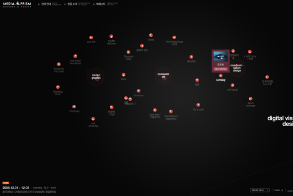
Website promoting an exhibition of works from the Digital Media Design course at Hongik University in Korea. Featuring an interesting draggable navigation / interface you can see the exhibits categorised by style. With nice little animations and interesting interaction, nicely laid out and easy to use…


