Monthly Archives: May 2016

Bundy Bundy

By | @madebywild | No Comments

bundy-1
bundy-2
bundy-3

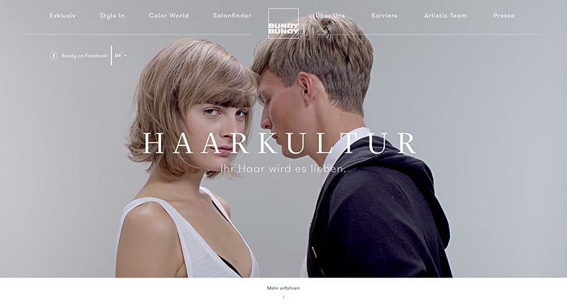
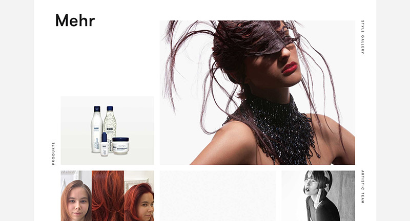
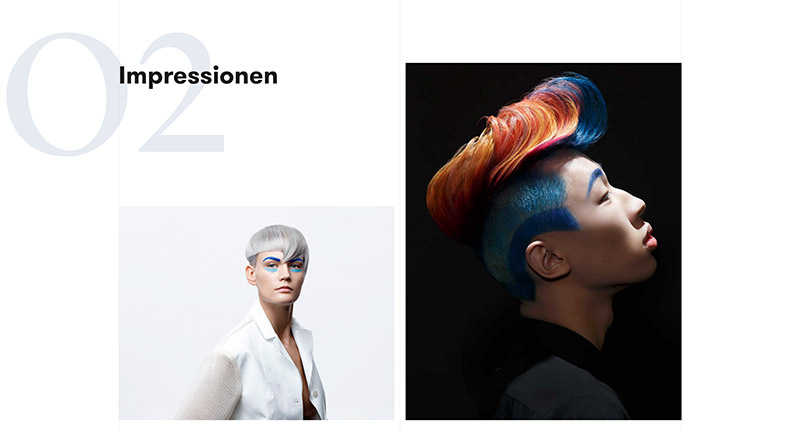
Site for German hair salons Bundy Bundy. Lots of different sections highlighting the key offerings of the salons, such as colour, style etc. Nice video intros to each section and lovely photography throughout, layouts look good with an editorial slant. Lots of small interactive details scattered throughout rounding out the whole experience.

Created by Wild (@madebywild).

Site here…

Ivy Park

By | @webdesign | No Comments

ivy-1
ivy-2
ivy-3

Site for Beyonce’s new active line Ivy Park. Big, bold, and full of attitude – hold down button to switch tracks. Photos, videos, gifs all play a part in this monochromatic experience. Love that when you open the menu, the music dims a little. The brand expressed through simple and bold web experience.

Site here…

Locomotive

By | @LocomotiveMTL | No Comments

loco-1
loco-2
loco-3
loco-4

Site for digital first agency Locomotive based in Canada. Full of transitions and animations, I love the diversity of the layouts for the project pages. Each project has its own colour palette which transitions when you visit other sections. I love the energy in each of the sections, from the fun ‘play’ section of the site to the detail when you reach the end of a case study – love the colour fade. Full of detail and beautifully designed, great example of a modern agency site.

Created by Locomotive (@LocomotiveMTL).

Site here…

Bear’s Eye View of Yellowstone

By | @hellomondaycom | No Comments

bear-1
bear-2
bear-3
bear-4
bear-5

Lovely site for National Geographic, documenting four resident bears in Yellowstone through their daily activity and cameras mounted to their necks. Fascinating insight into where the bears go, what they do and how people interact with them. Beautifully designed too, love the scrolling mechanic that tracks the position across the map for each bear pulling out key moments. Lots of nice details such as the progress bar along the left edge of screen, and little prompts for action. Lovely example of a long form

Created by Hello Monday (@hellomondaycom).

Site here…

Consortia

By | @webdesign | No Comments

consortia-1
consortia-2
consortia-3

Site for digital agency and research group Consortia. Lovely scrolling intro that pulls apart the logo and dives you into their lovely folio of work. Simple interactivity that splits the page to reveal the project detail in-situ. The component parts of the logo follow you down the page and add a nice element of depth.

Created by Lucas Lind.

Site here…

HAUS

By | @madeinhaus | No Comments

haus-1
haus-2
haus-3

Site of LA based digital agency HAUS. Nice animated intros to each project, with nice level of detail for each of the project pages. Lots of nice details that elevate – such as the contact page where you can play a game on the map, the menu page with awesome bg animations. All in all a well designed and executed modern agency site with lots of personality.

Created by HAUS (@madeinhaus).

Site here…

Fornasetti

By | @cartelle | No Comments

fornas-1
fornas-2
fornas-3

Refresh of the Fornasetti homepage – Italian design house from Milan. Featuring motifs from their products floating around a 3D space in varying scenes. Fun, playful interactivity and it looks great – nice intro to the site with no clear purpose other than being cool.

Created by Cartelle (@cartelle).

Site here…

Nicolas Errera

By | @fcinqagency | No Comments

composer-1
composer-2
composer-3

Site for French composer Nicolas Errera. Love the full screen scrubber on the homepage showing the progress of the music – lots of nice visual cues to show the progress. Also love the way the page builds up with blocks transitioning into the layout. Looks great, fun to play with and nicely executed.

Created by FCINQ (@fcinqagency).

Site here…

The Next Rembrandt

By | @JWTAmsterdam, @tastysuperhero | No Comments

remb-1
remb-2
remb-3
remb-4

Interesting project to 3D print a new Rembrandt painting from special software written to recognize and read a vast library of his paintings. The website itself takes you on a scrolling journey through how they tackled it, with sliding panels bringing in more info. So many nice details, from the animation and transitions to the lovely design. Thoughtful UI and interaction, brought to life with great imagery and short videos.

Created by JWT Amsterdam (@JWTAmsterdam) and Superhero Cheesecake (@tastysuperhero).

Site here…

Plane Site

By | @owenhoskins, @plane_site | No Comments

plane-1
plane-2
plane-3

Site for Berlin based agency that specialise in content creation. Love the visual metaphor of the piece of paper that rotates and moves as you scroll to reveal new patterns and color, very elegant and interesting way of presenting a concept of what they do. Nice nav along the right hand side that appears when you get into the more detailed sections.

Created by Plane Site (@plane_site), Ben Roth, and Owen Hoskins (@owenhoskins)

Site here…