Monthly Archives: July 2013

Sonia

By | @84Paris_live | No Comments

sonia-2

sonia-1

sonia-3


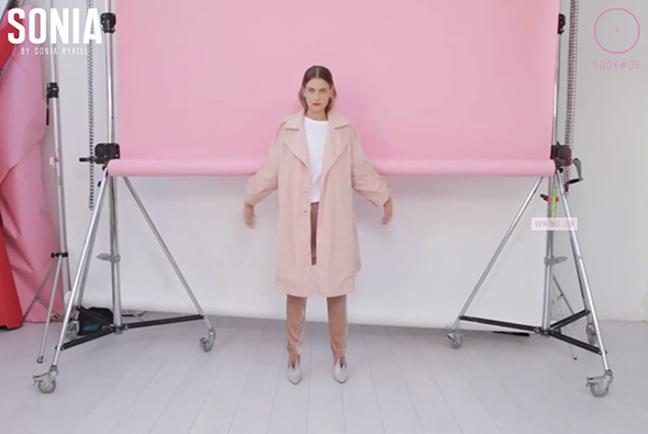
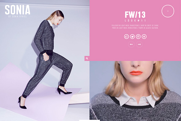
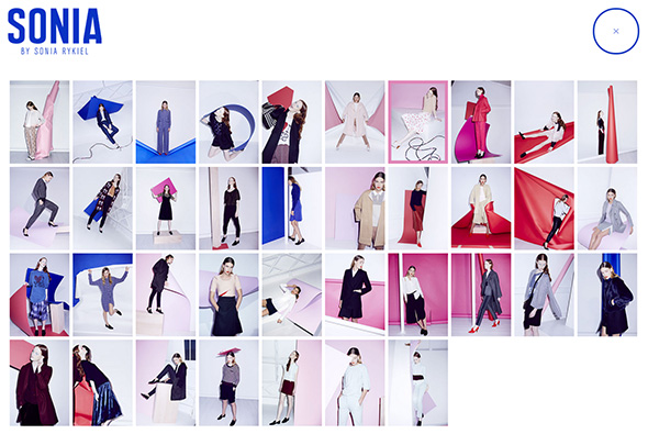
Site showing the A/W 2013 range from Sonia Rykiel. Sequence of video clips showcasing key looks which you stop at any minute to see the details. Love the transitions to see the detail and the way you can zoom in and drag around the larger images on the left all in-situ – feels pretty slick. Lots of nice little details – like the progress bar in the top right – changing frame colours, and viewing the full range of looks. Looks great and works well down to mobile phones – really nice piece of work.

Created by 84.Paris (@84Paris_live) and Merci Michel (@MerciMichel).

Site here…

POSTmatter

By | @POSTmatter | No Comments

post-matter-1

post-matter-2

post-matter-3


Site of POSTmatter – best put in their words: “POSTmatter is about the people and projects crossing boundaries. Where art meets science, where fashion crosses over with technology, and where the digital world collides with the physical world. We’re about what’s exciting today and tomorrow.” This is there web equivalent of their iPad edtions. An interesting editorial site with a minimal layout, but some nice touches here and there – with fade to black transitions and and some interesting rollovers. Nice example of a modern digital magazine.

Created by POSTmatter (@POSTmatter).

Site here…

Adidas NEO Lookbook

By | @NorthKingdom | No Comments

adidas-neo-1

adidas-neo-2

adidas-neo-3

Site promoting the Adidas NEO collection with Selena Gomez. Essentially a video clip of her wearing the range – you can click at any time and the video blurs out and you get a cool transition to show which items she is wearing – click through you can then buy the item. Pretty cool transitions and animations, and neat design.

Created by North Kingdom (@NorthKingdom).

Site here…

Nespresso Trieste & Napoli

By | @WerkstattParis | No Comments

nespresso-napoli-1

nespresso-napoli-2

nespresso-napoli-3


Lovely site for Nespresso showcasing 2 limited edition flavours – Napoli and Trieste. Fantastic 3d animated illustrations of the scenes evoking the ambience of both towns. Lovely animations and transitions and a great level of detail – love the way the scene colours in when you click on the label of the scene. Really nice site with a lovely ambience – really nicely executed.

Created by Werkstatt (@WerkstattParis), and Lowe Strateus (@lowestrateus).

Site here…

WeAreData

By | @BETCParis | No Comments

we-are-data-1

we-are-data-2

we-are-data-3

we-are-data-4

Site promoting new Ubisoft game ‘Watchdogs’ an action/adventure game set in the modern age of communication and data. This site pulls in public live data from lots of different sources such as Twitter, Flickr, Instagram, transport grids, phone mast locations, cctv etc etc – and plots it all on a series of 3d maps across London, Paris and Berlin. The detail is quite incredible, featuring moving trains, phone networks, twitter messages, all in a 3d interface which moves nicely as you click and drag around the map. It really gives the impression of the amount of data in the world around us – all nicely colour coded and with icons to tell the differences between each bit of information. It looks really cool too – with the dark background and glowing icons and drawing lines – when you pan the buildings are draw all in 3d boxes, with particles at different heights giving that illusion of depth. A very cool site – all built in Flash –  full of interactivity and dynamic information rendered in a 3d map!

Created by BETC Paris, (@BETCParis).

Site here…

Nitrocharge your game – Adidas

By | @DDBTribal_AMS | No Comments

nitrocharge-1

nitrocharge-2

nitrocharge-3


Site promoting the new Adidas football boot – via an interactive game which you can play connected to your phone. Through a series of timed gestures you control the sequence of clips highlighting features of the boot. Loads of cool effects and rollover states and attention to detail and clever behind the scenes work make this a really nice interactive experience.

Created by DDB & Tribal Amsterdam (@DDBTribal_AMS).

Site here…

Capitol Couture

By | @watsondg | No Comments

capitol-couture-1

capitol-couture-3

capitol-couture-2


New interactive magazine highlighting future fashion. Really nice typography and layout throughout – love the simple animations and transitions between sections, subtle and understated. For such a content heavy site the use of white space and grid is well thought out. The mobile version of the layout is nice too – responding nicely to changes in layout. Nice example of a modern magazine style responsive layout.

Created by Watson/DG (@watsondg).

Site here…

ROCCO Design Architects

By | @pillandpillow | No Comments

rocco-1

rocco-2

rocco-3


Site of renowned architect Rocco Yim showcasing his vast range of work. Really nice offset fluid grid that loads in thumbnails highlighting the projects, love the way the animate in and react to rollovers. Great transitions from one project to the next and zooming in/out – really cool. It was some 2 years in the making this site – everything feels polished and well considered.

Created by Pill and Pillow (@pillandpillow).

Site here…

INDEX-STD

By | @webdesign | No Comments

index-std-1

index-std-2

index-std-3


Portfolio site of French agency Index-Std. The main menu is a endlessly scrolling typographic almost Star Wars intro esque! Clicking a project gives a nice offset grid layout where the name of the project is locked in place and images scroll through. Love the way when you click on a thumbnail you get the outline of the image and project title – very cool. Really nice example of a modern and minimal portfolio site.

Created by Index-Std.

Site here…

Paper & Paint

By | @hellomondaycom | No Comments

sloret-1

sloret-2

sloret-3


Lovely site for Paper & Paint, from what I can tell an inspirations and ideas site for a range of paints. Presented with a magazine style layout as you scroll the images within their masks also scroll with hotspots revealing details about particular shades. The layout slightly varies for each section each with an overarching theme and colours which also change as you scroll down the page. Subtle parallax effect and nice looking layout.

Created by Hello Monday (@hellomondaycom).

Site here…

Staring is Caring

By | @weareachtung | No Comments

staring-caring-1

staring-caring-2

staring-caring-3


Nice idea to educate people about HIV in Africa. You are presented with three models – scrolling up reveals more skin – until you are greeted with the message to tweet to continue – thus spreading the message before seeing more. You can then scroll up and see the model (nothing explicit!) and learn a little about AIDS. Really nicely executed idea thats a bit of fun and educational – nice scrolling interface with some cool transitions.

Created by Achtung! (@weareachtung) and Superhero Cheesecake (@tastysuperhero).

Site here…