Yearly Archives: 2008

Killers

By | WEBSITES | No Comments

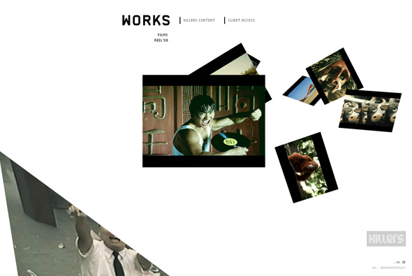
Pretty slick site of ‘Killers’, a South American production company. Yes, another 3D interface whereby you click on the images and the camera moves to show the image, which in turn loads a video highlighting the project. What I like about this example, is the smoothness, and slickness of the animation and 3D environment, it’s very simple, very fast and so smooth that just clicking between projects is a joy! I also like the little touches and attention to detail, when you view a project they have reimagined the scrubber for the video, it’s a little semi circle, it looks good – the rollovers and the buttons all feel nice and animate well. Cool site…

Created by Grafikonstruct.

Site here…

Honda FIT

By | WEBSITES | No Comments

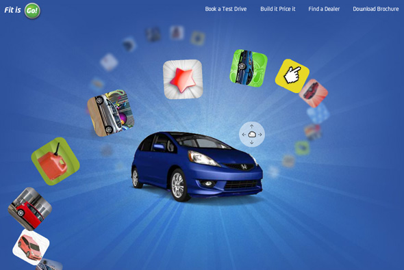
Fantastic site promoting the Honda FIT. Very cool interface, with a the car centre stage, you click and drag the car around and the thumbnails which float around the car in 3D space move so you can select them. Each section features something different, some with little games or images, each highlighting different features of the car. It’s a really fun colourful site, with a really nice use of 3D – which is followed through to the information sections – which is actually quite good fun. I like that you have to explore to get to the various sections – as they are fun you want to see most of them. Love the floating thumbnails and the great feeling of depth in the site, awesome.

Created by Grip Limited.

Website here…

Iceman

By | WEBSITES | No Comments

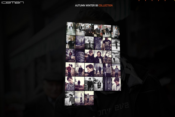
Website of Iceman denim of Denmark. What makes this different is the mechanism of viewing the products in the collection, it’s in 3D and and you can tilt/move your view – to see the next image you grab and ‘flip’ the photo – viola the image flips and the next one flips into view. It works really nicely and feels quite tactile, apart form that it is executed nicely with nice animations and video.

Created by JaHallo.

Website here…

Public Image Foundation vol. 02

By | WEBSITES | No Comments

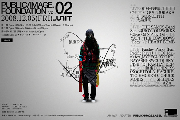
Mega cool site for what I can gather is a club night somewhere in Japan. Great use of typography and navigation, the menu wraps the character in the centre, you drag your view in 3D space and the text slides around. Your view zooms in/out when clicking on items. Really nicely designed, with a really good use of 3D… love it…

Created by ANSWR Inc.

Site here…

Egofoto

By | WEBSITES | No Comments

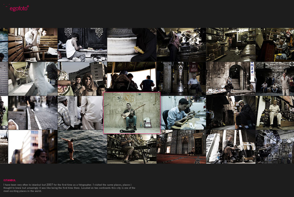
Photographer’s Senol Zorlu portfolio site. Yes another photography site, this one is really nice too! What I like about this example is the fact you can comment on each photograph. And the usual really slick transitions between the photographs, the full screen scrolling and so on. Another nice example…

Created by Navistudio.

Website here…

Final Art New Media

By | WEBSITES | No Comments

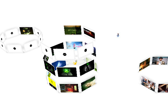
Portfolio site of Polish agency Final Art New Media. Interesting way of showing work, again a 3D interface where you find yourself inside and amongst the work, where you can view stills / watch videos of their work. Each category are in different stacks of images which you float between to see the different categories, which gives the site a nice depth and fun interactivity.

Made by Beestudio.

Website here…

Recom

By | WEBSITES | No Comments

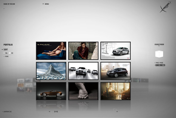
Portfolio of recom, a postproduction/artwork/CGI studio with 3 main offerings – recomPOST, recomCGI und recomART. A really great looking site, some nice touches – with the theme of pixels running throughout – you can even pick a colour and all images that have that range will display. The transitions are pretty cool, each being a cloud of pixels that morph into shapes and text. Some amazingly slick work in there too…

Created by Jung Von Matt/Neckar.

Site here…

Own Your C 2.0

By | WEBSITES | No Comments

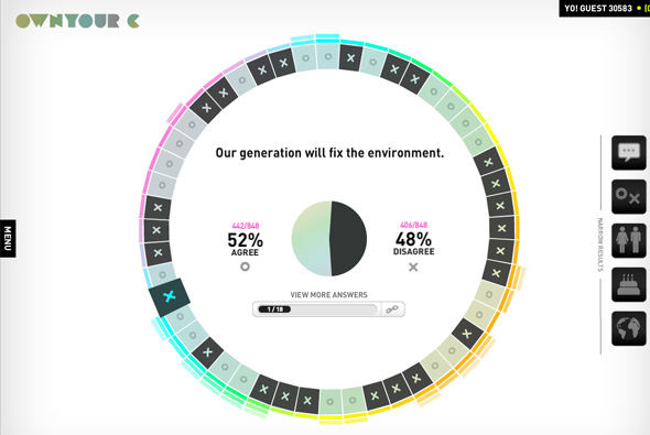
Self proclaimed as the ‘first-ever choice-making community’, the site poses questions to you, then displays how others have answered. Run by ‘The Colorado State Tobacco Education & Prevention Partnership’ to help young people form their own opinions and encourage better decisions about tobacco.

Presented in a really nice way, in 3D space! with floating responses waiting to form the results of the posed questions. You can also see how your opinions match with other user’s and see comments about each question. It is also possible to narrow results by country, gender, and age – amongst others. It’s a really nice way of presenting data in a simple, easy to narrow way. I also like the great use of 3D, really helps to add depth to the site and provide interesting transitions.

Created by AgencyNet.

Website here…

The Turn By Fredo Viola

By | WEBSITES | No Comments

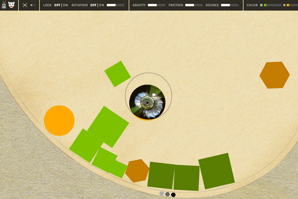
Interesting site of Fredo Viola – a visual/singer/audio artist. A large rotating shape containing peices of his work collide with each other and can be thrown around and interacted with. The works can then be seen by dragging into an area where they then expand. Really interesting way of navigation! You can even control the gravity, rotation, bounce etc of the world they occupy.

Created by Aer Studio.

Website here…

Speak Visual

By | WEBSITES | No Comments

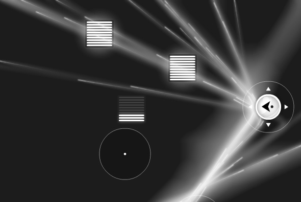
Website promoting nVidia graphics cards & processors. Presented in a 3D interface, you can see nVidia user’s perspectives and thoughts about using their products. (Even Joshua Davies is in there!!) There is also a 3D gallery of images from user’s the world over. I like the way they have used 3D to give a great sense of depth to the site, they often break the frame of the site to give an even more pronounced effect. Throughout is a realistic sense of light and shade with polished animations, layout and typography.

Made by Odopod & Cutwater.

Site here…

Hobnox – Audiotool

By | WEBSITES | No Comments

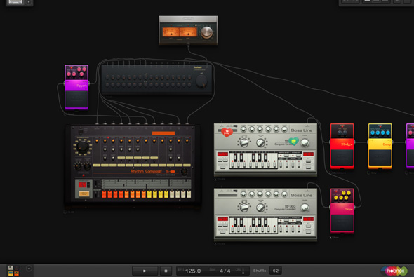
Incredible website that emulates the Roland set of synthesisers, drum machines, effects pedals and so on. You can control everything from which components you use to the tempo, rhythm, to effects – all to make compositions and sound effects. You can create a profile and save your creations and even download 5 minutes worth of material. Incredible amount of detail – you control all of the individual knobs and buttons, drag leads into mixers and boxes – and it looks great too. An example of how complex you can make Flash 10 applications…

Website here…

B-Reel

By | WEBSITES | No Comments

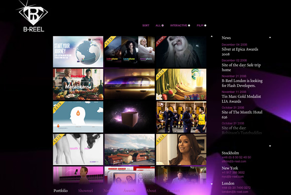
Website of awesome agency B-Reel, one of the heros of 2008. Aside from creating ground breaking work they also have a great website. I like the way the have organised their projects in a vertical scrolling thumbnail mechanism. I also admire the simple layout they have used whilst viewing a project. Simple, clean, easy to use and looks great! Their showreel is also damn cool.

Website here…

Safe Trip Home

By | WEBSITES | No Comments

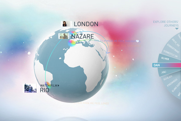
Website promoting the female vocal artist Dido and her new album ‘Safe Trip Home’. Featuring film director’s videos that are inspired by the idea ‘what home means to them’, they accompany selected songs from the album – the audience can also respond with their opinions which then float around the globe and when you are looking at specific videos. Navigated by dragging around a 3D globe and viewing the various videos.

It’s a really nicely crafted site, lots of attention to detail, nice typography, and a great interface, really easy to use and great to look at. Really a rich site and a nice idea for promoting a new album, you get the hear snippets of the songs, see nice visuals and interesting short films, and get emotional responses from people all over the world…

Created by B-Reel and Work Club.

Site here…