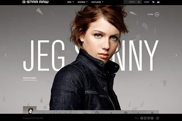
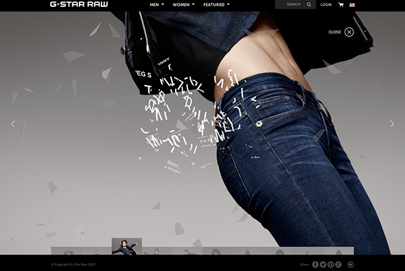
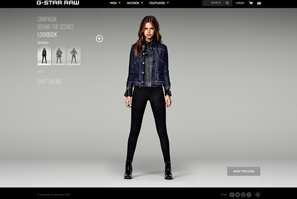
Site promoting the latest ‘campaign’ from denim label G-Star RAW. Featuring a carousel of looks constructing and de-constructing – love the way the typography builds up, and in the background the different layers of glass rotating and moving. Some nice sections such as the look book – again like the way on rollover you can cycle through some different angles. Nice clean / minimal interface, and monotone style.
Monthly Archives: October 2013
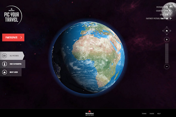
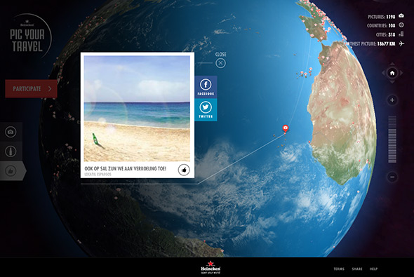
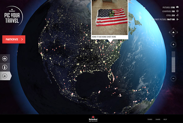
Competition setup by Heineken to win 2 intercontinental tickets to any destination of your choosing. All you have to do is submit a photo taken abroad with a bottle of Heineken somewhere in the image. The site housing of all is this is quite a technical feat, a fully 3d globe with night / day, rotation, bump mapping – the attention to detail is incredible! You can zoom in / out, see all the individual photos etc, all presented in a nice way. Loads of cool transitions and animations bringing it all to life – from planes tracking the distance to Amsterdam, to statistics on the amount of photos and locations – all really in depth a fun to explore.
Created by TBWA\NEBOKO (@tbwaneboko) and Superhero Cheesecake (@tastysuperhero).
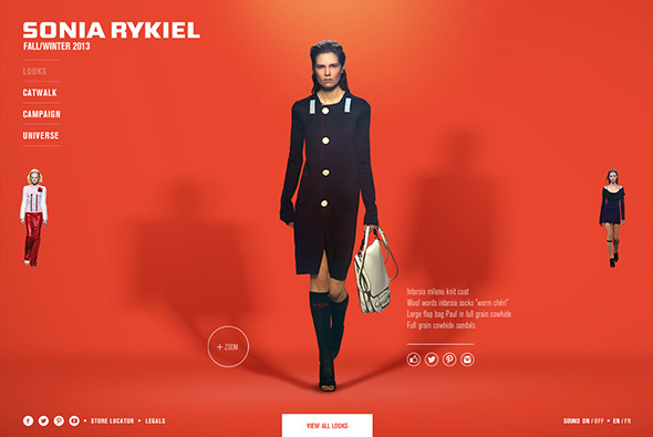
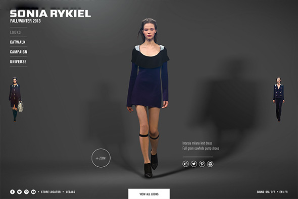
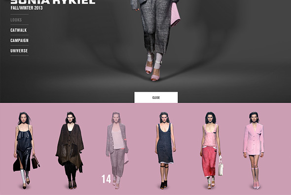
Lovely site of Sonia Rykiel 2013 F/W collection, arranged by looks set against bright coloured backgrounds and a cool lighting effect – changing by mouse position. Nice slick animations when navigating from look to look, and nice bottom tray with a carousel of all of the items. Good looking site with nice interface and cool animations.
Created by 84 Paris (@84Paris_live).
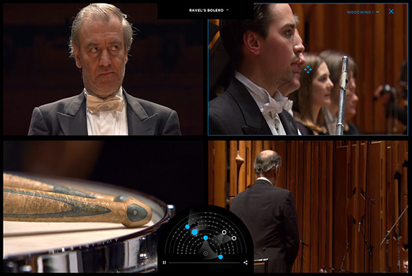
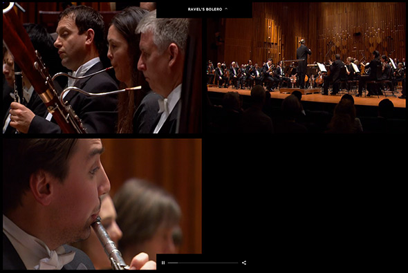
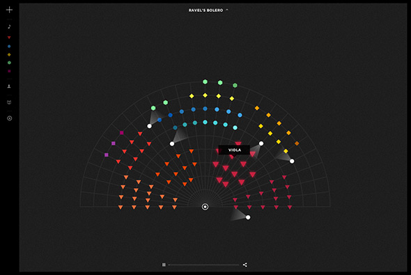
Fantastic work for the London Symphony Orchestra. Playing Ravel’s Bolero, you can watch the music from various angles, with up to 4 at once – with close ups on the various sections. You can drag around the views and select which angle you want, really customisable and a nice way to watch and explore the composition. Love the orchestra view with all the shapes and colours and the nice descriptions of the various instruments. Loads of nice transitions and animations bringing it all together, really nice experience.
Created by Sennep (@SennepLDN).
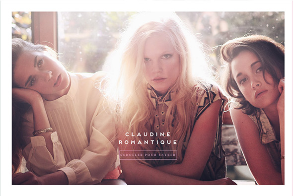
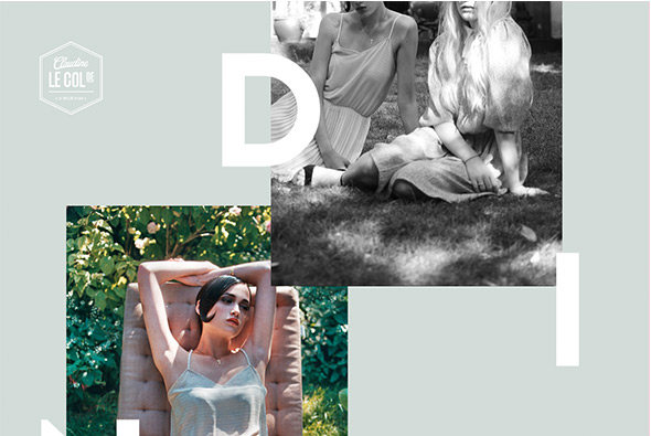
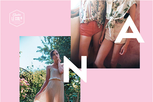
Short and sweet site for French label Le Col de Claudine. Simply a nicely laid out page with subtle parallax style effect, with nice photography and large type. Love the way the background colour changes on scroll and reflects the colour in the items on the models, really subtle and a nice way to tie it all together. Sweet and simple.
Created by Benjamin Guedj (@benguedj).
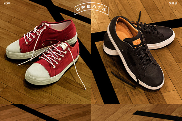
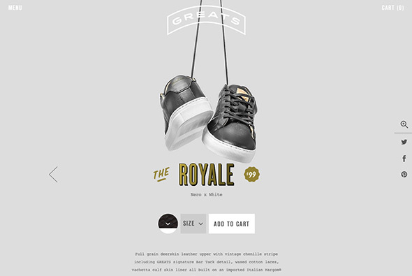
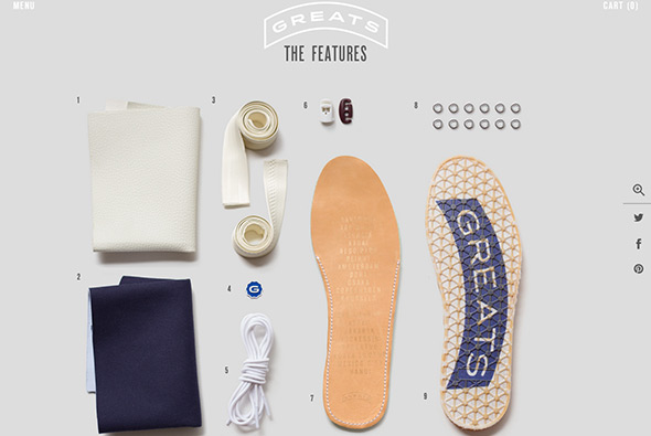
Nice site for GREATS a sneaker brand from the US. Really simple, with a grid of their shoes – clicking through takes you to the details where a nicely laid out page tells you all about the shoe. Love the fun 360 drag at the top and the exploded, military style view of all of the components that make up the shoe – bit like a stripped down gun! Minimal design and some nice little touches like the menu and in-page content reveals.
Created by Wondersauce (@wondersauce).
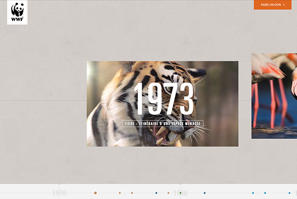
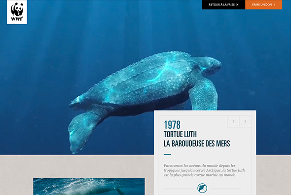
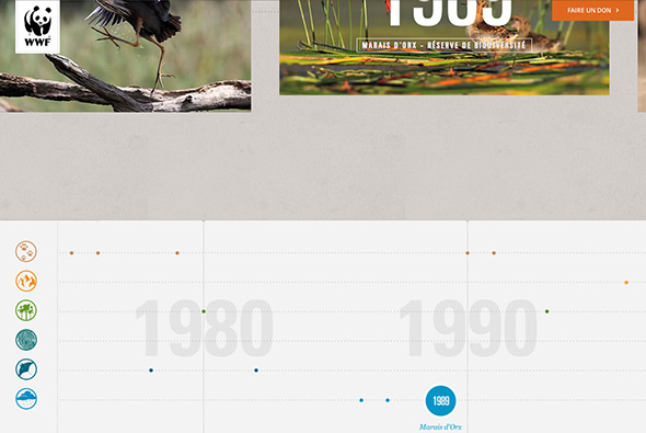
Stunning site for WWF France – documenting the past 40 years. Featuring an interactive timeline that you scroll through showing video thumbnails – clicking them and they expand to more detail – bit of parallax effect and some light information. Nice timeline shown at the bottom of the page – rollover to expand – which categorises the various events and milestones. Loads of cool transitions and smooth animation throughout, very nice…
Created by WWF France (@WWFFrance).

