Monthly Archives: August 2007

Oakley – Riders

By | WEBSITES | No Comments

Oakely

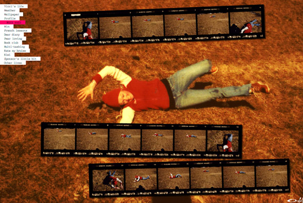
Not particularly an amazing technical / design driven site, but caught my imagination in terms of concept and execution. A really nice site by Oakley just showing their sponsored european snowboarders/skaters/surfers off in a series of websites. The site is structured like in a fun laid back style and is a basically a bit of fun with diaries and photos and competitions and so on.

Vicci’s site here…
Scott & Tlyer here…
Oli’s here…
Ben’s here…

Audi – Rhythm of Lines

By | WEBSITES | No Comments

Rhythm of Lines

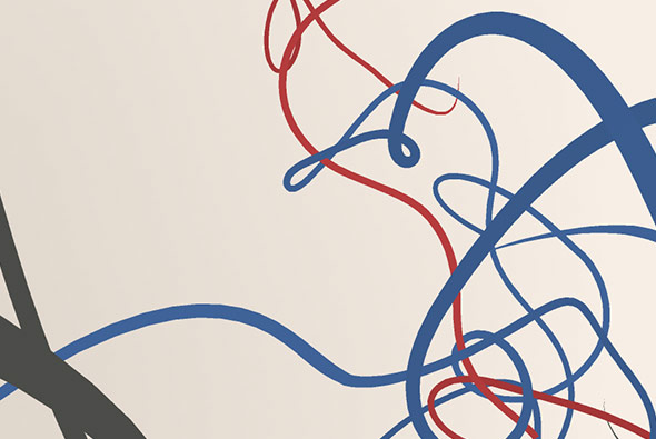
Based on ‘Lines’ ad promoting the new Audi A5, you make your own ‘Rhythm of Lines’. That is draw lines in a 3D space using the keyboard and mouse – it kinda works like flying through an empty 3D space. You end up with a very organic flow of coloured lines, once you get used to it you can get some nice results.

Created using Papervision and a customised line drawing script, made by Good Technology. Nice site – I like the kind of ethereal direction and lack of advertising – its quite involving and making your own design is enjoyable its a good way of promoting a concept online that ties in nicely with the ATL ad.

Website here…

HBO Voyeur

By | WEBSITES | No Comments

HBO Voyeur

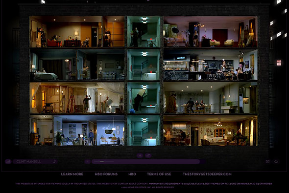
What a great execution of a fantastic concept to promote the HBO ‘Project Voyeur’ lots of extra material here. You explore an interactive world of videos showing what happens behind closed doors. Exploring various stories in different buildings and over serveral days you view the world through a voyeurs eyes.

Very slick website from Big Spaceship that just works so well. I love the way you can zoom in and follow individual rooms or see them all at the same time, explore different buildings and follow various stories, all very involving.

Website here…

Simon Rasmussen

By | WEBSITES | No Comments

Simon Rasmussen

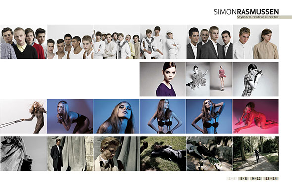
Good portfolio website of Simon Rasmussen, a Danish stylist and creative director. Made by Danish agency Flexmotion it is a well conceived concept.

I wanted to use the whole ‘contact sheet’ navigation on a recent website, as I feel it works very well when navigating a visual website such as this. Scrolling left and right to see more pictures as if sliding the negatives just feels intuitive. Nice to see it looking so well integrated…

Website here…