Monthly Archives: August 2014

Waterloo

By | @Dogstudio | No Comments

waterloo-1 waterloo-2 waterloo-3

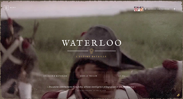
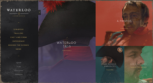
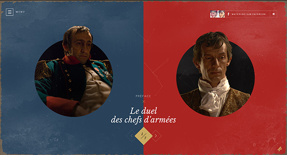
Site for French film ‘Waterloo’, telling the story of the famous battle of Waterloo. Focussing on the two sides pitted against each other, Napoleon and Wellington – and describing through iconography the differences between the English and French forces. Nice experience with sounds, full bleed imagery and video – all in a tight layout, with modern interaction design with sliding panels and menus. It looks great too, with the muted colours and distressed overlay.

Created by Dog Studio (@Dogstudio).

Site here…

Design by What Matters

By | @martinagency | No Comments

design-matters-1
design-matters-2
design-matters-3

Promoting Benjamin Moore paints in the US, this room designer allows you to customise imaginary rooms – created by a short test. Asking you to answer a short series of questions, based on your interests – short interactive questions – dragging a slider to show your perfect view and so on. Your answers drive the results of the rooms – and show you the swatches necessary to paint the rooms for real. It is brought to life with lots of animations and transitions – all wrapped up in as minimal as possible interface – all in all it works well and looks great.

Created by The Martin Agency (@martinagency).

Site here…

Cafe Society – Chanel

By | @transylvain | No Comments

chanel-cafe-1
chanel-cafe-2
chanel-cafe-3

Site promoting Chanel’s jewellery inspired by the cafe society in the 1920s. Featuring video, music, and photography to paint a scene via one long scrolling page. Love the time stamp as you scroll reflecting the time, and the ambience provided by the montage of sounds and images. Simple, beautiful, and elegant, it offers a much more interesting pastiche of the jewellery than simple product shots and much more inspiring story.

Created by 60fps (@transylvain).

Site here…

Aprilzero

By | @aprilzero | No Comments

aprilzero-1
aprilzero-2
aprilzero-3
aprilzero-4
aprilzero-5

Fascinating site created as a side project by Anand Sharma – it tracks his daily movements and visualises it in an interesting way. Using an array of APIs and custom code, a whole host of data is recorded, how much he ran, how many climbs he’s done, how far he’s walked, his heart rate and so on. Using the API from apps such as Moves, Foursquare, Nike+ etc – the interesting part is how the data is organised and visualised. ‘Sport’ focusses on the data such as heart rate, running, walking and so on – where as ‘Explorer’ highlights movements day to day, along with location check ins, photos and so on – the detail is quite incredible. The case study in his blog is worth a read too – really interesting to see the approach and decisions he made along the way. Not only is the visualisation and organisation of the data great, so too is the design, and the finishing touches such as the animation and the transitions – they just bring it all to life.

Created by Anand Sharma (@aprilzero).

Site here…

Do Dots

By | @tomvdv | No Comments

dosdots-1
dosdots-2
dosdots-3

Site promoting Dos Dots – a unisex children’s clothing label from Brooklyn, NY. Nice bold typography and style harking back to Japan, where the denim in the clothing is from. The interaction model is simple and easy to use, getting to the details of the items all from sliding panels from the homepage. It looks great, and is also responsive too.

Created by Tom van de Welde (@tomvdv).

Site here…

Over the Hills

By | @ultranoir | No Comments

tiny-hills-1
tiny-hills-2 tiny-hills-3

Really cool site – a collaboration between french agency Ultranoir and illustrator and artist McBess. A 3d gramophone allows you to grab the needle and crank up the motor – and dive into the music in a dark 3d world. Love all the 3d interactions, such as rotating your view, placing the needle on the record, opening the side panel and playing a piano along to the music. And the sound design is fantastic – rotate your view away from the speaker on the gramophone and the music sounds muffled. It looks amazing too, the stark black world sprinkled with white – really great work.

Created by Ultranoir (@ultranoir).

Site here…

Universal Typeface – BIC

By | @DDB_Germany, @mediamonks | No Comments

universal-typeface-1
universal-typeface-2
universal-typeface-3

Fantastic site brought to you by BIC pens. Essentially setting out to crowd source a font based on hand writing – from all the contributions on the site for each character. A seemingly complicated task, brought to life in a very simple and easy to understand way – it already has millions of contributions – you can even filter by gender / age / location and so on to see the range of results. It also looks great, I love the way you can see the average character in yellow and can see the different characters in an intuitive and playful way. Really easy to draw your own character, which you can do through your mouse or by connecting your mobile device, again all really made simple for the user. Lovely layout, great fonts, and nice animations and interactions – great piece of work.

Created by DDB Tribal Dusseldorf (@DDB_Germany) and MediaMonks (@mediamonks).

Site here…

Serge Thoraval

By | @jcsuzanne, @jonathandc | No Comments

serge-1
serge-2
serge-3

Site of Serge Thoraval, artisan French jeweller. App like layout and functionality taking you on a journey through the work of the jeweller. Like that you look at one section at a time, like turning the pages of a book, with well considered transitions and zoom in effects to enlarge the pictures – all which injects some personality into the site.

Created by Jonathan da Costa (@jonathandc) and Jean-Christophe Suzanne (@jcsuzanne).

Site here…