Category Archives: @SprngSmmr

Stine Goya

By | @SprngSmmr | No Comments


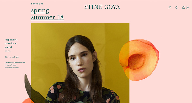
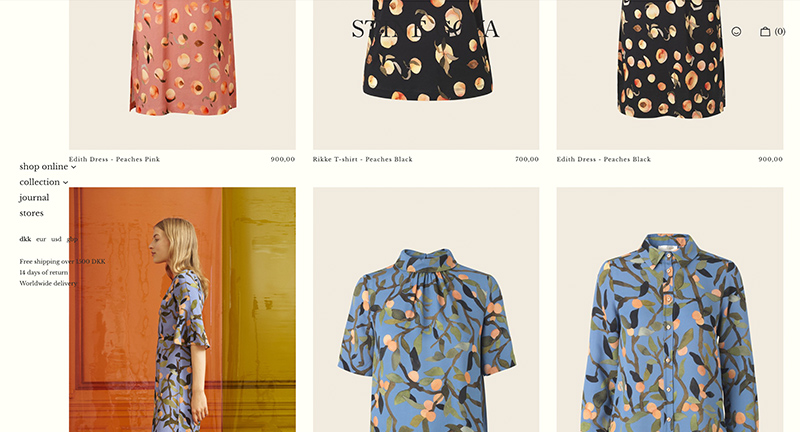
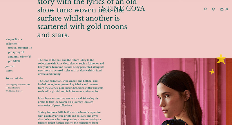
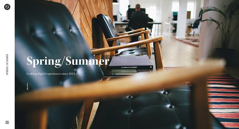
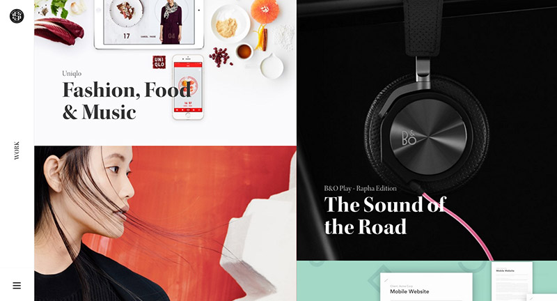
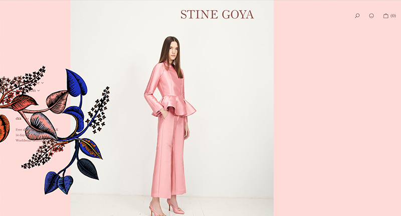
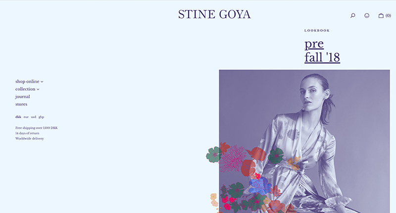
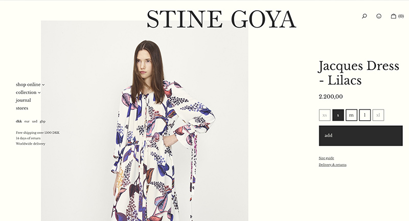
Site of Danish fashion label. Featuring the latest range of clothing, look books, social media, together in an offset grid layout. Love the colour palette and the way the accents transition between sections to compliment the photography. Lots of nice details and attention to detail throughout, beautifully crafted and realised site.

Created by Spring/Summer (@SprngSmmr).

Site here…

Stine Goya

By | @SprngSmmr | No Comments


Site of Danish fashion label Stine Goya. Beautiful editorial style layout with large imagery and type, highlighting their range, look books, and social content. Love the colour transitions and subtle animations during scroll, the personality of the brand shines through the interface. Great example of a modern & well designed brand + commerce site.

Created by Spring / Summer (@SprngSmmr).

Site here…

Navigating Responsibly

By | @SprngSmmr | No Comments

navi-1
navi-2
navi-3
navi-4

Great site for Danish Shipowners Association, highlighting how they are tackling key issues and showing stats and data on shipping. I love the way they bring their story to life through a long scrolling site that pulls out key stats and makes them tangible, like the banana. Love the way they have divided the chapters and if you click on the short nav it jumps straight to that section rather than scrolling you down. It looks great too, with well considered design, colour coded chapters, and nice type.

Created by Spring / Summer (@SprngSmmr).

Site here…

Spring/Summer

By | @SprngSmmr | No Comments

ss-1
ss-2
ss-3

Lovely site of Spring/Summer Danish digital agency. Refined and elegant is a good way to summarise this site – so many beautiful details in here, and with next-level of polish. Love the work section, when you tap on a project the mask and image stretches to fit full screen with a colour hit from the project fills the preloader along the left side of the screen. Nice and subtle transitions for text and interesting integration of a sticky nav on left side of page – which also shows section in page. Love the way the pages transition – and each project case study is really nicely considered, with in-situ videos / animations / sketches to illustrate their process. It translates beautifully on mobile too with an equal level of polish. A fantastic example of a modern agency portfolio site.

Created by Spring/Summer (@SprngSmmr).

Site here…

H6 Rapha Edition

By | @SprngSmmr | No Comments

h6-1
h6-2
h6-3

Lovely site for B&O Headphones, promoting their H6 Rapha Edition – a brand tie in with the cycling brand. Visualising how music can influence your ride, from preparation, hill climbs, racing, and all the emotions experienced whilst cycling. Lovely mix of videos, photography, hints of diagrams and descriptive and emotive copywriting.

Created by Spring/Summer (@SprngSmmr).

Site here…

DANISH

By | @SprngSmmr | No Comments

danish-1
danish-2
danish-3

Simply put an online magazine highlighting Danish architecture and design. Love the editorial style and design, slick and simple and with nice typography. Really fresh feeling layout accentuated with neat touches – such as the Danish logo animating when the content is loading. The site works really well across different devices and responds well to layout changes. A good example of a modern, well crafted editorial style site.

Created by Spring/Summer (@SprngSmmr).

Site here…