Monthly Archives: May 2009

D&G Jewels

By | WEBSITES | No Comments

d&g jewels

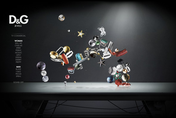
Site promoting D&G’s range of jewellery. Very simple but engaging – the ‘jewels’ float around and interact with each other – when you rollover them they glow and other objects cannot go near them. It’s quite nice just to watch them bouncing around, when you click on one you zoom in and can see the object in more detail. Well designed and fun to use, nice!

Created by Hi-Res!

Website here… 

magneticNorth

By | WEBSITES | No Comments

magneticNorth

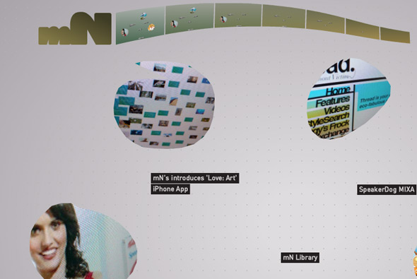
New portfolio site of British digital agency magneticNorth. Nice approach, using gesture recognition i.e. draw a line and you see news, draw a circle and we see a project. We’ve seen gesture recognition before but what I like about this one is the slickness & simplicity of it all – it just works. When drawing a circle to get a project the shape you draw becomes the mask for the content, where the video / screen grabs then appear in that area.

Created by themselves, Brendan Dawes is the creative director – that kinda helps getting visual concepts like this working!

Website here…

Goodby, Silverstein & Partners

By | WEBSITES | No Comments

goodby silverstein partners

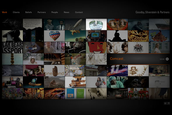
New site of  agency Goodby, Silverstein & Partners. Pretty cool site of successful digital agency GS&P, this site is a nice example of an agency portfolio, lately a lot of agencies are opting for the html/blog style – but this is full Flash with videos and slick transitions. I like the main landing page with it’s plethora of videos, the search function is really cool, you can search for say a client name i.e. HP and all the projects featuring HP will be highlighted – this search mechanism also works in other sections of the site such as ‘people’ and ‘news’. The ‘people’ section of the site is actually really cool too. Well coded with lots of cool transitions and animation – worth checking out.

Website here…

Pepgay

By | WEBSITES | No Comments

pepgay

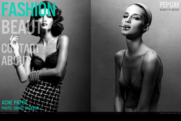
Site of make up artist Pepgay. Nice fullscreen Flash site with some beautiful photography, I like the way two images at a time are displayed – many really full of colour and depth. Nice bold typography and bottom thumbnail scroller, also like the way when you mouse over to the left the menu fades up – so when your mouse isn’t active you can see the images in all of their glory. A good example of a portfolio which is slick, stylish, and to the point.

Created by 2otsu – Oriol Bedia.

Website here…

Uniqlo – Wire

By | WEBSITES | No Comments

uniqlo wired
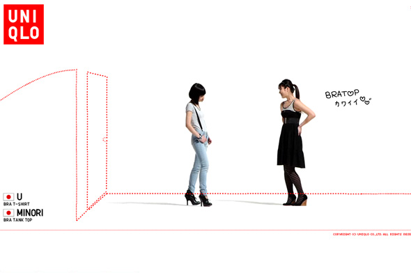
Site promoting Uniqlo’s range of bra tops. As usual Uniqlo provides another cool microsite promoting a new product, this time videos of 100 women talking about the bra tops. On top of this content is a layer of red dotted lines which draw things over the screen and ask simple questions about bra tops, at any time you can find out more about the products on display.  Presented in a slideshow type way, as with many of Uniqlo’s online work you can sit back and watch, it’s clean, cool, and so so simple.

Site here…

Hiroshi Seo

By | WEBSITES | No Comments

hiroshi seo

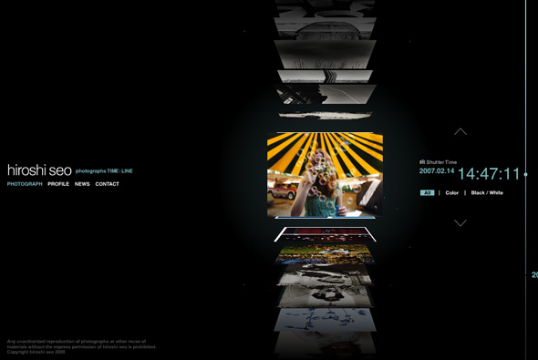
Portfolio site of photographer Hiroshi Seo. Slick timeline based interface which allows you to quickly scroll through thumbnails of his photos. Each of the thumbnails are 3d and flip upwards, much like a vertical coverflow interface, and organised upon time – on click the photo enlarges. Really like the scrolling interface, and the whole minimal slick look & feel. All in all a very nicely made photographers portfolio with some really nice touches with smooth fluid animation, nice interface that fits the content well.  

Created by Murakami Design.

Website here…

alice + olivia

By | WEBSITES | No Comments

alice olivia

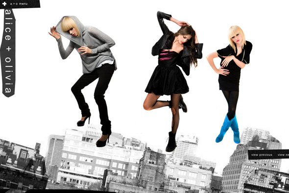
Cool playful site of clothing label alice + olivia. Really simple with a touch of surreal, each section of the site has objects which can be thrown around the screen, bouncing off the sides of the screen and each other. Even when viewing the collection you can pick up and throw around the models. Nice and clean and simple, to the point yet fun and playful.

Created by designedmemory.

Website here…

Only The Brave – Diesel

By | WEBSITES | No Comments

only the brave

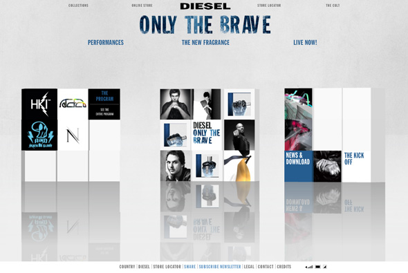
Site of Diesel’s new fragrance, ‘Only The Brave’. Based around a series of 3d cubes featuring ‘performances’ when opened show 3d rooms with video and designs featuring work by the likes of Mr Doob, Nico Stumpo, Eboy, and Hellohikimori, and many more to come over the next few months. You can also see the print ads and see the bottle the fragrance comes in. Yes another 3d site, this is quite nice though, it’s a cool idea to use modern digital artists to create the 3d rooms, the rooms themselves are pretty interesting, although unfortunately it just reminds me of the Absolut ‘In an Absolut World’, but essentially they have put their own spin on it. Also they have used a physics engine on the 3d blocks, so when each section loads the boxes interact with each other, overall a nice site!

Created by Hellohikimori.

Website here…

I Am Unique

By | WEBSITES | No Comments

i am unique

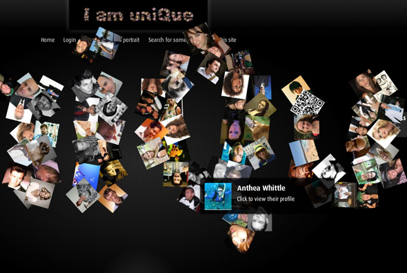
Interesting site promoting Foxtel’s IQ TV box, the site allows you to create an ‘interactive 3d portrait’ of yourself. Using photographs, words, stories, Twitter feeds, and so on – users can make a tiled 3d image of themselves which they can share with friends, Facebook etc. What I like about it, is the 3d build up of the ‘i am unique’ text made up of photos, and the way you interact with the scene, also the way the portrait is made up of various bits such as uploaded photos and descriptive words. Overall design is nice and simple, with a lack of overwhelming branding, the 3d portrait is a bit buggy but the idea is pretty nice…

Made by Lowe Sydney.

Website here…

I Kiss Fitness

By | WEBSITES | No Comments

i kiss fitness
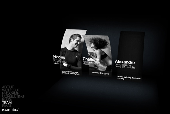
Very simple site of ‘I Kiss Fitness’, a personal training company. A very minimal, simple site outlining the company and it’s services, what I liked about it was the pretty cool use of 3d, bending images and especially the way the text explodes as you move your view around in the different sections, thats it!

Created by madebyg.

Website here…

Zoogami Beer

By | WEBSITES | No Comments

zoogami beer
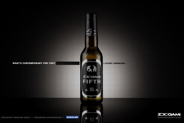
Interesting site promoting the launch of new beer Zoogami. Based around the idea of  ‘contemporary’, the site acts as a mash up of digital media – video, sound, and images all related to a search term that you provide. In the end you get a sequence of images, videos, and music given a treatment with colours, with it all moving in time with the music. It gets images from the web, sound/music from YouTube and video from Google Video. There is a gallery of saved searches, and even a Facebook Application. Sadly they all end with the same treatment, also it takes an extremely long time to load, and when there isn’t enough content it always uses the same images from some image resource – so after 2 times of making a new sequence you see a lot of the same things. Interesting idea, nice to see a brand experimenting with ‘contemporary’ digital ideas…

Created by Saatchi & Saatchi Rome.

Website here…

Keith Tyson

By | WEBSITES | No Comments

keith tyson
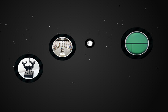
Website of artist Keith Tyson. Nice site which presents the works of Keith Tyson, presented in a floaty 3d space, you select projects and then view them from within a circular interface. A well designed site, with a clear interface and all the features you come to expect, but all done in an excellent way. Nice attention to detail, interface and look & feel, a great example of an online gallery…

Created by De-contruct.

Website here…

NY From Above

By | WEBSITES | No Comments

ny from above
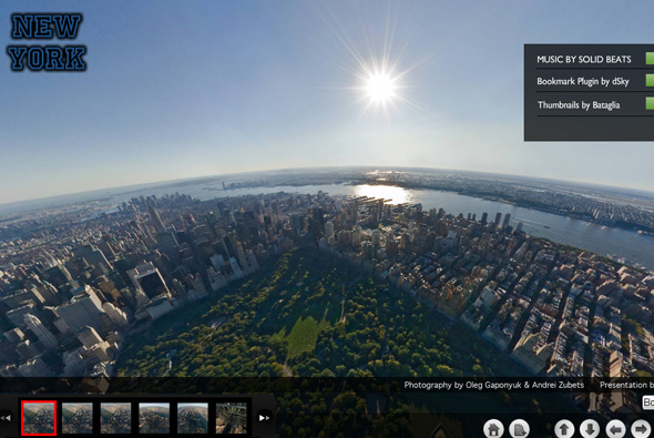
A showcase of Pixelcase’s high resolution panoramic photography above New York. Presented alongside a nice atmospheric soundtrack we our view moves around amazing photographs of New York – all taken from above. I like the way you can drag your view around, combined with really amazing in depth photography it really feels as though you are there – having a big monitor helps!

Website here…

Ford Edge

By | WEBSITES | No Comments

ford edge

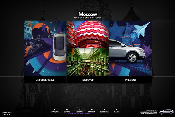
Site promoting the new Ford Edge. Nice looking site with lots of animations, transitions, and so on, bit of a weird one, I guess because it is mainly for the Brazilian market the copy does not translate across so well. Nothing ground breaking, but interesting and varied animations, attention to detail and lots of movement, all making it visually ‘exciting’.

Created by JWT Brazil.

Website here…