Yearly Archives: 2019

Nasa Visual Universe

By | @googlearts | No Comments


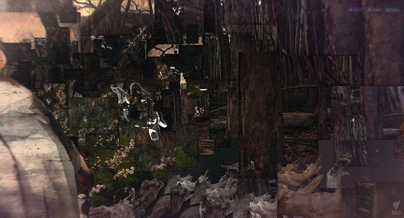
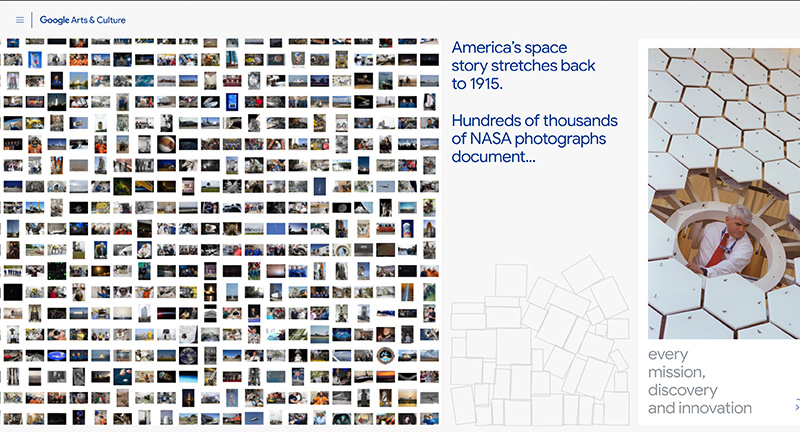
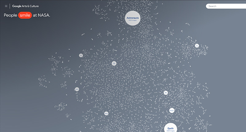
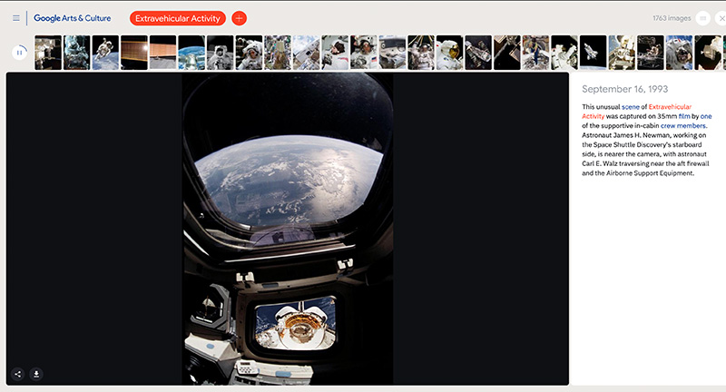
NASA’s photography archive analysed and group by ML into interesting clusters, editorialised by machines. Fascinating concept to make a huge photo library more browsable, by using sorting mechanics to spot similarities and group subjects together. Love the slideshow-esque exploration of themes which takes you through some fascinating themes. Very exploratory interface, with a smart search function, and fun to browse dive deeper on range of topics.

Created by Google Arts & Culture (@googlearts).

Site here…

Design Embraced

By | @DesignEmbraced | No Comments


Slick folio site of Anthony Goodwin Creative Director / Art Director – and his refreshed portfolio. Minimal and well considered layout which transitions nicely into project pages with a satisfying ripple / bounce. Great body of work and nice attention to detail like the little cursor ‘bump’ along the material-esque background.

Created by Design Embraced (@DesignEmbraced)

Site here…

The Atlas of Moons

By | @NatGeo | No Comments


Beautiful experience “The Atlas of Moons” that offers an immersive and fascinating glimpse of the moons orbiting the planets in our solar system. The editorial experience parallels that of their magazines and reminds me of the fascinating book ‘Atlas of Remote Islands: Fifty Islands I Have Never Set Foot On and Never Will’. Love the use of 3D here to offer a draggable ‘map’ of each of the major moons, but to also highlight the orbit of the planets and moons. The level of detail is incredible – love the ability to map states in the US to see and relate the scale.

Created by National Geographic (@NatGeo).

Site here…

MATSU

By | @webdesign | No Comments


Site of Matsu a cut vegetable factory in Kanazawa, Japan!
Best described by the creators, “When thinking about “What is human value?” From now on, the value of “manual work” and “skills using the human body” and “human imagination” that can change the cut to the person who eats will increase I thought. Therefore, it is possible to experience the immersive feeling when cutting vegetables on a website. Tell the fun and value of cut vegetables.”
Love the scrolling progression through the stop motion style animation.

Site here…

Atomo

By | @bureauCOOL | No Comments


Site of creative management Atomo, with a focus on the fashion industry. Love the amorphous rolling homepage with gliding and fading photography, this transitions down into a grid of featured projects and the people they represent. Beautifully crafted.

Created by Bureau Cool (@BureauCool).

Site here…

Zero is Two

By | @Zerostudiosnyc | No Comments


Playful celebration site of US agency Zero. Love the bold type set against inverted white on black styling, with parallax effect on the photography and type. Love the fun cursor replacement to explore the imagery. Lots of personality weaved into a fresh modern experience with an amazing feel of depth.

Created by Zero Studio (@Zerostudiosnyc).

Site here…

Missing

By | Loose | No Comments

Interactive documentary telling the story of an abducted school girl and the trackers that searched for her. Beautifully crafted site that allows you to explore the scenes to uncover the story through the eyes of the trackers. Mix of video, 3D, typography, audio narrative and storytelling – great example of interactive storytelling.

Created by SBS Online (@SBS).

Site here…

Kwok Yin Mak

By | @kwokidile | No Comments


Site of Kwok, US based designer, and a personal portfolio. Love the personality dotted all around this site, from the playful dot to dot represenation of distance from my ip to where he’s based, through to a guestbook where visitors leave their messages, it’s like going back to the fun websites of yesteryear. Lovely design and nice mix of type and languages, particularly like the transition from project thumbs to the detail page. Super cool and super fresh.

Created by Kwok Yin Mak (@kwokidile).

Site here…