Monthly Archives: June 2013

Perfect Storms

By | @secretlocation | No Comments

perfect-storms-1

perfect-storms-2

perfect-storms-3


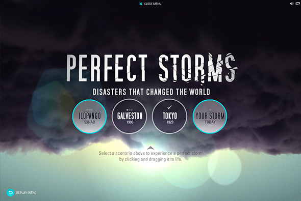
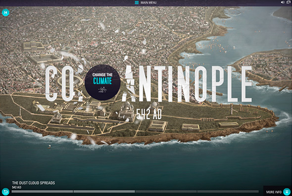
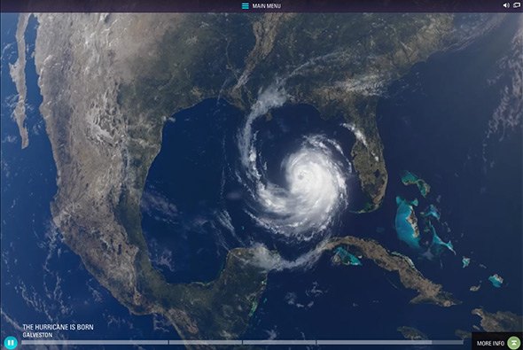
A micro site accompanying the History Channel’s ‘Perfect Storms’ tv show. A series of scenarios depicting the ‘perfect storm’ from Tokyo to Constantinople – you learn about what created these storms by a number of interactive scenes – for example fragging warm air across the atlantic and so on. Its a nice device to learn about how these storms are created and more more engaging than simply reading a paragraph about it. Some nice effects here and there and CGI heavy video scenes tie it all together.

Created by Secret Location (@secretlocation) and Entertainment One (@entonegroup).

Site here…

ATEA

By | @assemblylondon | No Comments

atea-1

atea-3

atea-2

Holding page mini site for ATEA – new fashion label launching in Autumn 2013. Really really simple a long infinite scrolling area of randomised photos and looping videos from their collection – encourages you to sign up and follow for updates. Just liked the way the grid looks and the position of the central logo and the simple interactivity that by itself is just fun to play with. Looking forward to seeing the full site.

Created by Assembly (@assemblylondon).

Site here…

Ranger Rover

By | @blastradius | No Comments

range-rover-1

range-rover-3

range-rover-2


Site promoting the all-new Range Rover. Essentially a video with annotations – showing the key features of the car – highlighted by small hints – the side panel slides out when pressed to reveal more info. Lots of little transitions add to the overall experience, the minimal design and animations make it feel like a modern tablet app.

Created by Blast Radius (@blastradius).

Site here…


Rezo Zero

By | @rezo_zero | No Comments

reso-zero-1

reso-zero-2

reso-zero-3


Portfolio site of French agency Rezo Zero. Nicely considered layout and subtle animations bring the design to life, with a modern and fresh look and feel. Really like the transitions from section to section and the way the images filter through and the layout for the individual case studies – telling the story in an interesting way. Nice example of a modern agency portfolio.

Created by Rezo Zero (@rezo_zero).

Site here…

Ed Banger Room

By | @anonymous_paris | No Comments

ed-banger-1

ed-banger-3

ed-banger-2

Site celebrating the 10th year anniversary and showing the history of the Ed Banger music label. A simple site – scrolling downwards reveals animations and shows key moments in the label’s history. Lots of detail – from dragging around music covers to interactive keyboards – it’s fun to explore and play. Love the history summary panel where you can see the entire page and navigate around. Just a nice example of a timeline based design which fun to explore.

Created by Anonymous (@anonymous_paris).

Site here…

The Build

By | @instrument | No Comments

the-build-1

the-build-2

the-build-3


Nice site – an interactive video documentary showing the lives of three custom motorcycle dudes. Essentially three different stories divided up into chapters. Really nice interface that comes in when you select a specific chapter, revealing what you can see – love the way you can scrub through the video on rollover – the image gallery is a treat. Love the amount of polish and craft that has gone into this experience – all the transitions, animations and effects have been crafted and perfected. A real showcase into what can be achieved with animations, video, and transitions.

Created by Instrument (@instrument).

Site here…

Carrera

By | @random_studio | No Comments

carrera-1

carrera-2

carrera-3


Great site for Carrera sunglasses. Super modern, fresh design – with sticky navigation element, sliding interface, overlays and so on – and its responsive looks good on mobile too. Really nice typography, well considered layout and design – love the offset grid and red highlight colour throughout. Loads of nice touches, including mini-campaign style pages telling the story of their history and so on. Great example of a responsive, modern & fresh site with parallax, great typography and loads of interactivity.

Created by Random Studio (@random_studio).

Site here…

Trance

By | @watsondg | No Comments

trance-3

trance-1

trance-2

Site promoting Danny Boyle’s new film Trance. Harking back to the days of Flash experimental sites this short experience is a maze of clips – like a fruit machine – clicking on a certain section reveals snippets from the film. Incorporating the films concept of being in a trance, you unveil memories – short erratic scenes – treated with ‘glitch’ artefacts and so on – nice to see a site just being an experience rather than a source of information.

Created by Watson / DG (@watsondg).

Site here…