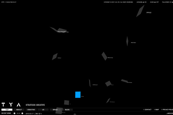
Portfolio of Japanese agency TYA. Set in a floating 3d space which is explorable through mouse movements. The ‘creative’ section highlights their work, with thumbnails moving through a floating space – allowing you to sit back and watch the projects float past. Nice camera movement and cool transitions and animation.
japan
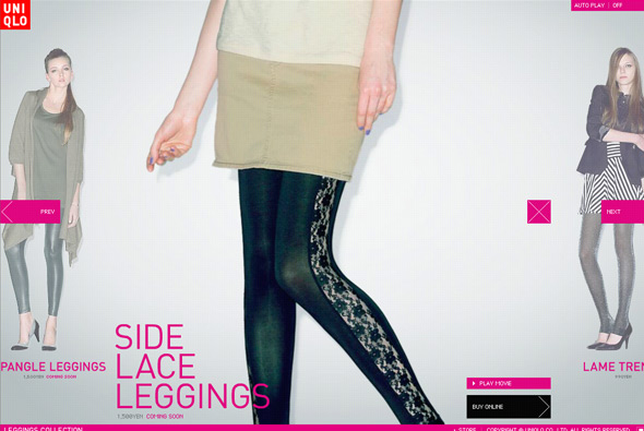
Site promoting Uniqlo’s range of women’s leggings. Another cool uniqlo site – interactive slideshow of leggings beginning with a zoomed in pan then with a video of a model walking in them. Colourful and fun it is also nicely integrated with online shop too, very smart. Love the panning feature, and slideshow, and the video is a nice touch too, cool animation and transitions.
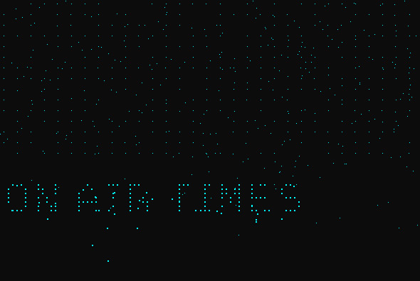
Beautifully simple portfolio of ‘Full Size Image’. Using pixels of light that move around to form text and thumbnails – each project scrolling past and regenerated by pixels on the homepage. Love the movement of all the pixels and simplicity of it all.
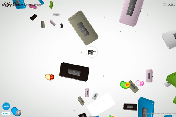
Mega cool, and mega mental promotional site for SoftBank, and what seems like promotional Jelly Beans edition phones! Featuring a 3d environment where jelly beans and the phones float around to music, making up shapes and animating around everywhere. By clicking and dragging a phone, you drag the phone towards you and the rest of the phones carry on doing their own thing. By dragging more you reveal different information about the phone. Really fun and captivating, I really love the drag interactivity, and sitting back to watch all the animation! Really cool…
Created by Dentsu.
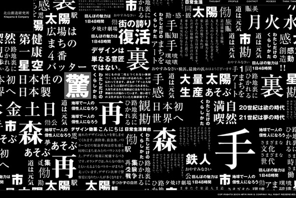
I’m not entirely sure what Kitayama & Company do exactly, but they have a nice website! It takes a while to load, but the preloader is pretty cool. Clicking on one of the thumbnail pictures reveals a timeline to show the work they have done over the years. Lots of nice animations and transitions, and I love the way the homepage transitions from text to photos.
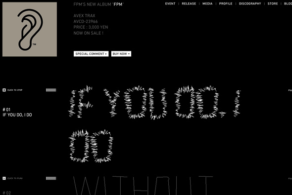
Awesome album teaser site for FPM (Fantastic Plastic Machine). Incredibly simple, and incredibly cool. With the track listing, when you preview one of the tracks the music then affects the track name, making it jump around in time to the music, the site then becomes alive – really nice idea. So minimal but brought to life by the music, that contrast is what makes this site so fun, effective, and cool!
Created by tha ltd.
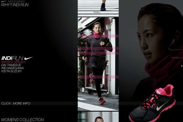
Site promoting Nike’s running collection in Japan. Slick and simple site centred around 4 Japanese celebrities and the products they are wearing. Loads of really nice animations and transitions – I also quite like the font treatment – and the way they highlight the various products.
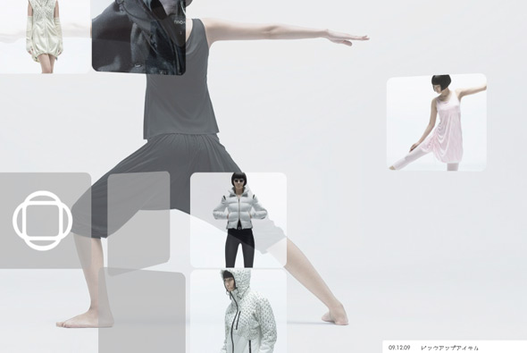
Site highlighting Naoki’s range of sportswear – “NAOKI is a unique sportswear collection designed by NAOKI TAKIZAWA, a designer renowned in the Paris fashion world as the decade-long creative director of ISSEY MIYAKE”. A nicely balanced, clean minimal site, with rotating 3d panels showing the range of clothing. Clicking on one shows an overview where you can smoothly zoom in and out. Nicely designed and executed with some really nice animation and interactivity.
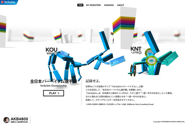
Interesting site promoting Verbatim memory. Characters that are made up from memory sticks fight each other in an arena, you can answer a series of questions, each correct answer gives you more memory – in the end creating your character – which you can then use to fight other characters. All in slick 3D, the site is great fun to use, with loads of nice animations and interactivity. Pretty unusual and engaging way of promoting a somewhat boring product!
Created by Roxik, who created Pictaps and developed the amazing Ecodazoo.
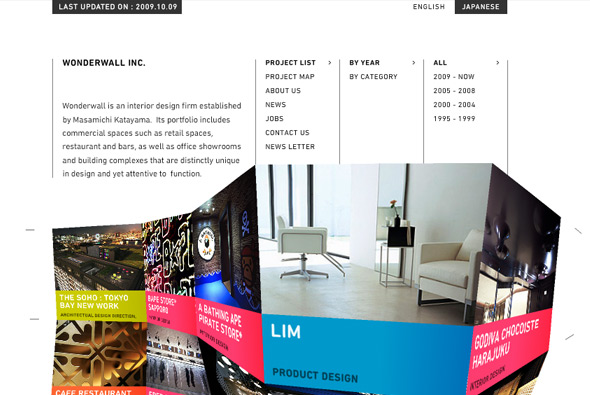
Interesting site of Japanese interior design firm, Wonderwall, formed by Masamichi Katayama. Set around an amorphous wall of projects, quite literally a wonder wall, when you rollover the wall it morphs size and position dependant on mouse location. It really is the centre piece of the site, and is really fun to play with. A similar mechanism forms the way you go through photos for each project. Nicely designed, very crisp, but with a fun twist.
Created by one of my favourites Yugo P.
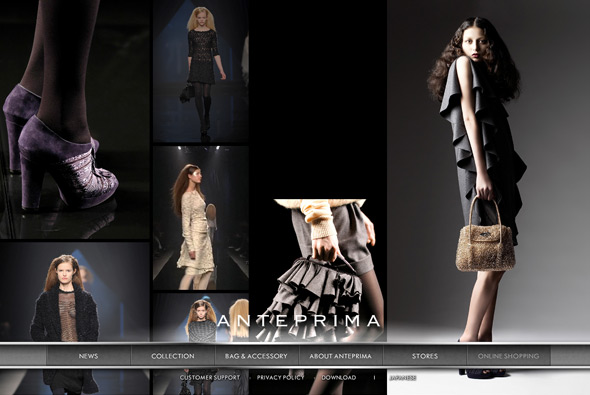
Interesting landing page that caught my attention of fashion label Anteprima. The page scrolls across with a mix of photos and videos, an interesting way of showcasing the label’s collection instantly, it is nice enough to just sit and watch the photos & video scroll by. The rest of the site is very straight forward but I loved the landing page, very interesting.
Created by FICC inc.
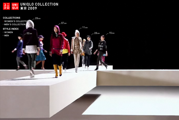
Another fantastic website from Uniqlo, promoting their 2009 collection. Presented with a full screen video with models walking on a giant cross, wearing Uniqlo clothing, with numbers and markers highlighting the style number following their movements. When you click on a style another video loads with the model walking alone along the giant cross, allowing you to see in detail what they are wearing. Cool music and nicely shot video assets, love the transition from the main video to the individual videos… very cool.
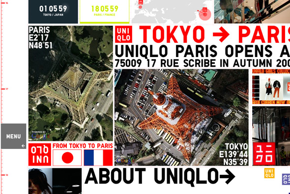
Yes another Uniqlo microsite, this time promoting the new launch of a Uniqlo store in Paris. Apart from that it’s pretty unclear – apart from general promotion – but this site is very flashy and fun. Currently it’s at 16000 pixels tall, which i’m assuming will grow as new content is added – along with the date scale on the left. Lots of little videos and products on display as you scroll down the huge page – all a bit mental really – but looks great!
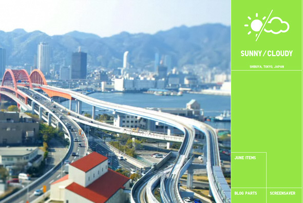
Nice little project for Uniqlo, this time in the shape of a calendar. Featuring tilt-shift photos in time-lapse video sequences of locations across Japan, when you click on the sequence a mosaic is produced – made up of Uniqlo products – which link through to the online store. Quite addictive just to watch the time-lapses showing the world going by, the tilt-shift technique adds a certain quality to the sequences. You can install a screen saver or embed it into your blog and set your local location to see local weather.

