Monthly Archives: May 2008

360 Snap

By | WEBSITES | No Comments

360 Snap

Nice idea for Vidal Sassoon in Japan, a booth that takes 360 degree photos of people has been setup for a new promotion. This has resulted in a nice set of photographs which can be seen in this interactive gallery. Each photo can be enlarged and there are some nice results that provide a quirky slow motion experience. Would have been really cool to be able to rotate each picture!

Made by Imaginative Inc.

Site here…

TERM’IT

By | WEBSITES | No Comments

Term’it

Interesting site for Russian clothing brand Term’it. The explorable interface has 3 main levels, where you can zoom in, rotate and pan around to see the clothing amongst other things. Technically it well accomplished, and works well – the rotation and zooming is smooth and feels good to use. Nice attention to detail and intelligent loading of sections means it all provides a good user experience. I like the thumbnails of the clothing and the playful way they are displayed.

Made by PARK Studio.

Website here…

Joshua Sterns

By | WEBSITES | No Comments

Joshua Sterns

Photography portfolio of Joshua Sterns. Nice way of viewing & scrolling the images – in that the thumbs are displayed vertically, scrolling up and down by moving the mouse, it fits to screen size too. Also really nice way of filtering the images, i.e. portrait, etc – all the images shuffle around to display the criteria. Images can be clicked to view the full size – and are even deeplinked in the Flash. Very accomplished and well made photographers portfolio – nice!

Created by Zero Style.

Website here…

Spectra

By | WEBSITES | No Comments

Spectra

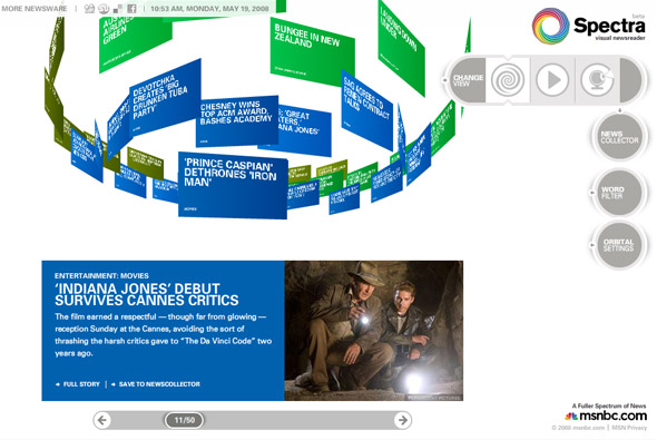
Very interesting way of presenting news, Spectra ‘visual newsreader’ for msnbc. You selected the channels to view, which then appear in a rotating ‘cloud’ of news items. The news items can be explored, saved, or you can click through to the full story. Your 3D view of the items can be changed and even interacted with a connected webcam – which is fantastic – as it works on the premise of colour. Each channel of news is a different colour i.e. blue for entertainment, hold up something blue to the camera and blue items will appear. What I really like is the attention to detail and the host of options and customisation available, your choices are saved, you can search – etc. Its a really nice concept and its always great to see new ways of presenting data in an interesting way. 

Created by Fluid and SSK.

Site here…

Louis Vuitton Journeys

By | WEBSITES | No Comments

Louis Vuitton Journeys

Website promoting the ‘jouneys’ campaign for Louis Vuitton. A very nice experiential site, with various people describing and painting a picture of their favourite cities for example London by Keith Richards. In each of the ‘journeys’ you experience images, videos, and sound from the various cities. It is a nice concept well executed – it is interesting to see ‘famous’ people give insight into their feelings about these places. With lots of nice little touches and details together it all provides a fairly cinematic montage of these amazing cities and inspires feelings to create your own ‘journey’.

Created by Ogilvy Interactive Paris.

Website here…

Leslie Low

By | WEBSITES | No Comments

Leslie Low

Website of Singapore based singer/songwriter Leslie Low. Explore an environment inspired by the music which acts as a backdrop and soundtrack to the visual fly through. Lots of layers that affect the scenes through different blending modes and provide a very visually interesting experience. Talking about ‘experiential’ sites, this is a nice example, nice attention to detail and I like the ‘about’ section (leslie low button) where the artist talks through his history and inspiration – which all overlays the background.

Overall the site provides a calming diversion that makes you want to explore all aspects of the site and provides a nice insight into the artist.

Website here…

DVEIN

By | WEBSITES | No Comments

Dvein

DVEIN – an art direction, motion & interactive studio. This is their site, using a nice navigational concept whereby the work is displayed via a rotating stack of images and videos. I like the way the work is presented and just the general ‘to the point’ approach adopted, clean and stylish it shows their best work well. There are some really great pieces of work too – I remember seeing the tocame work before and being very impressed. Check it out…

Site here…