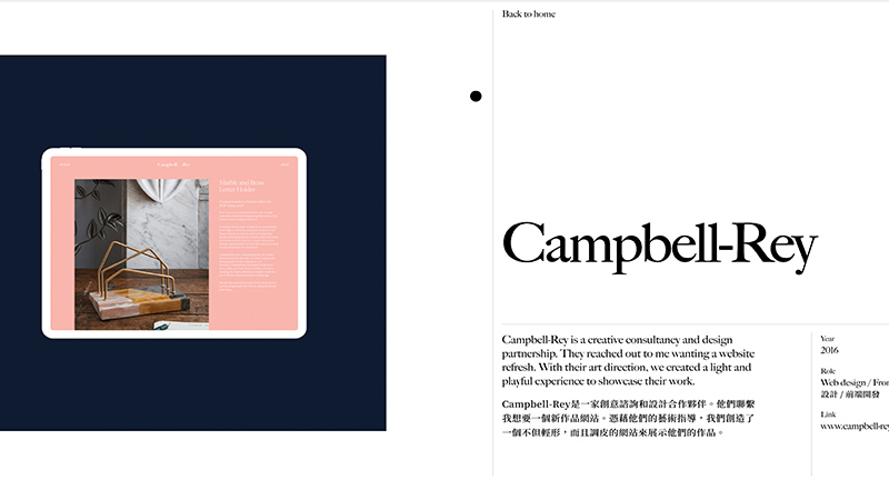
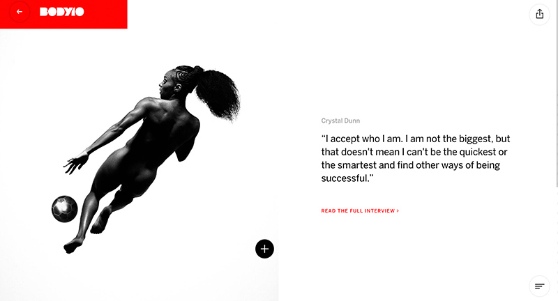
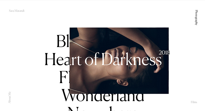
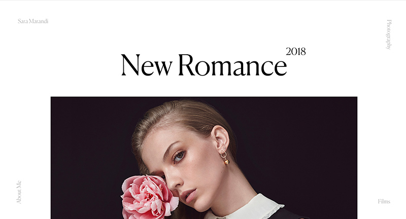
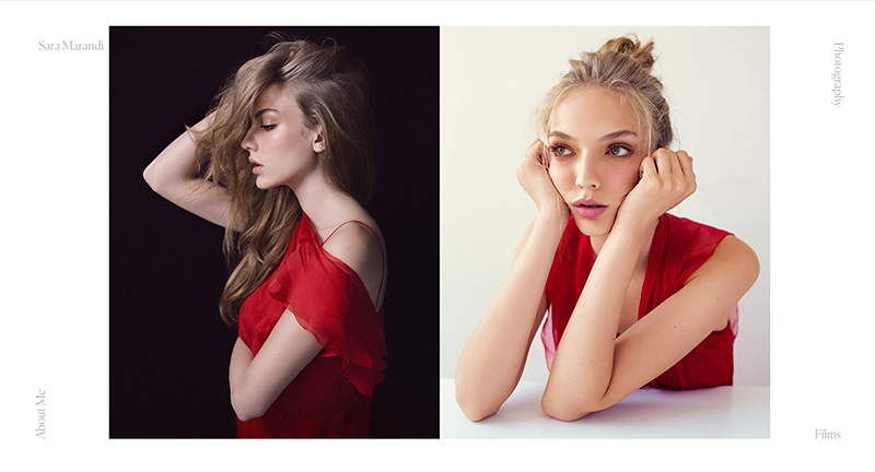
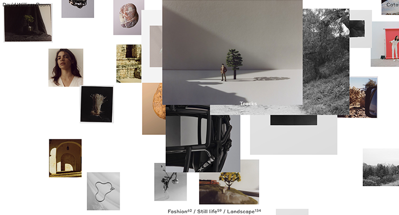
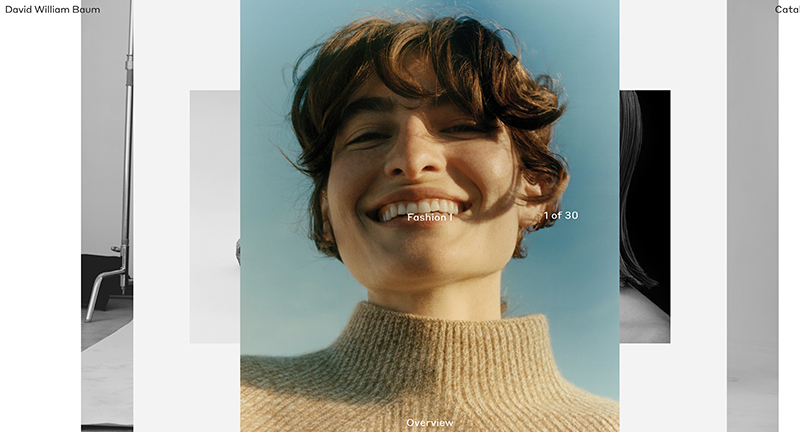
north america

Nasa Visual Universe

By | @googlearts | No Comments


NASA’s photography archive analysed and group by ML into interesting clusters, editorialised by machines. Fascinating concept to make a huge photo library more browsable, by using sorting mechanics to spot similarities and group subjects together. Love the slideshow-esque exploration of themes which takes you through some fascinating themes. Very exploratory interface, with a smart search function, and fun to browse dive deeper on range of topics.

Created by Google Arts & Culture (@googlearts).

Site here…

The Atlas of Moons

By | @NatGeo | No Comments


Beautiful experience “The Atlas of Moons” that offers an immersive and fascinating glimpse of the moons orbiting the planets in our solar system. The editorial experience parallels that of their magazines and reminds me of the fascinating book ‘Atlas of Remote Islands: Fifty Islands I Have Never Set Foot On and Never Will’. Love the use of 3D here to offer a draggable ‘map’ of each of the major moons, but to also highlight the orbit of the planets and moons. The level of detail is incredible – love the ability to map states in the US to see and relate the scale.

Created by National Geographic (@NatGeo).

Site here…

Zero is Two

By | @Zerostudiosnyc | No Comments


Playful celebration site of US agency Zero. Love the bold type set against inverted white on black styling, with parallax effect on the photography and type. Love the fun cursor replacement to explore the imagery. Lots of personality weaved into a fresh modern experience with an amazing feel of depth.

Created by Zero Studio (@Zerostudiosnyc).

Site here…

Kwok Yin Mak

By | @kwokidile | No Comments


Site of Kwok, US based designer, and a personal portfolio. Love the personality dotted all around this site, from the playful dot to dot represenation of distance from my ip to where he’s based, through to a guestbook where visitors leave their messages, it’s like going back to the fun websites of yesteryear. Lovely design and nice mix of type and languages, particularly like the transition from project thumbs to the detail page. Super cool and super fresh.

Created by Kwok Yin Mak (@kwokidile).

Site here…

Existing while Black

By | @gladeye | No Comments


Interactive documentary about what it’s like to exist while black. A range of stories from people describing discrimination in everyday existence – shopping, driving, parenting. A bold type driven experience, full of heart wrenching stories, told through the eyes of those who are victim of everyday discrimination.

Created by Gladeye (@gladeye).

Site here…

Nuclear Dissent

By | @jam3 | No Comments


Interactive documentary chronicling the testing of nuclear weapons. Fascinating combination of first person simulated VR / 3D videos, first hand testimonies, and history as told by those who were there. Beautifully crafted experience that really takes you there, and gives a multimedia overview of the history of these world ending weapons.

Created by Jam3 (@jam3).

Site here…

Emergence

By | @emergence_zine | No Comments


Site of Emergence magazine a quarterly online publication with an annual printed edition with stories that explore the threads connecting ecology, culture, and spirituality. Beautifully crafted articles and innovate interactive pieces that draw you in engage with you. Love the art direction of the site – lovely large type and nice photography throughout.

Created by Emergence (@emergence_zine) and Studio Airport.

Site here…

ESPN Body 10

By | @stinkstudios | No Comments


Site of ESPNs 10th Body issue – celebrating the physical prowess of male and female athletes. Beautifully designed with bold type and strong photography, great transitions between the homepage and profiles, and lots of subtle animations on each page.

Created by Stink Studios (@stinkstudios).

Site here…

Sara Mandi

By | @martinsilvestre, @rhold_a | No Comments


Site of photographer Sara Mandi and her collection of fashion and luxury photography. Lovely homepage showing a large type driven menu which on rollover reveal thumbnails from the project below, love that the horizontal axis shows other imagery. Nice seamless transitions to the project detail pages, clean aesthetic and nice typography throughout site.

Created by Martin Silvestre (@martinsilvestre) and Harold Urcun (@rhold_a).

Site here…