Monthly Archives: February 2016

Active Theory

By | @active_theory | No Comments

active-1
active-2
active-3
active-4

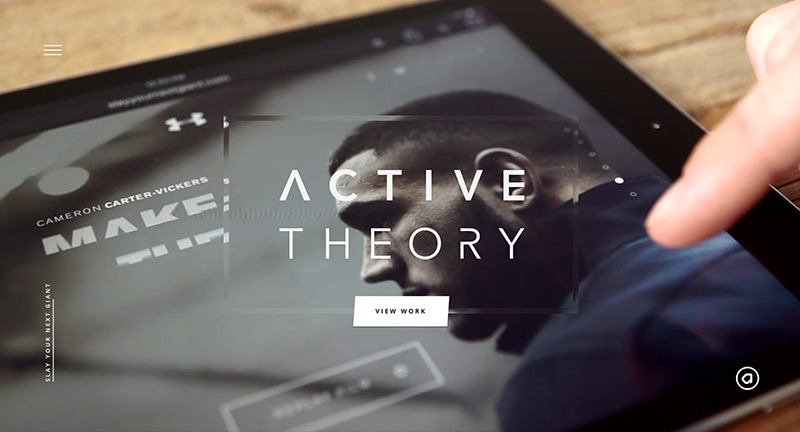
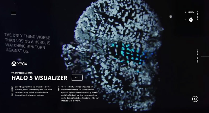
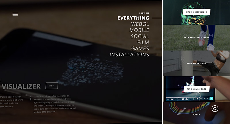
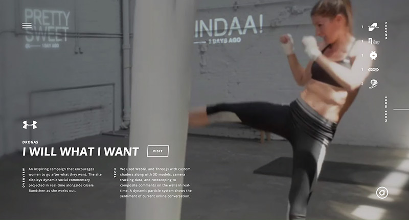
Lovely update to digital agency Active Theory. Nice approach to the homepage – full screen case study video clips cycle through their latest projects. Dive into the work and find a similar setup – screen captures and videos – letting you see the magic. Love the slide out projects menu on the right, fantastic scrolling effect where the mask moves quicker over the underlaying image. The site is full of detail and great interactions, animations, and transitions – love the peeking strips on projects on the project view – the main menu features a cool 3D logo – lots of cool particle rollover effects. Great attention to detail and a fantastic example of a modern, fresh and beautifully executed site.

Created by Active Theory (@active_theory).

Site here…

Jetlag

By | @creaktif | No Comments

jetlag-1
jetlag-2
jetlag-3
jetlag-4

Lovely photography site with the interesting idea of having two photographers shooting at the same time over 12 hours in two different places in the world. The results are wrapped up in a beautifully designed and executed site full of nice details. At it’s heart is beautiful photography – love the dynamic time stamp and the juxtaposition of the photos – love the slices which transition into one another. All so elegant and simple, and these small interactions are what really brings it to life.

Created by Creakif (@creaktif).

Site here…

Mirage Festival

By | @rbgaillard | No Comments

mirage-1
mirage-2
mirage-3

Site for the Mirage Festival – an art, design, and innovation event set in Lyon, France. Bold use of typography and colour through the site, from the photography treatment. Love the interactive undulating waves that move around as you mouse over the waves – a persistent element that flows into the subsequent pages of the site. Could watch the homepage for hours! Nice work…

Created by Cecile + Roger (@rbgaillard) and Martin Laxenaire (@webdesign_ml).

Site here…

America’s Most Admired Lawbreaker

By | @gladeye | No Comments

lawbreaker-1
lawbreaker-2
lawbreaker-3
lawbreaker-4

Lovely long form article on the story behind Johnson & Johnson – from the Huffington Post. Loads of great UI moments and nice approach to dealing with this amount of content and allowing users to navigate it in an interesting and compelling way. From the slide out menu detailing chapters, nice typography, to the sticky timeline along the left side which provides a nice reference marker. I love the use of illustrations to break up the content, some of which are interactive infographics, or nice parallax moments that play with depth. Considering the subject I love the way PDFs documenting evidence and letters etc backup the story. A fantastic take on in-depth interactive storytelling.

Created by Gladeye (@gladeye).

Site here…

Onirim

By | @Immersive_g | No Comments

onirim-1
onirim-2
onirim-3

Lovely site for creative production agency Onirim. Lovely scrolling and masking transitions from section to section with bold typography and inline video. Beautifully designed, with nice attention to detail and lots of cool transitions and animations – love the directors/photographers page with colour hits on rollover which injects personality into a monotone design. Great example of a modern, slick, and beautiful agency site.

Created by Immersive Garden (@Immersive_g).

Site here…

Performing Arts with Google

By | @google | No Comments

ci-1
ci-2
ci-3
ci-4

Site for Google’s Cultural Institute. Teaming up with some of the worlds most iconic venues and performances experience these moments from the stage in 360 video. Lovely type treatment and nice bold imagery, love the 360 video which really dives you into the experience. One of the things I love about it is how nicely it works on mobile, with an option to use your gyro or swipe to scan around the environment. Nice work.

Created by Google Brand Studio (@google).

Site here…

Message Design Lab

By | @homuculu | No Comments

message-1
message-2
message-3

Cool site for Message Design Center agency based in Japan. Love the 3D interactive type on the homepage, which transitions into the hero image for that project when tapped. Also love the company page where 3D characters float across the screen changing into photos – very cool. Nice, clean and simple portfolio site.

Created by homunculus (@homuculu).

Site here…

Our Brand is Crisis

By | @watsondg | No Comments

crisis-1
crisis-2
crisis-3

Site promoting the new film Our Brand is Crisis. Beautifully designed, with a cool navigation mechanic – sliding panels bring in more info when needed. Love the full screen video and bold type driven layout. Cool integration of a Tumblr blog too – fun and great looking site.

Created by Watson/DG (@watsondg).

Site here…