Monthly Archives: August 2013

Citroen DS4

By | @rumbatronics | No Comments

Citroën DS4 1

Citroën DS4 2

Citroën DS4 3

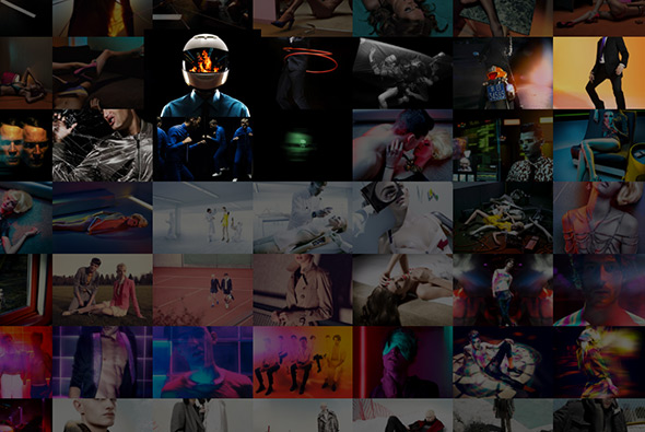
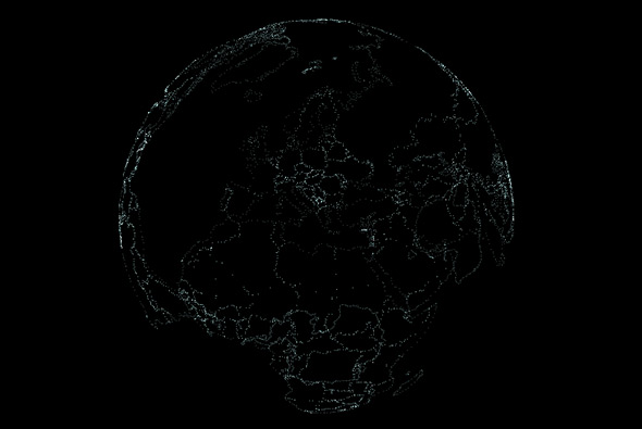
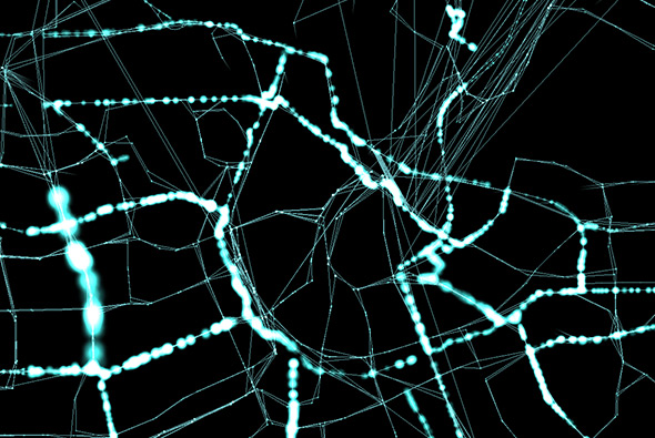
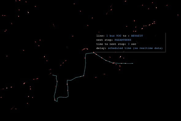
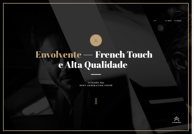
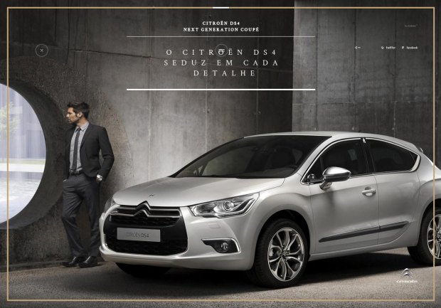
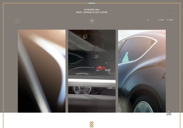
Lovely campaign site for the new Citroen DS4 in Brazil. One of the richest non-Flash sites i’ve seen for a long long time, videos, dynamic masking, fantastic rollover effects, lovely use of scroll and interactivity. It also looks great, with nice photographs and video assets, and well considered design and typography. Really like the homepage and the innovative menu – a real exercise in cutting edge design for non-Flash sites.

Created by Rumba (@rumbatronics).

Site here…

This is how we Dew

By | @BBDONY | No Comments

thisishow-1

thisishow-2

thisishow-3

A short series of video portraits of Mountain Dew’s sponsored sportsmen. Love the animations and transitions on the landing page, and seamless transition which leads you into the looping video portraits – which are beautifully put together and well conceived. Little hotspots allow you to find out more about the individual components of the portrait, and panning around adds some element of exploration to the scenes.

Created by BBDO New York (@BBDONY).

Site here…

HATSUMATSU

By | @webdesign | No Comments

hatsumatsu-1

hatsumatsu-2

hatsumatsu-3

Portfolio of designer / developer Martin Wecke – based in Berlin. Really minimal and interesting portfolio – all based around the scrolling mechanic used in a unique way. Scrolling down adds new thumbnails for projects, clicking on one gives more info, scrolling down reveals new images – similar mechanic one level down. Ultra minimal look and feel, straight to the point in an interesting way.

Created by Martin Wecke.

Site here…

H3 – Bang Olufsen

By | @hellomondaycom | No Comments

beoplay-h3-1

beoplay-h3-2

beoplay-h3-3

Website of Bang & Olufsen’s new in-ear headphones the H3. One long scrolling site with a navigation bar following you down the page, each section with animated features and information about the product. Really like the timeline where you can see the range of headphones B&O have made over the years. Also really like the image gallery and the way your view zooms into the grid of images. Lots of nice detail in each of the individual content modules, nice tidy promo site.

Created by hellomonday (@hellomondaycom).

Site here…

Socket Studios

By | @socketstudios | No Comments

socket-1

socket-2

socket-3


Really nice minimal portfolio site of freelance UX/UI designer Paul Macgregor. Sweet and simple & monotone – but adds to the effect when the brightly coloured screengrabs animate into view.  Really like the little animations when you press and tap the individual projects or go left / right. I like how you can browse the entire range of projects from the same view without having to keep go back up & down. Some nice design work in their too…

Created by Paul Macgregor (@SocketStudios).

Site here… 

Joe San F/W 2013

By | @nodymedia | No Comments

jose-san-1

jose-san-2

jose-san-3

Site of clothing label Joe San – the F/W 2013 collection. Some nice features, such as the full bleed videos and nice fluid transitions from each section. Like the video wallpaper and the detail view of the items shown in the video – nice to see these transitions and fluid video in non-Flash websites.

Created by Nodymedia (@nodymedia).

Site here…

60 FPS

By | @webdesign | No Comments

boris-1

boris-2

boris-3

Site of developer Boris Etingof. Loads of shiny 3d animated particles coming together to create icons of the clients he has worked on, responsibilities, links and so on. Reminds me of the old school Flash portfolio sites, but in this case in Web GL and so on. Nice animations and transitions between the various projects.

Created by Boris Etingof.

Site here…

OpenData Globe

By | @waag | No Comments

open-data-globe-1

open-data-globe-2

open-data-globe-3

Publicly available data rendered on a 3d globe, so far showing a handful of cities – such as Amsterdam, Istanbul, and Helsinki – information such as public transport lines, census, and even an example of live traffic data. All this info is drawn up with lines and blobs to illustrate intensity – the minimal design really accentuates the lines, dots and blobs. Love the way the city streets are drawn up with the real time traffic data in Amsterdam.

Created by Laurens Schuurkamp (@waag).

Site here…