Monthly Archives: April 2013

Perrier Secret Place

By | @Ogilvy_Paris | No Comments

perrier-1

perrier-2

perrier-3

perrier-4

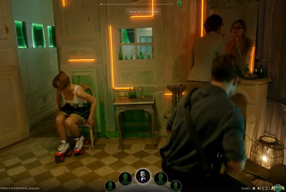
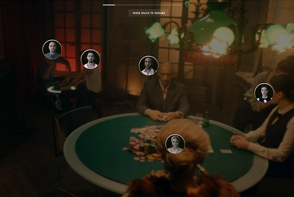
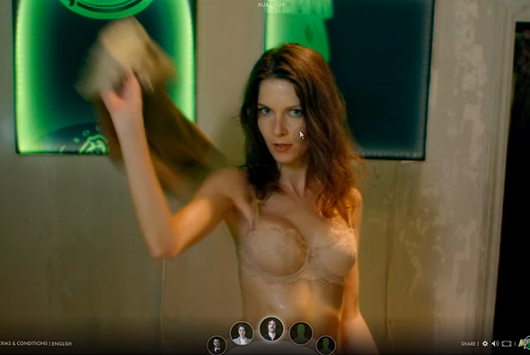
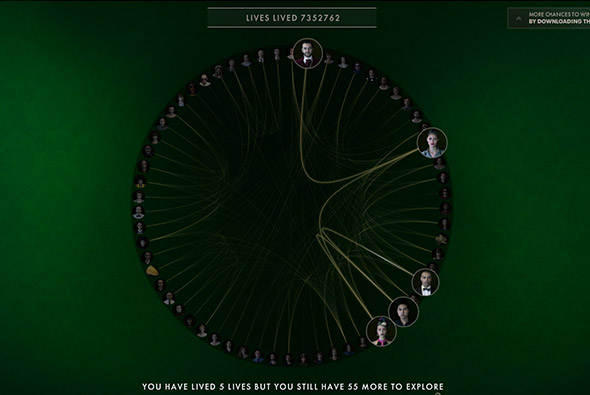
Perrier’s epic narrative ‘Secret Place’ – an immersive interactive film, where you choose your perspective featuring 60 people – you then see the story unfold through their eyes. The idea is to find the ‘secret bottle’ to enter a draw to win a holiday. There are lots of different scenarios from cutting a ladies dress off to reveal clues, to a game of poker, to flirting bar men – all with a sexy / weird twist. It is a lot of fun to explore the various story lines and characters – with their being a time limit to find the bottle it encourages you to replay time and time again. Great production value, and art direction – it apparently took Ogilvy Paris 18 months to create all the different scenes and characters. Also really like the summary of the characters and the journey you took through the site – again it makes you want to explore again and again.

Created by Ogilvy Paris (@Ogilvy_Paris) and Fighting Fish (@Fighting_Fish).

Site here…

OWL

By | @wearefellows | No Comments

owl-1

owl-2

owl-3

Site of OWL optics, makers of glasses and sunglasses aimed at the trend conscious. Nice modern, offset grid, minimal layout – looks like a crafted magazine layout. Very simple but the grid looks nice and piques your interest as your scroll through the frames on offer. The sticky elements of the nav work well and gives you some ground in sections where you might want to buy the glasses.

Created by We Are Fellows (@wearefellows).

Site here…

Cheval Blanc Randheli

By | @davidbasso | No Comments

cheval-1

cheval-2

cheval-3

Site promoting ‘Randheli’ a luxury villa in The Maldives. Long page of large full bleed imagery and panels of masked off text – revealing the bright photography. The menu is accessible from the side and slides across the page allowing you to explore the sections. It is also responsive and looks great on mobile devices too. Essentially a very slick brochure style site with some nice transitions and touches.

Created by Uzik (@davidbasso).

Site here…

Florilege – Vacheron Constantin

By | @webdesign | No Comments

constantin-1constantin-2constantin-3


Promotional site for a range of 3 special watches from swiss maker Vacheron Constantin. The watches are inspired by botanical illustration in the 18th Century, and that theme runs through the site. Essentially a long page with sections of detail off to the side – you scroll and animations are triggered as you go. I like the way the text fades in and the illustrations fade in as you go down, each watch has a slick video highlighting the dial – then prompting you to read about the details which are presented in a more editorial way. Really like the style and the execution which feels like a premium magazine feature.

Created by blue-infinity.

Site here…

Kerber

By | @emilolsson | No Comments

kerber-1 kerber-2 kerber-3

Site of Kerber, swedish fashion label. Sleek and minimal design, with large imagery and adaptive layout – elegant concept of large image followed by details for each item, like the rollover state which shows the rear of the item – and the enticing grid of thumbnails at the bottom to see other items in the collection.

Created by Emil Olsson (@emilolsson).

Site here…


Diesel Black Gold

By | @hellomondaycom | No Comments

diesel-black-gold-1

diesel-black-gold-2

diesel-black-gold-3 

Nice site for the Diesel – Black Gold collection. Explore Diesel’s latest catwalk photos and videos for the range. Love the offset grid of images and cool transition to full view, like the way the image resizes and moves. Really interesting method of navigation which unfolds out across the screen – then is ever present transparent and centred in the screen.

Created by hello monday (@hellomondaycom).

Site here…

Assembly London

By | @assemblylondon | No Comments

Assembly Assembly Assembly


Portfolio site of Assembly a branding agency in London. Super simple and elegant layout, scrolling takes you through their projects with big bold typography and relevant images. Nicely laid out grid and cool typography – the execution is direct and to the point – you get an essence of the agency and what they have done in a really elegant way.

Created by Assembly (@assemblylondon).

Site here…

Anonymous

By | @anonymous_paris | No Comments

AnonymousAnonymous Anonymous 

Portfolio site of Anonymous, Paris based digital production agency. Really cool site, fresh and modern – with lots of nice touches. Love the masking of the thumbnails and the splitting of the page to reveal the project detail inline – clicking and dragging through the images – gives it all an ‘appy’ feel. Really like the way they have arranged the projects chronologically and scrolling reveals a sticky element showing year following the scroll bar. Some amazing work in there too, all presented in an interesting way in a cool interface.

Created by Anonymous (@anonymous_paris).

Site here…

Control Films

By | @anonymous_paris | No Comments

control-1control-2control-3  

Simple and clean portfolio site of Control Films a boutique commercial / music video production agency based in Paris. Minimal layout and elegant concept – thumbnails play when interacted with, and when pressed scrolls you back to the top of the page where the video splits the page and begins playing. Clean and minimal and does the job well.

Created by Anonymous (@anonymous_paris).

Site here…