Category Archives: WEBSITES

Boundary Breaks

By | WEBSITES | No Comments

Boundary Breaks

Boundary Breaks

Boundary Breaks


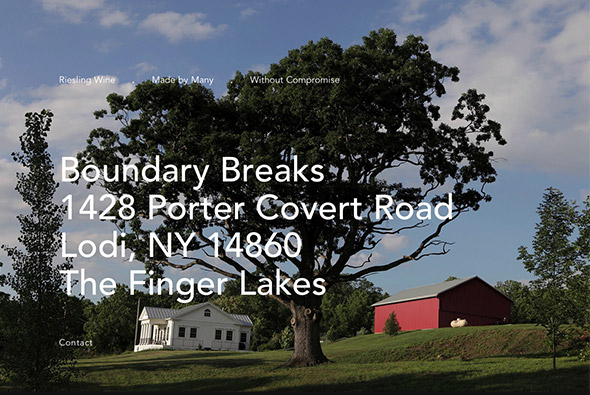
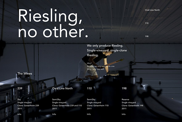
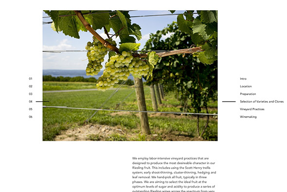
Site of Boundary Breaks wine from NY. Great looking typography and photography site – with some really nice touches. They go into great detail about how the wine is created, who is behind it, nice big photos – all aimed at getting across the ‘soul’ that goes into the wine. Nice looking minimal layout, each section is different and interesting, and the homepage is really quite unusual – a scene from outside of the vineyard  which shows a timelapse according on the position of your cursor. This all adds up to give a real ambience of the site, I love the ‘without compromise’ section – really interesting way of labelling where you are on the page, nice offset type and so on.

Created by Sons & Co.

Website here…


Silk

By | WEBSITES | No Comments

Silk is a simple site that allows you to create symmetrical swirling patterns – and share them! Very minimal and interesting to play with – the lines it creates are very smooth and there are a lot of nice touches that liven it up a little.

Created by Yuri Vishnevsky.

Site here…


Lexus RX

By | @brandstudio, WEBSITES | No Comments

Another great Russian Lexus microsite. Featuring the ever popular parallax vertical scroll layout – really like the gaps between the sections and the interactivity in some of the sections – such as changing the wheel or the car moving with your mouse cursor position – lots of little elements of delight. The sliding menu on the right panel is intuitive and works well – although always scrolling downwards can be a bit disorientating. Design is great, slick, elegant and simple makes the car visuals pop out, really nice well considered site with lots of cool interactivity.

Created by BrandStudio (@brandstudio).

Site here…

Dubfire

By | @dilshan_aruka, @transylvain, WEBSITES | No Comments

Site of musical outfit Dubfire. Featuring an explorable semi-3d interface with cubes revealing news items, tour details and so on. Loads of cool interface design, animations and transitions bring the whole minimal design to life – especially the feeling of depth, amplified when you use flat colours. Really well crafted site, looks modern and clean – animations super slick tie it all together. Really nice…

Created by Dilshan Arukatti (@dilshan_aruka) and Sylvain TRAN (@transylvain).

Site here…

Christian Mezöfi

By | @ChristianMezofi, WEBSITES | No Comments

Slick and elegant portfolio of Christian Mezöfi art director and designer. Really minimal layout highlighting visually the range of projects he has worked on. Love the way when changing between projects the layout slides down to visually and mentally see the transition to a new section – so essentially you can view the whole portfolio effortlessly – nice touch. Some really great work in there too…

@ChristianMezofi

Site here… 


Denon Visualiser

By | @jam3, WEBSITES | No Comments

Promoting the launch of a range of Denon headphones this campaign site visualises how it might feel in an interesting way. Using the frequency analyser to map the range and volume of frequencies animating to music – all applied to faces wearing the headphones. Love the approach and the detailed view of the headphones, again the 3d parallax comes into effect.

Created by BBDO New York (@BBDONY) and Jam3 (@jam3).

Site here…

Les Revenants

By | @BETCParis, WEBSITES | No Comments

Canal+ site promoting new series Les Revenants – again with the 360 drag to view mechanism. What I really like here is the feeling of depth and quality of the scenes, it really feels very immersive. You explore various locations and meet some of the characters from the series – the way they have placed video inside the scene is fantastic – with characters closer to you appearing closer with a kind of parallax effect. Really well crafted and fun to explore…

Created by BETC Paris, @BETCParis.

Site here…

Clouds over Cuba

By | @MartinTweets, WEBSITES | No Comments

Fantastic documentary site about the Cuban Missile Crisis. Highlighting the context for what happened, using videos and images – and interesting interviews – even with a section for ‘what if?’ an alternative ending for what might have happened. Lots of really nice user design, transitions and animations  – the line is really getting blurred now between what you can achieve with the latest CSS and HTML when compared with Flash. Love the minimal design and smooth animations and interactivity. Also happens to be a fascinating subject – brought to life in a fun and interesting way.

Created by The Martin Agency, @MartinTweets.

Site here…

Daybreak

By | @NorthKingdom, WEBSITES | No Comments

Site for Daybreak, an online drama series promoting AT&T and their 4G network, presented through a series of sites and an app to provide an alternative reality experience. Love the level of detail across the sites, the vertical scroll which for example shows the sun setting and rising as you scroll, the cool Jackboxer site – loads of animation and great art direction. Really cool sites, that a fun to explore, look great, and work well.

Created by BBDO New York (@BBDONY), and North Kindom (@NorthKingdom).

Site here…

Red Interactive Agency

By | @REDinteractive, WEBSITES | No Comments

Portfolio site of Red Interactive Agency. Loads of really cool transitions and animations – using a grid based layout to highlight key projects, news, awards etc, clicking one flips it around and makes the whole background fade back and the project come forward. Love the transitions between sections and the attention to detail as different sections of the page animate in. Really modern site, with progressive enhancement – most of the animations work on iPad, mobile and so on, pretty cool…

Created by Red Interactive Agency@REDinteractive.

Site here…

Hennesey White Rabbit

By | @resn_has_no_i, WEBSITES | No Comments

Site promoting Hennessy VS and their new campaign ‘what’s your white rabbit?’. Plunging you down the ‘rabbit hole’, and taking you to strange interactive 3d scenes, love the exploration feel to it all – moving you mouse around the scene,  clicking on strange objects and so on. Nice to see a site like this again, well crafted, fun to play with and looks great.

Created by Resn, @resn_has_no_i.

Site here…

TCM Summer Under The Stars

By | @1trickpony, WEBSITES | No Comments

Summer Under the Stars is a campaign site promoting TV movie channel TCM’s summer schedule. You able to choose a wealth of famous movie stars such as John Wayne, Rita Hayworth, Marilyn Monroe etc and explore their film history, bio, and so on. Setup as one long page with photos masked off revealing quotes, to a stand out quote treated typographically, content reveals and so on. Load and loads of really nice interactions, animations, and attention to detail – even the pre-loader is really cool.  It all feels like really rich and alive and fun to explore.

Created by One Trick Pony, @1trickpony.

Site here…

Evoke Sunglasses

By | WEBSITES | No Comments

Interactive musical experiment site promoting Evoke’s Zegon Sunglasses. A large sequencer plays samples, you interact by clicking and dragging shapes – sadly the site is quite hard to navigate / understand. However, there are lots of cool animations and interesting transitions – click to drag through images of specific frames – images zoom out and react to mouse position. Nice layout and minimal design, pretty cool.

Created by Rumba, @rumbatronics.

Site here…

Type / Code

By | WEBSITES | No Comments

Portfolio site of Type / Code, NY based digital agency. Nice splash screen, 3d reactive particles! Projects displayed as one long list of accordions, revealing the contents on page, with the section splitting and moving down. Like the transitions between the main sections, very simple layout – nice example of a clear, clean well crafted site.

Created by Type / Code, @typecode.

Site here…