Yearly Archives: 2007

Flash On

By | WEBSITES | No Comments

Flash On

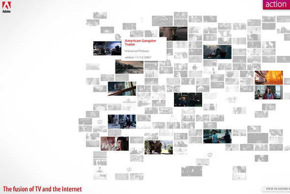
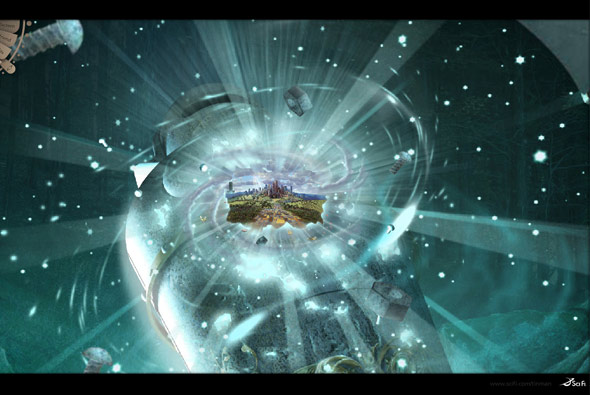
Site showcasing the new HD capabilities of the Flash Player, each trailer has a HD option, which launches the trailer in HD and full screen. Really great way of presenting the trailers in a nice visual way, nice touches and easy to use navigation. The transition between full screen and windowed is pretty cool. Great progress for the Flash Player.

Made by Big Spaceship.

Website here…

Be Online B

By | Loose | No Comments

Be Online B

Really interesting concept – an interactive music video. Arcade Fire’s ‘Neon Bible’ is shown in such a way, you are taken through the song and can interact with elements of the video. I love the idea and i’m quite amazed that there are not more of these around. Its a great way of involving the audience and keep their attention throughout.

Created by Vincent Morisset.

Website here…

Whalefootage

By | WEBSITES | No Comments

Whalefootage

Footage of whales to increase awareness of their plight. Really slick site – the best use of video in terms of interacting and navigating I have seen. For each bit of footage small images are placed apparently at each keyframe, these images change as the cursor is moved across the timeline. For each whale a small thumbnail of each video is played, all very minimal and stylish. Its a great site with lots of really good touches and great attention to detail.

By Scholz & Volkmer.

Website here…

Sean Kennedy Santos

By | WEBSITES | No Comments

Sean Kennedy Santos

Photographer’s website, using black as the concept – a whole host of transitions and effects are in full effect, revealing the content. There are some really nice touches in here, in particular the way text is revealed and images are transitioned – I really like the simplicity of the site. There is nothing over the top in terms of navigation and it remains easy to use.

Created by Artificial Duck.

Website here…

Nike – Melo M4

By | Loose | No Comments

m4

Nice slick website, promoting the Nike Jordan Melo M4 basketball trainer! Really smart art direction and great execution. A quasi 3D environment you can pan around the environment and view videos and see the shoe, download stuff and so on. Its a just a great experiential site, involving you and encouraging you to explore the website, really slick – I really like the simple & effective navigation, rollovers, it just so easy to use.

Created by Blast Radius.

Website here…

AUDI R8

By | Loose | No Comments

audi r8

Site promoting the new Audi R8 for the UK market, from the perspective of 12 ‘chapters’ explaining the intricacies of the car. There are some really nice transitions and touches that liven it up a lot, nothing ground breaking just a nice example of a car microsite and an interesting use of navigation.

Developed by Good Technology.

Website here…

UNIQLO – Grid

By | WEBSITES | No Comments

UNIQLO Grid

Another cool UNIQLO website, this time in the guise of a grid ‘game’. I say game lightly as its more like a kind of interactive experiment with up the 50 people from all over the world interacting with cubes in a virtual space. You can create cubes, rotate them, divide them, move them and so on, everyone can edit your cubes and vice versa. It provides an interesting irreverant website, with cool sounds and great interactivity.

Created by the legend that is Yugo Nakamura of YUGOP.

Website here…

Gyre

By | WEBSITES | No Comments

Gyre

Beautiful website, promoting a new shopping centre in Japan. Set to a piano soundtrack sentances are formed in different patterns – giving an ethereal atmosphere, more akin to an art display. ‘Gyre’ means swirl, and as such the information displayed is always being updated and swirled around. This can be seen from inside the Gyre building, on your phone and on the website.

A wonderful simple idea – in terms of art direction and style – it just works really well and is a nice way to promote a concept. Created by one of my favourites tha ltd.

Website here…

Playground – Canon EOS

By | WEBSITES | No Comments

Playground - Canon EOS

Amazing site – powered by Papervision 3D – again!! Promoting the new Canon EOS 400D camera.

Really lovely style of interaction – you pan around and explore 3 different scenes each with interlocking pictures which move around in a 3D environment. This has got to be my favourite example of Papervision so far, the execution is really accomplished.

Created by Mediacatalyst.

Website here…

Feel Something

By | WEBSITES | No Comments

Feel Something

Very simple idea and execution demonstrating a nice concept to promote Foxtel, an Australian tv service. Short videos of people watching a selection of different tv channels set alongside a nice soundtrack. I really like its simplicity & concept – overall a nice little site.

Created by SOAP.

Website here…

RECYOU.

By | WEBSITES | No Comments

recyou.

Japanese Sony Walkman promotional site, using Papervision 3D to provide an enjoyable visual and audio feast! Explore faces mapped to 3D objects that dance in time to music, see them displayed in landscapes and mapped to various different shapes. An extremely well executed and fun Flash site, its so great to see experiential sites like this, just good fun and promoting a positive image for the Sony Walkman.

Created by NON-GRID, and more specifically developed by Keita a very talented flasher.

Website here…

The Infinite Oz

By | WEBSITES | No Comments

The Infinite Oz

Inspired by the classic Zoomquilt which has been around for years, ‘Infinite Oz’ is based on the SciFi Channel’s new mini series ‘Tin Man’ – a new take on the classic Oz tale. Nine artists have collaborated to make an endless journey where the viewer explores mystical scenes with ambient music and sounds. Like Zoomquilt you can control the direction of travel.

I am amazed that there hasn’t been many more examples of this style of navigation/user experience in the commercial world. I have always loved Zoomquilt, and its good to see people paying credit to its origins and getting good artists to make the scenes. A really nicely polished experiential website, created by B-Reel and Fallon.

Website here…

Nike ACG Sweetspots

By | WEBSITES | No Comments

Nike ACG Sweetspots

Another great example of a site integrating Papervision 3D, this is one of the best showcases of it I have seen to date. A globe highlighting ‘sweetspots’, i.e. a cool snowboarding area, is the main navigation – very easy to manipulate & use. The attention to detail and overall design & polish is really spot on, i.e. the motion blur whilst rotating, and lovely transitions.

Created by Duke, it is an inspiring, enjoyable example of a slick, usable, and cutting edge Flash site.

Website here…