Category Archives: @hellomondaycom

Bear’s Eye View of Yellowstone

By | @hellomondaycom | No Comments

bear-1
bear-2
bear-3
bear-4
bear-5

Lovely site for National Geographic, documenting four resident bears in Yellowstone through their daily activity and cameras mounted to their necks. Fascinating insight into where the bears go, what they do and how people interact with them. Beautifully designed too, love the scrolling mechanic that tracks the position across the map for each bear pulling out key moments. Lots of nice details such as the progress bar along the left edge of screen, and little prompts for action. Lovely example of a long form

Created by Hello Monday (@hellomondaycom).

Site here…

Wove

By | @hellomondaycom | No Comments

wove-1
wove-3
wove-2

Site for new wearable technology product Wove using a flexible display. The site focuses on the different benefits and features of Wove, with neat little interactions the animate the Wove to change its display or share and so on. Lots of nice features and minimal layout that encourages you to cycle through the features of the product. Looks cool , great transitions between sections, and interesting menu execution.

Created by Hello Monday (@hellomondaycom).

Site here…

Revelator

By | @hellomondaycom | No Comments

revelator-1
revelator-2
revelator-3

Site for Revelator a new online service that helps music businesses streamline their revenue online. I like the horizontal scrolling layout, with a nice blue and black look and feel, videos and animated graphics to highlight the key features. Slick animations and transitions to the individual sections of the site, with sliding panels and so on pulling it all together.

Created by Hello Monday (@hellomondaycom).

Site here…

Hello Monday

By | @hellomondaycom | No Comments

monday-1
monday-2
monday-3

Lovely new portfolio for Danish digital agency Hello Monday. Vibrant and dynamic – I love the way colour plays a big part in each of the project case studies. The sliding panels for additional content and smooth animations all add to the slickness – the editorial style layout giving a great readable experience and looks fantastic. Nice little touches and attention to detail such as the mouseover effects that add a bit of personality and depth. Great example of a modern responsive agency folio.

Created by Hello Monday (@hellomondaycom).

Site here…

The DNA Project

By | @hellomondaycom | No Comments

dna-1
dna-2
dna-3
dna-4

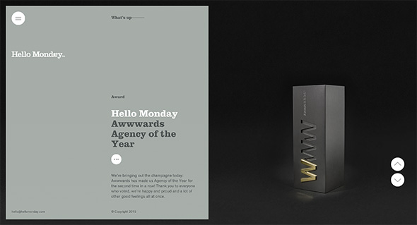
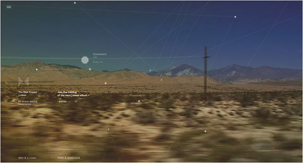
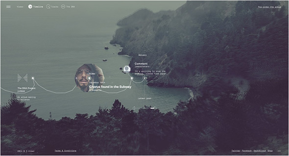
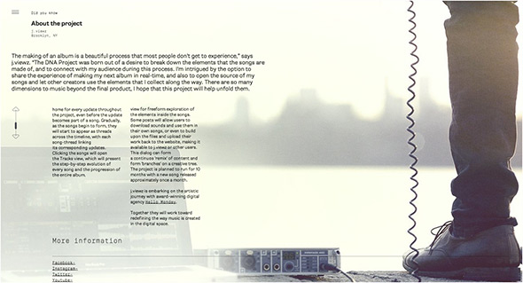
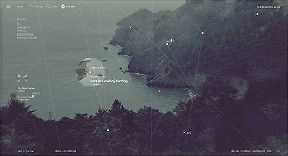
Fascinating site for j.views, documenting the creation of the new album. Brilliant insight into how the artist creates new music, from sources of inspiration to soundbites and video clips. Not only a great idea, but executed beautifully – a very exploratory interface with elements animating i.e. waveforms in a hexagonal pattern to represent sound recordings, and a timeline approach. Love the look and feel and all of the small details that breathe in life and dynamism. The DNA view is mental! But harks back to the day of more experimental interfaces and experiences – which ties in hand in hand with the concept.

Created by Hello Monday (@hellomondaycom).

Site here…

Hello Monday

By | @hellomondaycom | No Comments

hello-monday-1
hello-monday-2
hello-monday-3

New site of agency Hello Monday. Really simple and minimal, and responds nicely to layout changes. Simple animations add a nice element of movement when you visit the different projects, and the story told for each project is interesting. Nice images and nicely flowing design create the pages, all in all a nice example of an agency portfolio.

Created by Hello Monday (@hellomondaycom).

Site here…

MoMA – Magritte

By | @hellomondaycom | No Comments

moma-magritte-1

moma-magritte-2

moma-magritte-3

Site promoting MoMA’s exhibition on Magritte. Allowing you to explore Magritte’s surrealist paintings – in depth – or simply skim through them through a blend of music and typography. The information for each painting is detailed and interesting, with x-rays, background insights – which adds a nice layer to explore. The layout is pretty interesting too, with background colours morphing to fit the hue and colour for each painting.

Created by Hello Monday (@hellomondaycom).

Site here…

H3 – Bang Olufsen

By | @hellomondaycom | No Comments

beoplay-h3-1

beoplay-h3-2

beoplay-h3-3

Website of Bang & Olufsen’s new in-ear headphones the H3. One long scrolling site with a navigation bar following you down the page, each section with animated features and information about the product. Really like the timeline where you can see the range of headphones B&O have made over the years. Also really like the image gallery and the way your view zooms into the grid of images. Lots of nice detail in each of the individual content modules, nice tidy promo site.

Created by hellomonday (@hellomondaycom).

Site here…

Paper & Paint

By | @hellomondaycom | No Comments

sloret-1

sloret-2

sloret-3


Lovely site for Paper & Paint, from what I can tell an inspirations and ideas site for a range of paints. Presented with a magazine style layout as you scroll the images within their masks also scroll with hotspots revealing details about particular shades. The layout slightly varies for each section each with an overarching theme and colours which also change as you scroll down the page. Subtle parallax effect and nice looking layout.

Created by Hello Monday (@hellomondaycom).

Site here…

Into the Arctic

By | @hellomondaycom | No Comments

into-the-arctic-1

into-the-arctic-2

into-the-arctic-3


Lovely site for Greenpeace documenting their effort to claim the North Pole for nature – and highlighting peoples attempts to exploit the Arctic for resources. The story centres around a 3d map of the region which zooms and pans as you explore the timeline. There is lots of information about the animals in the area and the companies responsible for exploiting the region. All tied together with well considered typography and ‘app’ like design with sliding panels and large touchable buttons and icons. Really informative and loads of animations and transitions – all wrapped up in a great interface.

Created by hellomonday (@hellomondaycom).

Site here…

Diesel Black Gold

By | @hellomondaycom | No Comments

diesel-black-gold-1

diesel-black-gold-2

diesel-black-gold-3 

Nice site for the Diesel – Black Gold collection. Explore Diesel’s latest catwalk photos and videos for the range. Love the offset grid of images and cool transition to full view, like the way the image resizes and moves. Really interesting method of navigation which unfolds out across the screen – then is ever present transparent and centred in the screen.

Created by hello monday (@hellomondaycom).

Site here…

RVLT Revolution

By | @hellomondaycom | No Comments

Nice site of RVLT clothing. Really nice design brought to life by cool animation and transitions. Love the homepage – dragging will slide off the components and re-arrange the layout when they re-appear, clicking on a section or item brings it in – love the way the text overlaps the image and the info overlay. Nice grid layout – really simple, fresh and clean.

Created by Hello Monday (@hellomondaycom).

Site here…