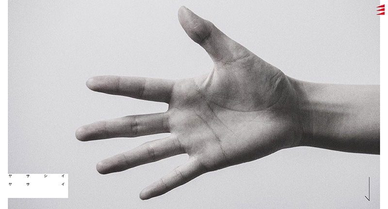
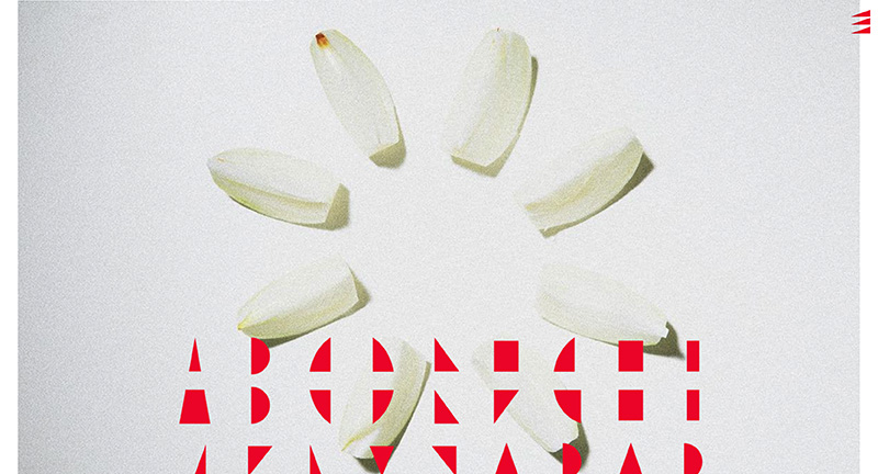
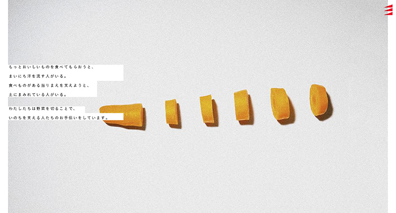
Site of Matsu a cut vegetable factory in Kanazawa, Japan!
Best described by the creators, “When thinking about “What is human value?” From now on, the value of “manual work” and “skills using the human body” and “human imagination” that can change the cut to the person who eats will increase I thought. Therefore, it is possible to experience the immersive feeling when cutting vegetables on a website. Tell the fun and value of cut vegetables.”
Love the scrolling progression through the stop motion style animation.
japan
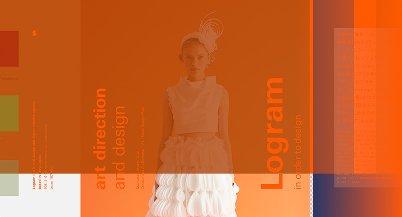
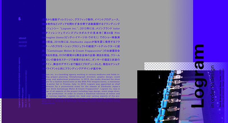
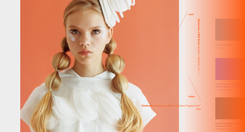
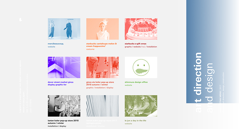
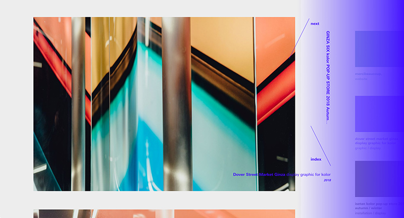
Site of Logram branding and creative agency based in Japan. Looking like a mash up of an early 2000s graphic design experiment and Photoshop layer this site is a medly of type, colours, and gradients. Lovely interactions, where sections of the site are in in separate spaces with sections of colour transitioning to the new pages. Love the dynamic colour palette too, along with the moving layers it feels as though the site is never the same from one moment to another. Very refreshing, lively and bold agency site.
Created by Keigo Anan (@anan) and Takehiko Ono (@onopko).
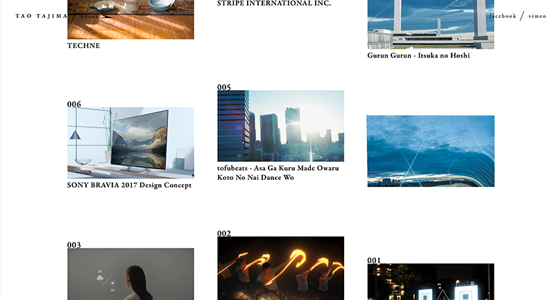
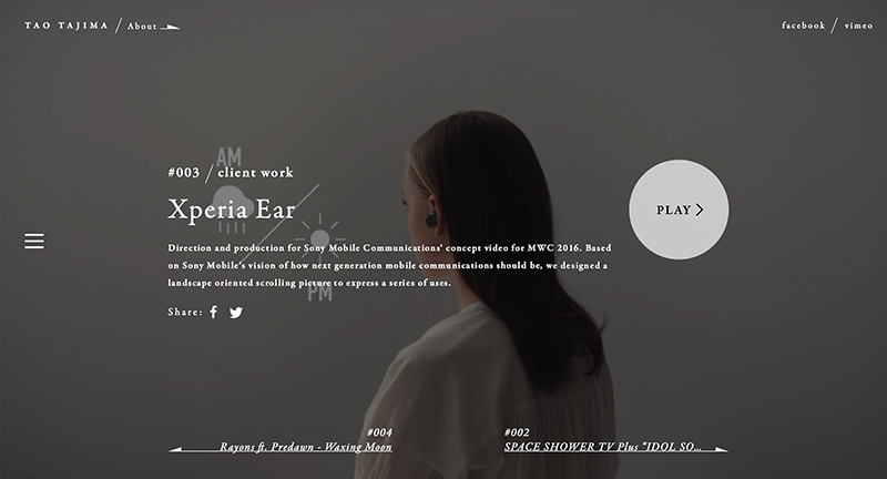
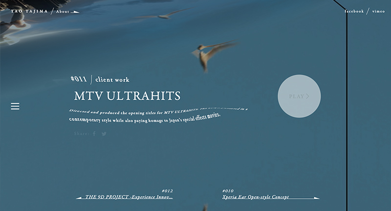
Site for Japanese filmmaker Tao Tajima. Love the home screen with all the thumbnails which react nicely to your interactions – love the fluid like transitions to the project pages. Try scrolling this this view and you traverse the projects in a liquid like fashion. Nice design, nicely executed.
Created by homunculus Inc (@homuculu).
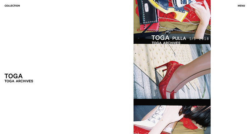
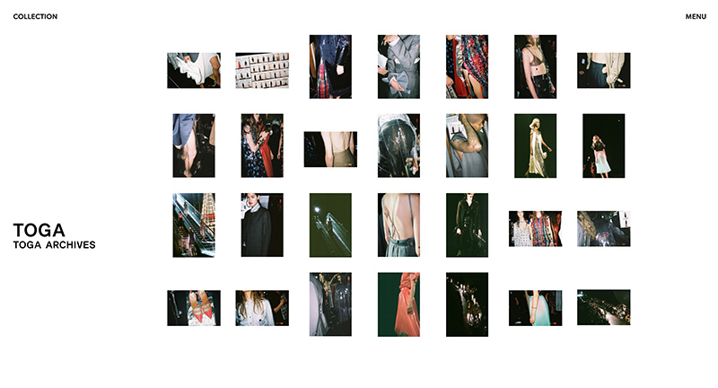
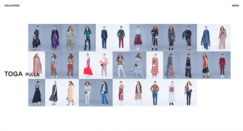
Site of Toga Japanese fashion label. Super minimal design and functionality, but with the Japanese aesthetic appeal throughout which elevates the overall feel of the site. Elegant selection of photography, love the views of the whole range which offers a great summary of the collection.
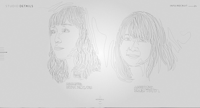
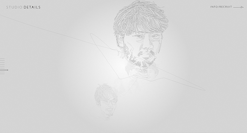
Promo site for Japanese agency Studio Details. Featuring an interactive 3D sketch gallery of the team members across the agency. Into more details pages. Nice effects on the 3D drawings and good to see a creative approach to agency sites.
Created by Yuichiroh Arai (@yuichiroharaiEN) and Studio Details (@studiodetails).
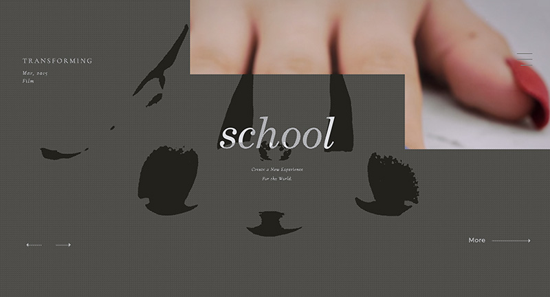
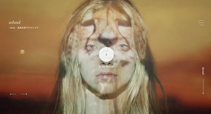
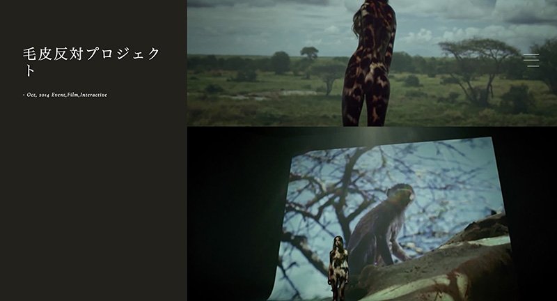
Site of School, a Japanese creative collective/agency. Nicely crafted body of work wrapped in a modern site full of nice interactions, transitions, and animations. Super smooth and pretty damn slick.
Created by School.
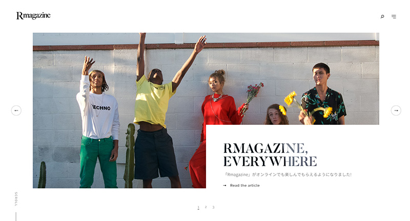
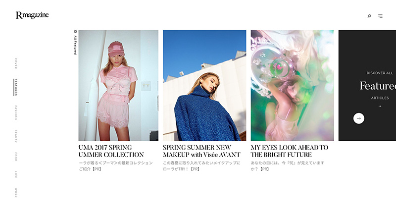
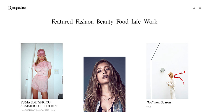
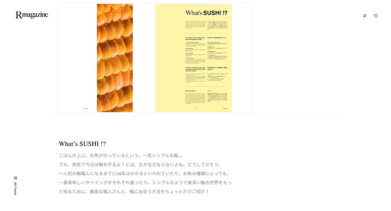
Site of Japanese lifestyle magazine R Magazine. Featuring a variety of content such as fashion through to food. Sleek and minimal design with editorial and fashion photography. Love the subtle scrolling effect and art direction throughout, with lots of small UI details and transitions.
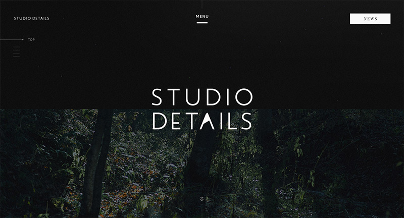
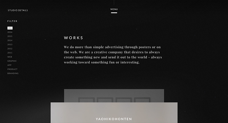
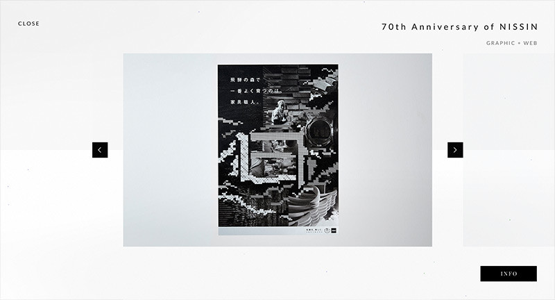
Site of Japanese design agency Studio Details. Nice dark look and feel with a nice body of work showcased in an elegant way. Love all of the transitions and attention to detail, making the site have an app like experience. Nice touch of floating particle effects adds an element of depth.
Created by Studio Details (@studiodetails).
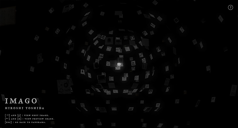
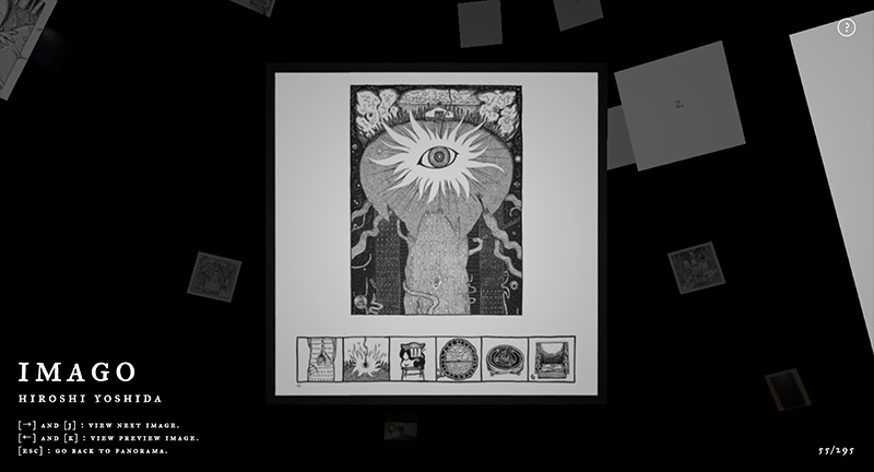
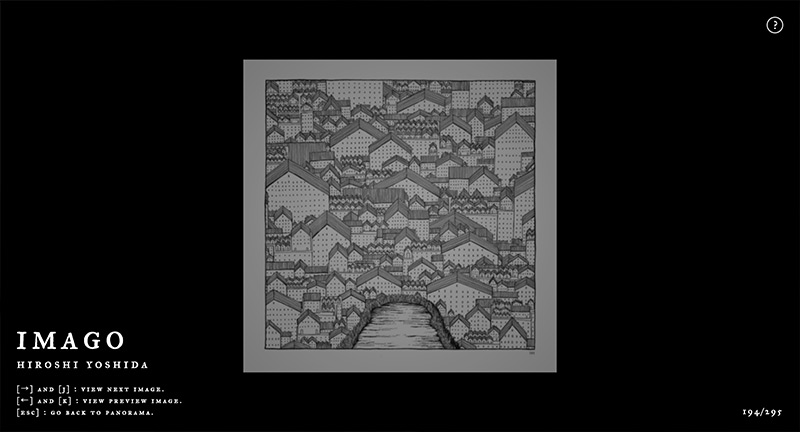
Site documenting a series of artworks from Japanese artist floating around a singular source of light. You can zoom in and cycle through the images in a floating view that pans and rotates around the circle. Very simple and interesting way to show a body of work.
Created by Hiroshi Yoshida & Yoichi Kobayashi (@ykob0123).
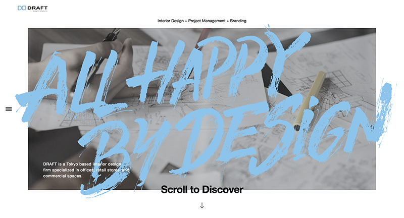
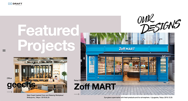
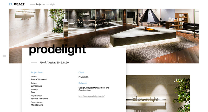
Site for Japanese interior design firm Draft. Lovely portfolio of work brought to life with lots of nice animation, transitions and interactions. It looks great, lots of large type and offset details that really break up the page and inject a sense of energy.
Created by Shiftbrain Inc (@shiftbrain).
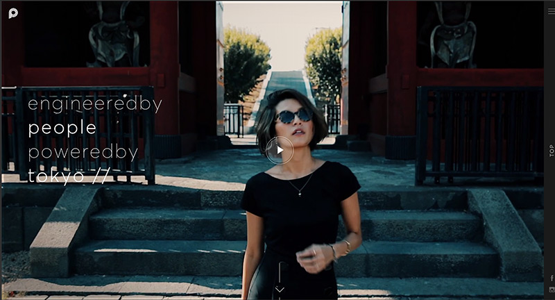
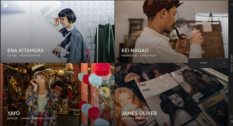
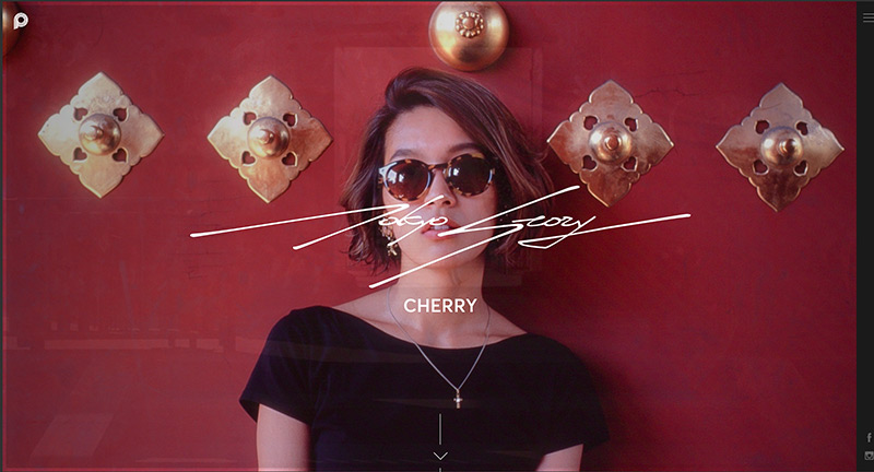
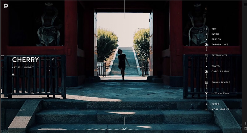
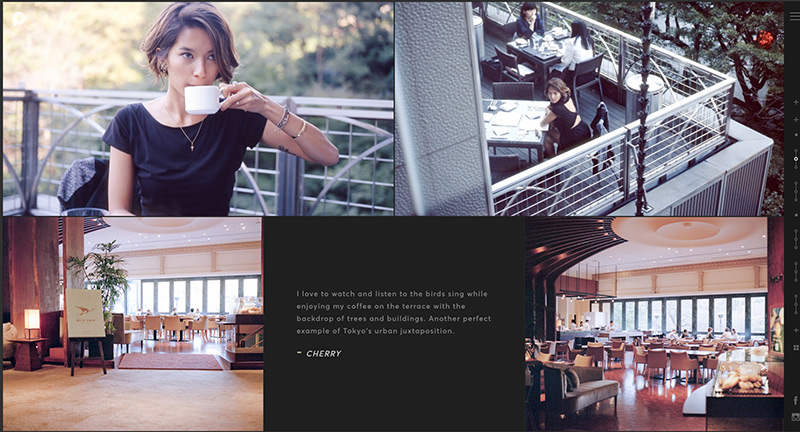
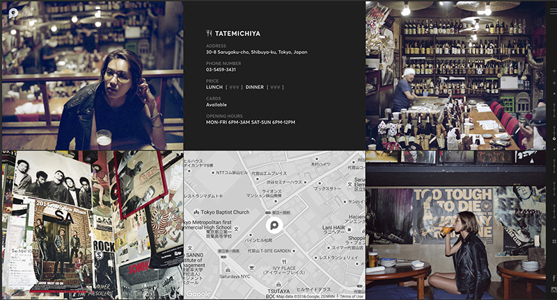
Site documenting various people who live in Tokyo, their lives, and their tips & recommendations for the city. In their own words “a community driven initiative that seeks to establish the modern Tokyojin. We aim to authentically and organically capture, document, and communicate Tokyo’s unique urban culture through the insight and experience of the very people that shape it while redefining what it means to call Tokyo home.” Interesting form of storytelling through in depth journeys. Lovely photography and design, love the blend of inline video and sprinkles of Google Maps that bring the stories to life. Nice transitions and art direction tie it all together to create a compelling experience.
Created by Monopo.
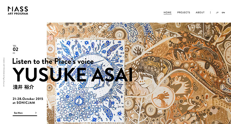
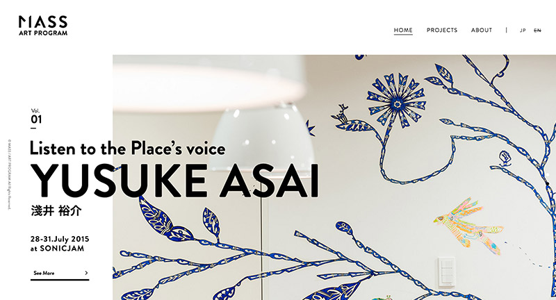
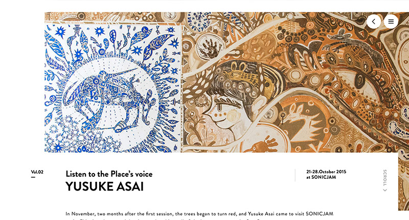
Site for new art project that invites artists to create in-house artwork for companies that co-create with the team. Lovely execution, love the transition from the header to the page view. It looks loverly with several nice UI moments and love the typography reveals on the homepage, where blocks of black transition into the type.
Created by Sonicjam (@sonicjam_Inc).
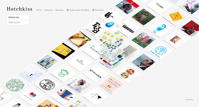
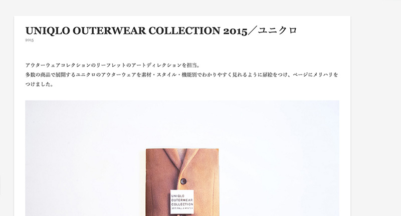
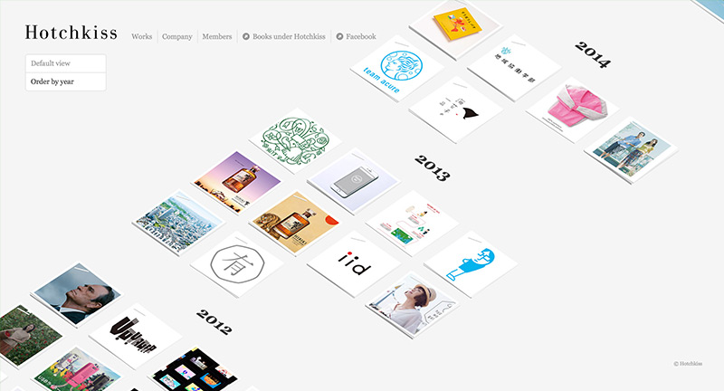
Site for Japanese ad agency Hotchkiss. Love the 3D tiles that shuffle and move as you scroll – really interesting way of presenting thumbnails and projects. Shame it doesn’t filter down into the project view. Nice clean minimal UI and layout that lets the content do the talking.
Created by Hotchkiss.
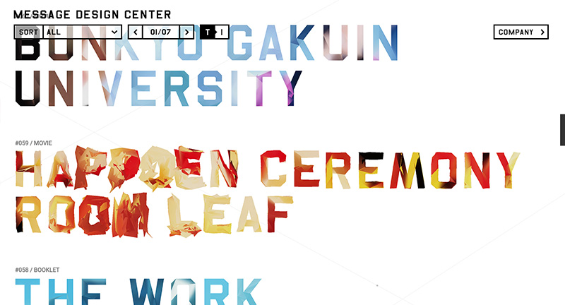
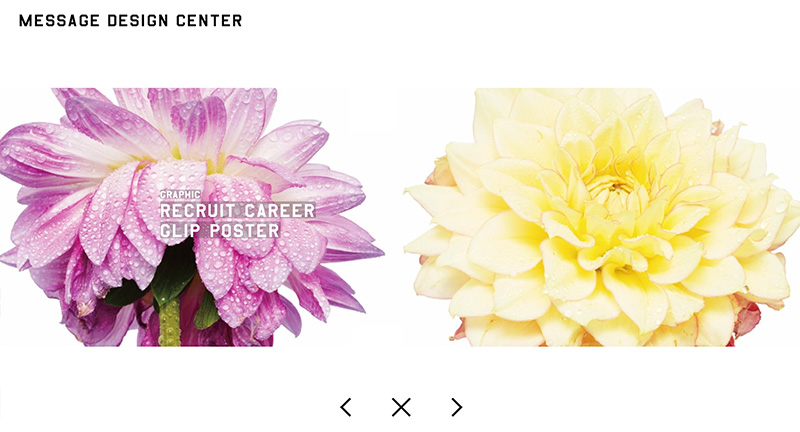
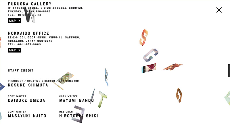
Cool site for Message Design Center agency based in Japan. Love the 3D interactive type on the homepage, which transitions into the hero image for that project when tapped. Also love the company page where 3D characters float across the screen changing into photos – very cool. Nice, clean and simple portfolio site.
Created by homunculus (@homuculu).

