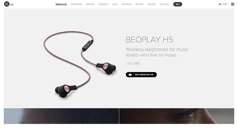
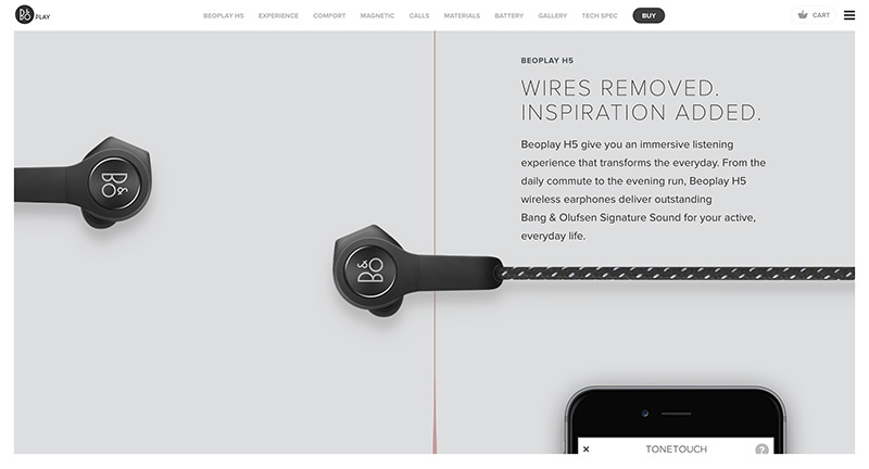
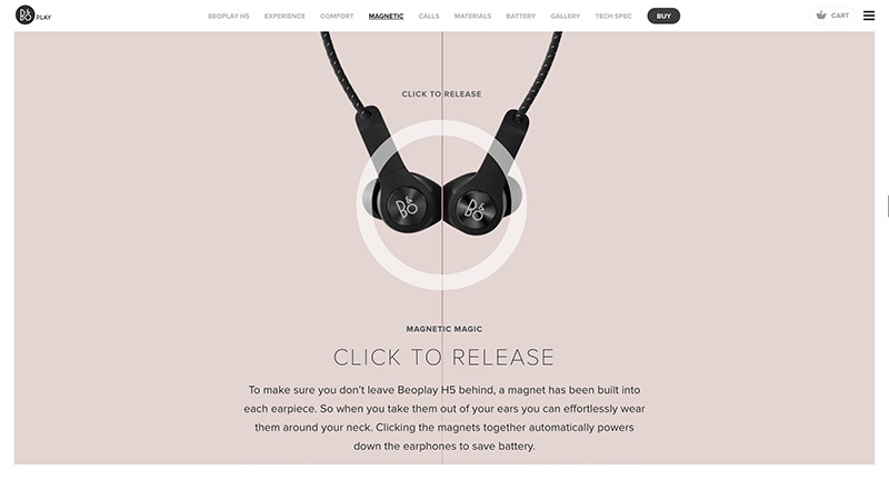
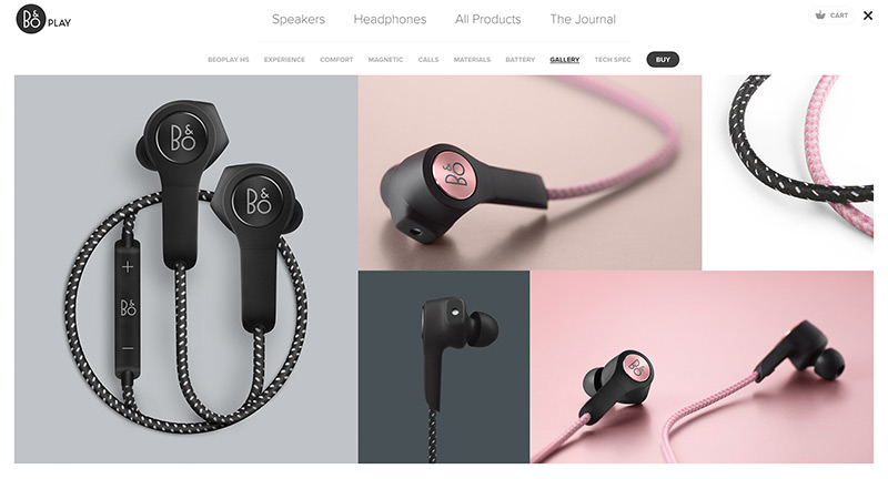
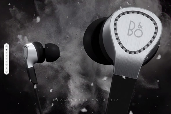
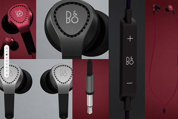
Another lovely B&O site, this time promoting their new wireless in ear headphones. Love the small interactive moments that tell the story and pull out the key features in a playful way. Nice design and interesting photography and location choice too – interesting moments of video scrubbing on scroll. Nice modern one-pager that pulls out all the details that users will find interesting wrapped in a nice to explore experience.
electronics
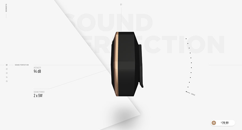
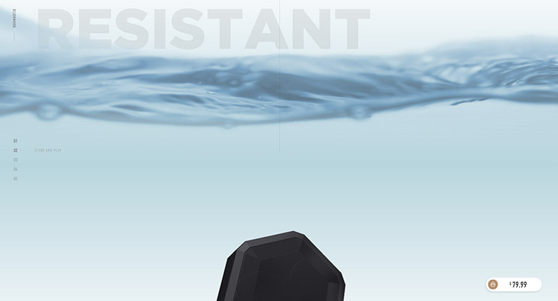
Lovely site for Boombotix Pro, a portable speaker. Really nice way of highlighting the top level features of the device from draggable 3d models to nice background video highlight the water resistant feature. Lots of nice details such as navigation down the side, nice simple light site that gets the key points across. And – it looks fantastic!
Created by AltoLabs (@altolabsdesign).
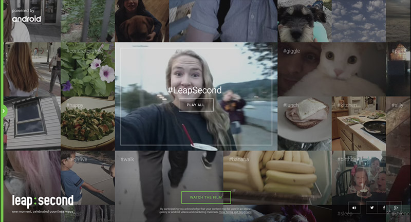
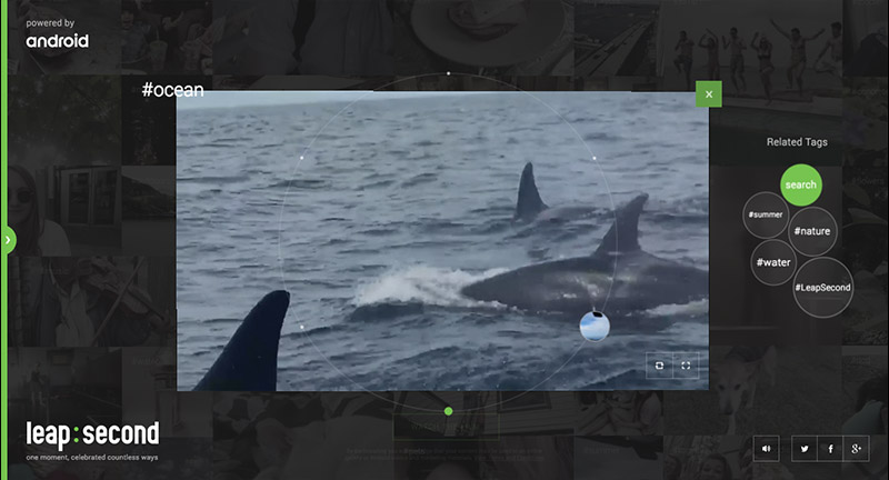
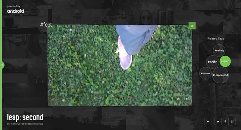
2015 saw a ‘leap second’ – everyone on earth had an extra second to play with. Android asked people to capture those moments and share with the world. The site itself is really well executed, with a great visual interface that captures the moments and themes of the submissions – with a larger video which combines all these moments into one clip. Love the 3D on this too, from the way the images enlarge and the lovely drag around interface – really works great on mobile too! Full of details and incredibly polished.
Created by Active Theory (@active_theory) and Droga5 NY.
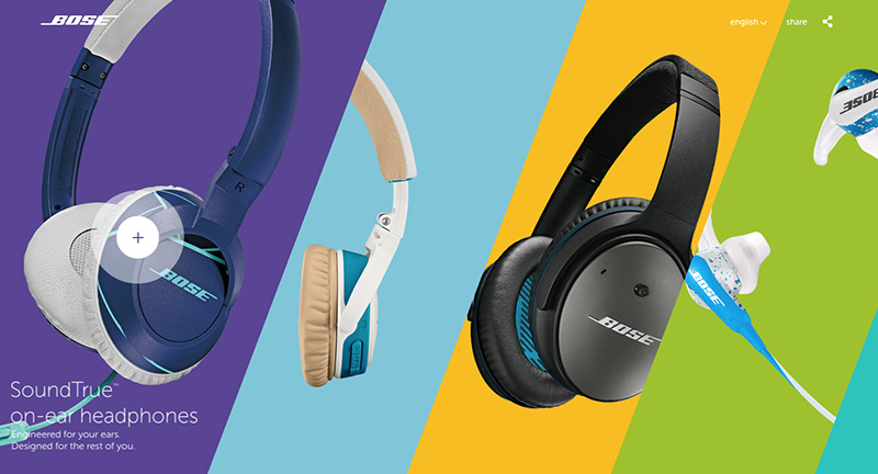
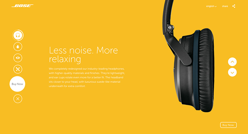
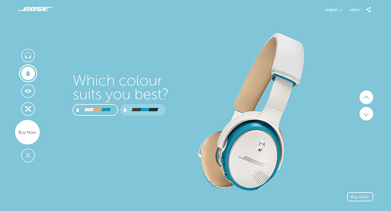
Site showcasing the new colourful and updated range of headphones from Bose. Really colourful and fun, with loads of slick animations that bring the layout to life. Real sense of energy in the design and a playful look and feel – love the diagonal imagery and the useful buy now button – linking to Amazon amongst others.
Created by This Page Amsterdam (@thispage_ams).
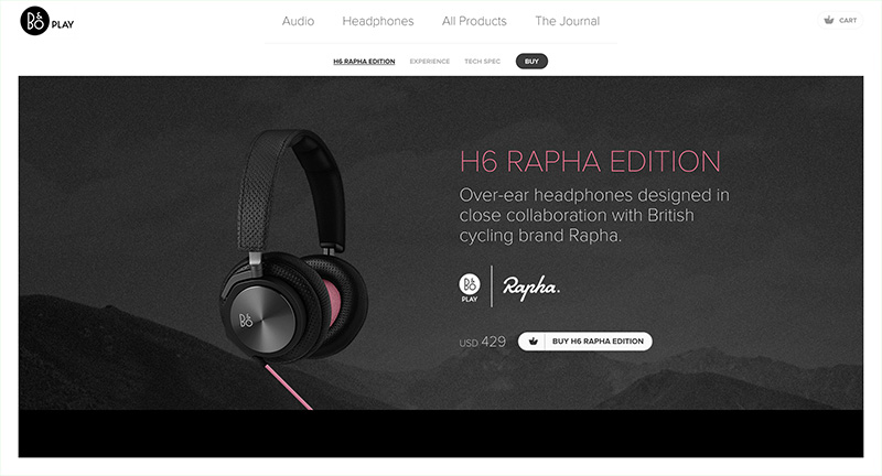
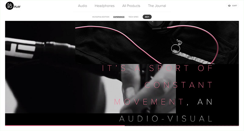
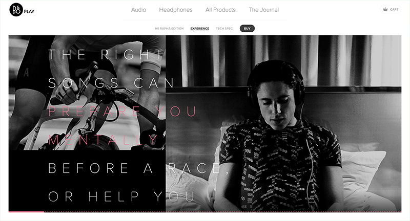
Lovely site for B&O Headphones, promoting their H6 Rapha Edition – a brand tie in with the cycling brand. Visualising how music can influence your ride, from preparation, hill climbs, racing, and all the emotions experienced whilst cycling. Lovely mix of videos, photography, hints of diagrams and descriptive and emotive copywriting.
Created by Spring/Summer (@SprngSmmr).
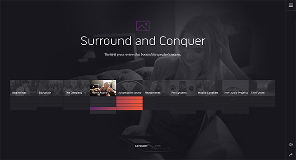
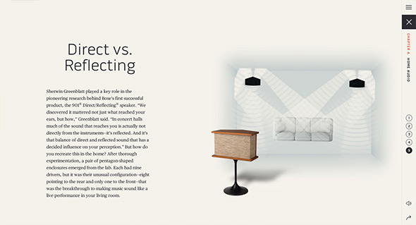
Site for Bose the speaker and electronics creators. Focussing on what makes up Bose, from their history through to their innovations. Presented in an interesting almost encyclopaedic way, with individual chapters with an app like appearance. Lots of nice little transitions and animations which lift the content and make it feel so much more dynamic. Love all the diagrams and the short snippets of video that really illustrate the content well. Nice work.
Created by MediaMonks (@mediamonks).
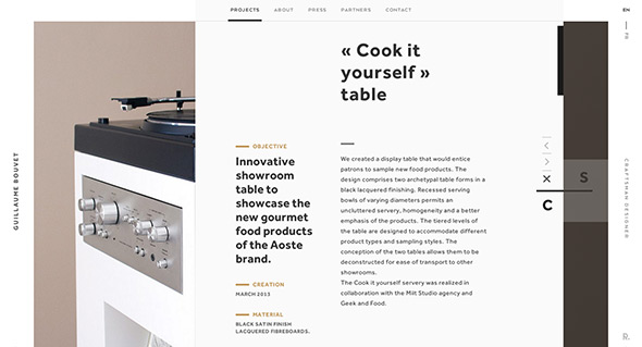
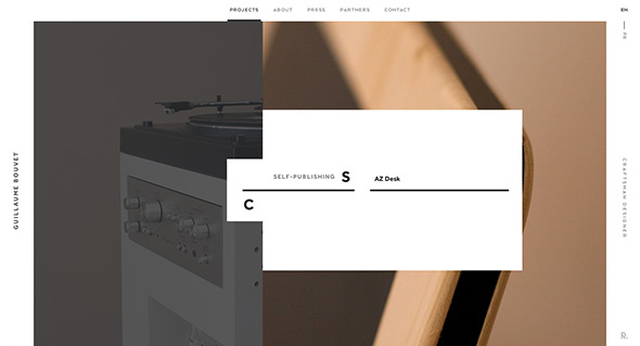
Lovely site for Guillame Bouvet, French industrial designer. Modern and fresh the editorial layout combined with transitions and animations brings out the details in his creations. Love the way you zoom into images – all within the white frame. It looks great and all the small details, rollovers – animations and so on bring it all to life.
Created by Rezo Zero (@rezo_zero).
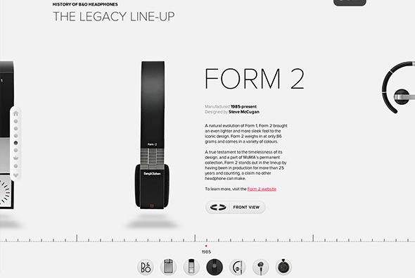
Website of Bang & Olufsen’s new in-ear headphones the H3. One long scrolling site with a navigation bar following you down the page, each section with animated features and information about the product. Really like the timeline where you can see the range of headphones B&O have made over the years. Also really like the image gallery and the way your view zooms into the grid of images. Lots of nice detail in each of the individual content modules, nice tidy promo site.
Created by hellomonday (@hellomondaycom).
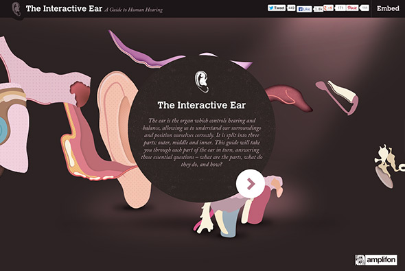
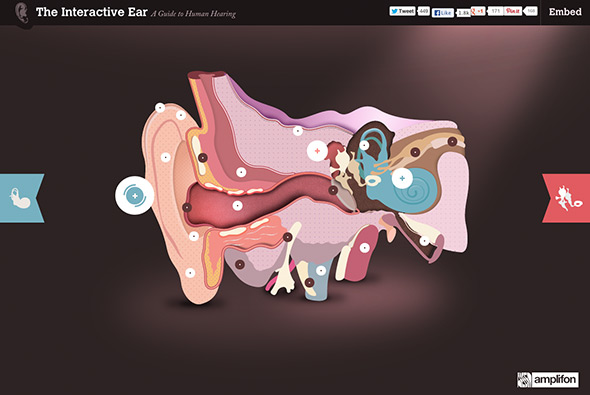
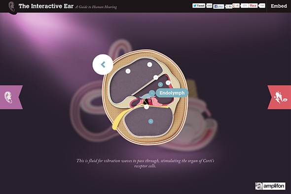
Site showing how the ear works – sponsored by a hearing aid company. Featuring a cut away of the ear with hotspots and animations illustrating how it all works – love the rollover magnifying and animating the process of how we hear. It also looks great, with nice typography and subtle animations bringing the diagrams to life.
Created by Epiphany Search (@Epiphanysearch).
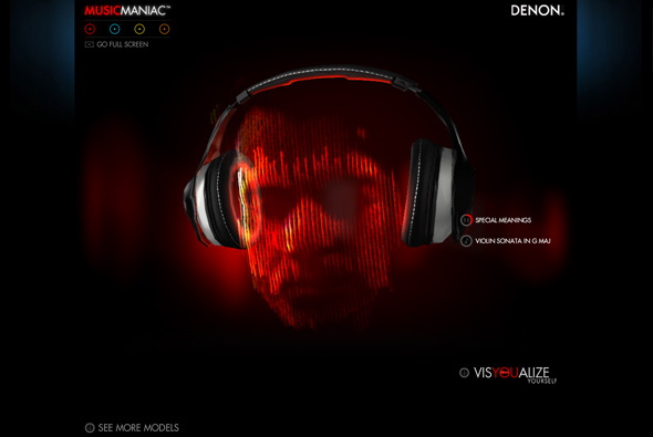
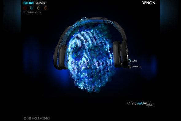
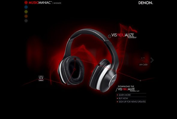
Promoting the launch of a range of Denon headphones this campaign site visualises how it might feel in an interesting way. Using the frequency analyser to map the range and volume of frequencies animating to music – all applied to faces wearing the headphones. Love the approach and the detailed view of the headphones, again the 3d parallax comes into effect.
Created by BBDO New York (@BBDONY) and Jam3 (@jam3).
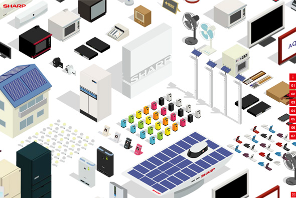
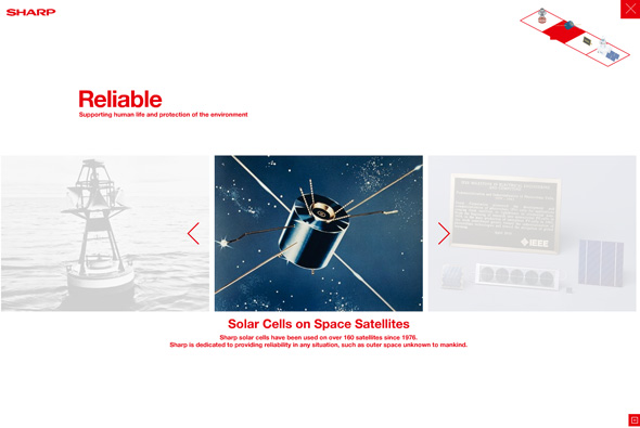
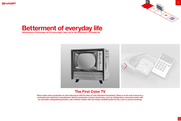
Website to celebrate Sharp’s centennial anniversary in 2012. Featuring their innovations since their inception in 1912, through a cute animated scrolling scene of their products. Click on an item and a nice slideshow of similar products and a bit of history. Set to a catchy tune and smooth animation, wrapped up in a minimal look and feel it gives the brand quite a bit of character. Simple, fun and looks good – very nice.
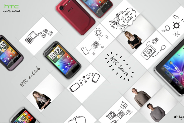
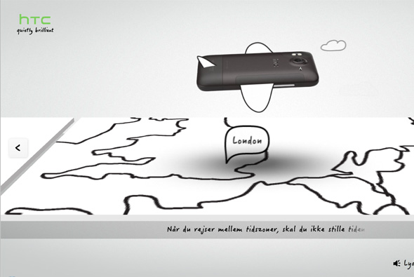
Nicely crafted site for HTC in Denmark. Nice 3d interface where you zoom into stories about the HTC phone and it’s features. Nice mixture of product photography and line drawings and video from YouTube. 3D interface is smooth, great transitions, and looks great.
Created by relax we are the good guys, and Bocca.
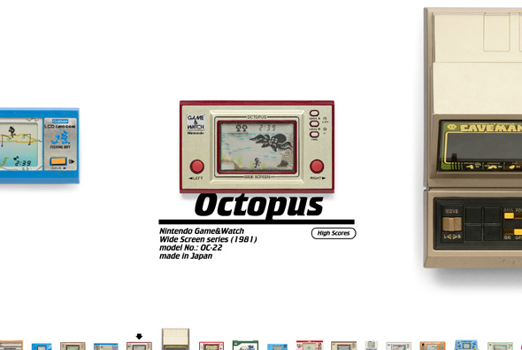
Incredible detailed site that is like an interactive museum of the old handheld games. I can only imagine the amount of time and effort that has gone into this amazing creation. They have taken high res photos and reproduced the games down to the sounds for each game – really amazing.
Crafted by Hipopotam Studio.
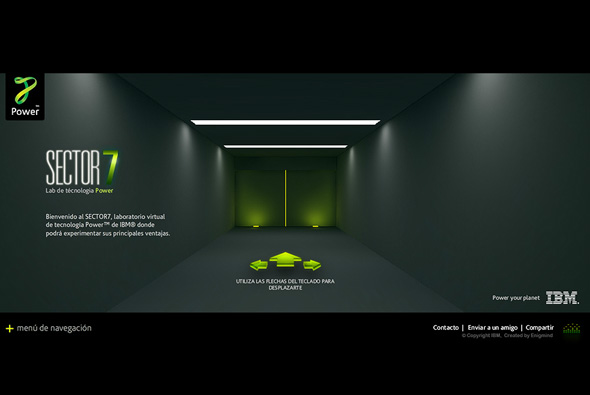
Promoting IBM’s ‘power 7’ systems in South America, by means of an explorable technology lab. Lots of little interactive experiments – all via a first person 3D interface – the best I have yet seen. Really nice look and feel, great interactivity all wrapped up in a simple interface!
Created by Enigmind.

