detail

Kenji Endo

By | @spc_tips | No Comments

kenji-1
kenji-2
kenji-3

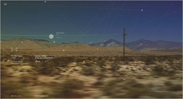
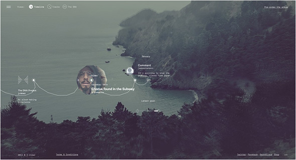
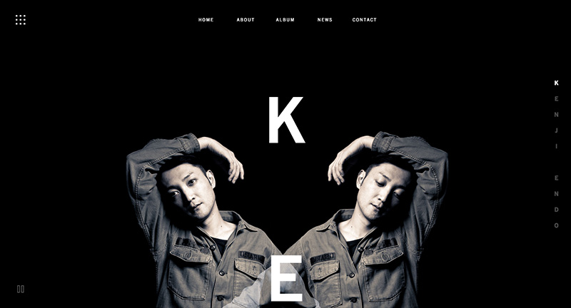
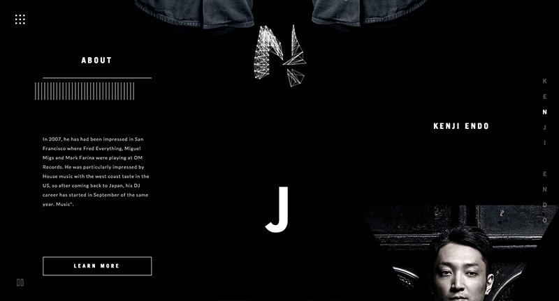
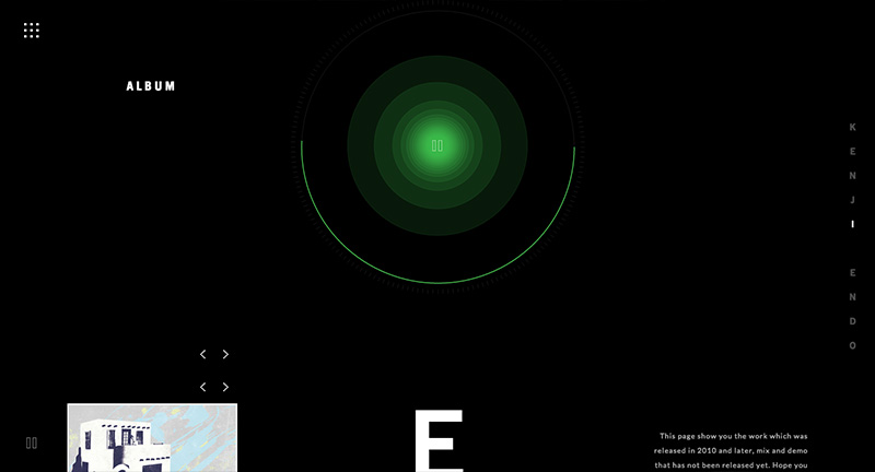
Lovely site for Japanese DJ and musician Kenji Endo. Lots of fun details hidden here, from 3D rollover mesh typography, embedded music players with accompanying sound reactive visuals, lots of little features. Nice layout and design, love the large type, monotone look and feel, with subtle splashes of colour.

Created by Stronghold (@spc_tips).

Site here…

Pal Zileri

By | @id_aquest | No Comments

pal-1
pal-2
pal-3

Site for Italian label Pal Zileri. Slick, simple, and elegant is a good way to describe the site – it feels very well crafted and seamless with the video playing full bleed and images zooming to full screen. The attention to detail is thorough, with lots of nice touches the preloader bar at the top, the menu, the cursor changes, the zooming. It looks great too, nice layout with well considered use of images and type.

Created by AQuest (@id_aquest).

Site here…

Amy

By | @watsondg | No Comments

amy-1
amy-2
amy-3
amy-4

Stunning site promoting a new movie about the musician Amy Winehouse. Divided into main themes about her life brought to life with full screen video and imagery. Love the typography and quotes, with a well designed layout – the menu also looks great. Full of little animations and transitions that ease you through each section. Really great example of a film site…

Created by Watson/DG (@watsondg).

Site here…

Leap Second

By | @active_theory | No Comments

leap-1
leap-2
leap-3

2015 saw a ‘leap second’ – everyone on earth had an extra second to play with. Android asked people to capture those moments and share with the world. The site itself is really well executed, with a great visual interface that captures the moments and themes of the submissions – with a larger video which combines all these moments into one clip. Love the 3D on this too, from the way the images enlarge and the lovely drag around interface – really works great on mobile too! Full of details and incredibly polished.

Created by Active Theory (@active_theory) and Droga5 NY.

Site here…

J. Hornig – Johos

By | @madebywild | No Comments

joho-1
joho-2
joho-3
joho-4

Beautiful site taking you on a journey through Brazil to find a certain coffee bean. The chapter based story depicts scenes from Brazil, photos and video – and simple small snippets of info brought to life through infographics and motion. Lovely layout and story telling really gives a flavour of what the coffee is all about, brought to life with simple and elegant animations and transitions.

Created by Wild (@madebywild).

Site here…

The Great Human Odyssey

By | @overhaulmedia | No Comments

human-1
human-2
human-3
human-4

Online interactive documentary highlighting nomads and their environment. Featuring first person walkthroughs of nomadic people, through their camps, where they hunt and live. Prompts to see videos and imagery pop up allowing you to see more when you want to dive into the detail – a sliding panel arrives with photos, film etc. There is a lot of detail, such as ambient sounds, conversations and insights into these people and their world. Lots of nice transitions, animations, icons and so on – it also looks great and provides an immersive experience.

Created by Overhaul Media (@overhaulmedia).

Site here…

House of Borel

By | @Immersive_g, @_blacknegative | No Comments

borel-1
borel-2
borel-3

Promo site for fashion brand House of Borel. Featuring a mysterious video walkthrough of small details, clicking on each ‘chapter’ reveals a secret layer behind the video highlighting details about the brand and their range of leather goods. Beautifully crafted, with 3D elements, love the dragging mechanism to scroll through the video – very cool and looks fantastic. Loads of attention to detail, nice sound and music, and really like the layout in the detail pages, full of video, depth and nice content – it all looks and works really great – really well crafted.

Created by blacknegative (@_blacknegative) and Immersive Garden (@Immersive_g).

Site here…

Inside Abbey Road

By | @google | No Comments

abbey-rd-1
abbey-rd-2
abbey-rd-3
abbey-rd-4
abbey-rd-5

Take an interactive journey through the iconic recording studio Abbey Road. Using a custom photo shoot and Google Streetview technology to show the insides of the famous studio. The amount of detail is incredible, from historic photos mapped to your viewpoint, inline videos of musicians, and even an interactive mixing studio. They used high res cameras to take ultra high detail of each panorama – if you read the about page you will really see the amount of detail and technical craftsmanship that has gone into this project. You can get lost exploring the studios and all the different views and snippets of information – it is a real feat and a real pleasure to explore – great piece of work.

Created by Google Creative Lab (@google).

Site here…

St. Louis Brown’s Historical Society

By | @HLKagency | No Comments

browns-1
browns-2
browns-3

Lovingly crafted site for baseball team The St. Louis Browns, and their history. Feels very much like an app, with rich photos and video, all with nice typography. Loads of detail and interesting nuggets of info, from photos, balls, and history. Look and feel is nicely grained and with hint of nostalgia – it looks great with accented orange colour – all nicely designed and all in all a rich, interactive, encyclopaedic experience.

Created by HLK (@HLKagency).

Site here…

Mario Testino

By | @marckremers | No Comments

mario-1
mario-2
mario-3
mario-4
mario-5

Lovely new site for the famous photographer Mario Testino. Well thought out and considered, a fresh approach to the photographer’s portfolio. Love the news feed highlighting the latest projects, the project view, where scrolling down scrolls the photos horizontally, and at the end of the page – suggested next reading, and other useful links. There are loads on nice little details like these dotted all over the site. On top of this it all looks great, works really nicely and is responsive too, working great on mobile and tablet.

Created by Marc Kremers (@marckremers).

Site here…

Sonoran’s Valley

By | @hellothierry | No Comments

sonorans-1
sonorans-2
sonorans-3
sonorans-4

Nice creative personal project from creative and developer duo. Using a barrage of 3D effects the site uses Google Maps Streetview to place you in an urban desert complete with volumetric sand, lighting, trees, and audio. Nice little backstory to the project and beautifully crafted the interface, menus, animations and interactions all enhance this cool project. Really pushes the boundaries of what is possible with browser based 3D.

Created by Thierry Ambraisse (@hellothierry) and Samsy (@Samsyyyy).

Site here…

Rockwell Group

By | @codeandtheory | No Comments

rockwell-1
rockwell-2
rockwell-3

Stunning site for Rockwell Group – cross-disciplinary architecture and design practice. Bold and beautiful design feels like reading a top end design magazine. Love the energy in the layouts and movement created by the offset grid and the various templates making up the pages. Projects are presented in a really dynamic way, with bold typography and large imagery and some intelligent sticky elements when scrolling to reveal details about each project. Not only does the site look great, but it also responsive and looks great also on mobile devices – one of the best responsive sites i’ve ever seen. This is what modern web design is all about, beautiful layouts, great functionality, simplicity and elegance.

Created by Code and Theory (@codeandtheory).

Site here…

The DNA Project

By | @hellomondaycom | No Comments

dna-1
dna-2
dna-3
dna-4

Fascinating site for j.views, documenting the creation of the new album. Brilliant insight into how the artist creates new music, from sources of inspiration to soundbites and video clips. Not only a great idea, but executed beautifully – a very exploratory interface with elements animating i.e. waveforms in a hexagonal pattern to represent sound recordings, and a timeline approach. Love the look and feel and all of the small details that breathe in life and dynamism. The DNA view is mental! But harks back to the day of more experimental interfaces and experiences – which ties in hand in hand with the concept.

Created by Hello Monday (@hellomondaycom).

Site here…

Take Your Pulse

By | @_blacknegative | No Comments

pulse-1
pulse-2
pulse-3

Site promoting the wearable tech product ‘Withings Pulse’. Set from the perspective of three people wearing the product in their daily lives, a short film shows what the product does in-situ – sliding panels appear and you can explore in more detail about the product. I like the flow of the journey and the additional info appearing in a nicely designed way, it also looks great, nice palette of colours and fresh design.

Created by Black Negative (@_blacknegative) and Dilshan Arrukati.

Site here…