detail

Brice Darmon

By | @BonhommeParis | No Comments

brice-1 brice-2 brice-3

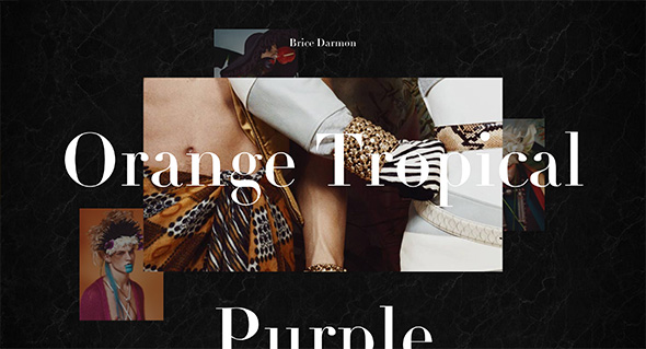
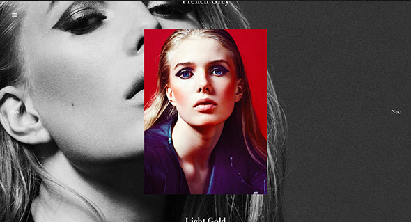
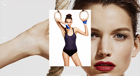
Fantastic portfolio of Parisian photographer Brice Darmon. The homepage shows a multi-layered layout that shows some highlights from each project – click on a project fills the screen with a cool transition that shows an interesting approach – the background image is the next image and the photo in the centre can be enlarged. Love all the cool interaction and transitions, roll over the right or left and the next or previous photo peeks, even the top and bottom peeks to show the next or previous projects. Also love all the masking transitions, looks and feels so slick – the animations are well considered and bring the static shots to life. Great example of modern photography portfolio site.

Created by Bonhomme (@BonhommeParis).

Site here…

Waterloo

By | @Dogstudio | No Comments

waterloo-1 waterloo-2 waterloo-3

Site for French film ‘Waterloo’, telling the story of the famous battle of Waterloo. Focussing on the two sides pitted against each other, Napoleon and Wellington – and describing through iconography the differences between the English and French forces. Nice experience with sounds, full bleed imagery and video – all in a tight layout, with modern interaction design with sliding panels and menus. It looks great too, with the muted colours and distressed overlay.

Created by Dog Studio (@Dogstudio).

Site here…

Design by What Matters

By | @martinagency | No Comments

design-matters-1
design-matters-2
design-matters-3

Promoting Benjamin Moore paints in the US, this room designer allows you to customise imaginary rooms – created by a short test. Asking you to answer a short series of questions, based on your interests – short interactive questions – dragging a slider to show your perfect view and so on. Your answers drive the results of the rooms – and show you the swatches necessary to paint the rooms for real. It is brought to life with lots of animations and transitions – all wrapped up in as minimal as possible interface – all in all it works well and looks great.

Created by The Martin Agency (@martinagency).

Site here…

Aprilzero

By | @aprilzero | No Comments

aprilzero-1
aprilzero-2
aprilzero-3
aprilzero-4
aprilzero-5

Fascinating site created as a side project by Anand Sharma – it tracks his daily movements and visualises it in an interesting way. Using an array of APIs and custom code, a whole host of data is recorded, how much he ran, how many climbs he’s done, how far he’s walked, his heart rate and so on. Using the API from apps such as Moves, Foursquare, Nike+ etc – the interesting part is how the data is organised and visualised. ‘Sport’ focusses on the data such as heart rate, running, walking and so on – where as ‘Explorer’ highlights movements day to day, along with location check ins, photos and so on – the detail is quite incredible. The case study in his blog is worth a read too – really interesting to see the approach and decisions he made along the way. Not only is the visualisation and organisation of the data great, so too is the design, and the finishing touches such as the animation and the transitions – they just bring it all to life.

Created by Anand Sharma (@aprilzero).

Site here…

Universal Typeface – BIC

By | @DDB_Germany, @mediamonks | No Comments

universal-typeface-1
universal-typeface-2
universal-typeface-3

Fantastic site brought to you by BIC pens. Essentially setting out to crowd source a font based on hand writing – from all the contributions on the site for each character. A seemingly complicated task, brought to life in a very simple and easy to understand way – it already has millions of contributions – you can even filter by gender / age / location and so on to see the range of results. It also looks great, I love the way you can see the average character in yellow and can see the different characters in an intuitive and playful way. Really easy to draw your own character, which you can do through your mouse or by connecting your mobile device, again all really made simple for the user. Lovely layout, great fonts, and nice animations and interactions – great piece of work.

Created by DDB Tribal Dusseldorf (@DDB_Germany) and MediaMonks (@mediamonks).

Site here…

Serge Thoraval

By | @jcsuzanne, @jonathandc | No Comments

serge-1
serge-2
serge-3

Site of Serge Thoraval, artisan French jeweller. App like layout and functionality taking you on a journey through the work of the jeweller. Like that you look at one section at a time, like turning the pages of a book, with well considered transitions and zoom in effects to enlarge the pictures – all which injects some personality into the site.

Created by Jonathan da Costa (@jonathandc) and Jean-Christophe Suzanne (@jcsuzanne).

Site here…

VW.com

By | @deutschinc | No Comments

vw-1
vw-3
vw-2

New responsive site for Volkswagen. So many small details to admire, the simplified navigation – to the side – expanding on pressing ‘more’ – so it remains elegant and does not over clutter the screen. Ultra stripped back models page, with the dynamic angles of the cars keeps it interesting. The full screen find a dealer feature – the real time stock inventory – the ‘find a match’ feature – the preloader that runs across the top of the page – the small legal disclaimers that slide up from the bottom of the viewport. Admittedly the site is for the US market, but still car sites are incredibly complicated and this site is really at the modern edge end of the spectrum. It looks lovely and stripped back as much as possible and responds well to different devices.

Created by Deutsch Inc (@deutschinc).

Site here…

VW Beetle – Collection Coccinelle

By | @BonhommeParis, @DDBParis | No Comments

vw-collection-1

vw-collection-2

vw-collection-3

vw-collection-4

Site for the Coccinelle Collection of VW Beetle’s. Full of videos and interactive content – lovely homepage carousel – a bit different to usual – in this case a 3d rendering of the cars in their natural habitat. The detail pages are lovely – a bit of subtle parallax along with interactive elements such as allowing you to change the colour and so on / 360 degree sliders etc. Elegant design and layout, brought to life with nice animations and transitions.

Created by DDB Paris (@DDBParis) and Bonhomme (@BonhommeParis).

Site here…

Jam3

By | @jam3 | No Comments

jam3-1
jam3-2
jam3-3

Lovely new site for Jam3, Toronto based digital agency. Fully responsive, but the desktop variant is alive with lots of animations and transitions that bring to life a lot of the work. So much attention to detail and craft has gone into and it shows! The project pages are interesting and well formatted, and the animations bring it life. Lovely, dynamic example of a responsive agency site.

Created by Jam3 (@jam3).

Site here…

Genealogy of Nike Free

By | @SEHSUCHT | No Comments

nike-free-1
nike-free-2
nike-free-3

Site showing the genealogy of Nike Free trainers through intricate 3d models of key Nike free models. The detail on the model is incredible, with each part of the shoe rendered with Web GL. Attention to detail is great, the noise layer and colour hues at different edges of the Y axis. Nice to see something a bit different to show off some shoes.

Created by SEHSUCHT (@SEHSUCHT).

Site here…

Active Theory

By | @active_theory | No Comments

active-theory-1
active-theory-2
active-theory-3

Site of Active Theory a digital production house in Venice, CA. Their body of work is impressive and is wrapped up in a nicely done, nicely animated site. Love the labs section – where you can see their dabbling in Web GL / Javascript experiments – also nicely shown on the homepage with the undulating interactive circles.

Created by Active Theory (@active_theory).

Site here…

Apocalypse – WW1

By | @ultranoir | No Comments

apocalypse-1
apocalypse-2
apocalypse-3
apocalypse-4

Site for French TV Channel ‘France 2’ – and their programmes about France in WW1. Set like an encyclopedia of important events centred around a map (which like the old school Flash days curls up when you visit events). A very rich interactive site full of videos, images, and transitions – which feels like an old school rich Flash site – when in fact it isn’t – great to see sites like this which aren’t a standard parallax site.

Created by Ultranoir (@ultranoir).

Site here…

Akademie Zubrowka – The Grand Budapest Hotel

By | @watsondg | No Comments

grand-budapest-1
grand-budapest-2
grand-budapest-3
grand-budapest-4

Site promoting the new Wes Anderson film ‘The Grand Budapest Hotel’ – through the guise of on an online course ‘Akademie Zubrowka’ to learn about world of the film. All done through the style of a projector – with lens blur and sliding transitions. Loads of lovely details such as looking at the individual items – zooming in on them. It looks great and the overall visual style of site is quite distinct and matches the film and posters well – really nice example of a film promo site.

Created by Watson / DG (@watsondg).

Site here…

Ibis Expedition – The Ultimate Sleep

By | @anonymous_paris, @betcdigital | No Comments

ultimate-sleep-1
ultimate-sleep-2
ultimate-sleep-3

Interesting idea – to take the an Ibis Hotel bed to the summit of ‘Devil’s Mountain’ for the ultimate night’s sleep. Following a format of a travel / expedition short film – with an interactive timeline, extras and a really cool 3d map. It is a surprisingly sophisticated interactive experience considering the client and subject matter – with loads of transitions / sliding panels / and cool animations. A fantastic example of a modern, sophisticated interactive film.

Created by BETC Digital (@betcdigital) and Anonymous (@anonymous_paris).

Site here…