Yearly Archives: 2013

Escape Flight

By | @b__reel | No Comments

escape-flight-1

escape-flight-2

escape-flight-3


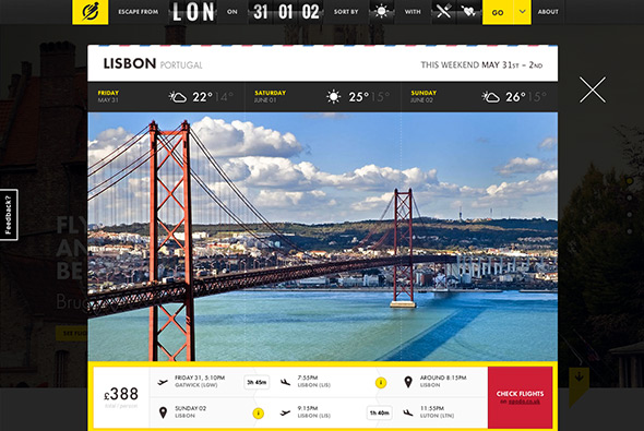
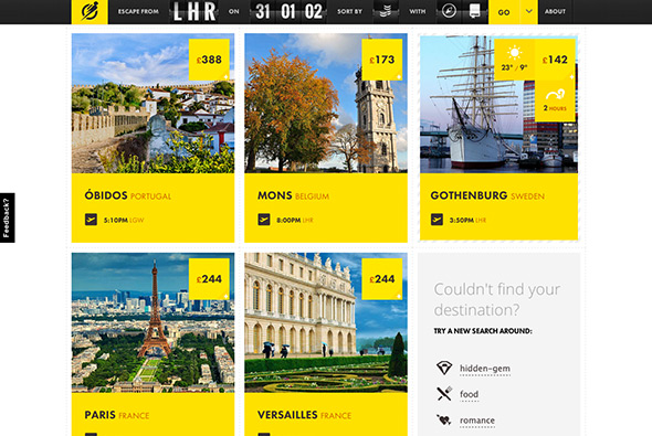
Lovely site for Escape Flight – a search engine for last minute weekend flights for trips abroad. With useful filters such as ‘weather’, ‘culture’, ‘food’, and ‘hidden-gem’ – all aimed at making this a really simple, intuitive way of finding a flight. Really slick animations and transitions everywhere, and lovely design – and great typography. Easy to use and very visual, very modern, very slick.

Created by B-Reel (@b__reel), and Dog Studio (@Dogstudio).

Site here…

Into the Arctic

By | @hellomondaycom | No Comments

into-the-arctic-1

into-the-arctic-2

into-the-arctic-3


Lovely site for Greenpeace documenting their effort to claim the North Pole for nature – and highlighting peoples attempts to exploit the Arctic for resources. The story centres around a 3d map of the region which zooms and pans as you explore the timeline. There is lots of information about the animals in the area and the companies responsible for exploiting the region. All tied together with well considered typography and ‘app’ like design with sliding panels and large touchable buttons and icons. Really informative and loads of animations and transitions – all wrapped up in a great interface.

Created by hellomonday (@hellomondaycom).

Site here…

Under Armour – I Will

By | @firstborn_nyc | No Comments

underarmor-1

underarmor-3

underarmor-2 

Site for Under Armour, sports clothing – another long scrolling site with lots of depth. You scroll through various people doing sports, wearing the clothes and equipment – copy floats on the highest level, background on the lowest – with a line running through the site with images / video scrolling down along with it. Large bold typography really adds to the impact. Nice transitions, cool scrolling effect and animations – all wrapped up in a nice design.

Created by Firstborn (@firstborn_nyc).

Site here…

Kajimai

By | @webdesign | No Comments

kajimai-1 kajimai-2 kajimai-3


Site promoting Yomitan village in Japan. Loads of nice interactions, animations, and transitions – all wrapped up in a minimal interface with large photography. Love the automatic scrolling – and the way scrolling occurs within the image masks – the way you you enlarge the images to view the detail. Loads of nice little touches.

Site here… 

Travis Rice – On His Own Terms

By | @webdesign | No Comments

travis-1

travis-2

travis-3

travis-4

Nice magazine style site documenting an interview with snowboarding maestro Travis Rice. Nice large full bleed imagery, large text and magazine layout. Love the little animations as you scroll, and the transitions to the next section – the current page sliding back and so on. Nice touch is that it is responsive too. Great example of an editorial, easy to browse and read site, will great imagery and subtle animation.

Site here…

Oakley Airbrake

By | @oakley | No Comments

oakley-moto-1

oakley-moto-2

oakley-moto-3


Really cool site for Oakley’s new goggles for Moto Cross. Essentially a long scrolling page – with scrolling triggering animation – in line videos, nice exploded 3d views and so on. The great part of the site is the fact it is responsive, so on the larger screens you get the full parallax experience, on mobile you get a stripped down experience and on in-between sizes you get fewer animations. The animations are fluid and it all comes together to really explain the product well – great example of a responsive parallax scrolling site.

Created by Oakley Digital (@oakley).

Site here…

Ringle 39

By | @Monkeys_Sydney | No Comments

ringle39-2

ringle39-3

ringle39-1

Elegant site for the Ringle 39 sailing boat. Essentially a scrolling brochure site – with the distinct vertical sections highlighting specific features of the boat. Like the effect of depth this site offers – with the descriptive text appearing higher up and linked to the vertical navigation. The slow gentle scrolling is fluid and feels great to navigate through and read through the content. Nice large full bleed imagery wrapped up in a minimal and elegant interface.

Created by The Monkeys (@Monkeys_Sydney).

Site here…

Perrier Secret Place

By | @Ogilvy_Paris | No Comments

perrier-1

perrier-2

perrier-3

perrier-4

Perrier’s epic narrative ‘Secret Place’ – an immersive interactive film, where you choose your perspective featuring 60 people – you then see the story unfold through their eyes. The idea is to find the ‘secret bottle’ to enter a draw to win a holiday. There are lots of different scenarios from cutting a ladies dress off to reveal clues, to a game of poker, to flirting bar men – all with a sexy / weird twist. It is a lot of fun to explore the various story lines and characters – with their being a time limit to find the bottle it encourages you to replay time and time again. Great production value, and art direction – it apparently took Ogilvy Paris 18 months to create all the different scenes and characters. Also really like the summary of the characters and the journey you took through the site – again it makes you want to explore again and again.

Created by Ogilvy Paris (@Ogilvy_Paris) and Fighting Fish (@Fighting_Fish).

Site here…

OWL

By | @wearefellows | No Comments

owl-1

owl-2

owl-3

Site of OWL optics, makers of glasses and sunglasses aimed at the trend conscious. Nice modern, offset grid, minimal layout – looks like a crafted magazine layout. Very simple but the grid looks nice and piques your interest as your scroll through the frames on offer. The sticky elements of the nav work well and gives you some ground in sections where you might want to buy the glasses.

Created by We Are Fellows (@wearefellows).

Site here…

Cheval Blanc Randheli

By | @davidbasso | No Comments

cheval-1

cheval-2

cheval-3

Site promoting ‘Randheli’ a luxury villa in The Maldives. Long page of large full bleed imagery and panels of masked off text – revealing the bright photography. The menu is accessible from the side and slides across the page allowing you to explore the sections. It is also responsive and looks great on mobile devices too. Essentially a very slick brochure style site with some nice transitions and touches.

Created by Uzik (@davidbasso).

Site here…

Florilege – Vacheron Constantin

By | @webdesign | No Comments

constantin-1constantin-2constantin-3


Promotional site for a range of 3 special watches from swiss maker Vacheron Constantin. The watches are inspired by botanical illustration in the 18th Century, and that theme runs through the site. Essentially a long page with sections of detail off to the side – you scroll and animations are triggered as you go. I like the way the text fades in and the illustrations fade in as you go down, each watch has a slick video highlighting the dial – then prompting you to read about the details which are presented in a more editorial way. Really like the style and the execution which feels like a premium magazine feature.

Created by blue-infinity.

Site here…

Kerber

By | @emilolsson | No Comments

kerber-1 kerber-2 kerber-3

Site of Kerber, swedish fashion label. Sleek and minimal design, with large imagery and adaptive layout – elegant concept of large image followed by details for each item, like the rollover state which shows the rear of the item – and the enticing grid of thumbnails at the bottom to see other items in the collection.

Created by Emil Olsson (@emilolsson).

Site here…


Diesel Black Gold

By | @hellomondaycom | No Comments

diesel-black-gold-1

diesel-black-gold-2

diesel-black-gold-3 

Nice site for the Diesel – Black Gold collection. Explore Diesel’s latest catwalk photos and videos for the range. Love the offset grid of images and cool transition to full view, like the way the image resizes and moves. Really interesting method of navigation which unfolds out across the screen – then is ever present transparent and centred in the screen.

Created by hello monday (@hellomondaycom).

Site here…

Assembly London

By | @assemblylondon | No Comments

Assembly Assembly Assembly


Portfolio site of Assembly a branding agency in London. Super simple and elegant layout, scrolling takes you through their projects with big bold typography and relevant images. Nicely laid out grid and cool typography – the execution is direct and to the point – you get an essence of the agency and what they have done in a really elegant way.

Created by Assembly (@assemblylondon).

Site here…