photography

This Place

By | @instrument | No Comments

this-place-1
this-place-2
this-place-3

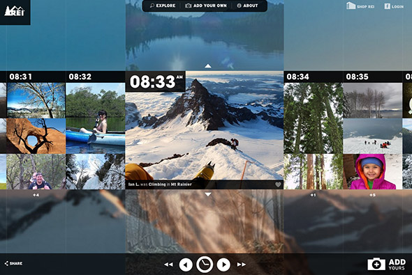
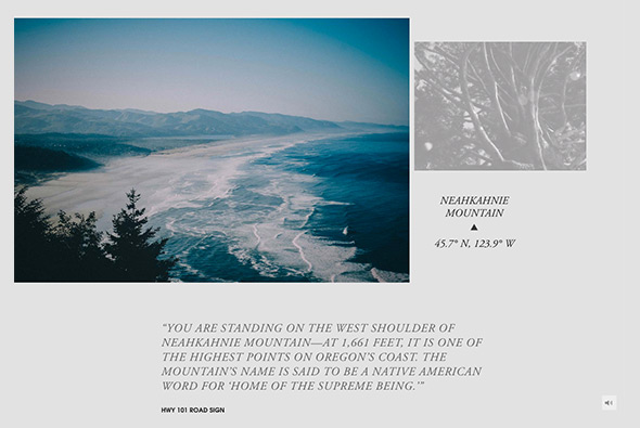
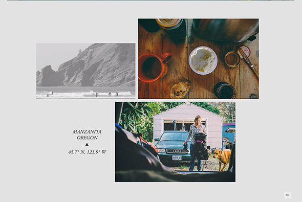
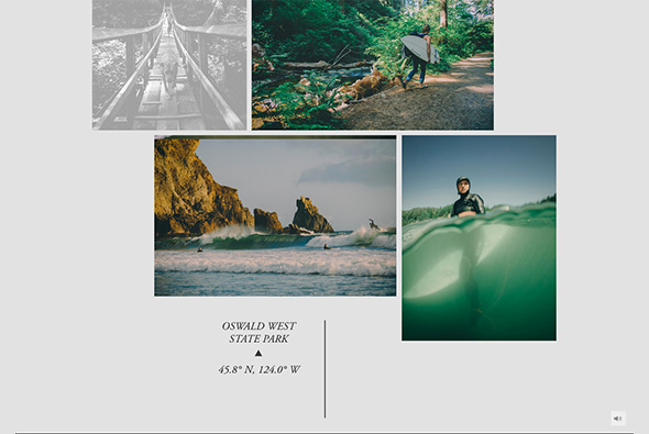
Lovely site ‘This Place’, described as “Everyone has a special place–a spot on earth you hold close to your heart. Like the town where you grew up or met the one you love. The cove where you learned to surf. The secret mountain hideaway where you go to find yourself.” In this first version, the coast of Oregon is explored through quotes and photography. Lots of lovely videos and photography – and a unique way of going through the photos as you scroll down – it all happens within the mask of the image – a really nice touch. Lovely typography and layout – really nicely designed and lots of nice touches, animations and transitions. And its even responsive as well!

Created by Instrument (@instrument).

Site here…

Life Color Clock

By | @thaltd | No Comments

life-color-clock-1

life-color-clock-2

life-color-clock-3

The ‘life color clock’ is a clock which pulls in images from Facebook and Instagram and takes pixel colour values from random places on the image and draws lines from these into the centre of the clock. All brought to you by Shiseido, a Japanese cosmetics brand, really minimal branding and typically Japanese style. The whole experience is really simple and elegant, you can sit back and just watch the whole thing draw out – the screen saver is pretty cool too.

Created by tha ltd. (@thaltd) and yugo p (@yugop).

Site here…

WWF – 40 Years

By | @WWFFrance | No Comments

wwf-1

wwf-2

wwf-3

Stunning site for WWF France – documenting the past 40 years. Featuring an interactive timeline that you scroll through showing video thumbnails – clicking them and they expand to more detail – bit of parallax effect and some light information. Nice timeline shown at the bottom of the page – rollover to expand – which categorises the various events and milestones. Loads of cool transitions and smooth animation throughout, very nice…

Created by WWF France (@WWFFrance).

Site here…

Sonia

By | @84Paris_live | No Comments

sonia-2

sonia-1

sonia-3


Site showing the A/W 2013 range from Sonia Rykiel. Sequence of video clips showcasing key looks which you stop at any minute to see the details. Love the transitions to see the detail and the way you can zoom in and drag around the larger images on the left all in-situ – feels pretty slick. Lots of nice little details – like the progress bar in the top right – changing frame colours, and viewing the full range of looks. Looks great and works well down to mobile phones – really nice piece of work.

Created by 84.Paris (@84Paris_live) and Merci Michel (@MerciMichel).

Site here…

POSTmatter

By | @POSTmatter | No Comments

post-matter-1

post-matter-2

post-matter-3


Site of POSTmatter – best put in their words: “POSTmatter is about the people and projects crossing boundaries. Where art meets science, where fashion crosses over with technology, and where the digital world collides with the physical world. We’re about what’s exciting today and tomorrow.” This is there web equivalent of their iPad edtions. An interesting editorial site with a minimal layout, but some nice touches here and there – with fade to black transitions and and some interesting rollovers. Nice example of a modern digital magazine.

Created by POSTmatter (@POSTmatter).

Site here…

ROCCO Design Architects

By | @pillandpillow | No Comments

rocco-1

rocco-2

rocco-3


Site of renowned architect Rocco Yim showcasing his vast range of work. Really nice offset fluid grid that loads in thumbnails highlighting the projects, love the way the animate in and react to rollovers. Great transitions from one project to the next and zooming in/out – really cool. It was some 2 years in the making this site – everything feels polished and well considered.

Created by Pill and Pillow (@pillandpillow).

Site here…

ATEA

By | @assemblylondon | No Comments

atea-1

atea-3

atea-2

Holding page mini site for ATEA – new fashion label launching in Autumn 2013. Really really simple a long infinite scrolling area of randomised photos and looping videos from their collection – encourages you to sign up and follow for updates. Just liked the way the grid looks and the position of the central logo and the simple interactivity that by itself is just fun to play with. Looking forward to seeing the full site.

Created by Assembly (@assemblylondon).

Site here…

Kajimai

By | @webdesign | No Comments

kajimai-1 kajimai-2 kajimai-3


Site promoting Yomitan village in Japan. Loads of nice interactions, animations, and transitions – all wrapped up in a minimal interface with large photography. Love the automatic scrolling – and the way scrolling occurs within the image masks – the way you you enlarge the images to view the detail. Loads of nice little touches.

Site here… 

Diesel Black Gold

By | @hellomondaycom | No Comments

diesel-black-gold-1

diesel-black-gold-2

diesel-black-gold-3 

Nice site for the Diesel – Black Gold collection. Explore Diesel’s latest catwalk photos and videos for the range. Love the offset grid of images and cool transition to full view, like the way the image resizes and moves. Really interesting method of navigation which unfolds out across the screen – then is ever present transparent and centred in the screen.

Created by hello monday (@hellomondaycom).

Site here…

Ittetsu Matsuoka

By | @sthrs | No Comments

Ittetsu Matsuoka Ittetsu Matsuoka Ittetsu Matsuoka


Portfolio site of Tokyo based photographer Ittetsu Matsuoka. Very minimal interface, essentially explored by scrolling – love the homepage where you scroll and it loads in images from Flickr by the photographer – the interface stays in place. This is a recurring theme – scrolling isn’t what you might traditionally expect – here it explores the images acting as next / back type action. I love the use of white space and the transparency / overlapping – it also uses an interesting vertical dot system for navigating the projects once within ‘project’.

Created by Hiroshi Sato (@sthrs).

Site here…

ELI

By | @mikefey | No Comments

ELI

ELI

ELI

Portfolio of Danish photo retouching studio ELI. One of my favourite features of the site is the way you navigate through the images in each section – scrolling within one of the strips or dragging the title bar. Love the transitions between sections with well considered animation and all wrapped up in a clean and minimal interface.

Created by Frederik Kirketerp and Mike Fey (@mikefey).

Site here…

REI 1440 Project

By | @resn_has_no_i | No Comments

REI 1440 Project

REI 1440 Project

REI 1440 Project

Site promoting REI an outdoor clothing specialist, through an online gallery documenting all 1440 minutes in the day with a photo! The main interface is a grid based layout to explore each minute, nice large photography and slick animation. The time is based on when the photo was taken – I love the way you pick a time – dragging the hands of clock around – it all feels very intuitive and slick. Loads of nice little details and works responsively down to mobile too – all in all great site that looks good and has lots of cool animation and transitions.

Created by Resn (@resn_has_no_i) and BBDO Atlanta (@bbdoatl).

Site here…


Christian Mezöfi

By | @ChristianMezofi, WEBSITES | No Comments

Slick and elegant portfolio of Christian Mezöfi art director and designer. Really minimal layout highlighting visually the range of projects he has worked on. Love the way when changing between projects the layout slides down to visually and mentally see the transition to a new section – so essentially you can view the whole portfolio effortlessly – nice touch. Some really great work in there too…

@ChristianMezofi

Site here…