photography

Mario Testino

By | @marckremers | No Comments

mario-1
mario-2
mario-3
mario-4
mario-5

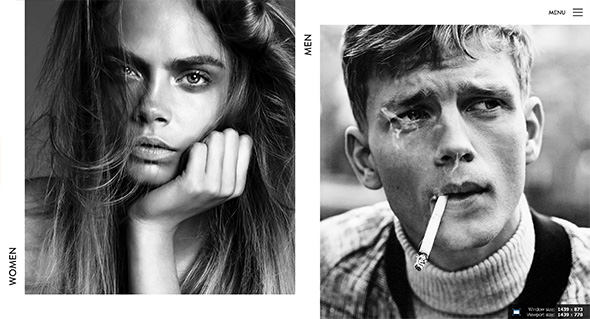
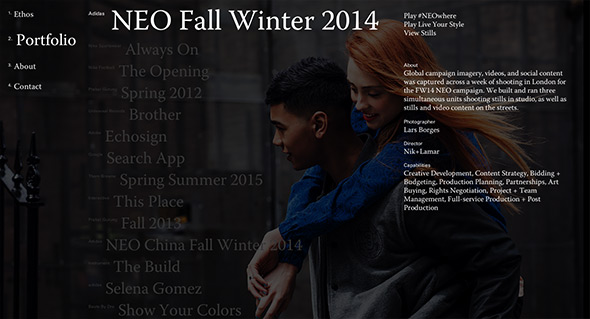
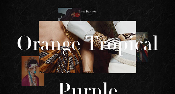
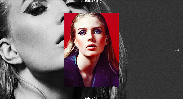
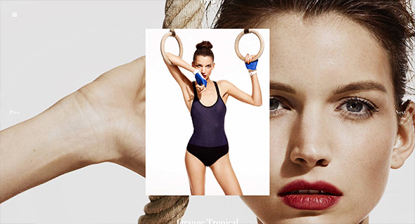
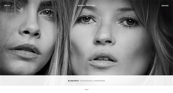
Lovely new site for the famous photographer Mario Testino. Well thought out and considered, a fresh approach to the photographer’s portfolio. Love the news feed highlighting the latest projects, the project view, where scrolling down scrolls the photos horizontally, and at the end of the page – suggested next reading, and other useful links. There are loads on nice little details like these dotted all over the site. On top of this it all looks great, works really nicely and is responsive too, working great on mobile and tablet.

Created by Marc Kremers (@marckremers).

Site here…

Well Storied

By | @ToolofNA | No Comments

well-storied-1
well-storied-2
well-storied-3

Collating social media posts from Land Rover owners and drivers, mapping it and classifying it into an exploratory interface. Love the visual treatment of the map and minimal interface, filter by tag or just explore all the posts. Nicely crafted with interactions and transitions that add to the experience.

Created by Tool (@ToolofNA) and Y&R (@YRNY).

Site here…

Elite Model France

By | @verde_io | No Comments

elite-1
elite-2
elite-3

Nice site for Elite Models in France. Slick and simple, love the offset grid for all the models and bold photographic approach. Lots of nice transitions for the various panels and interface, which creates an elegant and professional experience. It looks great, with nice use of white space and allowing the imagery to do the talking.

Created by Verde (@verde_io).

Site here…

Priestly

By | @campquiet | No Comments

priest-1
priest-2
priest-3

Site for Priestly, creative agency based in Oregon. Stripped back web site with typography led layout, pared back to the essentials. Really simple and effective, and nicely considered – really like the typographic approach and the sticky elements when reading the content.

Created by Camp Quiet (@campquiet).

Site here…

The Great Discontent

By | @greatdiscontent | No Comments

discontent-1
discontent-2
discontent-3
discontent-4

Nice refresh of the The Great Discontent website, a magazine about creativity, entrepreneurship, and risk taking. The online version is a beautifully laid out variant of the printed magazine, with lovely typography and nice photography. Nicely considered for the screen, with nice big copy for reading the interviews and the pull out quotes – nicely structured too, easy to find other articles and browse around. And it is responsive too, nicely done…

Created by The Great Discontent (@greatdiscontent).

Site here…

Slanted

By | @raphaelbastide | No Comments

slanted-1
slanted-2
slanted-3

Unique site for photographer Enrico Floriddia. Love the CV-esque approach that explains the work through writing rather than simple thumbnails, click on one of the projects and viola thumbnails appear, click on them and see how it all expands. Really nice, unexpected, original execution of a portfolio website.

Created by Raphael Bastide (@raphaelbastide).

Site here…

Brice Darmon

By | @BonhommeParis | No Comments

brice-1 brice-2 brice-3

Fantastic portfolio of Parisian photographer Brice Darmon. The homepage shows a multi-layered layout that shows some highlights from each project – click on a project fills the screen with a cool transition that shows an interesting approach – the background image is the next image and the photo in the centre can be enlarged. Love all the cool interaction and transitions, roll over the right or left and the next or previous photo peeks, even the top and bottom peeks to show the next or previous projects. Also love all the masking transitions, looks and feels so slick – the animations are well considered and bring the static shots to life. Great example of modern photography portfolio site.

Created by Bonhomme (@BonhommeParis).

Site here…

Photomap

By | @__chriswang | No Comments

photomap-1
photomap-2
photomap-3

Site from Chris Wang, a designer & art director, created to showcase his photography. Looks great and is full of elegant animations and transitions, love the typographic masking on the homepage. Lot of nice touches that bring to life the photography, love the preloader for each of the sections while the images in the set load, and again the transitions between the photos. Top class stuff…

Created by Chris Wang (@__chriswang).

Site here…

Thomas Ciszewski Photography

By | @coc6 | No Comments

thomas-ciszewski-1

thomas-ciszewski-2

thomas-ciszewski-3

Lovely site for the photography of Thomas Ciszewski. Love the large typography and large photography – loads of slick transitions and a lovely feeling of consideration. The minimal layout lets the photos pop, and the fullscreen mode is fantastic. There is also a quick view for the projects offering a more zoomed out view of the work. Very slick.

Created by Thomas Ciszewski (@coc6) and Jean-Christophe Suzanne.

Site here…

Sonia Rykiel – S/S 2014

By | @84Paris_live | No Comments

sr-1
sr-2
sr-3

Another great piece of work for Sonia Rykiel, this time revealing their pre Spring / Summer 2014 collection. Loads of super slick animations and transitions and details, especially like the little preloaders in different styles and positions – never overlaid across the visuals. The transitions from the grid to the detail view are pretty cool, and the way you see more tiles on the grid is great.

Created by 84 Paris (@84Paris_live).

Site here…

Rod McLean

By | @CanvasGroup | No Comments

rod-mclean-1
rod-mclean-2
rod-mclean-3

Site of photographer Rod McLean. Slick site, with several nice interactions, animations, with a nice intro and homepage. Really simple, but executed nicely – black backgrounds let the photos stand out, and the smooth transitions that reveal the images make exploring them fun. Nice example of a responsive, photography portfolio.

Created by Canvas Group (@CanvasGroup).

Site here…