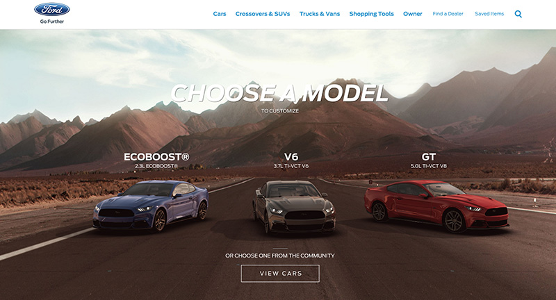
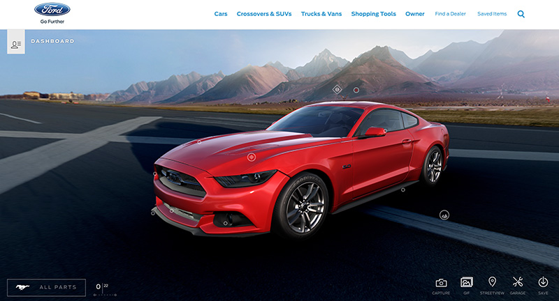
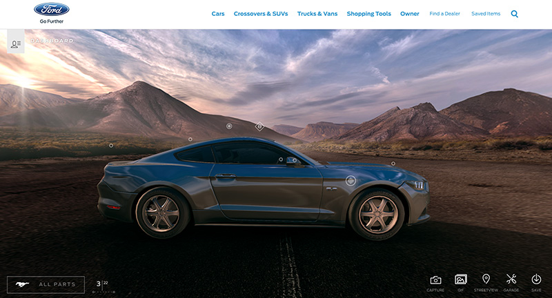
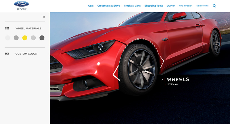
Fantastic 3D customizer to allow people to customize a range of Ford Mustangs. Love the detail and fidelity of the experience, from the amazing 3D model that renders wonderfully in browser that you can rotate and view from any angle. Love the way they have integrated the hotspots to allow you change options on the range of equipment and features. Taking cues from video games – and integrating slick transitions – makes for a playful and fantastically polished experience.
Yearly Archives: 2016
Another lovely B&O site, this time promoting their new wireless in ear headphones. Love the small interactive moments that tell the story and pull out the key features in a playful way. Nice design and interesting photography and location choice too – interesting moments of video scrubbing on scroll. Nice modern one-pager that pulls out all the details that users will find interesting wrapped in a nice to explore experience.
Site showcasing the collaboration of FILA and Marion Bartoli. A limited edition collection is shown through a series of colourful transitions and interactivity that showcase the range. Nice touches include the thumbnails for colourways that cycle over time, love the art direction and colour. Fun playful way to inject a lot of personality into the experience.
Created by Domani Studios (@domanistudios).
Site documenting various people who live in Tokyo, their lives, and their tips & recommendations for the city. In their own words “a community driven initiative that seeks to establish the modern Tokyojin. We aim to authentically and organically capture, document, and communicate Tokyo’s unique urban culture through the insight and experience of the very people that shape it while redefining what it means to call Tokyo home.” Interesting form of storytelling through in depth journeys. Lovely photography and design, love the blend of inline video and sprinkles of Google Maps that bring the stories to life. Nice transitions and art direction tie it all together to create a compelling experience.
Created by Monopo.
Site for XXIX NYC based design agency. Love the minimal approach and the iframed sites / project windows that showcase their body of work. A lot of the annotations down the side lead to windows where that particular site/visuals is displayed. Type led treatment that makes a bold statement, elegant and simple way of getting across their work in a fresh and modern way.
Created by XXIX (@twentynine_nyc).
Fantastic portfolio of Martin Wecke, designer & coder based in Berlin. Love the mechanic of iframed sites that sit to the left – showing the work in-situ – appearing as you scroll down the page. Minimal and elegant mix of inline sites and imagery letting the work speak for itself. Love the rotating ‘chart’ mapping individual project to types of work – very cool and interactive. Lovely, modern and fresh innovative portfolio.
Created by Martin Wecke (@martinwecke).
Site for the re-release of iconic Italian architect Gae Aulenti’s outdoor furniture collection. Lovely colourful and playful site that shows the range of furniture. Really like the product detail pages, as you scroll down towards the end the colour of the page and furniture changes to show the range of available colours. Also love the homepage mechanic of scrolling through the range and the seamless transitions from thumbnails to detail page. Lots of lovely details, animations and transitions that create a modern site full of personality.
Created by Studio Gusto (@GustoIDS).
Nice dive into some of the Polish arts, lovingly titled ‘A foreigners guide to’. Several interactive guides take you through the history of Polish cinema, photography and electronic music. Using a mixture of bold type, vibrant hints of colour and b&w photography to bring stories to life. There is a lot of polish and detail throughout, many transitions and animations to bring the content alive – love the mix of interactive moments such as timelines and so on – you can tell it has been a real labour of love.
Created by Bright Media (@brightmediapl).
Site for UK based digital agency Cuberto. Full of slick transitions and nice interaction details that reveals a nice body of work spanning mobile web and native apps. Like the video headers that transition seamlessly into the project case studies. It looks great, with well considered typography and nice layout to create a fresh and modern agency folio.
A collection of lovely Web GL driven particle experiments. Lovely presentation of some beautiful particle visualisations, ranging in complexity. Fun to play with and love ability to play around with the output via the control panel. Very slick wrapper that showcases this creative developer’s skills.
Site of designer and artist Yanto Maszewski. Type driven design with shards of imagery interspersed in the layout on rollover. Nice clean layout with offset grid of imagery for each of the project pages.
Created by Villa Böhnke.
Campaign site for HP and their campaign ‘Magic Words’, a documentary that tells stories of illiterate people in Brazil and how HP’s new technology translates voice to print. Nice companion site that houses the documentary and showcases some of the characters who spoke for the book. Nicely designed, with some good interactive flourishes such as the gallery of speakers and the animated logo.
Created by AlmapBBDO (@almapbbdo).
Fun site for French digital agency Waark. Playful interactivity and transitions bring a splash of fun to this agency’s body of work. Love the transitions from section to section, there’s a lot of personality injected into this experience, from the bouncy boxes, animations, and subtle interactivity.
Created by Waark (@waaark_studio).
Site showing the Central Saint Martins Degree Show for 2016. Fun, playful switches for ‘undo redo’ that flick on/off when you interact with the part of the design, that flows down the side. Very simple long scrolling site that allows you to see all the graduates and visit their sites in a quick and easy way. Fun, colorful and playful.
Created by No Plans (@noplansstudio).