Site for freelance Art Director & Designer. Simple type based home screen, on rollover large imagery represents the project. Slide in panel appears on click reveals nice layouts and designs for each project. Nice body of work, wrapped up in a slick and nicely designed site.
Yearly Archives: 2016
Love this companion site for Bastille’s new album ‘Wild World’. In a collaboration with Spotify this site maps the cities streaming the album and creates 3D ‘storms’ that represent the activity in those cities. Beautifully executed and playful site, that simply shows a world of activity and movement. Nice idea and fun to play with.
Created by Active Theory (@active_theory).
Site documenting Japanese style, art, culture and design. Wrapped in a fun minimal site with small moments of playfulness. Love the header that pops out, and collapses as you navigate the site, and the cool rollovers where the image inside the mask grows but mask shrinks. Fun scroll based animations and light white space layout lets the content shine.
Created by Michele Angeloro (@micheleangeloro).
Site of Italian design firm specializing in 3D renders and animation. Dark and simple – love the layers of the hero images slightly moving and the nice text transitions. Nice thoughtful project pages that inject a sense of movement and show the work in a simple way. Lots of nice little details that lift the experience and add some personality.
Created by Adoratorio (@adoratorio_cc).
An audio documentary site that shows childhood dreams. I love the way they have visualised the audio along with the transcript. Also love the exploratory nature of the experience – with the coloured bars at the bottom that let you explore the range of audio. Lovely background music and sound design.
Created by Belle and Wissell (@BelleandWissell) and Yonder.
Site documenting a series of artworks from Japanese artist floating around a singular source of light. You can zoom in and cycle through the images in a floating view that pans and rotates around the circle. Very simple and interesting way to show a body of work.
Created by Hiroshi Yoshida & Yoichi Kobayashi (@ykob0123).
Lovely site for label Maison Ullens. Beautifully designed with an elegant scrolling mechanic to discover the labels range. Love all the seamless transitions from one page to the other and the detail view for each item, that lets you cycle through the range easily. Lots of small and thoughtful animations, transitions and interactions that provide a sophisticated and refined experience.
Created by We Are Period (@WeArePeriod).
Site of Italian photographer Anna Morosini. Nicely crafted portfolio divided by category of work, love the offset grid and minimal layout reliant on slivers of imagery which expand with interaction. Love the whitespace and feeling of calm the layout offers, nice transitions between imagery. Some interesting interaction models dotted throughout, love the scroll to close image in the portrait section.
Created by Studio Gusto (@GustoIDS).
Site of Sean Klassen UX/UI designer co-founder of Legwork Studio fame. Lovely site that details his body of work over the years, nicely restrained to 5! Love the nav down the left that changes based on scroll position, lots of nice little details that inject personality into the folio, nice work!
Created by Sean Klassen (@seanjklassen).
Site of Chinese based designer and coder Du Haihang. Nice exploratory of visual code experiments that play with 3D, textures, and physics. Simple scroll mechanic to go through the experiments, love the transitions and bold type – nicely wrapped up in a minimal interface, fun to play around with.
Created by Du Haihang.
Site for digital agency based in the US. Lovely transitions and beautiful design make this site a joy to look at and use. Love all the small transitions and interactivity, on the homepage love the way the year marker scrolls down around the project tiles over time. Project pages look lovely, and have a sense of energy and emotion with lots of small details love the preloader too – that just reveals the logo. Loads of fun micro interactions and great type, layout and design.
Created by Welikesmall (@welikesmall)
Site for French agency Femme Fatale. List of projects that as you cycle through they transition nicely between one another – text splits, and image inside mask slides. Simple layout and case studies that highlight the motion design from the projects with inline video. It looks great too, with nice bold type and large imagery.
Created by Femme Fatale (@HiFemmeFatale).
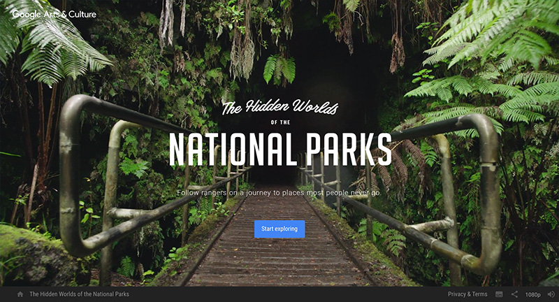
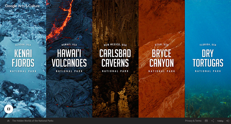
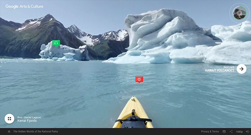
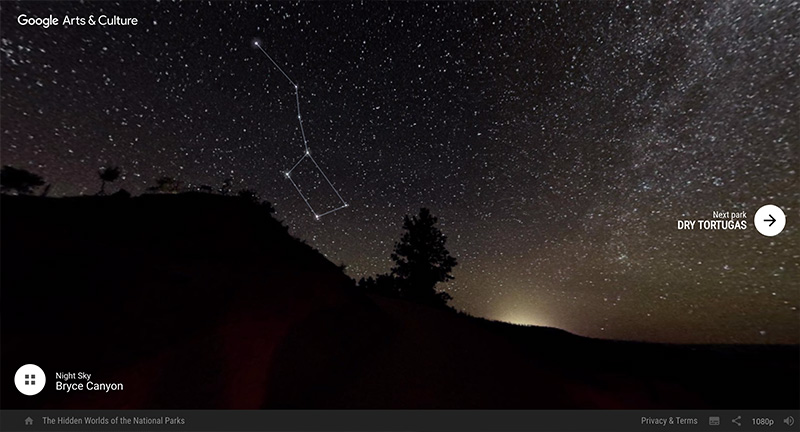
Lovely site promoting 100 years of the American National Parks System. Choosing five of the hardest to access National Parks, Google brings an immersive exploration of these parks guided by the rangers that work there every day. You can explore a crevasse, fly with thousands of bats, soar over an active volcano, dive through shipwrecks – many shot with 360 video/audio. Each location has a few interactive moments, like scrubbing through time to see glacier melt. High production values, and a beautiful and immersive experience taking you to these iconic National Parks.
Created Google Brand Studio (@google) & Stinkdigital (@stinkdigital).
Site of Gabe Ferreira US based designer and creative. Love the ultra minimal approach, beautifully pared down UX and design that really lets the work shine. Some fun interactive moments like the rollovers on the projects, and blur transitions that just add some dynamism into the site. Lovely work too!
Created by Gabe Ferreira (@gabe_ferreira_).