Yearly Archives: 2016

Consortia

By | @webdesign | No Comments

consortia-1
consortia-2
consortia-3

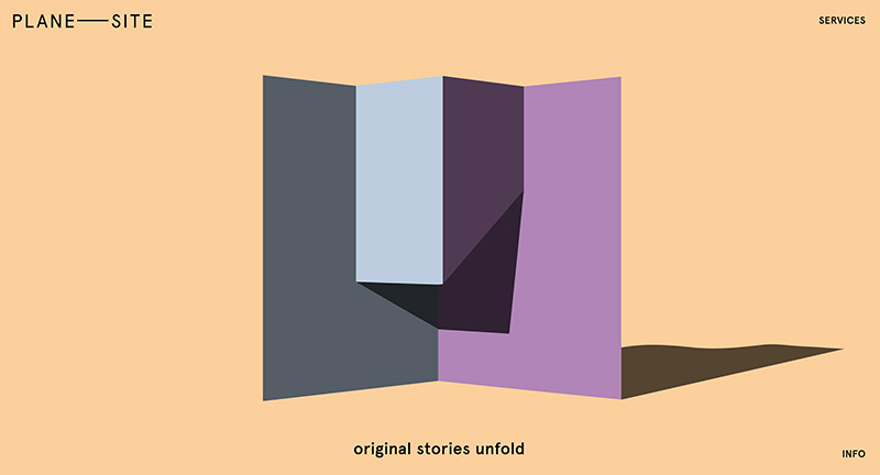
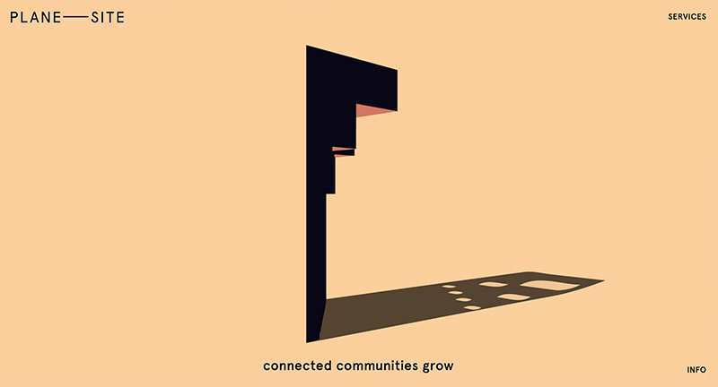
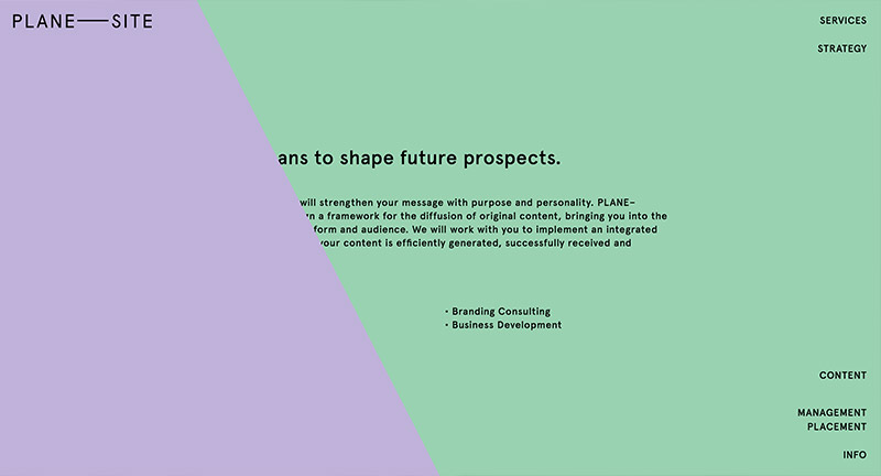
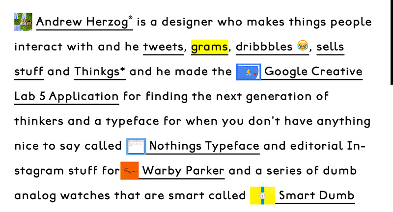
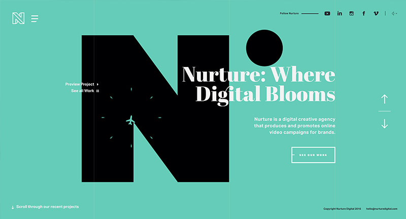
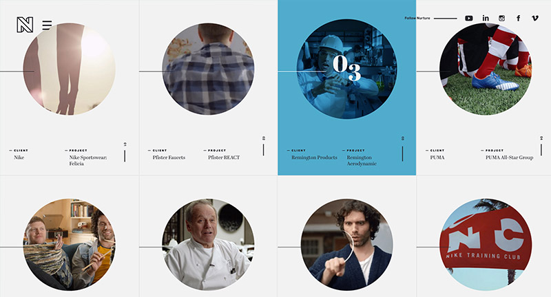
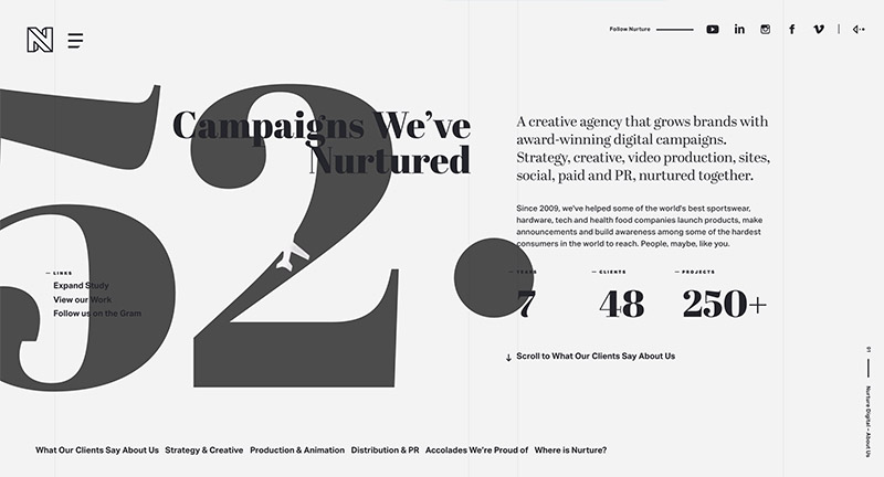
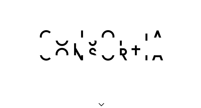
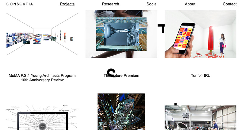
Site for digital agency and research group Consortia. Lovely scrolling intro that pulls apart the logo and dives you into their lovely folio of work. Simple interactivity that splits the page to reveal the project detail in-situ. The component parts of the logo follow you down the page and add a nice element of depth.

Created by Lucas Lind.

Site here…

HAUS

By | @madeinhaus | No Comments

haus-1
haus-2
haus-3

Site of LA based digital agency HAUS. Nice animated intros to each project, with nice level of detail for each of the project pages. Lots of nice details that elevate – such as the contact page where you can play a game on the map, the menu page with awesome bg animations. All in all a well designed and executed modern agency site with lots of personality.

Created by HAUS (@madeinhaus).

Site here…

Fornasetti

By | @cartelle | No Comments

fornas-1
fornas-2
fornas-3

Refresh of the Fornasetti homepage – Italian design house from Milan. Featuring motifs from their products floating around a 3D space in varying scenes. Fun, playful interactivity and it looks great – nice intro to the site with no clear purpose other than being cool.

Created by Cartelle (@cartelle).

Site here…

Nicolas Errera

By | @fcinqagency | No Comments

composer-1
composer-2
composer-3

Site for French composer Nicolas Errera. Love the full screen scrubber on the homepage showing the progress of the music – lots of nice visual cues to show the progress. Also love the way the page builds up with blocks transitioning into the layout. Looks great, fun to play with and nicely executed.

Created by FCINQ (@fcinqagency).

Site here…

The Next Rembrandt

By | @JWTAmsterdam, @tastysuperhero | No Comments

remb-1
remb-2
remb-3
remb-4

Interesting project to 3D print a new Rembrandt painting from special software written to recognize and read a vast library of his paintings. The website itself takes you on a scrolling journey through how they tackled it, with sliding panels bringing in more info. So many nice details, from the animation and transitions to the lovely design. Thoughtful UI and interaction, brought to life with great imagery and short videos.

Created by JWT Amsterdam (@JWTAmsterdam) and Superhero Cheesecake (@tastysuperhero).

Site here…

Plane Site

By | @owenhoskins, @plane_site | No Comments

plane-1
plane-2
plane-3

Site for Berlin based agency that specialise in content creation. Love the visual metaphor of the piece of paper that rotates and moves as you scroll to reveal new patterns and color, very elegant and interesting way of presenting a concept of what they do. Nice nav along the right hand side that appears when you get into the more detailed sections.

Created by Plane Site (@plane_site), Ben Roth, and Owen Hoskins (@owenhoskins)

Site here…

Nurture Digital

By | @wengerstoybus | No Comments

nurture-1
nurture-2
nurture-3

Site for US based digital and video production agency Nurture Digital. Love the masked showreel in the background as you scroll through the background changes with colour and animation – highlighting that project. It is beautifully designed, nice bold typography and full of great detail and animations – love the way the transitions on the homepage to see individual projects. The project view looks great, love the intro panel which transitions to full screen video then detailed panel down the side appears as you scroll. One of the nicest agency folio sites i’ve seen for a while.

Created by Bryan James (@wengerstoybus).

Site here…

Boombotix Pro

By | @altolabsdesign | No Comments

boom-1
boom-2
boom-3

Lovely site for Boombotix Pro, a portable speaker. Really nice way of highlighting the top level features of the device from draggable 3d models to nice background video highlight the water resistant feature. Lots of nice details such as navigation down the side, nice simple light site that gets the key points across. And – it looks fantastic!

Created by AltoLabs (@altolabsdesign).

Site here…

Porsche Blackbox

By | @onformative | No Comments

porsche-1
porsche-2
porsche-3

Taking racing data from a Porsche and mixing it with audio and visualising the results. Lovely rich, dynamic 3D experience, love the way the lines roll across the car and particles flow to highlight the profile of the Porsche. Nice colours and shapes that really offer a sensation of speed as the car ‘drives’ through the data. Nice idea and well crafted experience.

Created by Onformative (@onformative).

Site here…

Dada Data

By | @akufen | No Comments

dada-1
dada-2
dada-3

Lovely site celebrating 100 years of the Dada movement. Love the singular large canvas type execution, with multiple layers, imagery, and type – when navigation you scroll your viewport to another part of the canvas. There is a lot of depth to the site, from bizarre interactive games pairing up with your phone through to explorative profiles on artists and history. Beautifully executed and a lot of fun to explore.

Created by Afuken (@akufen).

Site here…