Yearly Archives: 2016

Small Victories

By | @twentynine_nyc | No Comments

sml-vic-1
sml-vic-2
sml-vic-3

Site for Small Victories a neat service that converts a Dropbox folder. Simple premise, simple site that walks you through the process in a step by step way, in a fun interactive way. Love the scrolling mechanic that scrolls the ‘pages’ of content whilst the rest of the site is sticky – fun and quirky, gets the across the simplicity through its execution.

Created by XXIX (@twentynine_nyc).

Site here…

Made by Six

By | @madebysix | No Comments

six-1
six-2
six-3

Site of UK based design agency Six. Elegant portfolio of work that spans branding & digital design for clients all over the world. Nice and simple way of presenting their work in an editorial style layout with lots of nice transitions that create a seamless experience when traversing their projects.

Created by Six (@madebysix).

Site here…

Paper Planes

By | @active_theory | No Comments

paper-planes-1
paper-planes-2
paper-planes-3

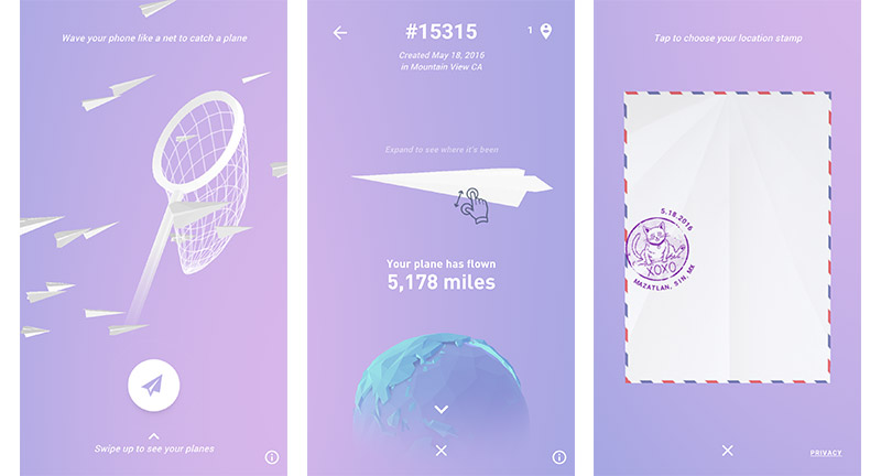
Lovely site for those at the 2016 Google I/O, as a way for people to spend some time and interact with the large screens in the intervals. The lovely thing about it is the mechanic and the way it worked on mobile, you would create a plane, place a geo-located stamp, fold it up, rotate your phone to landscape and imitate throwing a plane – the phone would vibrate and a little ‘swoosh’ noise would play. Once launched you could then catch other planes with a net, again moving around your phone like a net to capture a plane, once you caught one – you could again unfold it and add your stamp, and again launch it back out. Such a simple, but beautifully executed & crafted experience, using all the features of your phone to create a truly mobile first experience.

Created by Active Theory (@active_theory).

Site here…

Studio Chevojon

By | @mashvp | No Comments

chevojon-1
chevojon-2
chevojon-3

Site for French based photography studio Chevojon. Slick and simple, scroll through the photos – love that mask reveal transition – nice use of type too. I also like the menu, in that it opens up into a sideways scroll page that reveals a bit of information about the studio and other pieces that you might want. Project page is great too, with lots of lovely transitions and animations provide a nice smooth and premium feel and elevate the photography.

Created by Mashvp (@mashvp).

Site here…

Theremin

By | @femurdesign | No Comments

theremin-1
theremin-2
theremin-3

Simple interactive musical synth instrument in the browser. Awesome fun to play around with, simply click and drag around to change the pitch, and controls at the bottom allow you to customise the sound variables. There is even a companion app to download so you can record your creations.

Created by Femur (@femurdesign).

Site here…

Matt Irwin

By | @YESstudio | No Comments

mat-irwin-1
mat-irwin-2
mat-irwin-3
mat-irwin-4

Awesome folio of photographer Matt Irwin, sadly he has passed away but Yes Studio wanted to launch his lovely body of work. Love the absolute simplicity of the experience, click to proceed to the next image in a constant cycle. His work reveals such personality not only of the subject but the character of the photographer himself – curiosity and playful. Small subtle details such as the about section, and the navigation changing accent colours is a nice touch. Lovely, elegant site that hones in on the absolute simplicity of showing great photos.

Created by Yes Studio (@yesstudio).

Site here…

Stinkdigital

By | @stinkdigital | No Comments

stink-1
stink-2
stink-3
stink-4
stink-5

Lovely refresh of global agency Stinkdigital’s website. Clean and fresh and fast, the site shows a great folio of work. Love the transitions from page to page and pleasing gradients that accompany them, nice detail on the project pages with a mix of animated gifs, video content, and imagery. Really like the about page, and love the way they represented the different offices timezones is a smart and playful way.

Created by Stinkdigital (@stinkdigital).

Site here…

Maison Nue

By | @MaisonNue | No Comments

maison-1
maison-2
maison-3
maison-4

Site for Parisian based creative studio Maison Nue. Lovely typography led layout, love the first section where rolling over the types of work reveals imagery which then blurs and fades into the background. Also love the feature of cycling through ‘what you like’ which highlights the projects that you might like. Like the way the project thumbnails are revealed inline into the text. Simple, fun, and elegant.

Created by Maison Nue (@MaisonNue) and Tristan Bagot.

Site here…

Navigating Responsibly

By | @SprngSmmr | No Comments

navi-1
navi-2
navi-3
navi-4

Great site for Danish Shipowners Association, highlighting how they are tackling key issues and showing stats and data on shipping. I love the way they bring their story to life through a long scrolling site that pulls out key stats and makes them tangible, like the banana. Love the way they have divided the chapters and if you click on the short nav it jumps straight to that section rather than scrolling you down. It looks great too, with well considered design, colour coded chapters, and nice type.

Created by Spring / Summer (@SprngSmmr).

Site here…

Apollo 17

By | @benfeist | No Comments

apollo17-1
apollo17-2
apollo17-4
apollo17-3

Fascinating real time experience of Apollo 17 – the last lunar mission. Featuring all the radio transmissions, photography and video as it was shot over the course of the mission. This ambitious site catalogues it all in a real time experience – allowing you to jump around the timeline to relive the action.

Created by Ben Feist (@benfeist).

Site here…

Bundy Bundy

By | @madebywild | No Comments

bundy-1
bundy-2
bundy-3

Site for German hair salons Bundy Bundy. Lots of different sections highlighting the key offerings of the salons, such as colour, style etc. Nice video intros to each section and lovely photography throughout, layouts look good with an editorial slant. Lots of small interactive details scattered throughout rounding out the whole experience.

Created by Wild (@madebywild).

Site here…

Ivy Park

By | @webdesign | No Comments

ivy-1
ivy-2
ivy-3

Site for Beyonce’s new active line Ivy Park. Big, bold, and full of attitude – hold down button to switch tracks. Photos, videos, gifs all play a part in this monochromatic experience. Love that when you open the menu, the music dims a little. The brand expressed through simple and bold web experience.

Site here…

Locomotive

By | @LocomotiveMTL | No Comments

loco-1
loco-2
loco-3
loco-4

Site for digital first agency Locomotive based in Canada. Full of transitions and animations, I love the diversity of the layouts for the project pages. Each project has its own colour palette which transitions when you visit other sections. I love the energy in each of the sections, from the fun ‘play’ section of the site to the detail when you reach the end of a case study – love the colour fade. Full of detail and beautifully designed, great example of a modern agency site.

Created by Locomotive (@LocomotiveMTL).

Site here…

Bear’s Eye View of Yellowstone

By | @hellomondaycom | No Comments

bear-1
bear-2
bear-3
bear-4
bear-5

Lovely site for National Geographic, documenting four resident bears in Yellowstone through their daily activity and cameras mounted to their necks. Fascinating insight into where the bears go, what they do and how people interact with them. Beautifully designed too, love the scrolling mechanic that tracks the position across the map for each bear pulling out key moments. Lots of nice details such as the progress bar along the left edge of screen, and little prompts for action. Lovely example of a long form

Created by Hello Monday (@hellomondaycom).

Site here…