north america

Voyages

By | @nytimes | No Comments

voyage-1
voyage-2
voyage-3
voyage-4

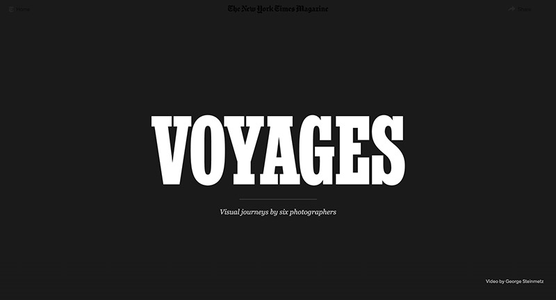
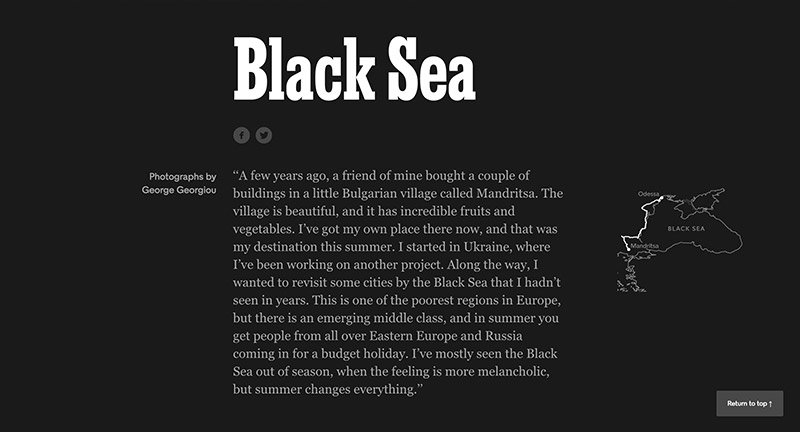
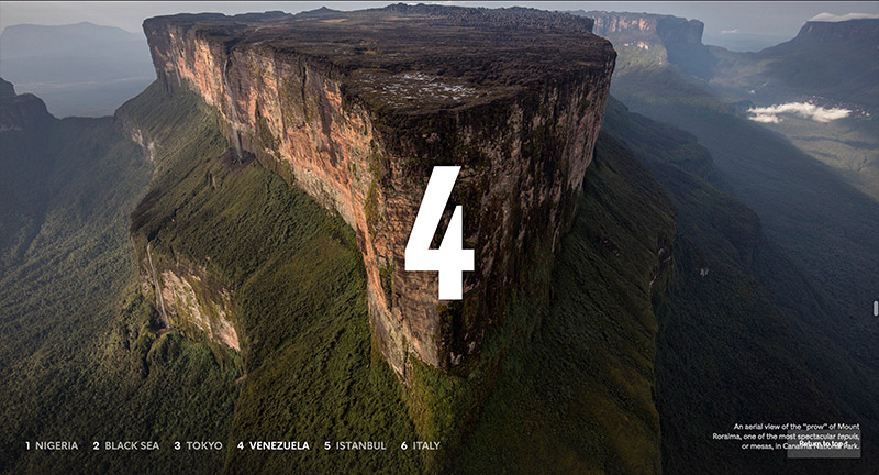
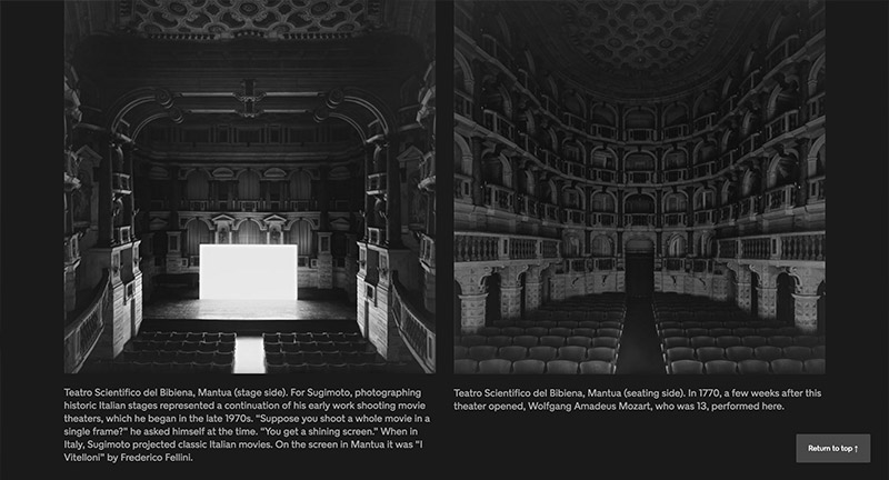
Lovely photo journalism piece documenting six visual journeys in Nigeria, Black Sea, Tokyo, Venezuela, Istanbul, and Italy. Lovely full bleed imagery and video mixed with simple introductions and background to each story. Simple and elegant – really nice bit of interactive storytelling.

Created by NY Times (@nytimes).

Site here…

Epicurrence 3

By | @letsgorally | No Comments

epi-1
epi-2
epi-3
epi-4

Site of Epicurrence conference of inspirational creative speakers set in Park City, Utah. Great example of a simple one pager site – elevated through stunning design and nice considered use of parallax. Love the bold colour, large imagery, and big type – lots of small nice details – nice.

Created by Rally Interactive (@letsgorally).

Site here…

Active Theory

By | @active_theory | No Comments

active-1
active-2
active-3
active-4

Lovely update to digital agency Active Theory. Nice approach to the homepage – full screen case study video clips cycle through their latest projects. Dive into the work and find a similar setup – screen captures and videos – letting you see the magic. Love the slide out projects menu on the right, fantastic scrolling effect where the mask moves quicker over the underlaying image. The site is full of detail and great interactions, animations, and transitions – love the peeking strips on projects on the project view – the main menu features a cool 3D logo – lots of cool particle rollover effects. Great attention to detail and a fantastic example of a modern, fresh and beautifully executed site.

Created by Active Theory (@active_theory).

Site here…

America’s Most Admired Lawbreaker

By | @gladeye | No Comments

lawbreaker-1
lawbreaker-2
lawbreaker-3
lawbreaker-4

Lovely long form article on the story behind Johnson & Johnson – from the Huffington Post. Loads of great UI moments and nice approach to dealing with this amount of content and allowing users to navigate it in an interesting and compelling way. From the slide out menu detailing chapters, nice typography, to the sticky timeline along the left side which provides a nice reference marker. I love the use of illustrations to break up the content, some of which are interactive infographics, or nice parallax moments that play with depth. Considering the subject I love the way PDFs documenting evidence and letters etc backup the story. A fantastic take on in-depth interactive storytelling.

Created by Gladeye (@gladeye).

Site here…

Performing Arts with Google

By | @google | No Comments

ci-1
ci-2
ci-3
ci-4

Site for Google’s Cultural Institute. Teaming up with some of the worlds most iconic venues and performances experience these moments from the stage in 360 video. Lovely type treatment and nice bold imagery, love the 360 video which really dives you into the experience. One of the things I love about it is how nicely it works on mobile, with an option to use your gyro or swipe to scan around the environment. Nice work.

Created by Google Brand Studio (@google).

Site here…

Our Brand is Crisis

By | @watsondg | No Comments

crisis-1
crisis-2
crisis-3

Site promoting the new film Our Brand is Crisis. Beautifully designed, with a cool navigation mechanic – sliding panels bring in more info when needed. Love the full screen video and bold type driven layout. Cool integration of a Tumblr blog too – fun and great looking site.

Created by Watson/DG (@watsondg).

Site here…

SF Book Club

By | @LandscapeSF | No Comments

sf-1
sf-2
sf-3

Site for San Francisco International Book Club, who in their own words “writes about and distributes books related to art, design, architecture, crafts, photography and fashion as well as everyday objects.” Nice horizontal infinite scroll experience that shows the range of products. Click on one to go into more detail – love the way you see the range of images – dependent on horizontal cursor position. Lovely big type and fresh colours, with fun and fresh look and feel with an injection of personality.

Created by Landscape (@LandscapeSF).

Site here…

Conde Nast 2015

By | @CondeNast | No Comments

condenast-1
condenast-2
condenast-3

Fantastic wrap up of events, moments, and stats for publisher Conde Nast. Featuring bold typographic approach with large imagery and horizontal scrolling mechanic that gives the timeline feel. Love the embedded videos and range of content from stats through to top moments, nicely wrapped in themes to give a more compelling experience. It looks lovely with an offset grid and bold type and large imagery, fantastic concept for end of year summary.

Created by Conde Nast (@CondeNast).

Site here…

Year In Music – Spotify

By | @stinkdigital | No Comments

spotify-1
spotify-2
spotify-3
spotify-4

Spotify’s year of music in review – sign in and see the facts and stats about your musical tastes in 2015. Lovely bold, colourful art direction and clear uncluttered interface. Sweet transitions between the sections and love the gradient colour changes as you navigate between key topics. Not too overwhelming with the stats, with the content flowing nicely from big topics to more granular stats. Works great on mobile too with all the same cool transitions and animations.

Created by Stinkdigital (@stinkdigital).

Site here…

Mike Bloomberg

By | @webdesign | No Comments

bloomberg-1
bloomberg-2
bloomberg-3

Site of Mike Bloomberg the founder of Bloomberg and a NY mayor. Lots of nice UI moments, and transitions, that breathes life into some pretty dry content. Like the top nav, and the way it evolves depending on context, and the preloader bar with slide in page content. Some nice interactive modules and carousels – all wrapped up in a nice looking layout and design.

Site here…

The Gift Department

By | @drxlr | No Comments

gift-1
gift-2
gift-3

Pop up shop site, promoting the partnership with a creative agency and local designers / shops etc. Nice bit of parallax with imagery, nice type, nice small interactions. Love the way the layout is broken up with interesting segments, circles, and when you scroll to the bottom you get a nice segway then it places you at the top of the site again.

Created by Drexler (@drxlr).

Site here…

Subaru and the Environment

By | @resn_has_no_i | No Comments

subaru-1
subaru-2
subaru-3

Highlighting Subaru’s CSR initiatives and relationship with the environment. Featuring a dynamic and fluid timeline that is first formed by tree rings – you can zoom in and out and the timeline unravels and populates with events. The execution sets this whole experience a level above, from the slick transitions, animations, and interactions. Fantastic attention to detail – great example of a timeline based experience.

Created by Resn (@resn_has_no_i).

Site here…

Kid. Studio

By | @fifty6studio | No Comments

kid-1
kid-2
kid-3

Site of Toronto based creative agency Kid. Studio. Fun homepage with nicely treated visuals that rotate around in 3D space linking to the relevant project with nicely implemented parallax effect on scroll. Minimal layout and monotone styling with nice details, like the Ken preloader, finish this agencies folio.

Created by 56 (@fifty6studio).

Site here…

The Intercept – Drone Papers

By | @firstlook | No Comments

dron-1
dron-2
dron-3

Redesign of ‘The Intercept’ a platform for reporting on leaked documents and thought provoking stories. This example shows a series of stories about Drones and their use in covert operations. Love the mixture of full bleed video, large imagery, and editorial layout to create an impactful design. Some really nice UI touches such as the menu, the sticky nav on the left, and bookending of articles and pages. Well crafted with insightful content and well designed layout full of thoughtful details.

Created by First Look Media (@firstlook).

Site here…