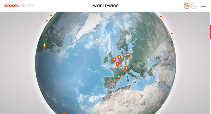
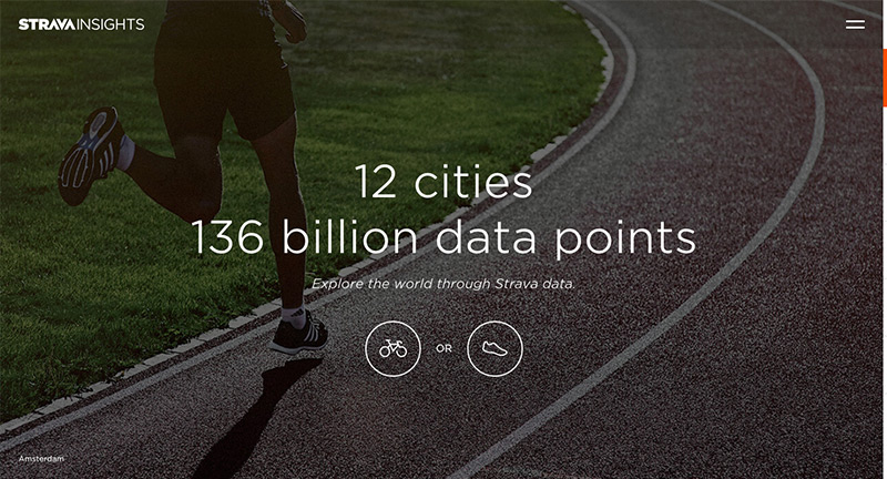
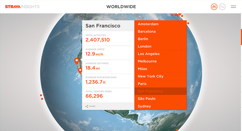
north america

Strava Insights

By | @stinkdigital | No Comments

strava-1
strava-3
strava-3
strava-4

Site that visualises billionsĀ of data points gathered by sports and fitness tracker Strava. The nice thing about the site, is the way it puts context around the data – by pulling insights from around the world – comparing them and visualising them. Love the attention to detail with the 3D sphere – even with moving clouds – and nice shareable snippets.

Created by Stink Digital (@stinkdigital).

Site here…

Network Effect

By | @jjhnumber27 | No Comments

network-1
network-2
network-3
network-4
network-5

Interactive documentary that has curated 10,000 video clips, news, tweets, charts, graphs, lists, and millions of individual data points. Fascinating mix of topics and overwhelming amount of data. An interesting aspect of the site is that it limits you to viewing for only a couple of minutes at a time – then blocking you from re-visiting for 24 hours. Love all the infographics, and the interesting navigation at the top – all the topics instantly navigable from the scrolling mechanic. Simple but impactful it offers a glimpse into what people are doing and looking for online.

Created by Jonathon Harris (@jjhnumber27) and Gregor Hochmuth (@grex).

Site here…

Taste Rewind – Spotify

By | @Razorfish, @stinkdigital | No Comments

rewind-1
rewind-2
rewind-3
rewind-4

Site for Spotify that creates playlists for you based on your preferences that rewinds musical tastes back a couple of decades. Really nice design and animations that inject a sense of playfulness and colour. Love all the preloading sequences and transitions – that creates a sense of narrative and storytelling and shows how you can get more out of Spotify.

Created by Razorfish (@Razorfish) and Stink Digital (@stinkdigital).

Site here…

Amy

By | @watsondg | No Comments

amy-1
amy-2
amy-3
amy-4

Stunning site promoting a new movie about the musician Amy Winehouse. Divided into main themes about her life brought to life with full screen video and imagery. Love the typography and quotes, with a well designed layout – the menu also looks great. Full of little animations and transitions that ease you through each section. Really great example of a film site…

Created by Watson/DG (@watsondg).

Site here…

Leap Second

By | @active_theory | No Comments

leap-1
leap-2
leap-3

2015 saw a ‘leap second’ – everyone on earth had an extra second to play with. Android asked people to capture those moments and share with the world. The site itself is really well executed, with a great visual interface that captures the moments and themes of the submissions – with a larger video which combines all these moments into one clip. Love the 3D on this too, from the way the images enlarge and the lovely drag around interface – really works great on mobile too! Full of details and incredibly polished.

Created by Active Theory (@active_theory) and Droga5 NY.

Site here…

Colin Snow

By | @csnowrun | No Comments

colin-snow-1
colin-snow-2
colin-snow-3

Site for Colin Snow, Art Director and Designer based in Los Angeles. Love the cropped logo intro segment, and the interesting use of video for the projects – rollover a project it enlarges slightly and plays video inline. Nice use of mouse icon changes to show when you can cycle through thumbnails, and the sticky logo element. Looks great too with the offset thumbnails and use of whitespace.

Created by Colin Snow (@csnowrun).

Site here…

Lucas Hirata

By | @ramon_fritsch | No Comments

hirata-1
hirata-2
hirata-3

Portfolio of creative director Lucas Hirata. Nice background video and large tiles that link through to the individual project pages. Well thought out project pages that look great and offer a real sense of personality. Also love the ‘about’ section, which is really fun. Nice transitions between sections all in all a slick well designed portfolio site.

Created by Lucas Hirata and Ramon Fritsch (@ramon_fritsch).

Site here…

Enough

By | @cabbibo | No Comments

enough-1
enough-2
enough-3

A journey through a 3D world filled with light, music and brooding darkness. Each scene is accompanied with a page from the story, each scene the jellyfish like creature following your cursor throughout each scene. Love the hints and sparks of light emanating from your cursor and how each scene is introduced – you get a real feeling of the 3D space as your view floats into the scenes.

Created by Cabbibo (@cabbibo).

Site here…

The Sim Tests

By | @webdesign | No Comments

divergent-3
divergent-2
divergent-1

Immersive site promoting the latest installment of the Divergent series of sci-fi films. Essentially mimicking the film – a series of tests designed to get you thinking, all rendered in 3D using a nice implementation of the virtual look around model. High production values and slick execution bring it all to life.

Created by Hybrid Studio.

Site here…

DENNIS

By | @georgealways | No Comments

dennis-1
dennis-2
dennis-3

Generative 3D music video featuring music by popcorn_10. Each time you watch the video it changes, with colours, shapes and sequencing changing depending on the details in the music. Love the playful and colourful feel and the way the 3D shapes appear, collide, and interact with each other – a great bit of fun.

Created by Always & Forever (@georgealways).

Site here…

Revelator

By | @hellomondaycom | No Comments

revelator-1
revelator-2
revelator-3

Site for Revelator a new online service that helps music businesses streamline their revenue online. I like the horizontal scrolling layout, with a nice blue and black look and feel, videos and animated graphics to highlight the key features. Slick animations and transitions to the individual sections of the site, with sliding panels and so on pulling it all together.

Created by Hello Monday (@hellomondaycom).

Site here…

Namale

By | @__ThePhoenix | No Comments

namale-1
namale-2
namale-3

Site for Namale jewellery, and a short and sweet look book for their collection. Nicely styled site showcasing Namale’s range of jewellery – like the way the image splits and each segment scrolls to create the complete image. Also like the way the image goes full screen when you zoom into a specific product, small details help lift the experience. It looks lovely, with nice tone and grading throughout the site to help make it look premium.

Created by Phoenix The Creative Studio (@__ThePhoenix).

Site here…

Anton & Irene

By | @antonandirene | No Comments

anton-1 anton-2 anton-3

Site of new New York based creative duo & agency Anton & Irene. Lovely dynamic layout, combining nice typography, bold imagery and a playful elegance featuring the main protagonists Anton & Irene in a series of fun photographs. Nice showcase of what they are involved with from talks, conferences, and of course creating work. Love the in-depth case studies on their latest projects, where they talk about the process and the amount of thought and consideration that goes into each project. Love the feeling of energy in the layout and the personality which shines through, it is also responsive. Great example of a modern folio site.

Created by Anton & Irene (@antonandirene) and Oleg Chulakov Studio (@chulakov).

Site here…

Work & Co

By | @workandco | No Comments

work-1
work-2
work-3

Lovely site for digital agency Work & Co. Detailing their ethos, approach, and body of work in an elegant and effective way. Love the menu toggle – really fresh idea – to zoom out and see all the pages in a form of visual index. Love the splashes of colour here and there and the really nice typography used throughout the site – see the ‘facts’ page. It is responsive and reacts really nice to devices and screen size changes – works really well.

Created by Work & Co (@workandco).

Site here…