minimal

Paradiso

By | @bravouremedia | No Comments


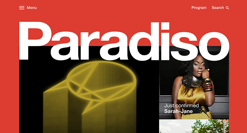
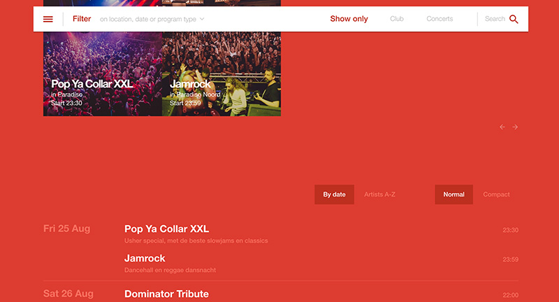
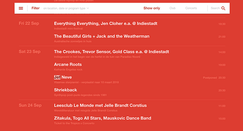
Site of Amsterdam music venue Paradiso, where you can buy tickets and see the line up. Matching the visual style of the venue itself it is a natural extension into the digital space. Love the poster style layout followed by a quick and simple ticketing system. Nice bold art direction lots of large type and slick transitions.

Created by Bravoure (@bravouremedia).

Site here…

Flavien Guilbaud

By | @baptistebriel, @flavienguilbaud | No Comments


Super slick, super cool folio of Flavien Guilbaud digital Art Director. Love the homescreen, transitioning between monotone photography and bold type. Tap on a project and transition into the project pages, heavy on visuals and screen captures. Beautiful and bold Art Direction and well executed, great example of a modern stand out folio.

Created by Flavinsky (@flavienguilbaud) and Baptiste (@baptistebriel).

Site here…

Centerfold

By | @40mackenzie | No Comments


Site of Centerfold a “Montreal-based organization with the aim of driving social and economic change in the art industry. Our goal is to enable artists to gain funding, visibility, and access”. You can buy the curated prints or browse around a virtual gallery a fun feature that replicates a surreal 3D exhibition space. Nice idea and nicely executed.

Created by Mackenzie Davidson (@40mackenzie).

Site here…

On The Rocks

By | @ontherocks_mag | No Comments


Site of jewelry magazine On The Rocks. Short and sweet with minimal layout hosting a diverse range of photography and lifted with the addition of fun interactions, mouse over the parts of the site for a contextual button and for flicking through the magazine. Shows that even the smallest of interactivity makes it that much more compelling.

Created by On The Rocks (@ontherocks_mag).

Site here…

R Magazine

By | @webdesign | No Comments


Site of Japanese lifestyle magazine R Magazine. Featuring a variety of content such as fashion through to food. Sleek and minimal design with editorial and fashion photography. Love the subtle scrolling effect and art direction throughout, with lots of small UI details and transitions.

Site here…

Whities

By | @hlemtr0n | No Comments


Site of London based record label Whities. Simple mechanic of scrolling through artists – love the way the background transitions – and tapping through to reveal videos and so on, love the way the windows layer. Really simple and enjoyable mechanic that keeps your context. Looks great, nice minimal design.

Created by Alex McCullough and Lemuel Dix (@hlemtr0n).

Site here…

Timeline Gallery

By | @webdesign | No Comments


Interesting UI for exploring the latest updates for the concept of the Timeline Gallery in the Netherlands. Navigate the content by tapping on the individual cards – with the latest at the front of the stack, oldest at the back. Really simple, interesting, and exploratory way of presenting content.

Site here…

Mendo

By | @buildinams | No Comments


Lovely site for speciality book store in Amsterdam – described as “A candy store for book aficionados”. Bold type, and large imagery funnel the viewer down the page with a mixture of editorial, curated, and book suggestions. Some really nice features here with smooth transitions and a great attention to detail. Love the preloader and new page slide in representing a new page – nice link back to the printed medium. On top of this it looks lovely, well designed and interesting layouts that really life the experience.

Created by Build in Amsterdam (@buildinams).

Site here…