minimal

Gudrun & Gudrun

By | WEBSITES | No Comments

gudrun

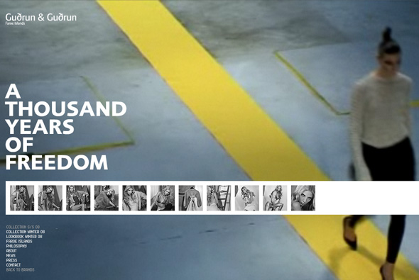
Very nice website for fashion label Gudrun & Gudrun based on the Faroe Islands. Not ground breaking – but really nice transitions and style. I particularly like the way you zoom in on a thumbnail, where the interface zooms with you. Clumsy way of zooming in on a particular image – but the concept is nice.

Created by Hello Monday.

Website here…

Elastic Mind

By | WEBSITES | No Comments

Design & Elastic Mind

Extensive collection of artwork from MoMA’s Design and the Elastic Mind exhibition with some 240 pieces. With such a mission to display this amount of work, a well conceived and executed navigation system has been produced. Each item is interlinked with varying categories and more detail can be seen. With such complexity the site is easy to use, and totally intuitive. The work in the site is amazing too, a really great website.

Created by the legendary tha ltd.

Website here…

Whitevoid

By | WEBSITES | No Comments

Whitevoid

Website of Whitevoid Art & Design, an agency that specialises in various interactive disciplines. A really clean, fluid 3d interface; very simple and enjoyable to use. I really like the concept – and feel its a really nice use of 3d – kept simple and to the point.

Website here…

Dreams Are Electronic

By | WEBSITES | No Comments

Dreams Are Electronic

Nice way of showcasing short films and installations. Showing 20 works from the last 20 years of Coventry School of Art and Design’s New Media Arts MA. Using Papervision 3D to allow the use to explore the material in an interesting way. Effective and fun site.

Created by Less Rain.

Website here…

Whalefootage

By | WEBSITES | No Comments

Whalefootage

Footage of whales to increase awareness of their plight. Really slick site – the best use of video in terms of interacting and navigating I have seen. For each bit of footage small images are placed apparently at each keyframe, these images change as the cursor is moved across the timeline. For each whale a small thumbnail of each video is played, all very minimal and stylish. Its a great site with lots of really good touches and great attention to detail.

By Scholz & Volkmer.

Website here…

Gyre

By | WEBSITES | No Comments

Gyre

Beautiful website, promoting a new shopping centre in Japan. Set to a piano soundtrack sentances are formed in different patterns – giving an ethereal atmosphere, more akin to an art display. ‘Gyre’ means swirl, and as such the information displayed is always being updated and swirled around. This can be seen from inside the Gyre building, on your phone and on the website.

A wonderful simple idea – in terms of art direction and style – it just works really well and is a nice way to promote a concept. Created by one of my favourites tha ltd.

Website here…

Feel Something

By | WEBSITES | No Comments

Feel Something

Very simple idea and execution demonstrating a nice concept to promote Foxtel, an Australian tv service. Short videos of people watching a selection of different tv channels set alongside a nice soundtrack. I really like its simplicity & concept – overall a nice little site.

Created by SOAP.

Website here…

Honda – Inside Elysion

By | WEBSITES | No Comments

Honda - Elysion

Slick website promoting Honda’s new car ‘Elysion’ in Japan. Showing a series of photos taken every hour for 24 hours a day, all week, from the viewpoint of owning the car. It’s strength is the way it shows the photos – it is fun to navigate and use. The images zoom up to the full screen size, and I like the way they have restricted the user’s control of the size of the page, so they can’t resize the page once opened in fullscreen – always a bane for Flash designers!

Created by Simon Inc in Japan, make sure you view the ‘full screen’ mode.

Website here…

Audi – Rhythm of Lines

By | WEBSITES | No Comments

Rhythm of Lines

Based on ‘Lines’ ad promoting the new Audi A5, you make your own ‘Rhythm of Lines’. That is draw lines in a 3D space using the keyboard and mouse – it kinda works like flying through an empty 3D space. You end up with a very organic flow of coloured lines, once you get used to it you can get some nice results.

Created using Papervision and a customised line drawing script, made by Good Technology. Nice site – I like the kind of ethereal direction and lack of advertising – its quite involving and making your own design is enjoyable its a good way of promoting a concept online that ties in nicely with the ATL ad.

Website here…

Simon Rasmussen

By | WEBSITES | No Comments

Simon Rasmussen

Good portfolio website of Simon Rasmussen, a Danish stylist and creative director. Made by Danish agency Flexmotion it is a well conceived concept.

I wanted to use the whole ‘contact sheet’ navigation on a recent website, as I feel it works very well when navigating a visual website such as this. Scrolling left and right to see more pictures as if sliding the negatives just feels intuitive. Nice to see it looking so well integrated…

Website here…