data

Strava Insights

By | @stinkdigital | No Comments

strava-1
strava-3
strava-3
strava-4

Site that visualises billionsĀ of data points gathered by sports and fitness tracker Strava. The nice thing about the site, is the way it puts context around the data – by pulling insights from around the world – comparing them and visualising them. Love the attention to detail with the 3D sphere – even with moving clouds – and nice shareable snippets.

Created by Stink Digital (@stinkdigital).

Site here…

Network Effect

By | @jjhnumber27 | No Comments

network-1
network-2
network-3
network-4
network-5

Interactive documentary that has curated 10,000 video clips, news, tweets, charts, graphs, lists, and millions of individual data points. Fascinating mix of topics and overwhelming amount of data. An interesting aspect of the site is that it limits you to viewing for only a couple of minutes at a time – then blocking you from re-visiting for 24 hours. Love all the infographics, and the interesting navigation at the top – all the topics instantly navigable from the scrolling mechanic. Simple but impactful it offers a glimpse into what people are doing and looking for online.

Created by Jonathon Harris (@jjhnumber27) and Gregor Hochmuth (@grex).

Site here…

Lincoln Musical Selfie

By | @jam3 | No Comments

musical-selfie-1
musical-selfie-2
musical-selfie-3

Interesting site for Lincoln cars, using the contours and shape of your face to make a ‘musical selfie’. Simply upload your image / take a snapshot or view the gallery – the site will pick up key features of your face and arrange a song. The main thing I like here is the execution, it looks great – from the sliding mechanic in the gallery to the small animations and attention to detail. They have really made it feel alive and dynamic, and even tried to treat the uncertainty of user generated content, by making sure the imagery looks good, like the 3D moving shapes around the corner of the images.

Created by Jam3 (@jam3) and Hudson Rouge (@HudsonRouge).

Site here…

BODA-RIDE

By | @Bascule_Inc | No Comments

boda-1
boda-2
boda-3
boda-4

Fascinating site that uses peoples 3D data as a landscape to interact with. All executed through an experimental 3D interface where you pan and rotate your view. Feeling akin to something out of Blade Runner – the music the design – it is all an assault on the senses. The 3D bodies are moving around as you interact with the scene and you can play races that float across the moving 3D contours of the bodies. Love the 3D elements and the experimental look and feel, really cool to see digital experiences like this. Quite an experience…

Created by Bascule Inc (@Bascule_Inc).

Site here…

Word Map

By | @AgenciaLoducca | No Comments

word-map-1
word-map-2
word-map-3

Simple site mapping the origins and usage of words across the world. Simple premise enter a word and the site will – using Google Translate – track the use of the word and translate in across the world. I like the way it tracks the words and actually speaks them as your travels all over the world. When it stops lines represent the origin of the word and clicking on them reveal how to speak the word in that country. Nice bit of fun and something a bit different.

Created by Loducca (@AgenciaLoducca).

Site here…

A World of Belonging

By | @ToolofNA | No Comments

airbnb-1
airbnb-2
airbnb-3

Short and sweet promo for Air BnB showing a globe with all the Air BnB activity going on today. Love the 3d globe with lots of nice little animations of people checking in, snippets about certain locations, and geo located tweets with their #OneLessStranger tag. Nice little branding piece that just highlights how global Air BnB is – it looks nice and matches the style of the newly rebranded Air BnB.

Created by Tool of NA (@ToolofNA).

Site here…

Take Your Pulse

By | @_blacknegative | No Comments

pulse-1
pulse-2
pulse-3

Site promoting the wearable tech product ‘Withings Pulse’. Set from the perspective of three people wearing the product in their daily lives, a short film shows what the product does in-situ – sliding panels appear and you can explore in more detail about the product. I like the flow of the journey and the additional info appearing in a nicely designed way, it also looks great, nice palette of colours and fresh design.

Created by Black Negative (@_blacknegative) and Dilshan Arrukati.

Site here…

Aprilzero

By | @aprilzero | No Comments

aprilzero-1
aprilzero-2
aprilzero-3
aprilzero-4
aprilzero-5

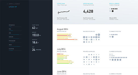
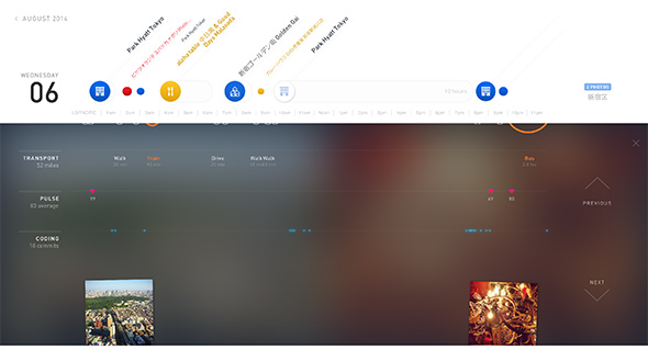
Fascinating site created as a side project by Anand Sharma – it tracks his daily movements and visualises it in an interesting way. Using an array of APIs and custom code, a whole host of data is recorded, how much he ran, how many climbs he’s done, how far he’s walked, his heart rate and so on. Using the API from apps such as Moves, Foursquare, Nike+ etc – the interesting part is how the data is organised and visualised. ‘Sport’ focusses on the data such as heart rate, running, walking and so on – where as ‘Explorer’ highlights movements day to day, along with location check ins, photos and so on – the detail is quite incredible. The case study in his blog is worth a read too – really interesting to see the approach and decisions he made along the way. Not only is the visualisation and organisation of the data great, so too is the design, and the finishing touches such as the animation and the transitions – they just bring it all to life.

Created by Anand Sharma (@aprilzero).

Site here…

Universal Typeface – BIC

By | @DDB_Germany, @mediamonks | No Comments

universal-typeface-1
universal-typeface-2
universal-typeface-3

Fantastic site brought to you by BIC pens. Essentially setting out to crowd source a font based on hand writing – from all the contributions on the site for each character. A seemingly complicated task, brought to life in a very simple and easy to understand way – it already has millions of contributions – you can even filter by gender / age / location and so on to see the range of results. It also looks great, I love the way you can see the average character in yellow and can see the different characters in an intuitive and playful way. Really easy to draw your own character, which you can do through your mouse or by connecting your mobile device, again all really made simple for the user. Lovely layout, great fonts, and nice animations and interactions – great piece of work.

Created by DDB Tribal Dusseldorf (@DDB_Germany) and MediaMonks (@mediamonks).

Site here…

Dataveyes

By | @dataveyes | No Comments

dataveyes-1
dataveyes-2
dataveyes-3
dataveyes-4

Site of data visualisation agency Dataveyes. In their words “We translate data into experiences, to share narratives, support new uses, and make sense of a world increasingly shaped by algorithms. We design useful, relevant interfaces through our workflow, which revolves around both data and user needs.” They have brought to life some nice animations and particle effects and tried to simplify what data is and how you can visualise it. Some really nice touches and it looks great.

Created byĀ Dataveyes (@dataveyes).

Site here…

Audi – #onemillionreasons

By | @minivegas | No Comments

audi3d-1

audi3d-2

audi3d-3

Incredible campaign microsite for Audi and #onemillionreasons. Essentially a model of their R8 car made up of spheres, which people can ‘own’ through social media, clicking on one of the spheres shows the statement, which then also when the “3d ansicht” button is clicked – totally destroys the car and rebuilds it in front of your eyes – and turns it into the photo or statement – absolutely incredible! All built in Web GL, it allows you to rotate your view, zoom in, and interact with the various spheres. Love the attention to detail too, with the spheres moving around based on position of your cursor, and watching the light source cast shadows dynamically. It really is incredibly well made.

Created by Minivegas (@minivegas) and Razorfish Germany (@razorfish_de).

Site here…

OpenData Globe

By | @waag | No Comments

open-data-globe-1

open-data-globe-2

open-data-globe-3

Publicly available data rendered on a 3d globe, so far showing a handful of cities – such as Amsterdam, Istanbul, and Helsinki – information such as public transport lines, census, and even an example of live traffic data. All this info is drawn up with lines and blobs to illustrate intensity – the minimal design really accentuates the lines, dots and blobs. Love the way the city streets are drawn up with the real time traffic data in Amsterdam.

Created by Laurens SchuurkampĀ (@waag).

Site here…

100,000 Stars

By | @google | No Comments

100000 Stars

100000 Stars

100000 Stars


Quite an accomplishment – Google Creative Lab have made a bit of a tech demo / visualisation of part of our galaxy for Chrome browsers. I love their disclaimer ‘Warning:Ā Scientific accuracy is not guaranteed. Please do not use this visualization for interstellar navigation.’ all a bit of fun. Love the way you can zoom right in and even see other stars each with a bit of explanation and knowledge. Nice animation that show orbits of suns, planets etc – Gliese 570 is a great example – nice detail.

Created by Google Creative Lab.

Site here…