data

Nike MvsW

By | @pillandpillow | No Comments

Nike MvsW

Nike MvsW

Nike MvsW

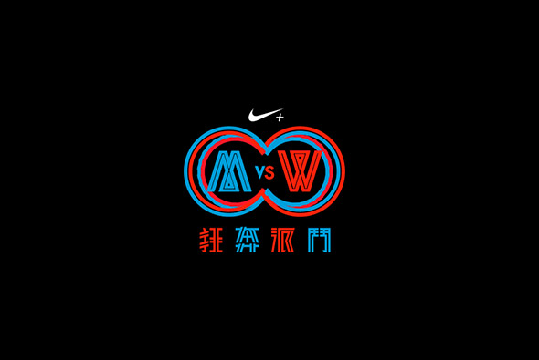
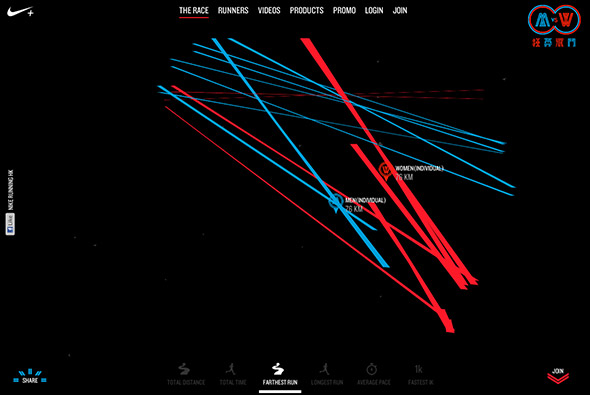
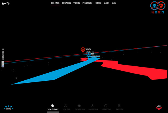
Nike MvsW is a Nike+ running competition aimed at pitching men against women in Hong Kong – using their Nike+ data to compare themselves against other people and celebrities. It is all brought together into a minimal data visualisation layout – all in 3d! The graphs are drawn in front of you – you can affect your view by moving your mouse around – quite immersive. Really bold and bright look and feel, (love the login page) great animation and the 3d effect is ultra smooth – great way to bring the concept to life.

Created by pill & pillow (@pillandpillow).

Site here…


The Rational Keyboard

By | @ftzo | No Comments

The Rational Keyboard

The Rational Keyboard

The Rational Keyboard

Interesting site this – The Rational Keyboard. Has to be seen and played with – best explained by the man himself: “The Rational Keyboard is an HTML5 web app demonstrating a consonance model injust intonation. It’s kind of like a piano with infinitely many keys (one for each rational number) that move around and resize based on what sounds good.”

Essentially – play around with it, fascinating work and utterly mesmerising – looks great too. You can spend a long time here playing around with the sounds and watching how the keys blend and change size.

Created by Fritz Obermeyer (@ftzo).

Site here…

Here At Home

By | @thenfb | No Comments

Here At Home

Here At Home

Here At Home

Site from the National Film Board of Canada – highlighting the plight of homeless people in Canadian cities – an starting an experiment to home thousands of homeless people to see how much this costs vs not homing them and then treating them in drug clinics / shelters and so on. A brave experiment from the Canadian government. On top of being a fascinating story – the site is beautiful. Lots of cool transitions and lovely attention to detail. The homepage is a visual treat of swirling balls of colour and video clips. Exploring the cities we see a more infographic approach to the layout and design. The way things move around the screen and the way text animates is really nice as is the art direction – all in all a nicely rounded experience.

Created by National Film Board of Canada (@thenfb).

Site here…


Chrome Experiment #500

By | @google | No Comments

500 of the best Chrome experiments – a mixture of the latest WebGL / CSS3 / Javascript experiments. Love the interface – a swirling mass of shapes colour coded by subject, for example 3d, physics, and so on – which by itself is fun to play with. Rolling over the dots gives more info about that project, clicking through will take you to the example. Clean, clear, fun – what more could you want – loads of great experiments to discover.

Created by Google Creative Labs.

Site here…

Consumer Barometer

By | WEBSITES | No Comments

For something as dry as Consumer statistics – this site does a fantastic job. You can browse popular statistics such as % of people per country with access to internet, to creating your own graphs and diagrams via an intuitive interface – all internet stats. I love the subtle animations and interactivity – bouncing spheres, animated transitions – really brings it all alive. It looks good too with a subtle colour palette and clear layout.

Created by Clever Franke, @cleverfranke.

Site here…