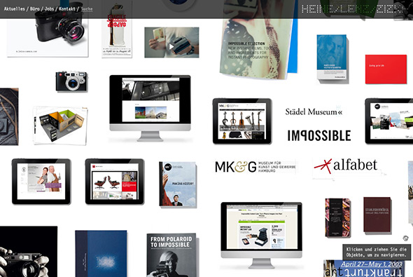
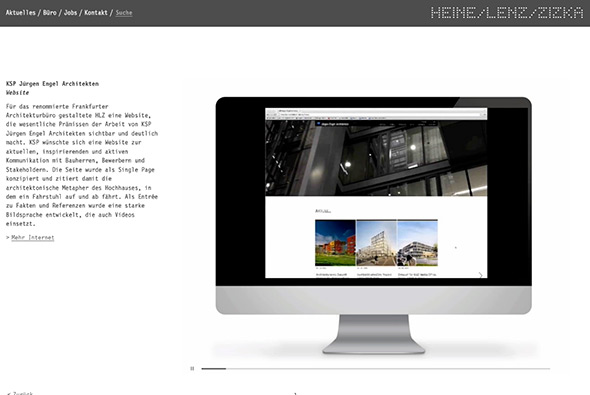
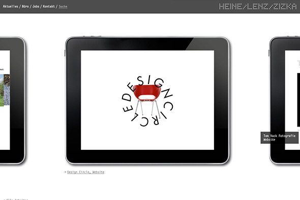
Nice site for Heine / Lenz / Zizka – a German branding studio. Presented in a large grid of projects which you can zoom in and out of to explore the range of work they have created. Clicking on projects allows you to drill down and look through the various designs, love the way when you move your mouse to one side the screen slightly moves to illustrate there is more to explore. Really nice layout and works nicely – fun to explore and good to look at!
agency
Welikesmall, nice new portfolio for this digital agency based in Salt Lake City. Nice responsive layout and lots of transitions – love the case studies for each project – a blend of animated gifs / videos / nice visuals and well explained ideas. Each section is different and interesting to browse through. Cool site, looks good, works across lots of devices – modern responsive approach.
Created by Welikesmall (@welikesmall).
GREY group’s directions to their Japan office. Instead of doing a standard map, they did a fun interactive third person map. Simply using the arrow keys to go forwards / backwards arriving at crossroads, going the wrong way prompts some silly dead end sequence – lots of these to find! Just a really fun, creative way of showing people how to get to the office – full of personality and Japanese style irreverance!
Created by GREY (@greygroupapac).
Portfolio site of Museum Studio Swedish Art-direction and creative studio. Really nice thumbnail based layout, rolling over the projects shuffles through the thumbnails, clicking shoots them all out in a line and enlarges them and places a grey overlay on the rest of the background. Love the animation and transitions, really nicely crafted and clean minimal design.
Created by the now closed Antenna Research Facility and Museum Studio (@museumstudio).
Portfolio site of Red Interactive Agency. Loads of really cool transitions and animations – using a grid based layout to highlight key projects, news, awards etc, clicking one flips it around and makes the whole background fade back and the project come forward. Love the transitions between sections and the attention to detail as different sections of the page animate in. Really modern site, with progressive enhancement – most of the animations work on iPad, mobile and so on, pretty cool…
Created by Red Interactive Agency, @REDinteractive.
Portfolio of Dutch VFX and film agency Woodwork. Love the way the projects appear and slide in and out, clicking one expands that section and allows you to scroll through the details for that item. Scroll along left and right too see more projects. I like that viewing each project doesn’t take you away from the homepage just expands upon it. Nice animations and very clean and clear layout.
Created by Vandaan, @UncleDane.
Portfolio site of Type / Code, NY based digital agency. Nice splash screen, 3d reactive particles! Projects displayed as one long list of accordions, revealing the contents on page, with the section splitting and moving down. Like the transitions between the main sections, very simple layout – nice example of a clear, clean well crafted site.
Created by Type / Code, @typecode.
Nice site of global agency Designktichen. Really simple, essentially a news feed of items (news, twitter, images) and latest projects that when pressed split the layout to reveal the content – in a really nice smooth way. Nicely designed and bold typography – thoroughly modern site.
Portfolio of Polish agency K2. Really slick site highlight their best work, with plenty of nice transitions and effects. Like the simplicity of layout and large imagery, the open / close transitions on the work section are great, and it all feels well polished. And all in a non-Flash site…
Beautifully crafted site for French agency blacknegative. Adopting a style of navigation similar to an iPad app you click and drag between sections to see what blacknegative is all about and see their projects. Full of well considered animations and transitions, and most insterestingly it is all in HTML5/Javascript, the smoothness of the animations and style of transition is incredible. The integration with the minimal design and layout is fantastic – a top notch site.
Created by Sylvain Tran & Dilshan Arukatti.
Site of Hungarian based agency Carnation Group. Nice design, slick transitions (non Flash), and lots of interesting interaction ideas. Done to death with the vertical scrolling and parallax but I think this is a nice example, particularly with the animation and smooth transitions.
Best described by their website – ‘PARTY is a “Creative Lab” based in Tokyo and New York, founded by 5 Creative Directors, Naoki Ito, Morihiro Harano, Qanta Shimizu, Hiroki Nakamura, and Masashi Kawamura.’ Essentially 5 really talented creative directors working on some really nice, innovative projects. I like the strips on the homepage representing their projects – stretched over time, nice visually strong idea. For the rest they have some really nice projects and its well worth taking a look, definitely one to watch.
Wicked portfolio of Toronto based digital agency JAM3. Using very cool transitions and an interesting particle based 3d effect, every part of this site is slick and smooth. All the interactions have been carefully designed and animated, I love the transition between the projects and section with your view zooming around and the interface building and disappearing, all so detailed. Really great, modern and fresh portfolio showing what Flash can do.
Created by JAM3.
Portfolio of multidisciplinary design and marketing firm based in Japan. Simple minimal interface with nice scrolling navigation – easy to use, clean and efficient. Like the almost parallax style navigation.
Created by Shun Kawakami and Manmaru.