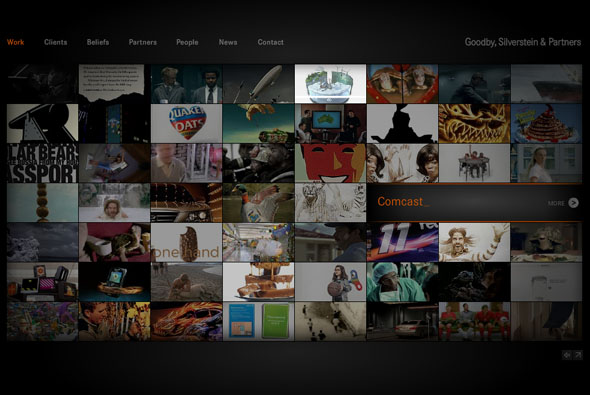
New site of agency Goodby, Silverstein & Partners. Pretty cool site of successful digital agency GS&P, this site is a nice example of an agency portfolio, lately a lot of agencies are opting for the html/blog style – but this is full Flash with videos and slick transitions. I like the main landing page with it’s plethora of videos, the search function is really cool, you can search for say a client name i.e. HP and all the projects featuring HP will be highlighted – this search mechanism also works in other sections of the site such as ‘people’ and ‘news’. The ‘people’ section of the site is actually really cool too. Well coded with lots of cool transitions and animation – worth checking out.
agency
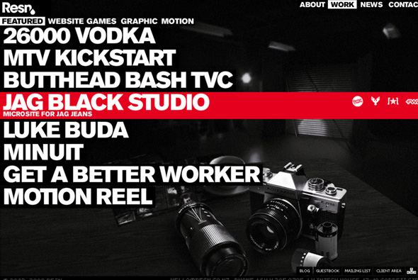
Cool portfolio site of digital agency Resn, from New Zealand. Nicely done, their personality and slick Flash design skills comes through. Like the use of bold typography and nice detailing and animation. Good to see something slightly different and an agency not scared to show their personality…
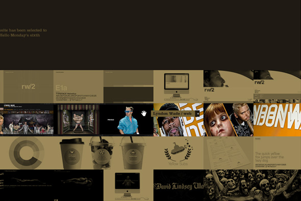
Portfolio site of Danish agency Hello Monday. Draggable strips featuring images from each of their projects, you zoom in/out of these to see more about each project. Nicely done full screen site that allows you to drag around everywhere, some really nice projects in here also. Together it all provides a slick overview of some nice projects with a nice interface…
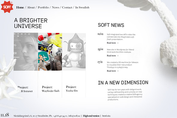
Portfolio of Swedish agency Soft. Another 3d portfolio, but this one is also pretty cool, with a good parallax and feeling of depth, with elemtents of the design on different layers, and the mouse controlling your viewing angle. Nicely designed and good attention to detail which livens up the archetypal ‘portfolio’ site, pretty cool…
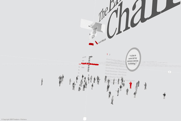
New portfolio site of agency Freedom & Partners. Going for the 3D interface design, Freedom have created a very minimal, well crafted portfolio site, highlighting their work in an innovative way. With information presented on the various axis, you can view 3d animations and videos of their work, along with the standard text desciptions, whereby you move your view around by clicking and dragging to see all parts of a project. There is also a non-3d version, which ironically I found harder to use, it’s quite a daring approach to take for an agency portfolio, as the interface is a little clunky and fiddly. Aside from that it’s great to see a different approach, with an original approach to interface design, pretty cool…
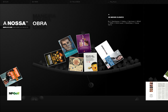
Fantastic site of Portugese agency Nossa. The attention to detail and polish in this site has really got to be experienced to be believed, really incredible. For example when you look at their work, each case happens to be part of fully interactive physics engine. Look at their location, Google maps is fully integrated into the interface. All the rollovers / buttons / user actions are thought about, the whole site is well laid out and designed, it really is a shining example of a great portfolio site… very impressive…
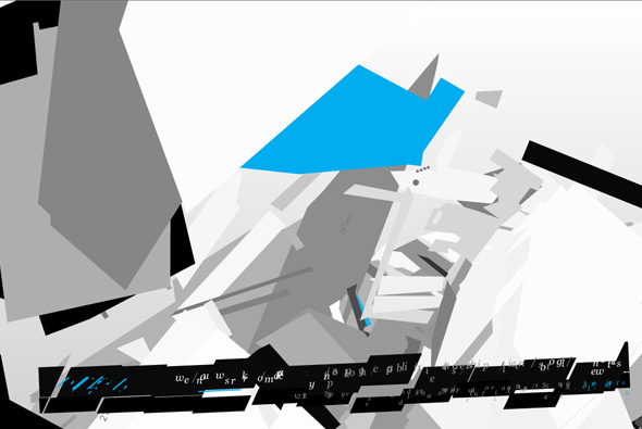
Interesting navigation for the site of JVST an agency based in California. I like the transitions between the sections, lots of floating 3d planes and objects – but it all seems a bit, well unfinished maybe? It was created by one of the old masters, Joshua Davis, who did the groundbreaking Praystation, and makes incredible digital paintings. Was he restricted? Were things changed? How much input did he have? You would think that such a name would bring greatness. It’s a shame as the navigation transitions are nice, but on the whole it doesn’t really work… a lesson to be learned here maybe…
Created by Joshua Davis.
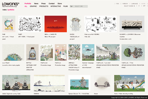
The home of LOWORKS, a Japanese agency. Really nice site, very clean & simple, easy to use and nice to look at. Smooth animations reveal the artwork where you can find more about the project. The navigation is super clean, really nice site…
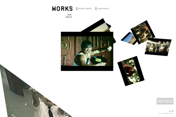
Pretty slick site of ‘Killers’, a South American production company. Yes, another 3D interface whereby you click on the images and the camera moves to show the image, which in turn loads a video highlighting the project. What I like about this example, is the smoothness, and slickness of the animation and 3D environment, it’s very simple, very fast and so smooth that just clicking between projects is a joy! I also like the little touches and attention to detail, when you view a project they have reimagined the scrubber for the video, it’s a little semi circle, it looks good – the rollovers and the buttons all feel nice and animate well. Cool site…
Created by Grafikonstruct.
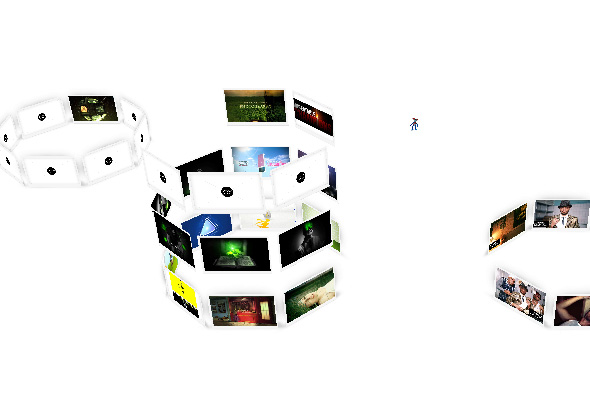
Portfolio site of Polish agency Final Art New Media. Interesting way of showing work, again a 3D interface where you find yourself inside and amongst the work, where you can view stills / watch videos of their work. Each category are in different stacks of images which you float between to see the different categories, which gives the site a nice depth and fun interactivity.
Made by Beestudio.
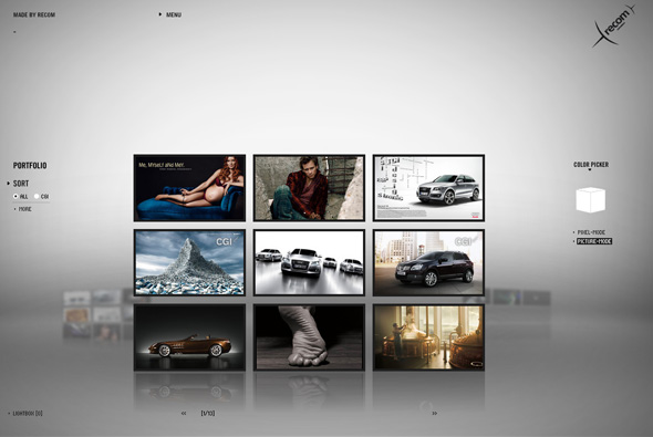
Portfolio of recom, a postproduction/artwork/CGI studio with 3 main offerings – recomPOST, recomCGI und recomART. A really great looking site, some nice touches – with the theme of pixels running throughout – you can even pick a colour and all images that have that range will display. The transitions are pretty cool, each being a cloud of pixels that morph into shapes and text. Some amazingly slick work in there too…
Created by Jung Von Matt/Neckar.
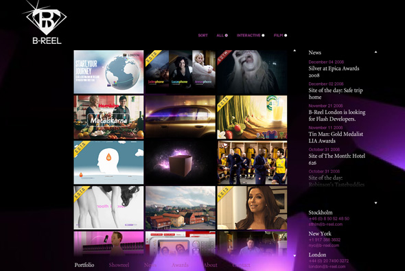
Website of awesome agency B-Reel, one of the heros of 2008. Aside from creating ground breaking work they also have a great website. I like the way the have organised their projects in a vertical scrolling thumbnail mechanism. I also admire the simple layout they have used whilst viewing a project. Simple, clean, easy to use and looks great! Their showreel is also damn cool.
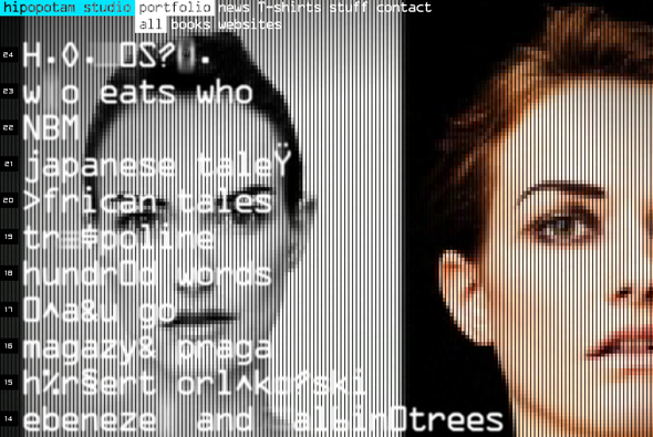
Website of Polish agency Hipopotam Studio. Heavily pixellated full screen video forms the backdrop for a stylish interface that is like an old video game menu. When interacting with the menu items screen grabs & videos of the portfolio fills the screen – nice interaction and interface, and a stylish look and feel.
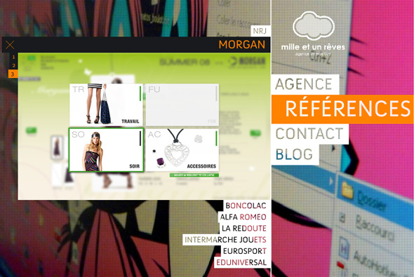
Portfolio of French studio Mille et un Reves. Formulaic but still – it’s nice! Large images of the studio form the backdrop, nice menu system and transparent text, videos and screen grabs show off their projects. Nice animation and easy to use and slick navigation.

