Yearly Archives: 2007

Red Bull Mediamix

By | WEBSITES | No Comments

Red Bull Mediamix

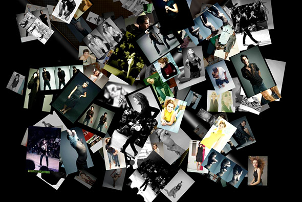
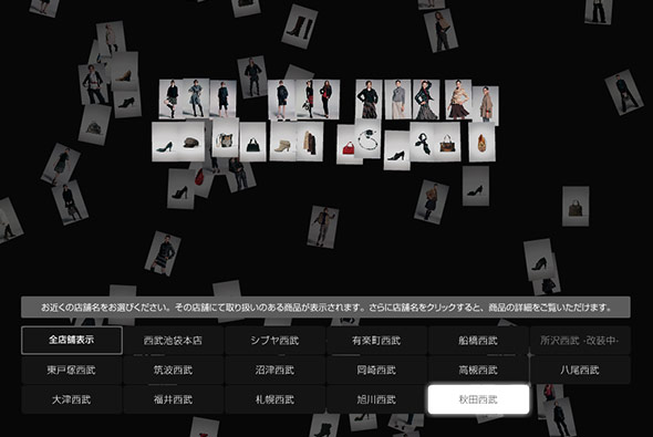
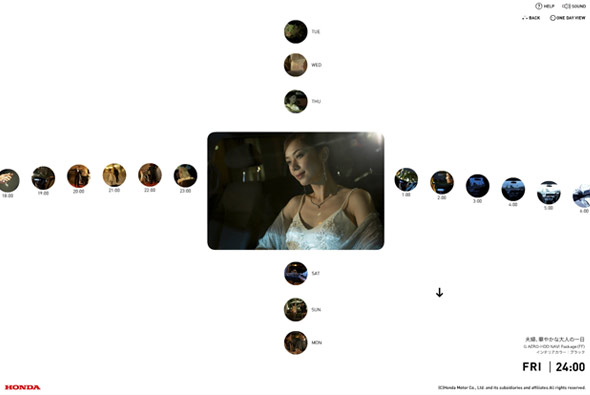
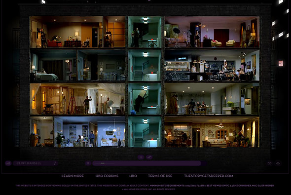
Innovative Flash site providing video content in an interesting layout, really like the design and fantastic transitions. he way a mass of information is organised and displayed is really nice, with good use of rollovers and fades – its also very easy to use.

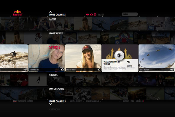
Made by Less Rain, they explain it best: “The purpose of the Mediamix is to bring media content – in particular video content – to the foreground and make existing media content more accessible through an innovative channel interface.One of the main goals has been the cross linking of all media with related content. Additionally all media items are downloadable, linkable and can be embedded on 3rd party sites with the branded Red Bull player you can see below.”

Website here…

Javier Ferrer Vidal

By | WEBSITES | No Comments

Javier Ferrer Vidal

Winner of the Flashforward2007 Boston Film Festival in the Typography category – again it’s been around for a while. But it is really well executed, not just down to the typography – but also in terms of navigation and style. Using 3D esque parallax navigation it is a joy to use and at times jaw dropping. It remains simple and easy to use but also the animation and transitions are amazing.

Website here…

Anteprima

By | WEBSITES | No Comments

Anteprima

Anteprima’s website for the autumn/winter range 2007. There are several nice touches – particularly the parallax style navigation – it just feels very fluid and intuitive.

Made by the famous Japanese agency FICC inc.

Website here…

Digitaria

By | WEBSITES | No Comments

Digitaria

Very nice and appropriate use of Papervision 3D! A kind of parallax environment which is cool to use. The rest of the site is pretty nice too, good use of Flash for a agency portfolio website…

Website here…

Seibu – Autumn Collection

By | WEBSITES | No Comments

Seibu - Autumn Collection

Another slick Japanese website, quite confusing to navigate (I guess as I can’t read Japanese!) – however the way images are presented is really nice. Could do with a bit of image smoothing though! I like the way they have made it quick to load by using small thumbnails – utilising it in the gallery view to great effect. Looking pretty stylish when you are cycling through the collection, with the next/previous images all pixellated.

Website here…

Honda – Inside Elysion

By | WEBSITES | No Comments

Honda - Elysion

Slick website promoting Honda’s new car ‘Elysion’ in Japan. Showing a series of photos taken every hour for 24 hours a day, all week, from the viewpoint of owning the car. It’s strength is the way it shows the photos – it is fun to navigate and use. The images zoom up to the full screen size, and I like the way they have restricted the user’s control of the size of the page, so they can’t resize the page once opened in fullscreen – always a bane for Flash designers!

Created by Simon Inc in Japan, make sure you view the ‘full screen’ mode.

Website here…

Oakley – Riders

By | WEBSITES | No Comments

Oakely

Not particularly an amazing technical / design driven site, but caught my imagination in terms of concept and execution. A really nice site by Oakley just showing their sponsored european snowboarders/skaters/surfers off in a series of websites. The site is structured like in a fun laid back style and is a basically a bit of fun with diaries and photos and competitions and so on.

Vicci’s site here…
Scott & Tlyer here…
Oli’s here…
Ben’s here…

Audi – Rhythm of Lines

By | WEBSITES | No Comments

Rhythm of Lines

Based on ‘Lines’ ad promoting the new Audi A5, you make your own ‘Rhythm of Lines’. That is draw lines in a 3D space using the keyboard and mouse – it kinda works like flying through an empty 3D space. You end up with a very organic flow of coloured lines, once you get used to it you can get some nice results.

Created using Papervision and a customised line drawing script, made by Good Technology. Nice site – I like the kind of ethereal direction and lack of advertising – its quite involving and making your own design is enjoyable its a good way of promoting a concept online that ties in nicely with the ATL ad.

Website here…

HBO Voyeur

By | WEBSITES | No Comments

HBO Voyeur

What a great execution of a fantastic concept to promote the HBO ‘Project Voyeur’ lots of extra material here. You explore an interactive world of videos showing what happens behind closed doors. Exploring various stories in different buildings and over serveral days you view the world through a voyeurs eyes.

Very slick website from Big Spaceship that just works so well. I love the way you can zoom in and follow individual rooms or see them all at the same time, explore different buildings and follow various stories, all very involving.

Website here…

Simon Rasmussen

By | WEBSITES | No Comments

Simon Rasmussen

Good portfolio website of Simon Rasmussen, a Danish stylist and creative director. Made by Danish agency Flexmotion it is a well conceived concept.

I wanted to use the whole ‘contact sheet’ navigation on a recent website, as I feel it works very well when navigating a visual website such as this. Scrolling left and right to see more pictures as if sliding the negatives just feels intuitive. Nice to see it looking so well integrated…

Website here…