responsive

Mercedes – Forgotten Roadtrip

By | @jungvonmatt | No Comments

forgotten-roadtrip-1 forgotten-roadtrip-2
forgotten-roadtrip-3

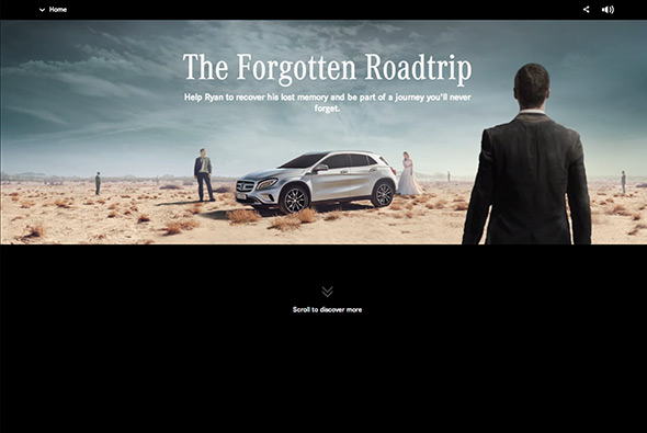
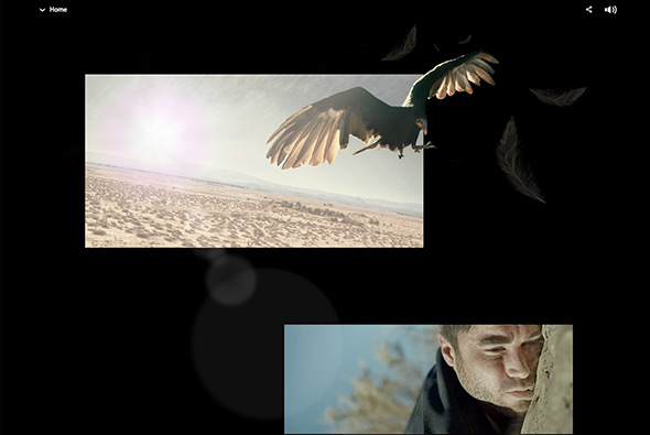
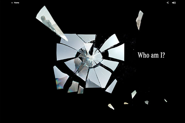
Nice bit of storytelling for the Mercedes GLA Class. You watch the main character regain his memory through small snippets of videos, images and interactive elements – all presented in a long scrolling page. Nice to see people trying different approaches – in order to appreciate the site you have to go through the story slowly – if you were to scroll quickly through it easy to dismiss as another parallax site. But all the individual snippets of the story, sound, draggable interactivity, and video draw you into the story. It also looks nice – with a bold style and feeling a little like Max Payne or Memento.

Created by Jung von Matt (@jungvonmatt) and B-Reel (@B__REEL).

Site here…

Moments Before Dawn

By | @SoapCreative | No Comments

planet-of-apes-1

planet-of-apes-2

planet-of-apes-3

Micro site promoting ‘Dawn of the Planet of the Apes’ a new film released this summer. Some nice touches such as ambient noises and video, to put across a mood – with some cool interactions to explore the two main scenes. It also works responsively – although the desktop experience relies on rollovers – it still works and is nice to see people trying something other than long scrolling parallax pages.

Created by Soap Creative (@SoapCreative).

Site here…

Artificial Rome

By | @artificialrome | No Comments

artificial-rome-1

artificial-rome-2

artificial-rome-3

Site of German digital agency Artificial Rome. Nice offset grid style layout, and an interesting way of having elements ‘stick’ to the top of the browser as you scroll, providing context for what you are viewing. Some nice transitions here and there, but on the whole quite minimal and considered. I like the amount of white space and the layout which creates interest as you scroll the page.

Created by Artificial Rome (@artificialrome).

Site here…

Huge Inc

By | @hugeinc | No Comments

huge-1
huge-2
huge-3

New responsive portfolio site of agency Huge Inc. Really stripped back and to the point, I like the homepage where the 3 best / latest projects are shown – all within or featured around a giant ‘H’. The featured projects give across a hint of the work and the process, like the key stats section. Love the menu – large overlay with big typography and a pink overlay – really cool.

Created by Huge Inc (@hugeinc).

Site here….

Hello Monday

By | @hellomondaycom | No Comments

hello-monday-1
hello-monday-2
hello-monday-3

New site of agency Hello Monday. Really simple and minimal, and responds nicely to layout changes. Simple animations add a nice element of movement when you visit the different projects, and the story told for each project is interesting. Nice images and nicely flowing design create the pages, all in all a nice example of an agency portfolio.

Created by Hello Monday (@hellomondaycom).

Site here…

Rod McLean

By | @CanvasGroup | No Comments

rod-mclean-1
rod-mclean-2
rod-mclean-3

Site of photographer Rod McLean. Slick site, with several nice interactions, animations, with a nice intro and homepage. Really simple, but executed nicely – black backgrounds let the photos stand out, and the smooth transitions that reveal the images make exploring them fun. Nice example of a responsive, photography portfolio.

Created by Canvas Group (@CanvasGroup).

Site here…

Sang Han

By | @sanghan_ | No Comments

sang-han-1
sang-han-2
sang-han-3

Portfolio of digital creative Sang Han. Nice, simple, responsive portfolio site, with a lot of work to explore. Direct and to the point, the wrapper lets the work do the talking, with nicely selected pieces of work highlighted. Nice to see some personality come through with the ‘life’ section too.  Good example of a modern, clean, portfolio site.

Created by Exlir818, and Sang Han (@sanghan_).

Site here…

This Place

By | @instrument | No Comments

this-place-1
this-place-2
this-place-3

Lovely site ‘This Place’, described as “Everyone has a special place–a spot on earth you hold close to your heart. Like the town where you grew up or met the one you love. The cove where you learned to surf. The secret mountain hideaway where you go to find yourself.” In this first version, the coast of Oregon is explored through quotes and photography. Lots of lovely videos and photography – and a unique way of going through the photos as you scroll down – it all happens within the mask of the image – a really nice touch. Lovely typography and layout – really nicely designed and lots of nice touches, animations and transitions. And its even responsive as well!

Created by Instrument (@instrument).

Site here…

H3 – Bang Olufsen

By | @hellomondaycom | No Comments

beoplay-h3-1

beoplay-h3-2

beoplay-h3-3

Website of Bang & Olufsen’s new in-ear headphones the H3. One long scrolling site with a navigation bar following you down the page, each section with animated features and information about the product. Really like the timeline where you can see the range of headphones B&O have made over the years. Also really like the image gallery and the way your view zooms into the grid of images. Lots of nice detail in each of the individual content modules, nice tidy promo site.

Created by hellomonday (@hellomondaycom).

Site here…

Sonia

By | @84Paris_live | No Comments

sonia-2

sonia-1

sonia-3


Site showing the A/W 2013 range from Sonia Rykiel. Sequence of video clips showcasing key looks which you stop at any minute to see the details. Love the transitions to see the detail and the way you can zoom in and drag around the larger images on the left all in-situ – feels pretty slick. Lots of nice little details – like the progress bar in the top right – changing frame colours, and viewing the full range of looks. Looks great and works well down to mobile phones – really nice piece of work.

Created by 84.Paris (@84Paris_live) and Merci Michel (@MerciMichel).

Site here…

Capitol Couture

By | @watsondg | No Comments

capitol-couture-1

capitol-couture-3

capitol-couture-2


New interactive magazine highlighting future fashion. Really nice typography and layout throughout – love the simple animations and transitions between sections, subtle and understated. For such a content heavy site the use of white space and grid is well thought out. The mobile version of the layout is nice too – responding nicely to changes in layout. Nice example of a modern magazine style responsive layout.

Created by Watson/DG (@watsondg).

Site here…

Carrera

By | @random_studio | No Comments

carrera-1

carrera-2

carrera-3


Great site for Carrera sunglasses. Super modern, fresh design – with sticky navigation element, sliding interface, overlays and so on – and its responsive looks good on mobile too. Really nice typography, well considered layout and design – love the offset grid and red highlight colour throughout. Loads of nice touches, including mini-campaign style pages telling the story of their history and so on. Great example of a responsive, modern & fresh site with parallax, great typography and loads of interactivity.

Created by Random Studio (@random_studio).

Site here…