responsive

Rockwell Group

By | @codeandtheory | No Comments

rockwell-1
rockwell-2
rockwell-3

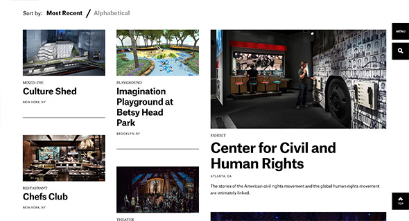
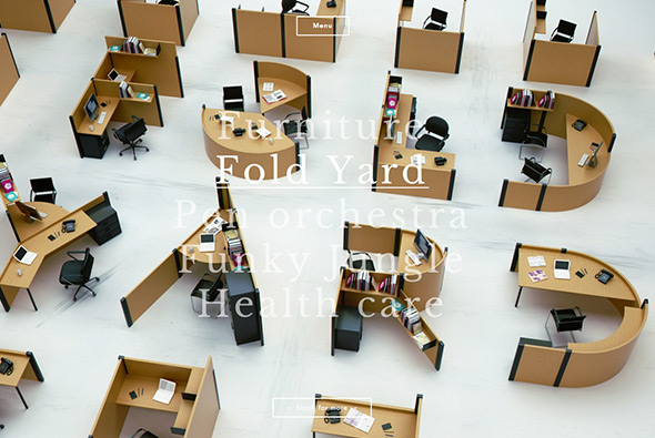
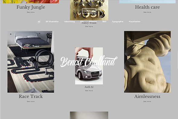
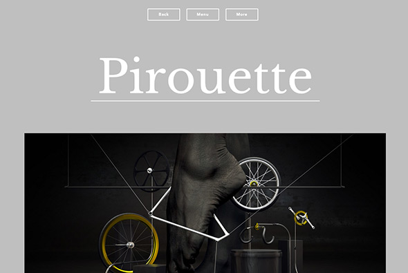
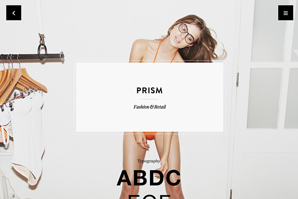
Stunning site for Rockwell Group – cross-disciplinary architecture and design practice. Bold and beautiful design feels like reading a top end design magazine. Love the energy in the layouts and movement created by the offset grid and the various templates making up the pages. Projects are presented in a really dynamic way, with bold typography and large imagery and some intelligent sticky elements when scrolling to reveal details about each project. Not only does the site look great, but it also responsive and looks great also on mobile devices – one of the best responsive sites i’ve ever seen. This is what modern web design is all about, beautiful layouts, great functionality, simplicity and elegance.

Created by Code and Theory (@codeandtheory).

Site here…

The Great Discontent

By | @greatdiscontent | No Comments

discontent-1
discontent-2
discontent-3
discontent-4

Nice refresh of the The Great Discontent website, a magazine about creativity, entrepreneurship, and risk taking. The online version is a beautifully laid out variant of the printed magazine, with lovely typography and nice photography. Nicely considered for the screen, with nice big copy for reading the interviews and the pull out quotes – nicely structured too, easy to find other articles and browse around. And it is responsive too, nicely done…

Created by The Great Discontent (@greatdiscontent).

Site here…

Do Dots

By | @tomvdv | No Comments

dosdots-1
dosdots-2
dosdots-3

Site promoting Dos Dots – a unisex children’s clothing label from Brooklyn, NY. Nice bold typography and style harking back to Japan, where the denim in the clothing is from. The interaction model is simple and easy to use, getting to the details of the items all from sliding panels from the homepage. It looks great, and is also responsive too.

Created by Tom van de Welde (@tomvdv).

Site here…

Universal Typeface – BIC

By | @DDB_Germany, @mediamonks | No Comments

universal-typeface-1
universal-typeface-2
universal-typeface-3

Fantastic site brought to you by BIC pens. Essentially setting out to crowd source a font based on hand writing – from all the contributions on the site for each character. A seemingly complicated task, brought to life in a very simple and easy to understand way – it already has millions of contributions – you can even filter by gender / age / location and so on to see the range of results. It also looks great, I love the way you can see the average character in yellow and can see the different characters in an intuitive and playful way. Really easy to draw your own character, which you can do through your mouse or by connecting your mobile device, again all really made simple for the user. Lovely layout, great fonts, and nice animations and interactions – great piece of work.

Created by DDB Tribal Dusseldorf (@DDB_Germany) and MediaMonks (@mediamonks).

Site here…

Serge Thoraval

By | @jcsuzanne, @jonathandc | No Comments

serge-1
serge-2
serge-3

Site of Serge Thoraval, artisan French jeweller. App like layout and functionality taking you on a journey through the work of the jeweller. Like that you look at one section at a time, like turning the pages of a book, with well considered transitions and zoom in effects to enlarge the pictures – all which injects some personality into the site.

Created by Jonathan da Costa (@jonathandc) and Jean-Christophe Suzanne (@jcsuzanne).

Site here…

Nike Natural Motion

By | @nike | No Comments

natural-motion-1
natural-motion-2
natural-motion-3

Nice site for Nike, and their philosophy of their natural motion range of trainers. Taking inspiration from the shoes themselves, the site is flexible and dynamic, love that you can drag around the blocks of copy, video, and imagery. Lots of detail in the content too – giving a insight into the design philosophy – again which is mirrored by the interface. It is also responsive, which is great to see too. Nice to see something like this which is a bit different, looks good, with a nice visual/interactive concept behind it.

Created by Nike (@Nike).

Site here…

VW.com

By | @deutschinc | No Comments

vw-1
vw-3
vw-2

New responsive site for Volkswagen. So many small details to admire, the simplified navigation – to the side – expanding on pressing ‘more’ – so it remains elegant and does not over clutter the screen. Ultra stripped back models page, with the dynamic angles of the cars keeps it interesting. The full screen find a dealer feature – the real time stock inventory – the ‘find a match’ feature – the preloader that runs across the top of the page – the small legal disclaimers that slide up from the bottom of the viewport. Admittedly the site is for the US market, but still car sites are incredibly complicated and this site is really at the modern edge end of the spectrum. It looks lovely and stripped back as much as possible and responds well to different devices.

Created by Deutsch Inc (@deutschinc).

Site here…

OK Kid

By | @LafondBenoit | No Comments

grundlos-1

grundlos-2

grundlos-3

New EP from German band OK Kid. Love the way the video grid builds up, bringing in one video at a time, and the cool little transitions that reveal text and so on. Lovely transition to the track playing and so on, nicely thought out. For a bonus – it’s also responsive – nice work.

Created by Benoit Lafond (@LafondBenoit).

Site here…

McColl Center

By | @studiobanks | No Comments

mccoll-1
mccoll-2
mccoll-3

Lovely responsive site for the McColl Center, which is a center “for Art + Innovation empowers artists to advance community through the creative process.” this is their site. Looking more like a design magazine it is beautifully designed – from the typography to the layout and photography, all feeling very fresh. Proof that responsive design does not have to be boring and boxy.

Created by Studiobanks (@studiobanks).

Site here…

Jam3

By | @jam3 | No Comments

jam3-1
jam3-2
jam3-3

Lovely new site for Jam3, Toronto based digital agency. Fully responsive, but the desktop variant is alive with lots of animations and transitions that bring to life a lot of the work. So much attention to detail and craft has gone into and it shows! The project pages are interesting and well formatted, and the animations bring it life. Lovely, dynamic example of a responsive agency site.

Created by Jam3 (@jam3).

Site here…

Benoit Challand

By | @hermetikstudio | No Comments

challand-1
challand-2
challand-3

Portfolio site of 3D Artist & Illustator Benoit Challand. Really nice portfolio of work wrapped up in a responsive site sprinkled with elements of delight. Love the main screen with the bold typographic layout highlighting latest project with the remainder of the projects sitting below in a fun multi layer layout. Really nice palette of colour highlights for the projects and I love the transitions to and from the various sections. Really fresh, modern, and well executed example of a portfolio site.

Created by Jerome Bodin (@hermetikstudio) and Leo Cheron (@mrgnou).

Site here…

Pollen

By | @wearepollen | No Comments

pollen-1 pollen-2
pollen-3

Nice new site for Pollen a branding and design agency for the fashion sector. Responsive, modern site – love the slide out menu and the slick transitions / preloader to the individual projects. Nicely laid out the offset grid maintaining it visually interesting throughout. Individual stories for each of the projects offering moodboards, user journeys and so on make it a bit different to the mainstream portfolio site. Nice.

Created by Pollen (@wearepollen).

Site here…

VW Sports Cars

By | @MerciMichel | No Comments

vw-sportscars-1
vw-sportscars-2 vw-sportscars-3

Really nice site for VW France showcasing VW sport cars in a rich and interactive environment. Featuring several cars that you can spin around in a dark and moody warehouse – with key stats design details and so on. The amount of detail from the 3d models to the animations is incredible, every small transition has been considered. I love the transitions from the home screen to the cars, and the way the 360 works, also all of the hotspot transitions. Another really cool part of the site is the way it responds, so desktop users get the full rich experience, tablet users get a very similar experience using the same content and videos and mobile users get a much more stripped back version – they all work really well. It looks great, feels great and is a fantastic example of a modern responsive promo site.

Created by DDB Paris (@DDBParis) and Merci-Michel (@MerciMichel).

Site here…