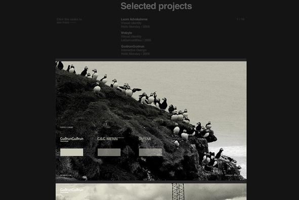
Portfolio site of Art Director / Graphic Designer Sebastian Gram. Very nice and simple vertical scrolling website showing his work, you click on an item and the area expands to show screengrabs of the projects. Nicely structured and clean crisp design, to the point!
europe
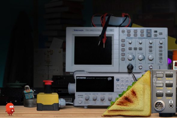
Site promoting the Museum of Science and Industry in Chicago. Designed to teach children basic physics, the whole experience is played out via ‘Twitch’ a little character who you interact with to complete physics challenges. Really nice puzzle games that are well designed and polished, with great animations, cool music & sfx and a nice physics engine – all together combine an ideal fun and engaging site for kids (and adults!) to learn about physics.
Created by Unit9.
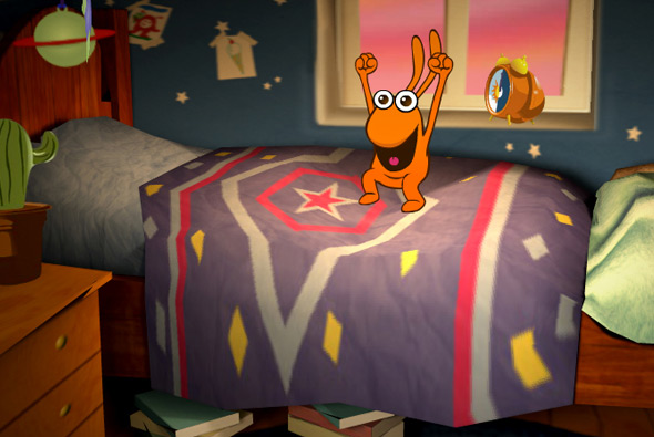
Entertaining site accompanying the BBC kids show ‘Big & Small’ – designed for children aged 3-6 and their parents. The site is a playground, with little interactive games and experiences such as hand painting, music, videos and so on. But what makes this so remarkable is the depth and polish of the site itself. Set within a detailed 3d environment you explore the setting via the interactive experiences, with your mouse affecting your view. But it isn’t just the way it looks, the interactive sections are really a lot of fun, each of them highly polished, with great animations and sound fx – it’s been a while since i’ve interacted with a site like this for so long! For example there is a small game where you have to try and brush the teeth of one of the characters and the toothpaste spreads all over the 3d items in the bathroom, the sink, the mirror etc. Another where one of the characters jumps on the bed and the bed surface reacts to his movement. The little touches all add up to make a fantastic website with incredible use of Papervision – really detailed environments, highly interactive, and really well designed.
Created by Plug-in Media. Really nice write up from Seb Lee-Delisle one of the team members that helped shape Papervision.
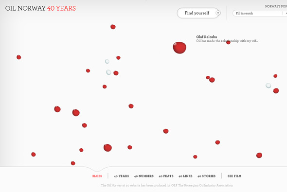
Website showing the relationship the Norwegian people have with oil. ”The Norwegian oil story written by Norwegians’, the site allows each of Norway’s 5 million citizens to share how oil has affected their lives, and their country. Interesting way of presenting the thoughts and stories of people through bubbles, oil if you like, floating around in water. Love how the bubbles fill the screen and become slightly transparent – with the inside showing pictures and text mapped to the surface of the bubble, with your mouse moving around your view. Each of the sections of the site are very interactive and fun to play around with, where you can pick up and drag around bubbles and so on. Well designed and all the Flash is well produced with a high level of detail. Very cool!
Created by Fi.
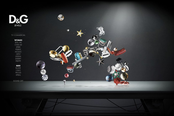
Site promoting D&G’s range of jewellery. Very simple but engaging – the ‘jewels’ float around and interact with each other – when you rollover them they glow and other objects cannot go near them. It’s quite nice just to watch them bouncing around, when you click on one you zoom in and can see the object in more detail. Well designed and fun to use, nice!
Created by Hi-Res!
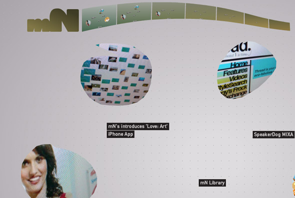
New portfolio site of British digital agency magneticNorth. Nice approach, using gesture recognition i.e. draw a line and you see news, draw a circle and we see a project. We’ve seen gesture recognition before but what I like about this one is the slickness & simplicity of it all – it just works. When drawing a circle to get a project the shape you draw becomes the mask for the content, where the video / screen grabs then appear in that area.
Created by themselves, Brendan Dawes is the creative director – that kinda helps getting visual concepts like this working!
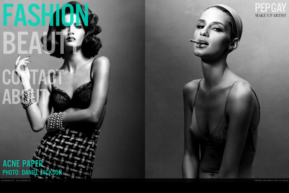
Site of make up artist Pepgay. Nice fullscreen Flash site with some beautiful photography, I like the way two images at a time are displayed – many really full of colour and depth. Nice bold typography and bottom thumbnail scroller, also like the way when you mouse over to the left the menu fades up – so when your mouse isn’t active you can see the images in all of their glory. A good example of a portfolio which is slick, stylish, and to the point.
Created by 2otsu – Oriol Bedia.
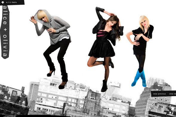
Cool playful site of clothing label alice + olivia. Really simple with a touch of surreal, each section of the site has objects which can be thrown around the screen, bouncing off the sides of the screen and each other. Even when viewing the collection you can pick up and throw around the models. Nice and clean and simple, to the point yet fun and playful.
Created by designedmemory.
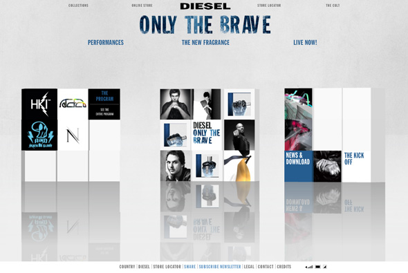
Site of Diesel’s new fragrance, ‘Only The Brave’. Based around a series of 3d cubes featuring ‘performances’ when opened show 3d rooms with video and designs featuring work by the likes of Mr Doob, Nico Stumpo, Eboy, and Hellohikimori, and many more to come over the next few months. You can also see the print ads and see the bottle the fragrance comes in. Yes another 3d site, this is quite nice though, it’s a cool idea to use modern digital artists to create the 3d rooms, the rooms themselves are pretty interesting, although unfortunately it just reminds me of the Absolut ‘In an Absolut World’, but essentially they have put their own spin on it. Also they have used a physics engine on the 3d blocks, so when each section loads the boxes interact with each other, overall a nice site!
Created by Hellohikimori.
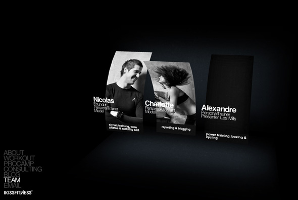
Very simple site of ‘I Kiss Fitness’, a personal training company. A very minimal, simple site outlining the company and it’s services, what I liked about it was the pretty cool use of 3d, bending images and especially the way the text explodes as you move your view around in the different sections, thats it!
Created by madebyg.
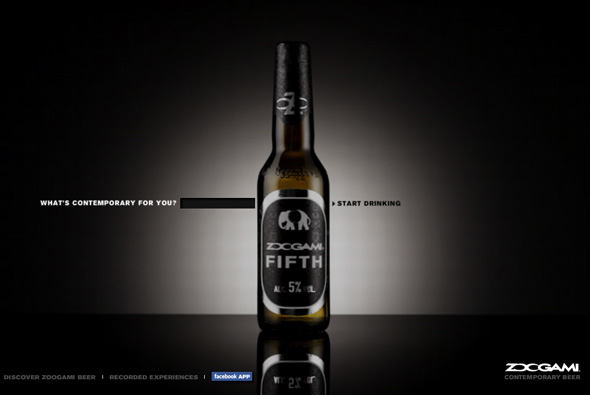
Interesting site promoting the launch of new beer Zoogami. Based around the idea of ‘contemporary’, the site acts as a mash up of digital media – video, sound, and images all related to a search term that you provide. In the end you get a sequence of images, videos, and music given a treatment with colours, with it all moving in time with the music. It gets images from the web, sound/music from YouTube and video from Google Video. There is a gallery of saved searches, and even a Facebook Application. Sadly they all end with the same treatment, also it takes an extremely long time to load, and when there isn’t enough content it always uses the same images from some image resource – so after 2 times of making a new sequence you see a lot of the same things. Interesting idea, nice to see a brand experimenting with ‘contemporary’ digital ideas…
Created by Saatchi & Saatchi Rome.
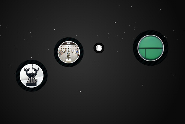
Website of artist Keith Tyson. Nice site which presents the works of Keith Tyson, presented in a floaty 3d space, you select projects and then view them from within a circular interface. A well designed site, with a clear interface and all the features you come to expect, but all done in an excellent way. Nice attention to detail, interface and look & feel, a great example of an online gallery…
Created by De-contruct.
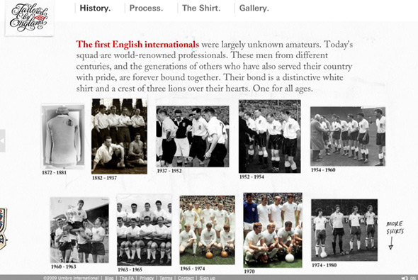
Site promoting the new England football shirt. This site goes for the angle of showing the craftsmanship and history of the England shirt, how the design has changed over the ages and how it is today. Nicely designed to reflect the shirt the site itself is well crafted – you move your view around a nice 3D area with the different sections of the site located in various places, your perspective changing swiftly through the scene. I like the rotating view of the new shirt with the different features highlighted – with a really nice panning detailed photo of each feature. The site also looks great, lots of nice touches and cool buttons, all with that ‘hand crafted’ look which the site is aiming for. Great animation and transitions and nice use of 3d, draws you into exploring all the different sections of the site, pretty cool…
Created by Perfect Fools and Anomaly.
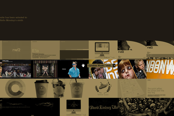
Portfolio site of Danish agency Hello Monday. Draggable strips featuring images from each of their projects, you zoom in/out of these to see more about each project. Nicely done full screen site that allows you to drag around everywhere, some really nice projects in here also. Together it all provides a slick overview of some nice projects with a nice interface…

