europe

Whalefootage

By | WEBSITES | No Comments

Whalefootage

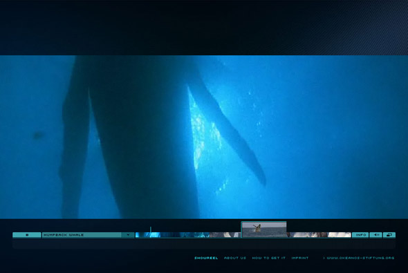
Footage of whales to increase awareness of their plight. Really slick site – the best use of video in terms of interacting and navigating I have seen. For each bit of footage small images are placed apparently at each keyframe, these images change as the cursor is moved across the timeline. For each whale a small thumbnail of each video is played, all very minimal and stylish. Its a great site with lots of really good touches and great attention to detail.

By Scholz & Volkmer.

Website here…

Sean Kennedy Santos

By | WEBSITES | No Comments

Sean Kennedy Santos

Photographer’s website, using black as the concept – a whole host of transitions and effects are in full effect, revealing the content. There are some really nice touches in here, in particular the way text is revealed and images are transitioned – I really like the simplicity of the site. There is nothing over the top in terms of navigation and it remains easy to use.

Created by Artificial Duck.

Website here…

AUDI R8

By | Loose | No Comments

audi r8

Site promoting the new Audi R8 for the UK market, from the perspective of 12 ‘chapters’ explaining the intricacies of the car. There are some really nice transitions and touches that liven it up a lot, nothing ground breaking just a nice example of a car microsite and an interesting use of navigation.

Developed by Good Technology.

Website here…

Playground – Canon EOS

By | WEBSITES | No Comments

Playground - Canon EOS

Amazing site – powered by Papervision 3D – again!! Promoting the new Canon EOS 400D camera.

Really lovely style of interaction – you pan around and explore 3 different scenes each with interlocking pictures which move around in a 3D environment. This has got to be my favourite example of Papervision so far, the execution is really accomplished.

Created by Mediacatalyst.

Website here…

Nike ACG Sweetspots

By | WEBSITES | No Comments

Nike ACG Sweetspots

Another great example of a site integrating Papervision 3D, this is one of the best showcases of it I have seen to date. A globe highlighting ‘sweetspots’, i.e. a cool snowboarding area, is the main navigation – very easy to manipulate & use. The attention to detail and overall design & polish is really spot on, i.e. the motion blur whilst rotating, and lovely transitions.

Created by Duke, it is an inspiring, enjoyable example of a slick, usable, and cutting edge Flash site.

Website here…

Red Bull Mediamix

By | WEBSITES | No Comments

Red Bull Mediamix

Innovative Flash site providing video content in an interesting layout, really like the design and fantastic transitions. he way a mass of information is organised and displayed is really nice, with good use of rollovers and fades – its also very easy to use.

Made by Less Rain, they explain it best: “The purpose of the Mediamix is to bring media content – in particular video content – to the foreground and make existing media content more accessible through an innovative channel interface.One of the main goals has been the cross linking of all media with related content. Additionally all media items are downloadable, linkable and can be embedded on 3rd party sites with the branded Red Bull player you can see below.”

Website here…

Javier Ferrer Vidal

By | WEBSITES | No Comments

Javier Ferrer Vidal

Winner of the Flashforward2007 Boston Film Festival in the Typography category – again it’s been around for a while. But it is really well executed, not just down to the typography – but also in terms of navigation and style. Using 3D esque parallax navigation it is a joy to use and at times jaw dropping. It remains simple and easy to use but also the animation and transitions are amazing.

Website here…

Oakley – Riders

By | WEBSITES | No Comments

Oakely

Not particularly an amazing technical / design driven site, but caught my imagination in terms of concept and execution. A really nice site by Oakley just showing their sponsored european snowboarders/skaters/surfers off in a series of websites. The site is structured like in a fun laid back style and is a basically a bit of fun with diaries and photos and competitions and so on.

Vicci’s site here…
Scott & Tlyer here…
Oli’s here…
Ben’s here…

Audi – Rhythm of Lines

By | WEBSITES | No Comments

Rhythm of Lines

Based on ‘Lines’ ad promoting the new Audi A5, you make your own ‘Rhythm of Lines’. That is draw lines in a 3D space using the keyboard and mouse – it kinda works like flying through an empty 3D space. You end up with a very organic flow of coloured lines, once you get used to it you can get some nice results.

Created using Papervision and a customised line drawing script, made by Good Technology. Nice site – I like the kind of ethereal direction and lack of advertising – its quite involving and making your own design is enjoyable its a good way of promoting a concept online that ties in nicely with the ATL ad.

Website here…

Simon Rasmussen

By | WEBSITES | No Comments

Simon Rasmussen

Good portfolio website of Simon Rasmussen, a Danish stylist and creative director. Made by Danish agency Flexmotion it is a well conceived concept.

I wanted to use the whole ‘contact sheet’ navigation on a recent website, as I feel it works very well when navigating a visual website such as this. Scrolling left and right to see more pictures as if sliding the negatives just feels intuitive. Nice to see it looking so well integrated…

Website here…