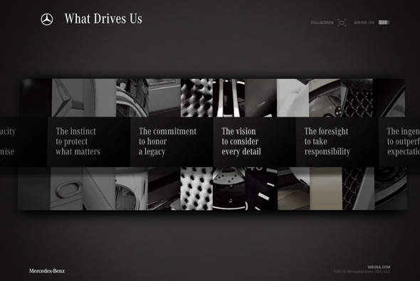
Simple & slick branding site from Mercedes Benz USA. Featuring an array of videos and images wrapped around a smart 3d interface. I really like the 3d menu system that is very modern and sleek but remaining easy and fun to use. Some nice content here too, all with a thick layer of polish.
3d
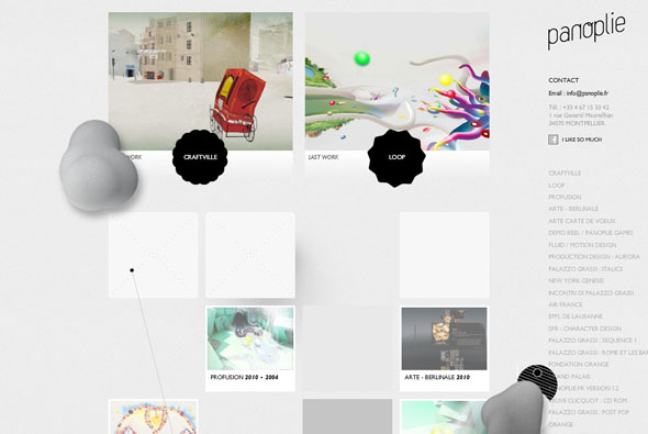
Website of French agency Panolie. Pretty interesting, standard layout but all with a twist and some injected personality. The scrolling up and down also brings weird blobs and interactive things onto screen, all adding a nice feeling of depth. Clicking on a project and clicking left/right shows a really cool 3d cloth effect. Nice attention to detail and a bit different.
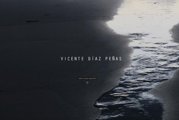
Website of photographer Vicente Diaz Penas. Quite normal, until you click and drag, then you see that the photos are mapped to a 3d surface to give the impression of depth. On some images it works really well, a very interesting effect, a nice concept…
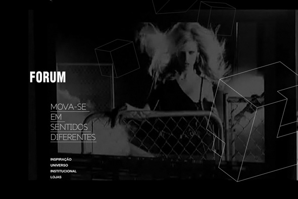
Website promoting ‘Forum’ a Brazilian fashion label. Cool interface, very nicely laid out with typography, 3d objects, video and photography. Coupled with slick and smooth animation and loads of nice touches, in particular I like the mechanism used to show off their products a very cool interactive slideshow. Also really like the intro withe the 3d wireframes overlaid with video – Very nice…
Created by grafikonstruct.
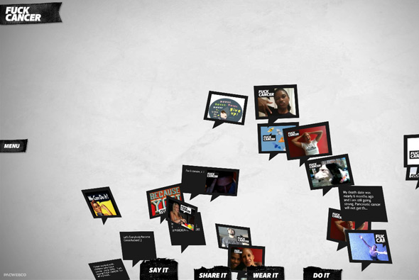
Interesting site trying to change our perception and attitude towards cancer. Encouraging the fight against cancer you can post images, text, and so on. Set in a 3d interface with all the comments and photos floating up in 3d space which you can interact with, it looks great and works nicely. Nice ‘fun’ idea, inspiring message, and well executed.
Created by Pacwebco.
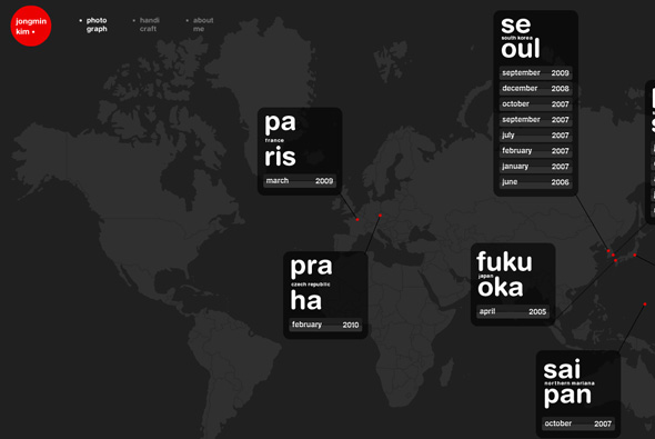
Portfolio of Jongmin Kim, interactive designer and photographer. Nice work in a fresh portfolio, interactive work in a smooth 3d interface, and all his photos plotted by date and location on a map. Loads of cool transitions and animation, interactivity is simple and smart, nicely designed – all in all a good portfolio site with a bit of extra polish that really makes it come alive.
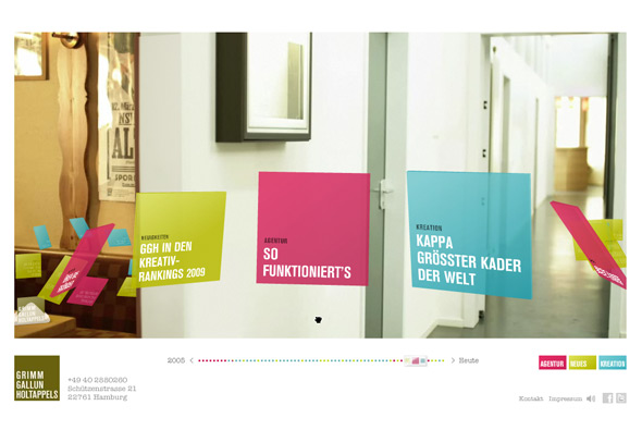
Website of Grimm Gallun Holtappels, German agency. Combining real environment and 3d interactive objects this site really comes alive. Travelling through what looks like an office, thumbnails of their projects can be dragged along through the space and expanded to find out more. By clicking on the coloured boxes you can explore lots of different areas, the zoom function is really cool as well. I love the motion tracking of the 3d objects and the faux camera / POV movement. The animation is super smooth, with an amazing level of detail and timing. It looks great also, with every button and feature well considered and designed. Love it!
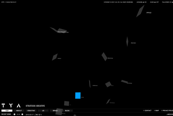
Portfolio of Japanese agency TYA. Set in a floating 3d space which is explorable through mouse movements. The ‘creative’ section highlights their work, with thumbnails moving through a floating space – allowing you to sit back and watch the projects float past. Nice camera movement and cool transitions and animation.
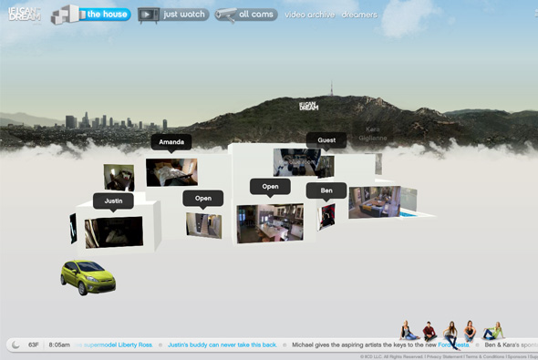
If I can Dream – website documenting the stories of 5 young people chasing their dreams in Hollywood. Set in a Big Brother esque house with cameras everywhere – as the viewer you can go to several of the rooms and choose a camera and be a voyeur. Set within a 3d navigation and with a really nice interface design, you navigate to different areas within a fluid 3d box. One of nicest and smoothest uses of 3D I have ever seen, the 3d doesn’t get in the way of anything and just adds to the whole experience. Loads of attention to detail, I love all the little rollovers and icons, the 3d transitions are amazing. Great design, very complicated build, slick animation, all in all a fantastic looking and very impressive website.
Created by Poke New York.
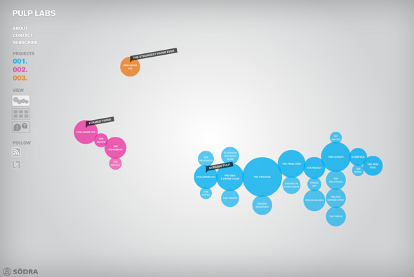
Site challenging everything we know about paper and pulp. Highlighting 3 main projects showing the stages in each of the projects, all showing the need for sustainability and care of our environment. Integrating videos, Twitter, YouTube etc, and allowing Facebook users to comment. Nice and simple interface with really nice animations and look and feel. Users can also follow all updates in the projects via RSS and email.
Created by Garbergs and Public Class.
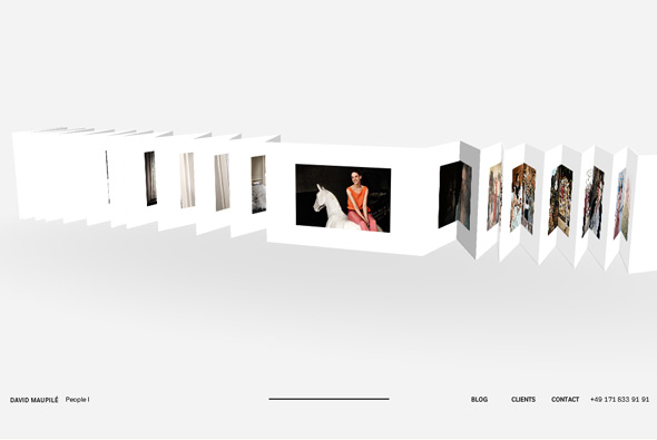
Website of photographer David Maupilé. Based around a long sheet of folded paper in 3D, with each photograph folded – when clicked camera zooms in and displays photo bigger. Very clean and minimal with a nice navigational interface, well made and looks great! Very cool…
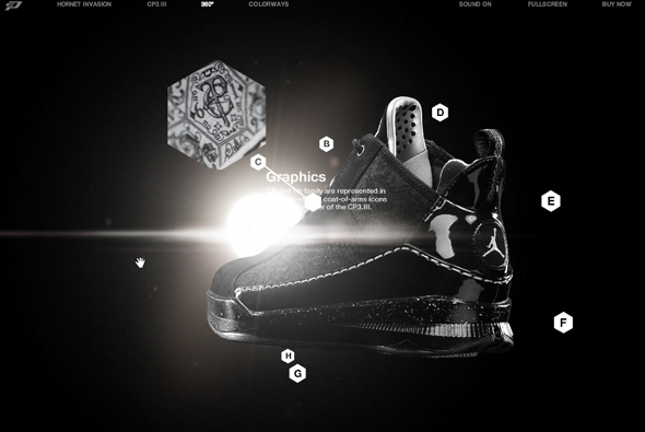
Site promoting the new Nike CP3.III basketball trainers with the help of Chris Paul – basketball player. Slick dark interface, which offers the option to watch Chris Paul in action or check out the trainers. Lots of nice parallax visual effects to give a really cool feeling of depth, love the lens flare effect behind it all – bleaching out your view slightly. Really cool 360 of the shoe and 3d effects on the details. Very slick…
Created by Academy.
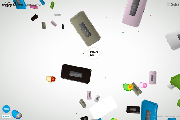
Mega cool, and mega mental promotional site for SoftBank, and what seems like promotional Jelly Beans edition phones! Featuring a 3d environment where jelly beans and the phones float around to music, making up shapes and animating around everywhere. By clicking and dragging a phone, you drag the phone towards you and the rest of the phones carry on doing their own thing. By dragging more you reveal different information about the phone. Really fun and captivating, I really love the drag interactivity, and sitting back to watch all the animation! Really cool…
Created by Dentsu.
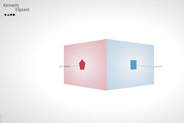
Portfolio of Danish artist Kenneth Elgaard. Clean and minimal, drag based interactivity – set around a cube with each side a different section of the site. What I like is the way you navigate the portfolio, by dragging along you view the work, and by dragging up and down you zoom in and out. All makes for a fluid, easy to use experience.
Created by I Like to Play.

