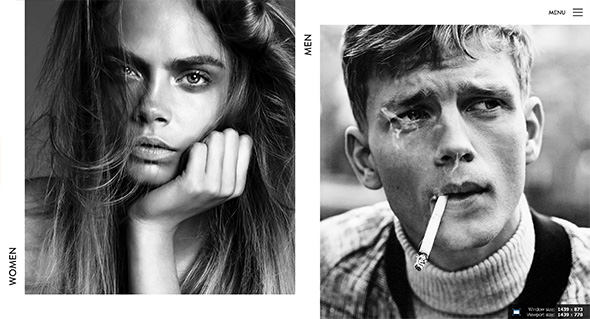
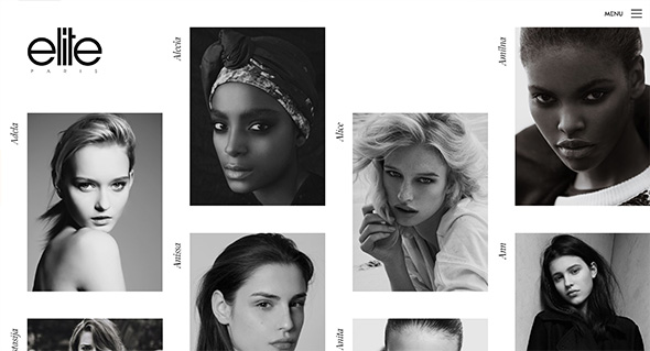
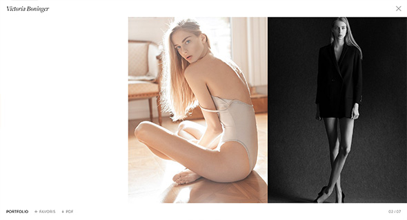
Nice site for Elite Models in France. Slick and simple, love the offset grid for all the models and bold photographic approach. Lots of nice transitions for the various panels and interface, which creates an elegant and professional experience. It looks great, with nice use of white space and allowing the imagery to do the talking.
Yearly Archives: 2015
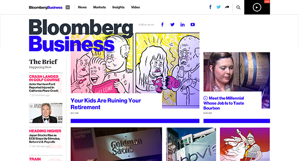
Nice example of a modern, fresh, responsive design solution for a complex site. Lots of really nice touches and features. Not only does it look great, with the bold typography, but they have injected elements of personality into the site. Love the way when you reading an article – a blue line simply indicates your progress which appears alongside the sticky nav. Also love that when you are reading an article, when you reach the end, it lazy loads the next article – really simple but thoroughly well thought out. Also like the full screen navigation that opens up really allows you to find what you might be after. On top of that it is all responsive – design is great for such a site, loads of nice touches – great stuff.
Created by Code and Theory (@codeandtheory).
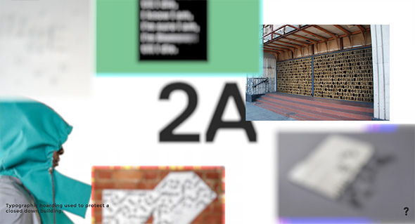
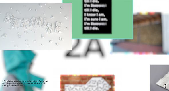
Portfolio of London based multi-discipline studio 2A. Very simple site, some nice hero images using a nice depth of field effect to let you focus on the particular projects. Really nice way of putting together something visually interesting when there isn’t so much content available – a fun interaction to play around with.
Created by Bong (@bong_intl).
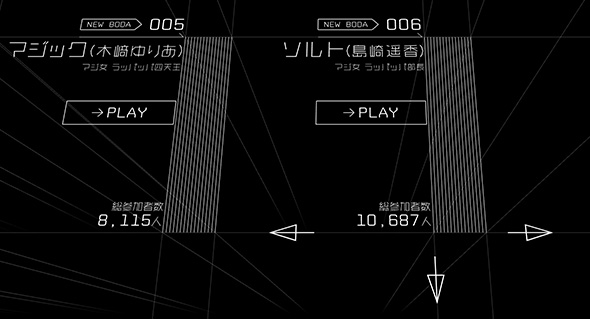
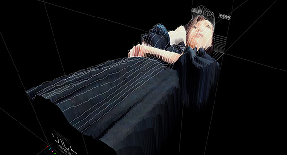
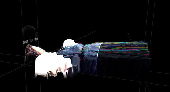
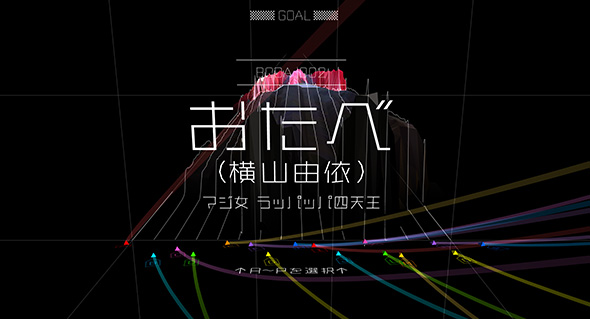
Fascinating site that uses peoples 3D data as a landscape to interact with. All executed through an experimental 3D interface where you pan and rotate your view. Feeling akin to something out of Blade Runner – the music the design – it is all an assault on the senses. The 3D bodies are moving around as you interact with the scene and you can play races that float across the moving 3D contours of the bodies. Love the 3D elements and the experimental look and feel, really cool to see digital experiences like this. Quite an experience…
Created by Bascule Inc (@Bascule_Inc).
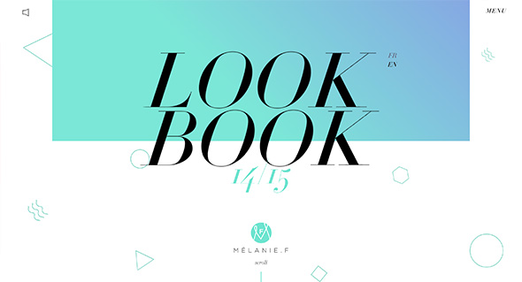
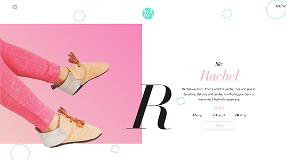
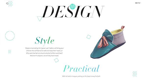
Sweet and simple site for Mélanie F – a lookbook for their slippers range. Like the products themselves, the site is fun and colourful – love the elegant layout and smooth scrolling parallax decoration elements. Absolutely love the simple animated elements that really lift the experience – and make it feel that more dynamic.
Created by Lionel Durimel (@wmnvm) and Julien Renau (@julien_rno).
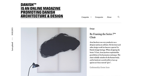
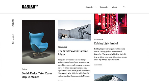
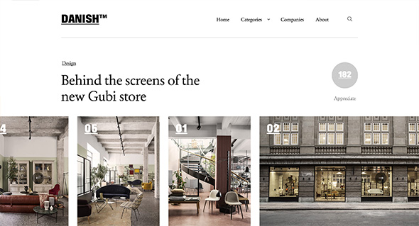
Simply put an online magazine highlighting Danish architecture and design. Love the editorial style and design, slick and simple and with nice typography. Really fresh feeling layout accentuated with neat touches – such as the Danish logo animating when the content is loading. The site works really well across different devices and responds well to layout changes. A good example of a modern, well crafted editorial style site.
Created by Spring/Summer (@SprngSmmr).
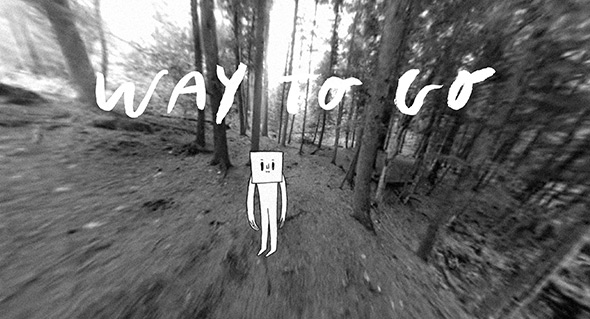
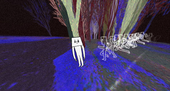
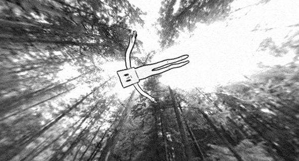
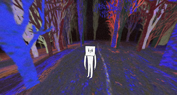
Surreal and beautiful – a ‘walking simulator’ – probably best described as an immersive interactive digital short film. Starting in the woods you guide your character along a path – you control your view from a 360 degree camera. You explore your environment, clicking brings your character to investigate a certain spot on the ground. It gets more surreal the further you explore, across various environments – a real feat in interactive storytelling. Love the way it totally immerses you into this strange world, drawing you in further and further. Beautifully executed and well crafted – nice to see more of this kind of thing that really highlights the potential of the interactive medium.
Created by Vincent Morisset and friends, AATOAA (@vmorisset).
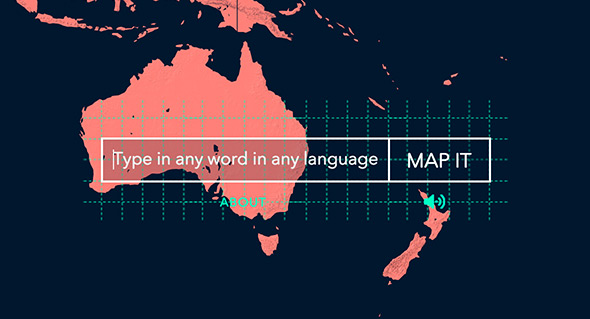
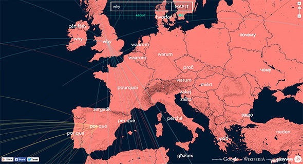
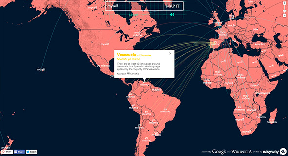
Simple site mapping the origins and usage of words across the world. Simple premise enter a word and the site will – using Google Translate – track the use of the word and translate in across the world. I like the way it tracks the words and actually speaks them as your travels all over the world. When it stops lines represent the origin of the word and clicking on them reveal how to speak the word in that country. Nice bit of fun and something a bit different.
Created by Loducca (@AgenciaLoducca).
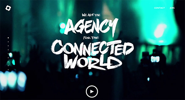
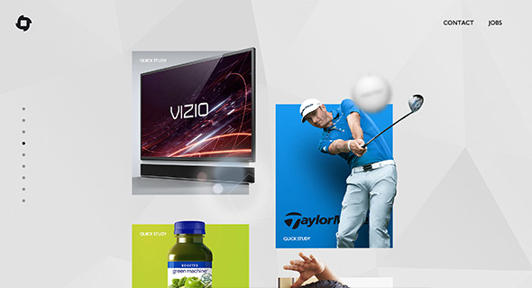
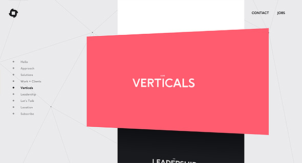
New site for Blitz, digital agency in California. Nice and refreshing approach to an agency site – with a quasi-3d scrolling interface. Bold and bright, each section is full of information about the agency – like their approach to the project showcase – which feels like a slick presentation of videos and visuals. Lots of nice little details such as the menu to the left, really fresh agency site.
Created by BLITZ (@BLITZagency).
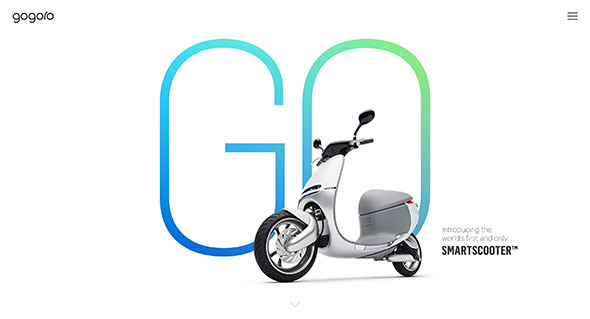
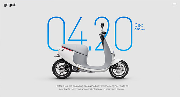
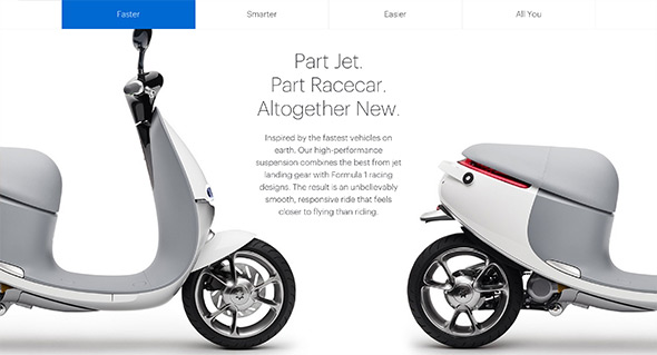
Lovely informative and entertaining site promoting the Gogoro electric scooter. Highlighting the key characteristics of the scooter in a bold and engaging way – showing how fast it accelerates, how it corners, the key components – all the interesting things. What I like is the way they make it interactive – lots of little playful interactions – such as turning on the lights / carousels revealing nice animations and so on. Love the bold and streamlined approach to the layout – large imagery and bold typography. It is also responsive and works well across various devices – really nice example of a product site.
Created by Cinco Design (@cincodesign).
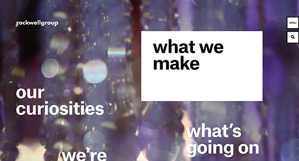
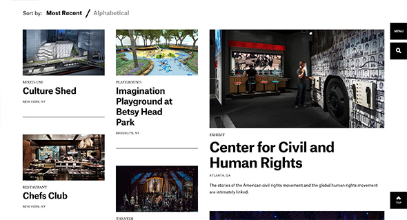
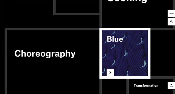
Stunning site for Rockwell Group – cross-disciplinary architecture and design practice. Bold and beautiful design feels like reading a top end design magazine. Love the energy in the layouts and movement created by the offset grid and the various templates making up the pages. Projects are presented in a really dynamic way, with bold typography and large imagery and some intelligent sticky elements when scrolling to reveal details about each project. Not only does the site look great, but it also responsive and looks great also on mobile devices – one of the best responsive sites i’ve ever seen. This is what modern web design is all about, beautiful layouts, great functionality, simplicity and elegance.
Created by Code and Theory (@codeandtheory).
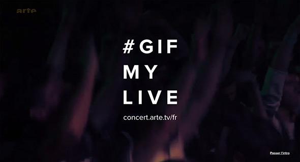
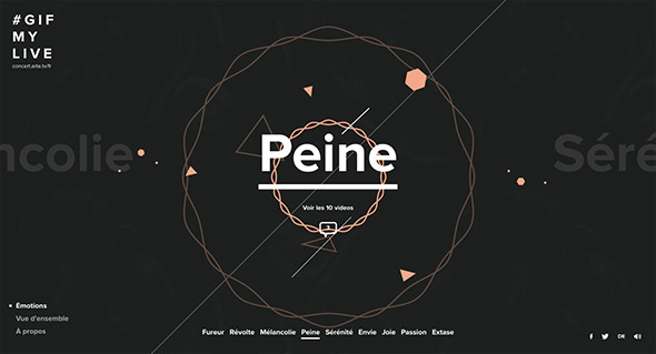
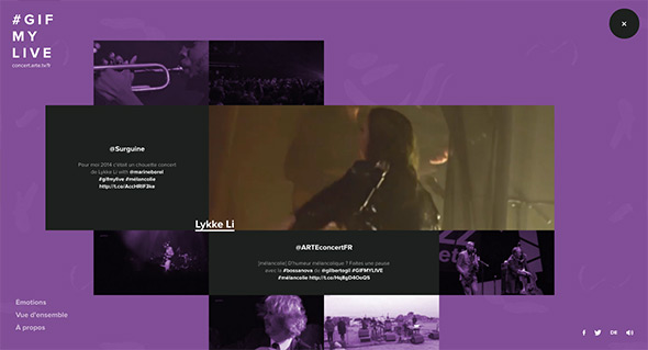
Retrospective of live musical moments for a spectrum of emotions from rage, melancholy to passion. Watch the videos and hear the music of various acts and bands – wrapped up in a fun explorative interface. Love the elastic rollovers and the nice feeling of depth on the homepage – lots of small playful moments. Love the bold typographic style and splashes of colour.
Created by Bonhomme (@BonhommeParis).
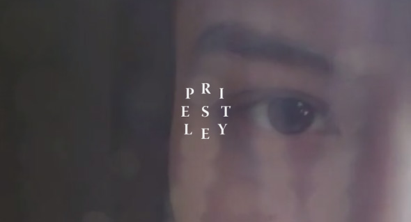
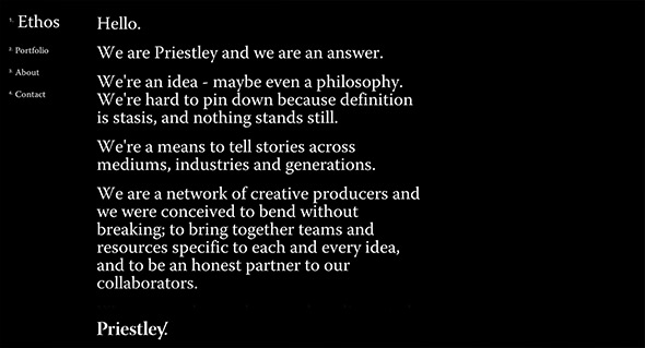
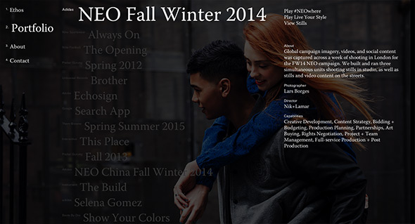
Site for Priestly, creative agency based in Oregon. Stripped back web site with typography led layout, pared back to the essentials. Really simple and effective, and nicely considered – really like the typographic approach and the sticky elements when reading the content.
Created by Camp Quiet (@campquiet).
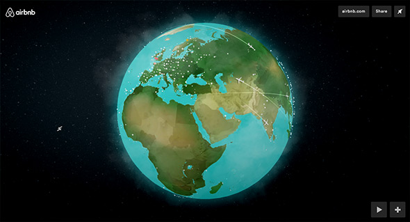
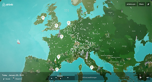
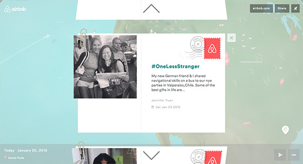
Short and sweet promo for Air BnB showing a globe with all the Air BnB activity going on today. Love the 3d globe with lots of nice little animations of people checking in, snippets about certain locations, and geo located tweets with their #OneLessStranger tag. Nice little branding piece that just highlights how global Air BnB is – it looks nice and matches the style of the newly rebranded Air BnB.
Created by Tool of NA (@ToolofNA).

