portfolio

Waark

By | @waaark_studio | No Comments

waarl-1
waarl-2
waarl-3
waarl-4

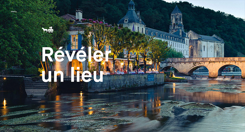
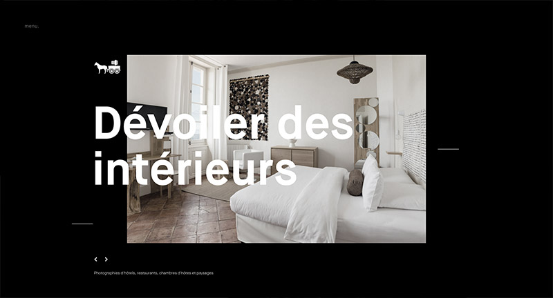
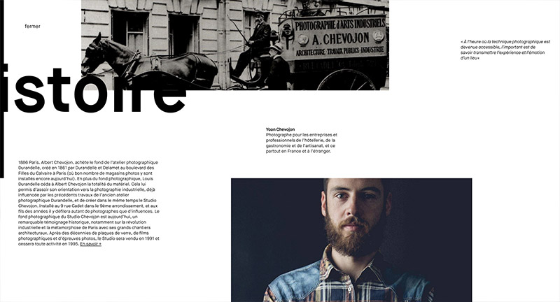
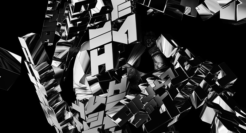
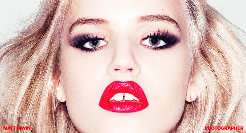
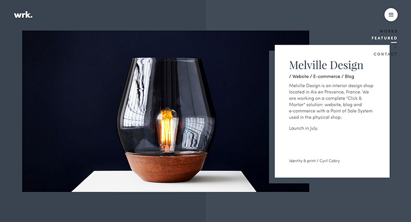
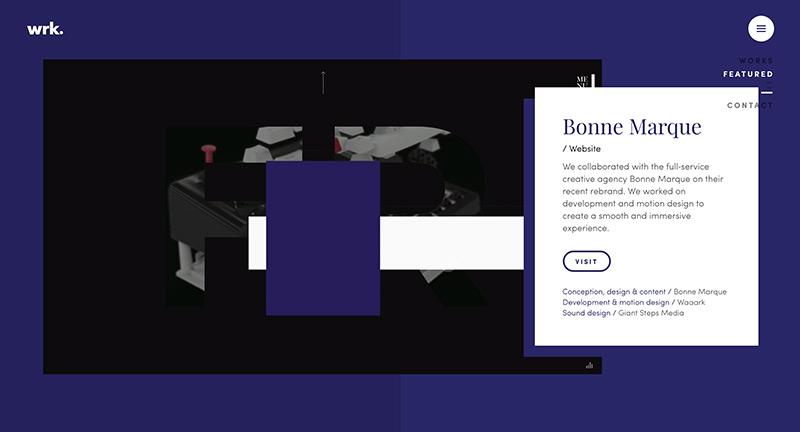
Fun site for French digital agency Waark. Playful interactivity and transitions bring a splash of fun to this agency’s body of work. Love the transitions from section to section, there’s a lot of personality injected into this experience, from the bouncy boxes, animations, and subtle interactivity.

Created by Waark (@waaark_studio).

Site here…

Made by Six

By | @madebysix | No Comments

six-1
six-2
six-3

Site of UK based design agency Six. Elegant portfolio of work that spans branding & digital design for clients all over the world. Nice and simple way of presenting their work in an editorial style layout with lots of nice transitions that create a seamless experience when traversing their projects.

Created by Six (@madebysix).

Site here…

Studio Chevojon

By | @mashvp | No Comments

chevojon-1
chevojon-2
chevojon-3

Site for French based photography studio Chevojon. Slick and simple, scroll through the photos – love that mask reveal transition – nice use of type too. I also like the menu, in that it opens up into a sideways scroll page that reveals a bit of information about the studio and other pieces that you might want. Project page is great too, with lots of lovely transitions and animations provide a nice smooth and premium feel and elevate the photography.

Created by Mashvp (@mashvp).

Site here…

Matt Irwin

By | @YESstudio | No Comments

mat-irwin-1
mat-irwin-2
mat-irwin-3
mat-irwin-4

Awesome folio of photographer Matt Irwin, sadly he has passed away but Yes Studio wanted to launch his lovely body of work. Love the absolute simplicity of the experience, click to proceed to the next image in a constant cycle. His work reveals such personality not only of the subject but the character of the photographer himself – curiosity and playful. Small subtle details such as the about section, and the navigation changing accent colours is a nice touch. Lovely, elegant site that hones in on the absolute simplicity of showing great photos.

Created by Yes Studio (@yesstudio).

Site here…

Stinkdigital

By | @stinkdigital | No Comments

stink-1
stink-2
stink-3
stink-4
stink-5

Lovely refresh of global agency Stinkdigital’s website. Clean and fresh and fast, the site shows a great folio of work. Love the transitions from page to page and pleasing gradients that accompany them, nice detail on the project pages with a mix of animated gifs, video content, and imagery. Really like the about page, and love the way they represented the different offices timezones is a smart and playful way.

Created by Stinkdigital (@stinkdigital).

Site here…

Maison Nue

By | @MaisonNue | No Comments

maison-1
maison-2
maison-3
maison-4

Site for Parisian based creative studio Maison Nue. Lovely typography led layout, love the first section where rolling over the types of work reveals imagery which then blurs and fades into the background. Also love the feature of cycling through ‘what you like’ which highlights the projects that you might like. Like the way the project thumbnails are revealed inline into the text. Simple, fun, and elegant.

Created by Maison Nue (@MaisonNue) and Tristan Bagot.

Site here…

Locomotive

By | @LocomotiveMTL | No Comments

loco-1
loco-2
loco-3
loco-4

Site for digital first agency Locomotive based in Canada. Full of transitions and animations, I love the diversity of the layouts for the project pages. Each project has its own colour palette which transitions when you visit other sections. I love the energy in each of the sections, from the fun ‘play’ section of the site to the detail when you reach the end of a case study – love the colour fade. Full of detail and beautifully designed, great example of a modern agency site.

Created by Locomotive (@LocomotiveMTL).

Site here…

Consortia

By | @webdesign | No Comments

consortia-1
consortia-2
consortia-3

Site for digital agency and research group Consortia. Lovely scrolling intro that pulls apart the logo and dives you into their lovely folio of work. Simple interactivity that splits the page to reveal the project detail in-situ. The component parts of the logo follow you down the page and add a nice element of depth.

Created by Lucas Lind.

Site here…

HAUS

By | @madeinhaus | No Comments

haus-1
haus-2
haus-3

Site of LA based digital agency HAUS. Nice animated intros to each project, with nice level of detail for each of the project pages. Lots of nice details that elevate – such as the contact page where you can play a game on the map, the menu page with awesome bg animations. All in all a well designed and executed modern agency site with lots of personality.

Created by HAUS (@madeinhaus).

Site here…

Plane Site

By | @owenhoskins, @plane_site | No Comments

plane-1
plane-2
plane-3

Site for Berlin based agency that specialise in content creation. Love the visual metaphor of the piece of paper that rotates and moves as you scroll to reveal new patterns and color, very elegant and interesting way of presenting a concept of what they do. Nice nav along the right hand side that appears when you get into the more detailed sections.

Created by Plane Site (@plane_site), Ben Roth, and Owen Hoskins (@owenhoskins)

Site here…

Nurture Digital

By | @wengerstoybus | No Comments

nurture-1
nurture-2
nurture-3

Site for US based digital and video production agency Nurture Digital. Love the masked showreel in the background as you scroll through the background changes with colour and animation – highlighting that project. It is beautifully designed, nice bold typography and full of great detail and animations – love the way the transitions on the homepage to see individual projects. The project view looks great, love the intro panel which transitions to full screen video then detailed panel down the side appears as you scroll. One of the nicest agency folio sites i’ve seen for a while.

Created by Bryan James (@wengerstoybus).

Site here…

Karina Twiss

By | @StudioThomas | No Comments

karina-1
karina-2
karina-3
karina-4

Lovely portfolio of London based photographer Karina Twiss. Love the ultra high res photos that form the background and let you explore the quality of the shots. Love the grid of images, with a mix of animations and videos forming a stunning pastiche of beautiful photography. Nice details such as the minimal menu and zoom out on an image to bring up a carousel. Stunning example of letting the content do the talking.

Created by Studio Thomas (@StudioThomas).

Site here…